fighters: a custom display typeface
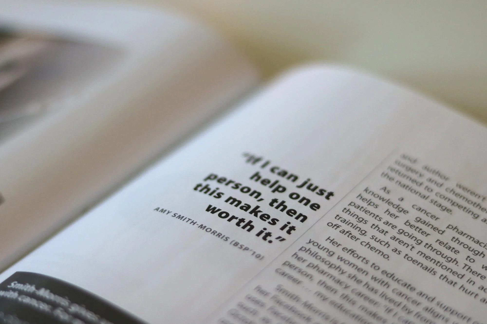
I designed this custom typeface for the usask alumni magazine to use for larger text throughout as an alternative to imagery. this issue in particular had a lot of really powerful stories about some very strong alum, each in their own way, but most of the supplied photos didn’t match that energy and we weren’t able to take our own.
After a lot of unsuccessful searching for the perfect typeface, one day I thought, “maybe i can just make my own.”
skills highlighted:
creative and art direction, typeface design, digital lettering, layout/graphic design illustration, typeface creation/installation