
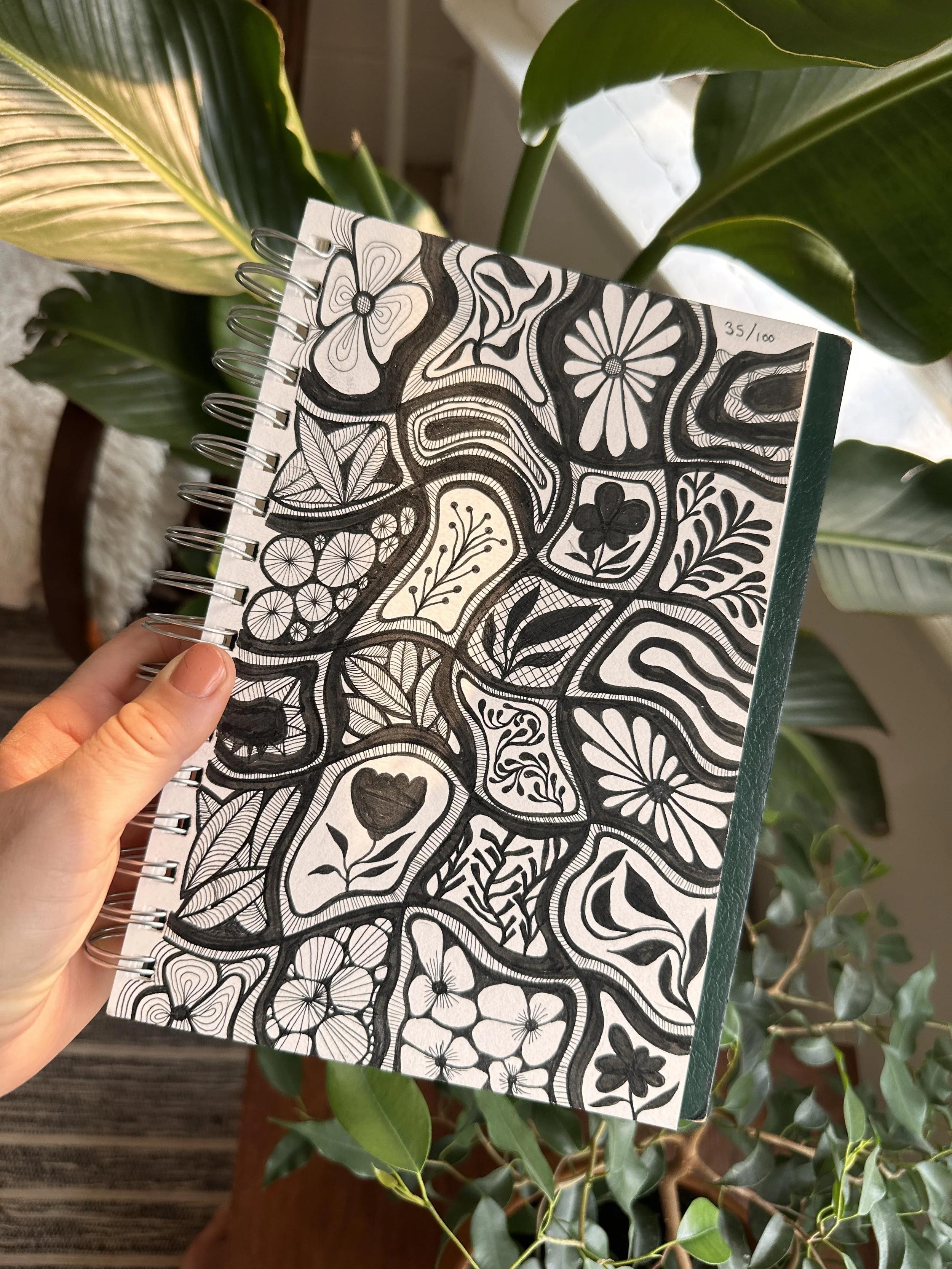
a space for:
[1] personal work [2] flashback projects [3] photos i’ve taken that i like [4] stories behind some of my art
for more words, sometimes i write things
when life gives you a bunch of paper, magazines, books…
…make new stories?
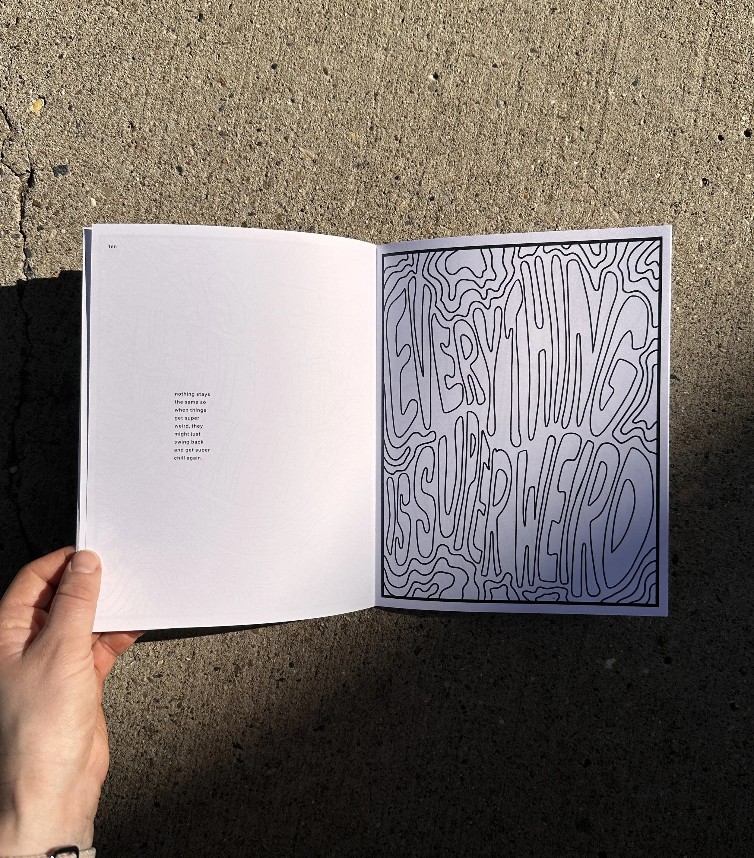
8x10 inches
mixed media collage
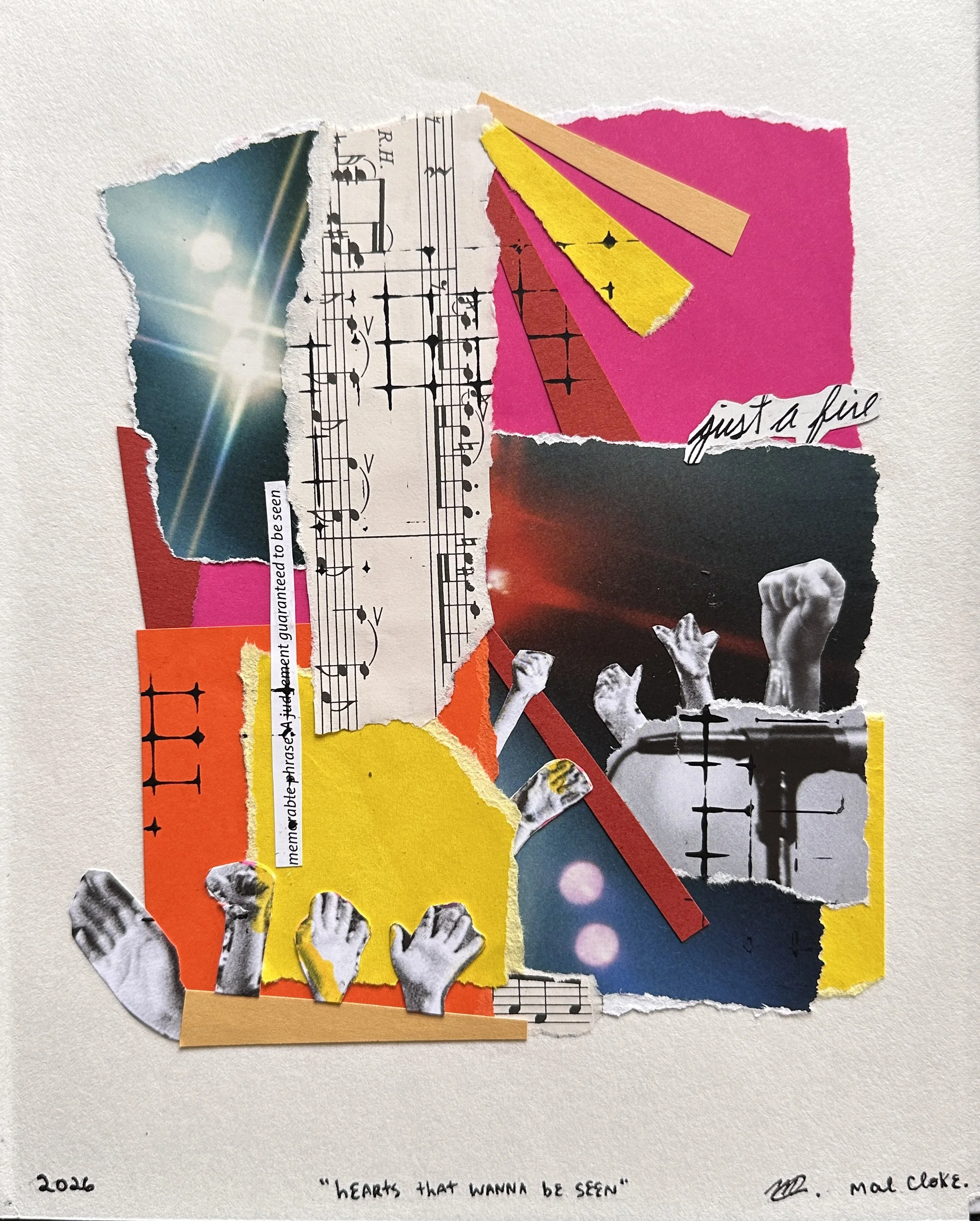
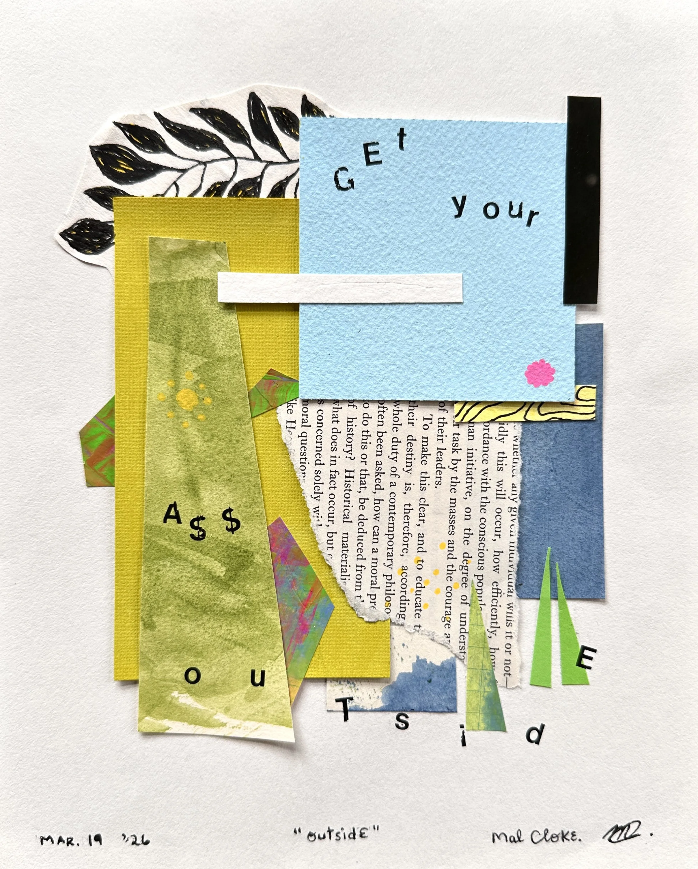
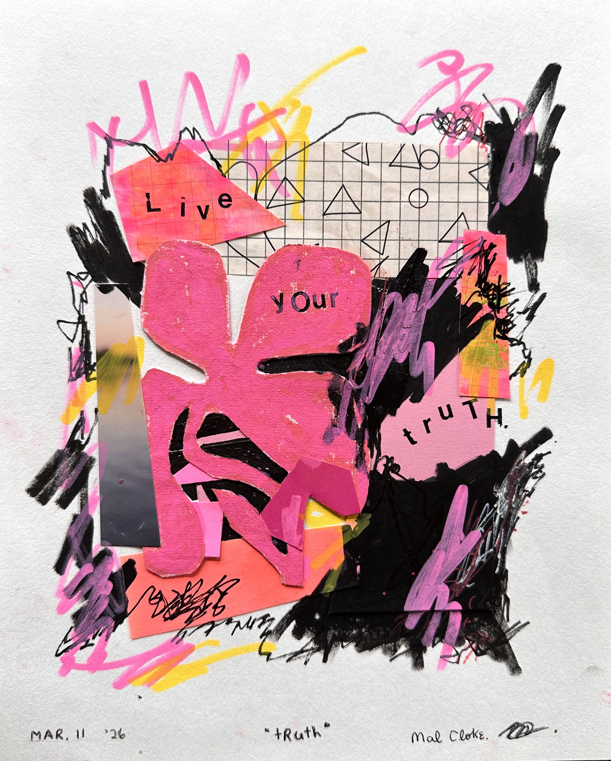
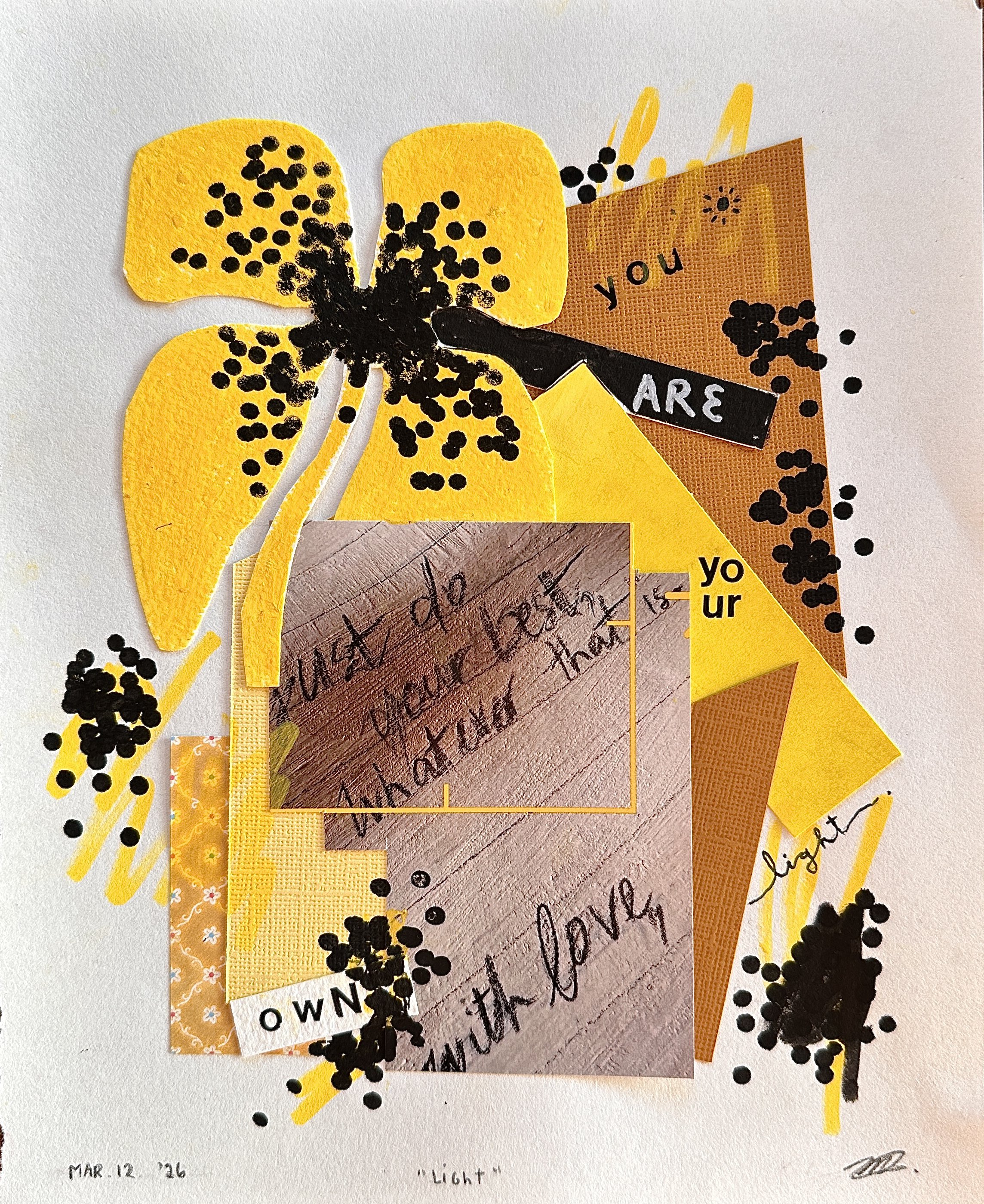
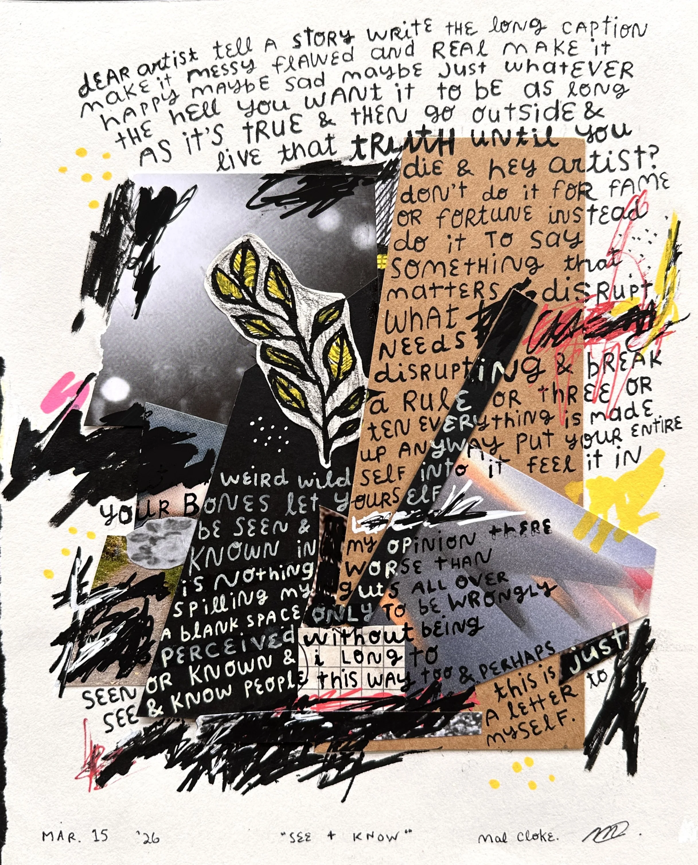
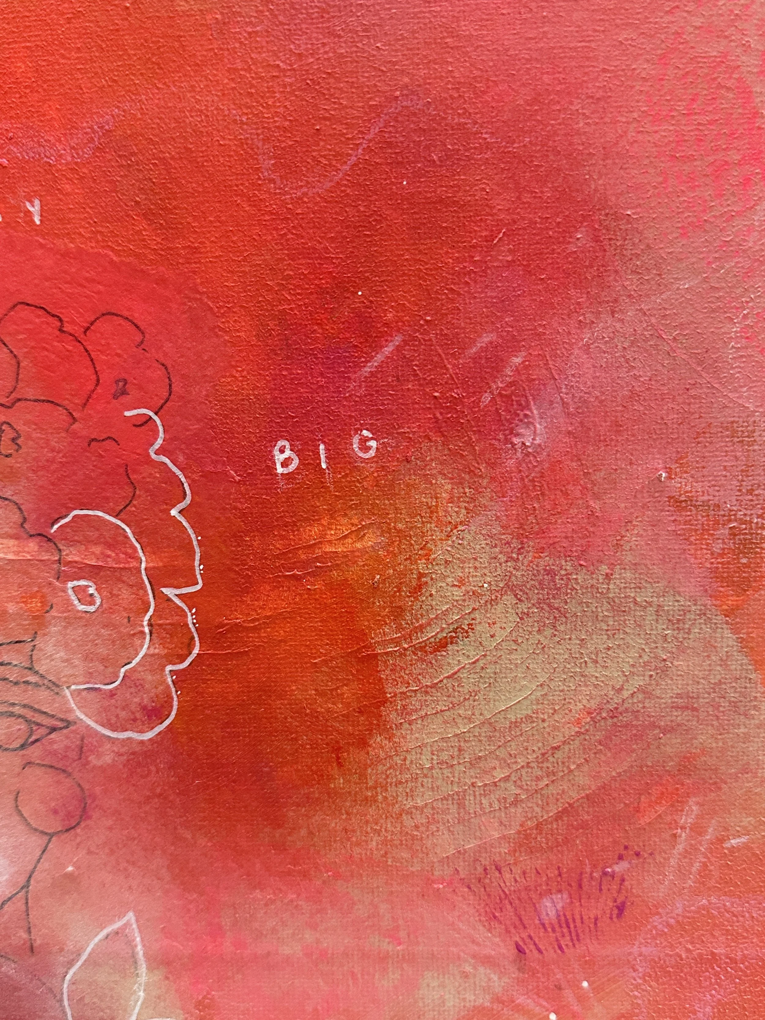
![rambling hearts [the words]](https://images.squarespace-cdn.com/content/v1/604bd4d554930a5adb77ab4c/1771293386896-ODGBTA9XYBD9UVL7O3S1/2025+rambling+heart+stories+v2__heart+first+4x6.JPG)
rambling hearts [the words]
words that inspired the romantics collection.
all were written quickly with minimal to no editing to mimic the way that we tell stories when we are excited or care deeply about something; different variations evolved over time but this writing strategy stayed.
all artwork shown below is sold
—
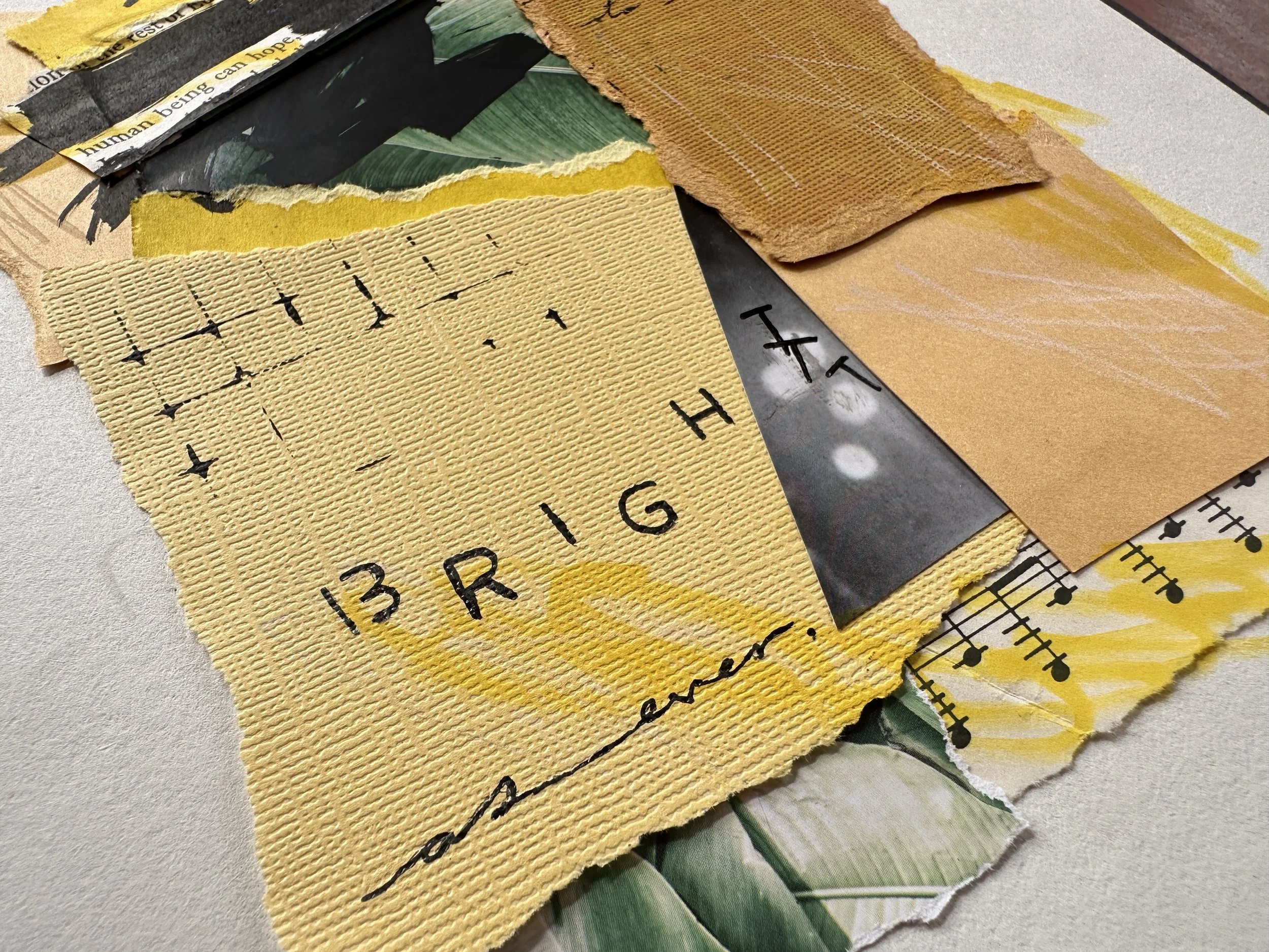
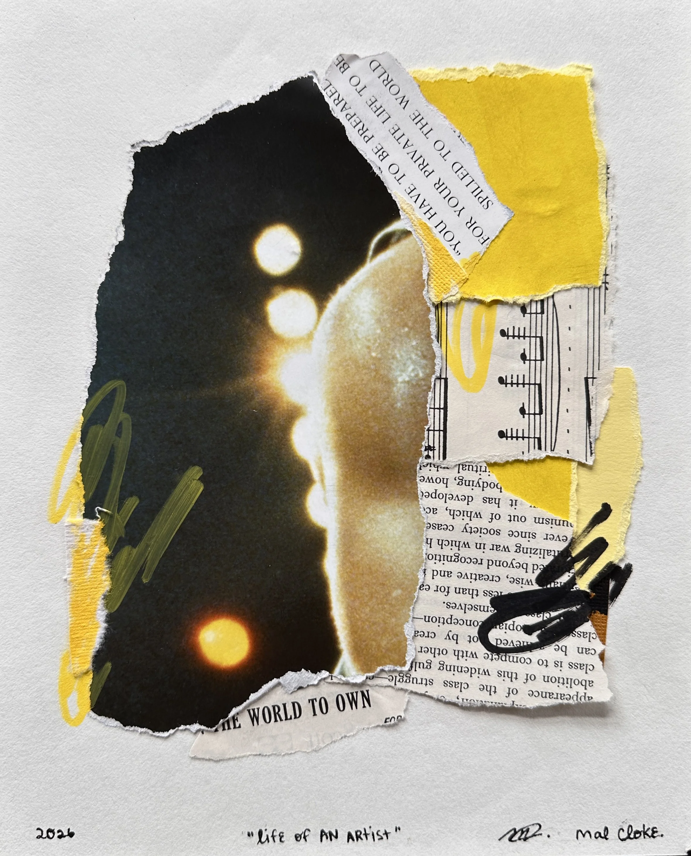
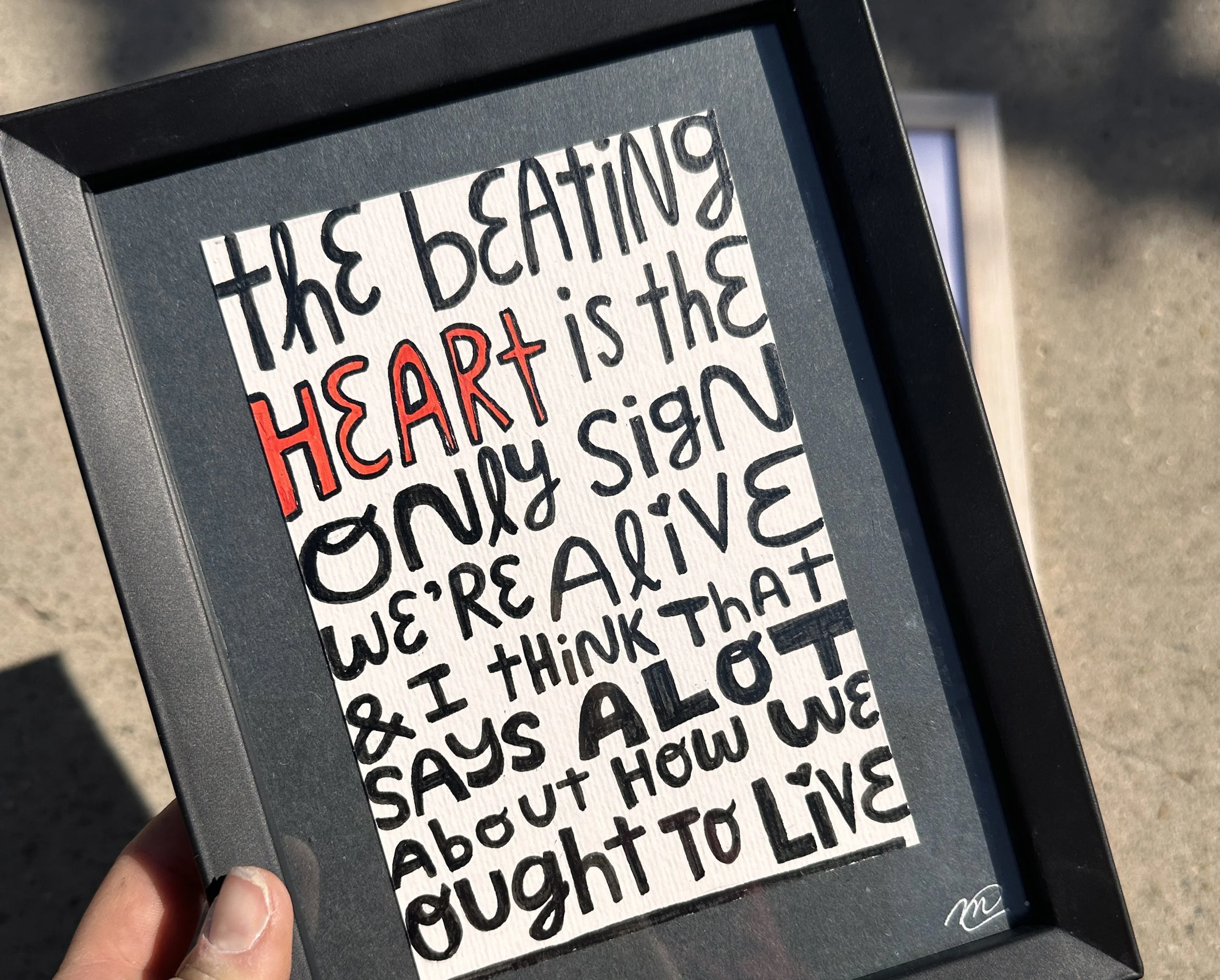
“HEART FIRST”
WINTER 2025
version 01
acrylic paint pen on media paper
7x7 inches
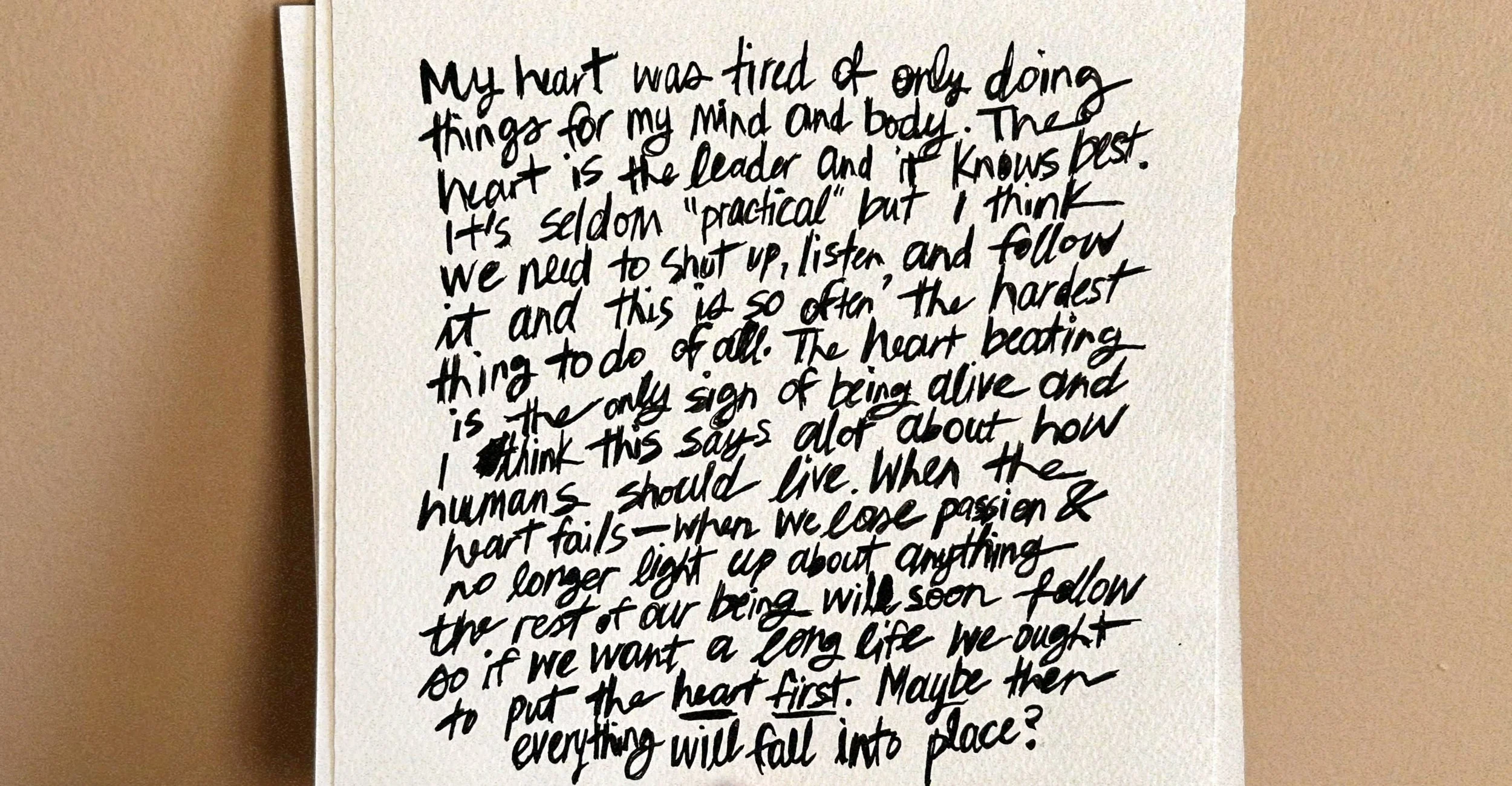
“my heart was tired of only doing things for my mind and body. the heart is the leader and it knows best. it’s seldom ‘practical’ but i think we need to shut up, listen, and follow it and this is so often the hardest thing to do of all. the heart beating is the only sign of being alive and i think this says a lot about how humans should live. when the heart fails——when we lose passion and no longer light up about anything, the rest of our being will soon follow. so if we want a long life we ought to put the heart first. maybe then everything will fall into place?”
SUMMER 2025
version 02 [2]
acrylic paint pen on media paper
8x10 inches [11x14 frame] & 4x6 inches [5x7 frame]
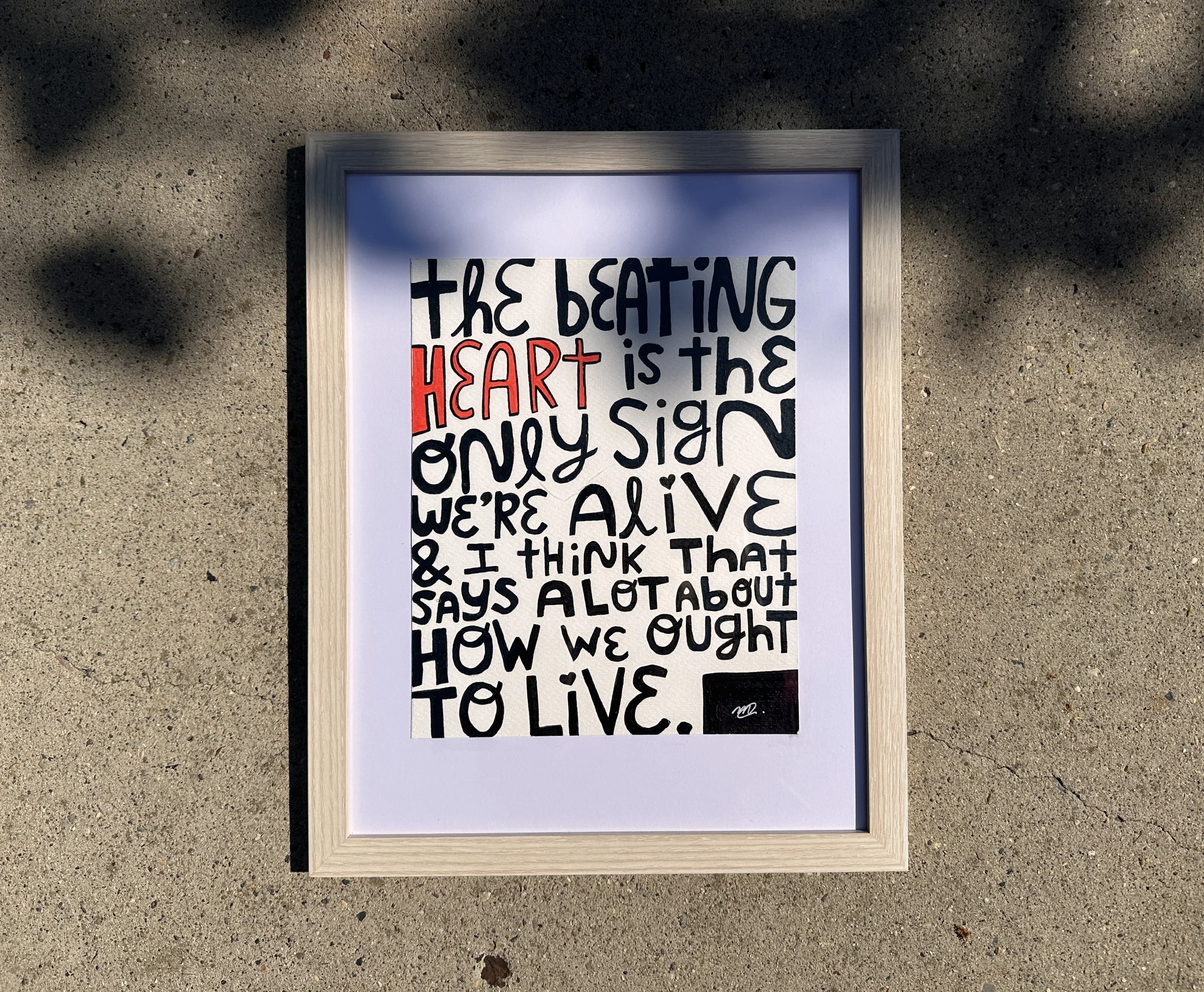
“the beating heart is the only sign we’re alive and i think that says a lot about how we ought to live.”
—
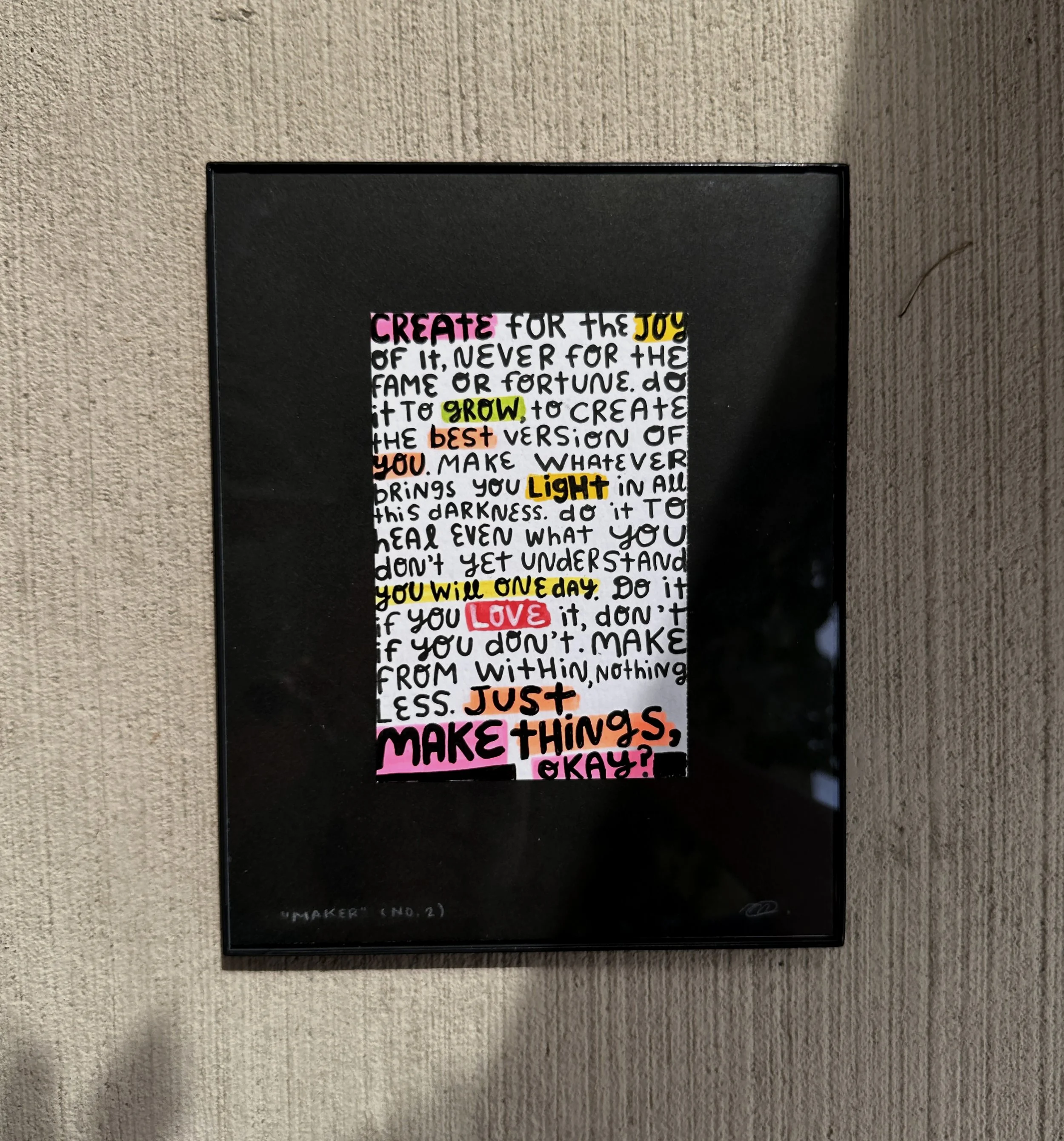
“MAKER”
FALL 2023
version 01
high flow acrylic ink on media paper
18×24 inches
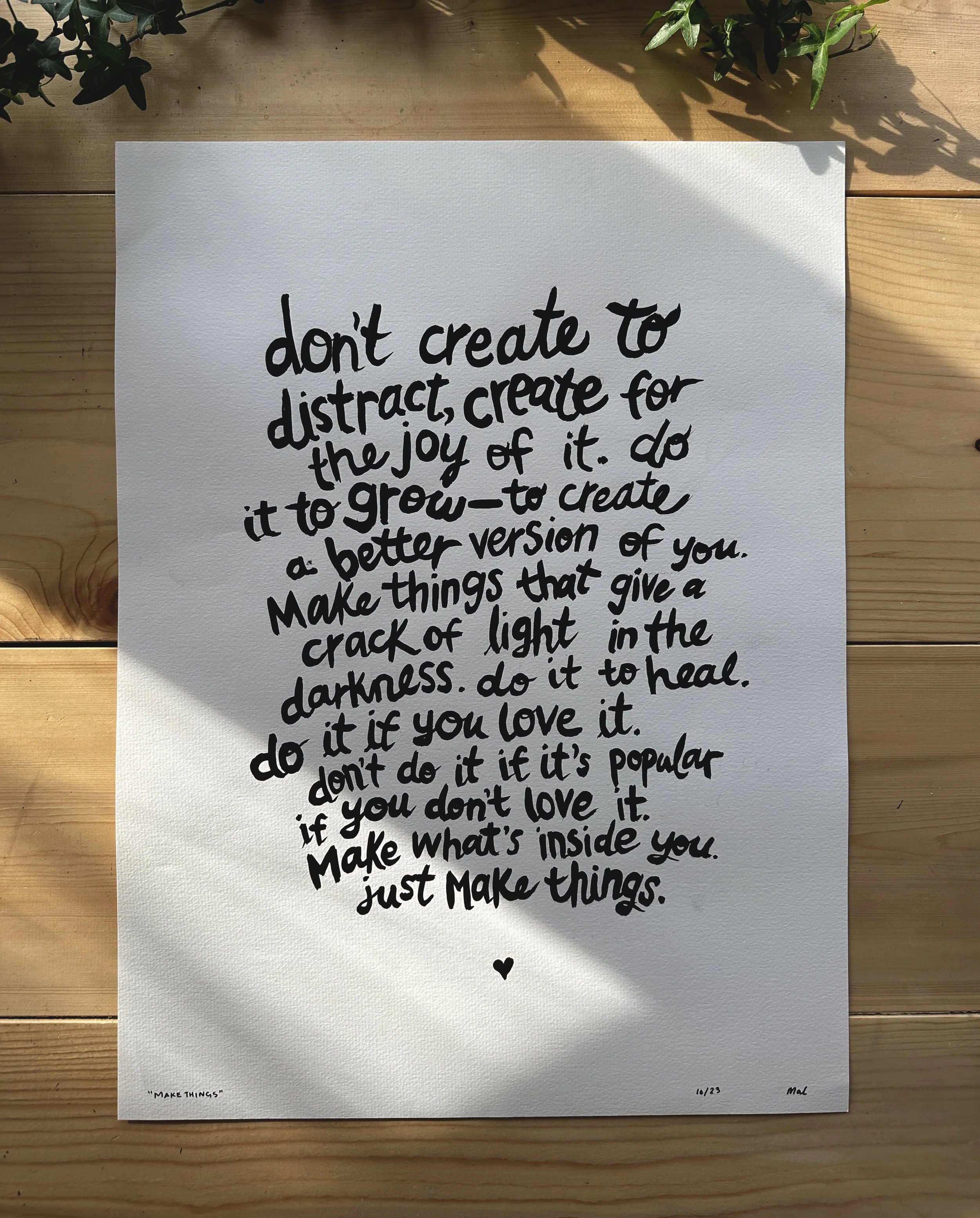
“don’t create to distract, create for the joy of it. do it grow——to create a better version of you. make things that give a crack of light in the darkness. do it to heal. do it if you love it. don’t do it if it’s popular if you don’t love it. make what’s inside you. just make things.”
WINTER 2025
version 02
acrylic paint pen on media paper
7×7 inches
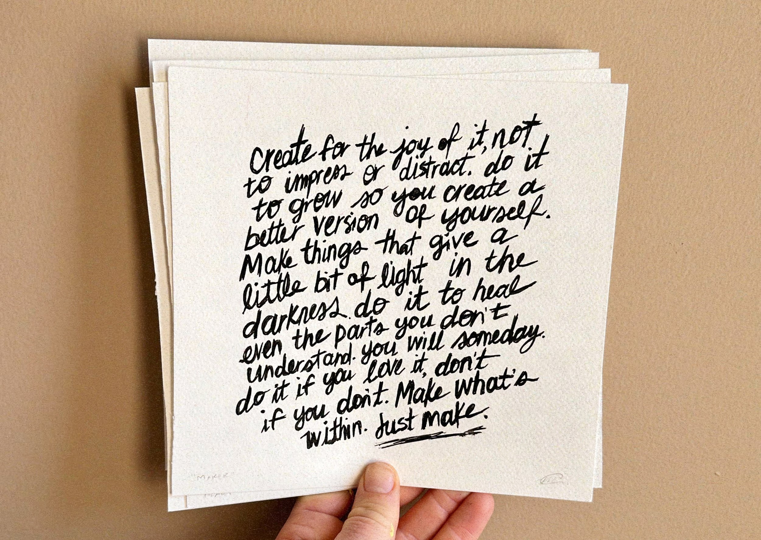
“create for the joy of it, not to impress or distract. do it to grow so you create a better version of yourself. make things that give a little bit of light in the darkness. do it to heal even the parts you don’t understand. you will someday. do it if you love it, don’t if you don’t. make what’s within. just make.”
SUMMER 2025
version 03
acrylic paint marker/pen on media paper
8x10 inches [11x14 frame]
4×6 inches [8×10 matte/frame]
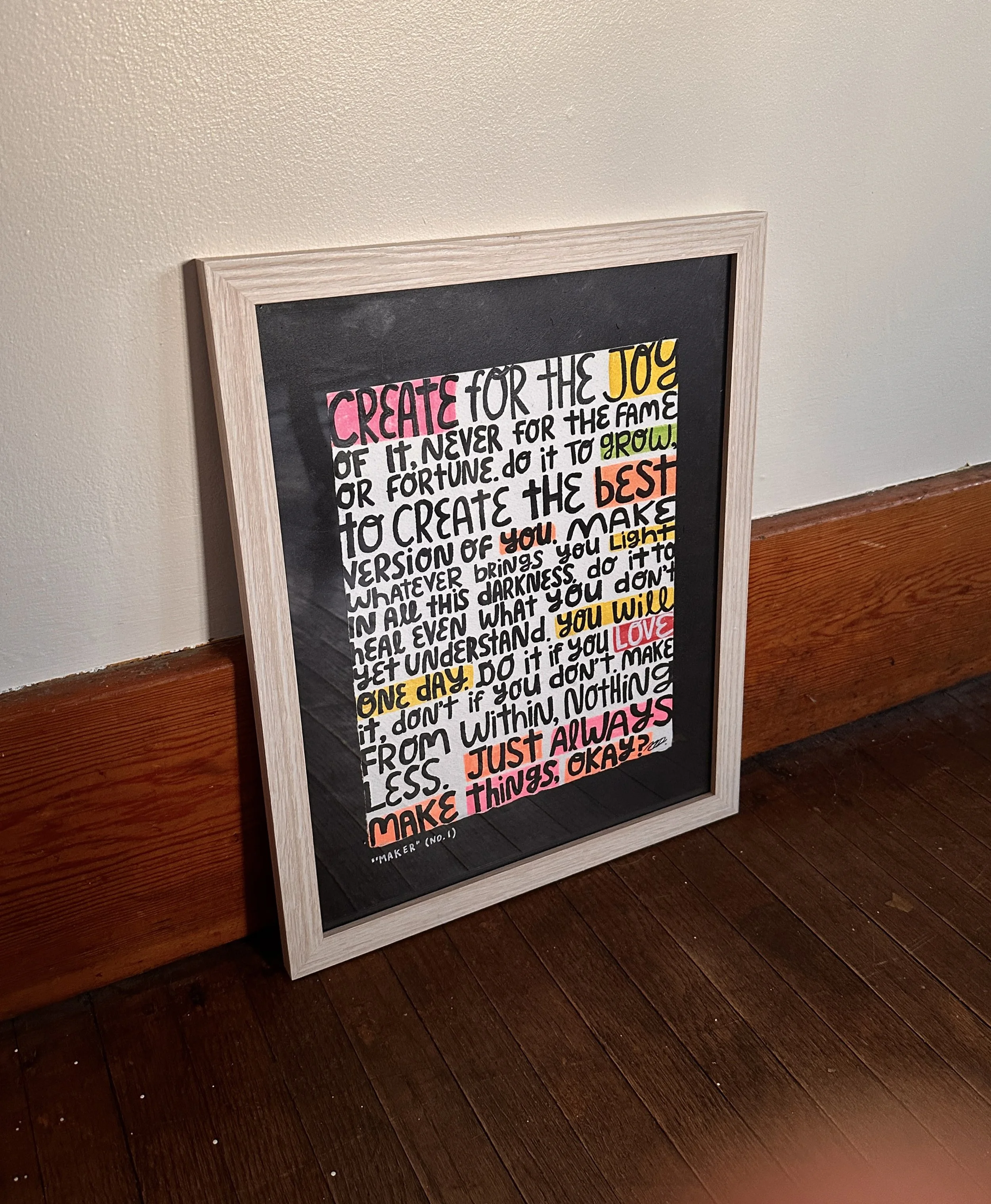
“create for the joy of it, never for the fame or fortune. do it to grow, to create the best version of you. make whatever brings you light in all this darkness. do it to heal even what you don’t yet understand. you will one day. do it if you love it, don’t if you don’t. make from within, nothing less. just always make things, okay?”
—
“REAL DREAMER”
WINTER 2025
version 01
acrylic paint pen on media paper
7x7 inches
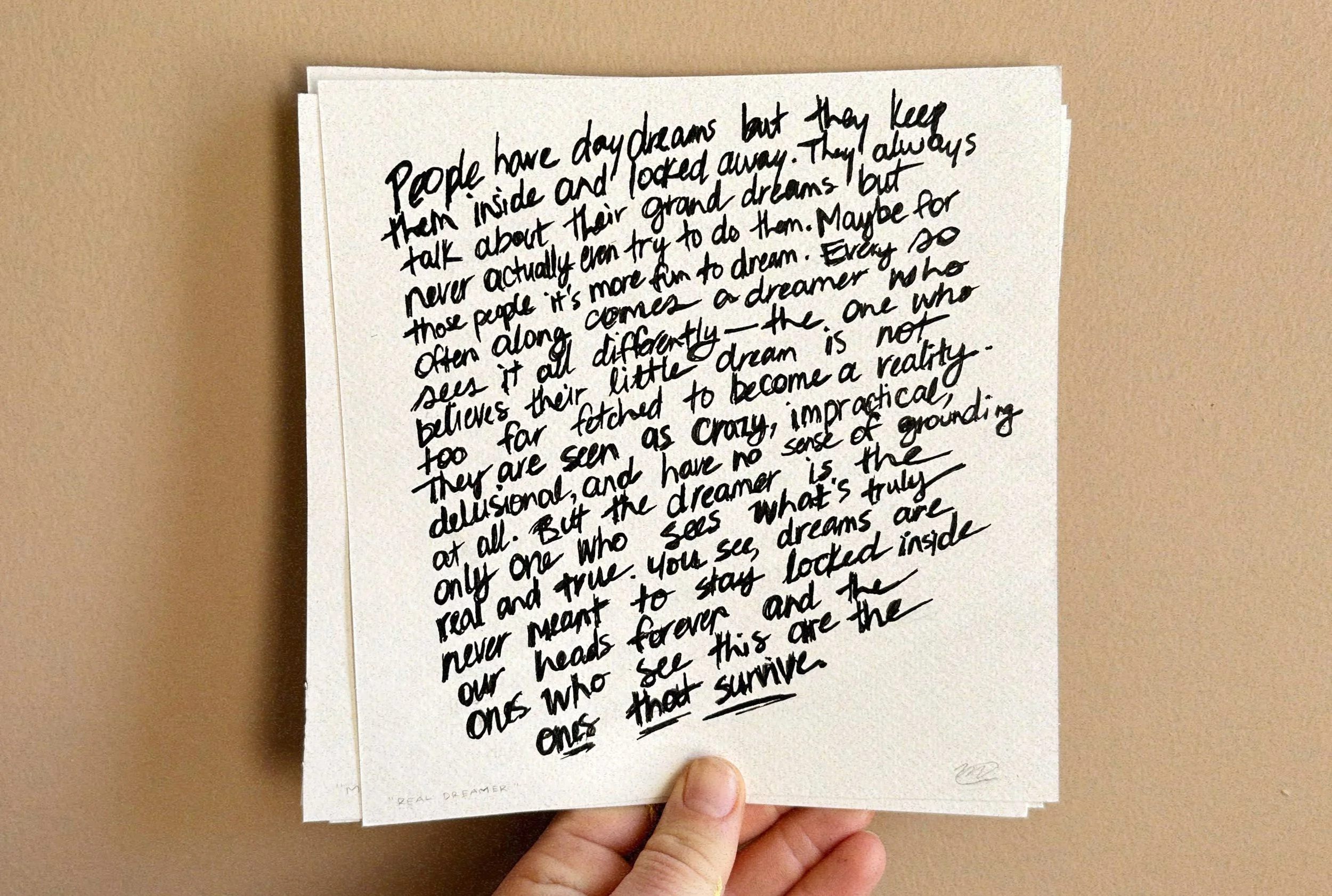
“people have daydreams but they keep them inside and locked away. they always talk about their grand dreams but never actually even try to do them. maybe for those people it’s more fun to dream. every so often along comes a dreamer who sees it all differently——the one who believes their little dream is not too far fetched to become a reality. they are seen as crazy, impractical, delusional, and have no sense of grounding at all. but the dreamer is the only one who sees what’s real and true. you see, dreams are never meant to stay locked inside our heads forever and the ones who see this are the ones that survive.”
SUMMER 2025
version 02
acrylic paint pen on media paper
8x10 inches [11x14 matte/frame]
4×6 inches [8×10 matte/frame]
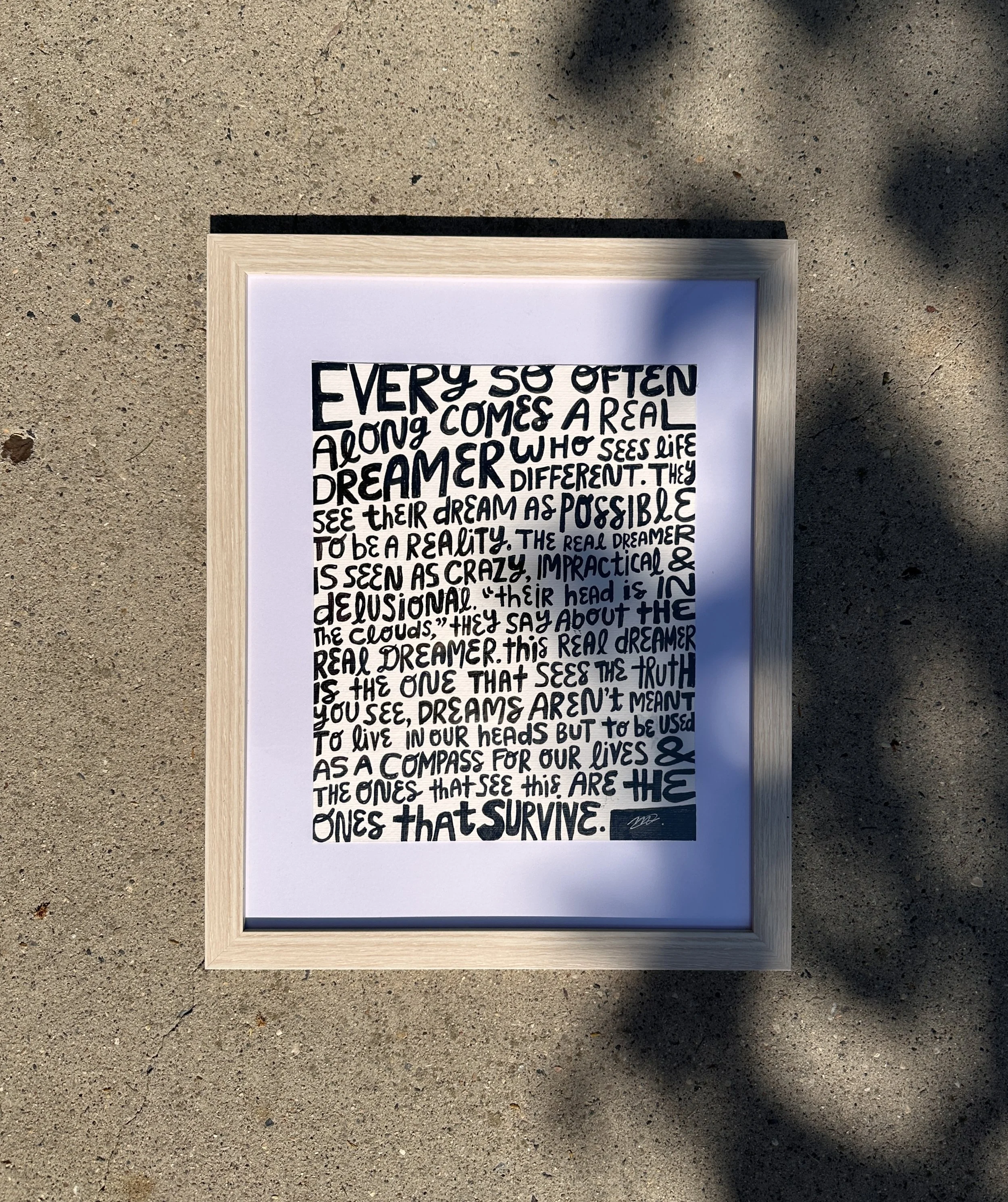
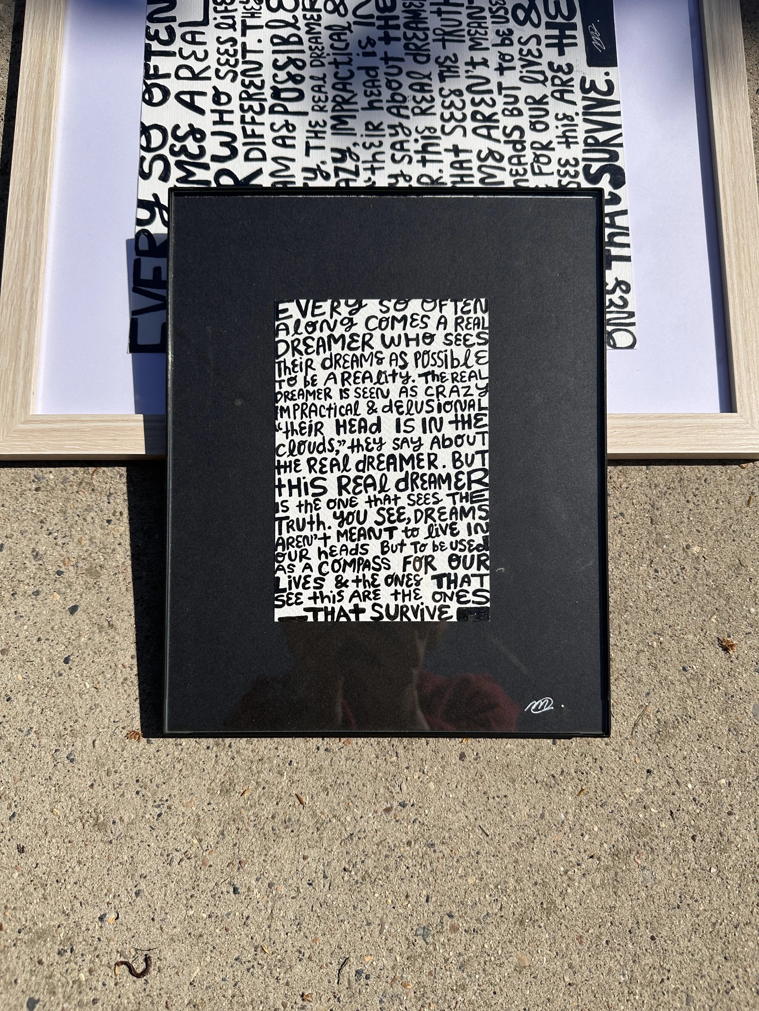
“every so often along comes a real dreamer who sees life different. they see their dream as possible to be a reality. the real dreamer is seen as crazy, impractical, and delusional. ‘their head is in the clouds,’ they say about the real dreamer. this real dreamer is the one that sees the truth. you see, dreams aren’t meant to live in our heads but to be used as a compass for our lives and the ones that see this are the ones that survive.”
—
“TOO MUCH”
SUMMER 2025
version 01
acrylic paint marker/pen on media paper
8x10 inches [11x14 matte/frame]
4×6 inches [8×10 matte/frame]
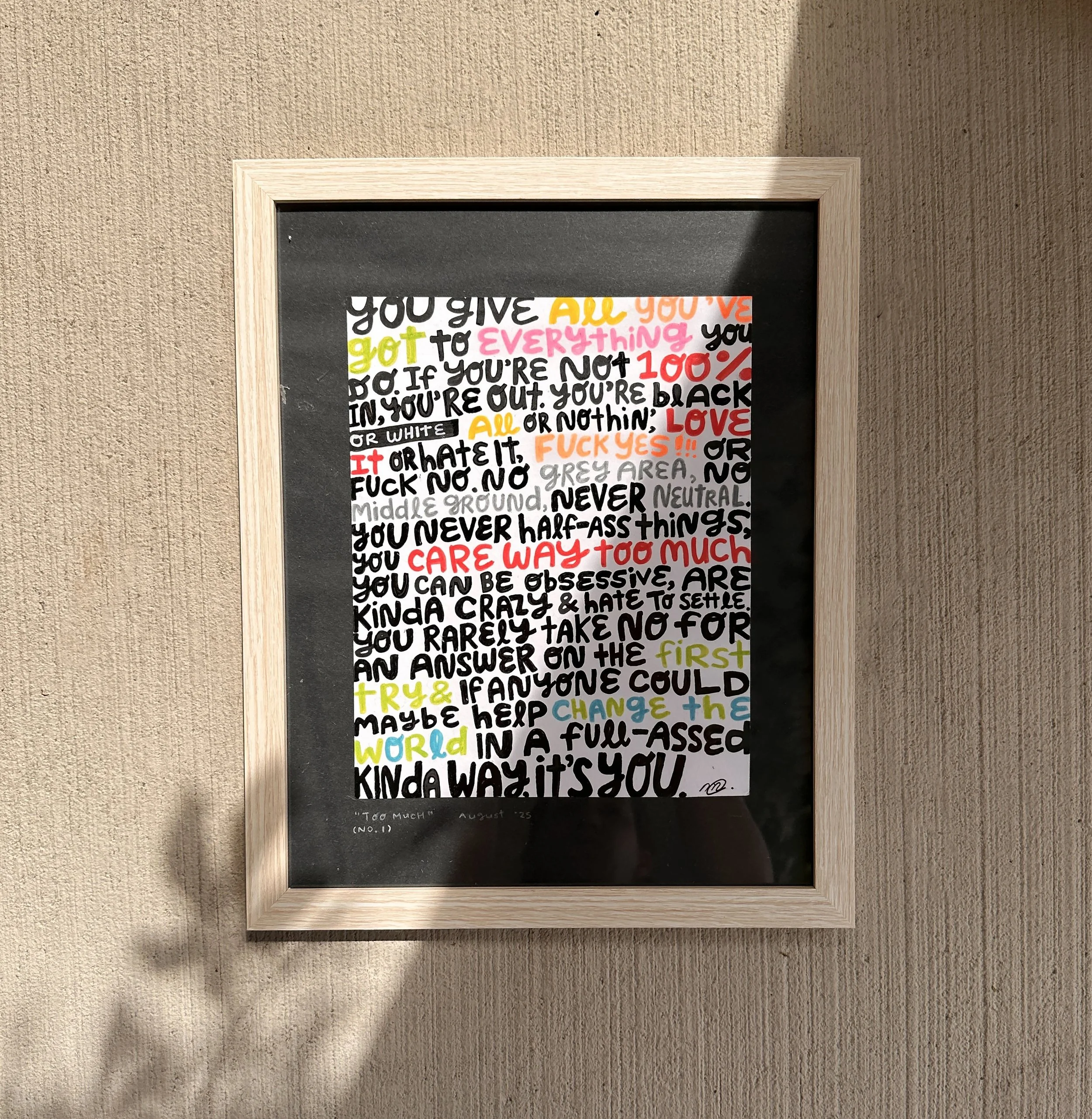
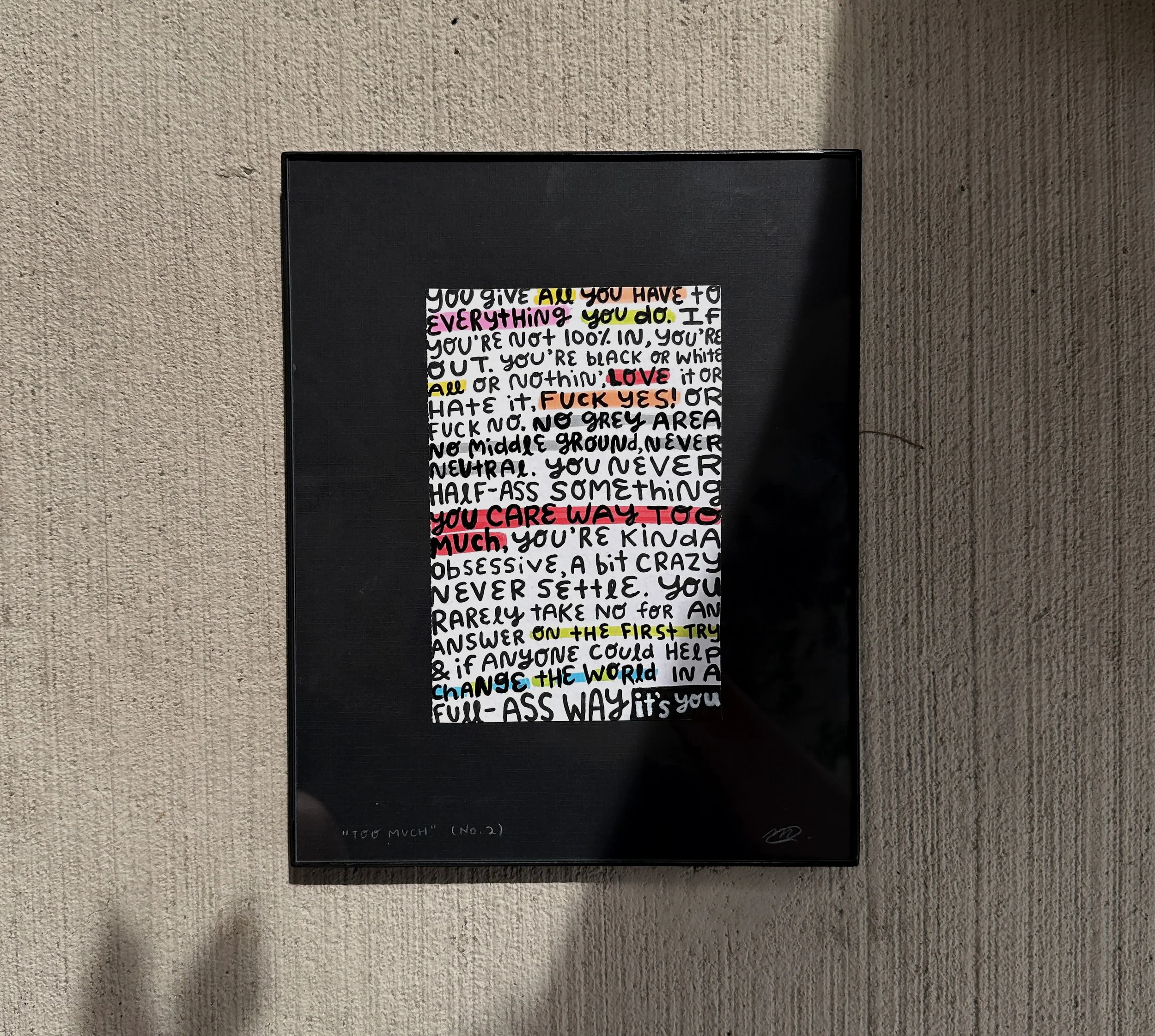
“you give all you’ve got to everything you do. if you’re not 100% in, you’re out. you’re black or white, all or nothin’, love it or hate it, fuck yes!!! or fuck no. no grey area, no middle ground, never neutral. you never half-ass things, you care way too much, you can be obsessive, are kinda crazy, and hate to settle. you rarely take no for an answer on the first try and if anyone could help change the world in a full-assed kinda way, it’s you.”
![uncool [the words]](https://images.squarespace-cdn.com/content/v1/604bd4d554930a5adb77ab4c/1771271378872-1JKERV6PRYHQFBFKA1LX/2025+uncool+story_version+1.JPG)
uncool [the words]
the words that inspired the uncool collection.
all were written quickly with minimal to no editing to mimic the way that we tell stories when we are too excited about something and don’t care if it’s ‘cringe’; different variations evolved over time but this writing strategy stayed.
all artwork shown below is sold; words below are an expansion on the concept from the Almost Famous quote, “the only true currency in this bankrupt world is what we share with someone else when we’re uncool.”
—
WINTER 2025
version 01
acrylic paint pen on media paper
7x7 inches
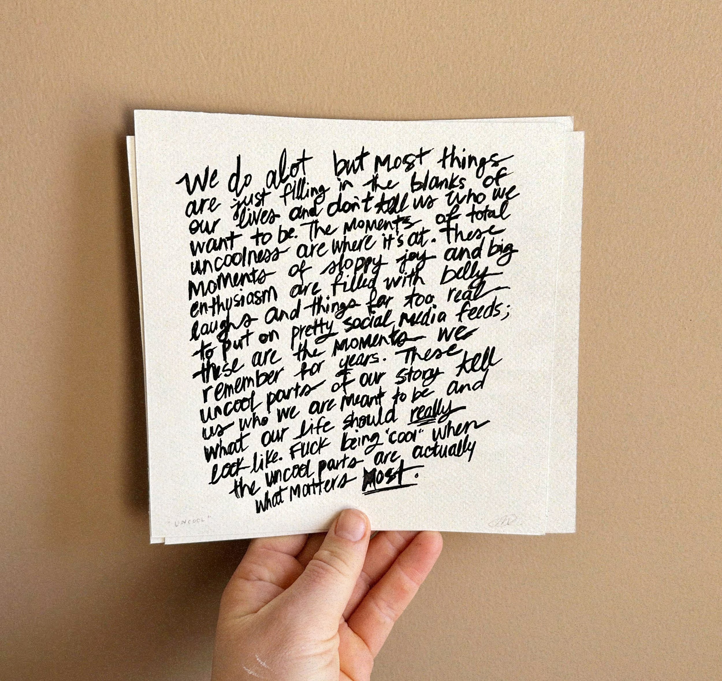
“we do a lot but most things are just filling in the blanks of our lives and don’t tell us who we want to be. the moments of total uncoolness are where it’s at. these moments of sloppy joy and big enthusiasm are filled with belly laughs and things far too real to put on social media feeds; these are the moments we remember for years. these uncool parts of our story tell us who we are meant to be and what our life should really look like. fuck being “cool” when the uncool parts are actually what matters most.”
—
SUMMER 2025
version 02
acrylic paint pen on media paper
8×10 inches
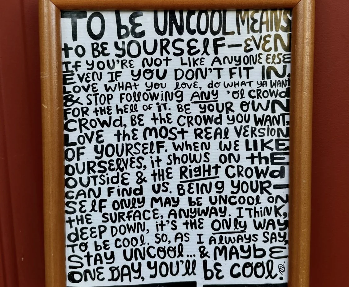
“to be uncool means to be yourself——even if you’re not like anyone else. even if you don’t fit in. love what you love, do what ya want and stop following any ‘ol crowd for the hell of it. be your own crowd, be the crowd you want. love the most real version of yourself. when we like ourselves, it shows on the outside and the right crowd can find us. being yourself only may be uncool on the surface, anyway. i think, deep down, it’s the only way to be cool. so, as i always say, stay uncool… stay uncool, and one day you’ll be cool.”
![“sure, why not?” [the story]](https://images.squarespace-cdn.com/content/v1/604bd4d554930a5adb77ab4c/1768518689054-717PDO1CW10JBB3S05QO/IMG_8976.JPG)
“sure, why not?” [the story]
the way we went about finding work was said to be simple: go to school or do training for something of interest, get a job in exactly what we are trained in, and after a very brief interview process we were on our way to a good life, probably with a nice pension to retire with. we’d climb this corporate ladder in a nice, orderly fashion.
this is just what i was told.
this no longer works for most, yet for some reason the way most are hiring hasn’t changed and it’s creating friction. people are applying for new jobs in an old system. we’re all tired of being rejected by non-humans with no feedback.
is this all worth it? do i even want this job?
sure, it might feel secure… until they do yet another round of budget cuts, of course, and when that happens any one of us might be the target.
what if?…
we went outside the box with what work could start to look like? what if we cared more about actually liking our work? we are going to be working until we die at this rate so we might as well enjoy it.
i want this so called corporate ladder to cease to exist.
i want less judgment on gaps, contract work, and unrelated side jobs on resumes.
maybe there’s a better way to do all this than we ever imagined if we think outside the cubical.
the process:
the background is a collage of a bunch of handwritten rejection emails i’ve gotten in the past year or two; this layer is hardly shown in the final piece because they are not important
rejection is redirection
i cut out small phrases, words, or images from vintage books and magazines that fit the concept and placed them around the canvas
the white/yellow paint blending the collaged words together acts as a symbol of optimism
the connected dots and stencilled words tell the story of the people we meet and opportunities we come across, always leading you from one to the next without really knowing until you’re in it
the final step was a golf ball dipped in black paint and then rolled freely around the canvas… because that’s how curious we should be when looking for work we love to do
final look:
i showed this at a local art event at saskatoon makerspace at the end of 2025.
makerspace typically dims the lights for events with hanging patio lights so in addition to that, i hung flashlights on either side of the canvas for people to hold up to the canvas and move it around to see all the details as an immersive treasure hunt experience.
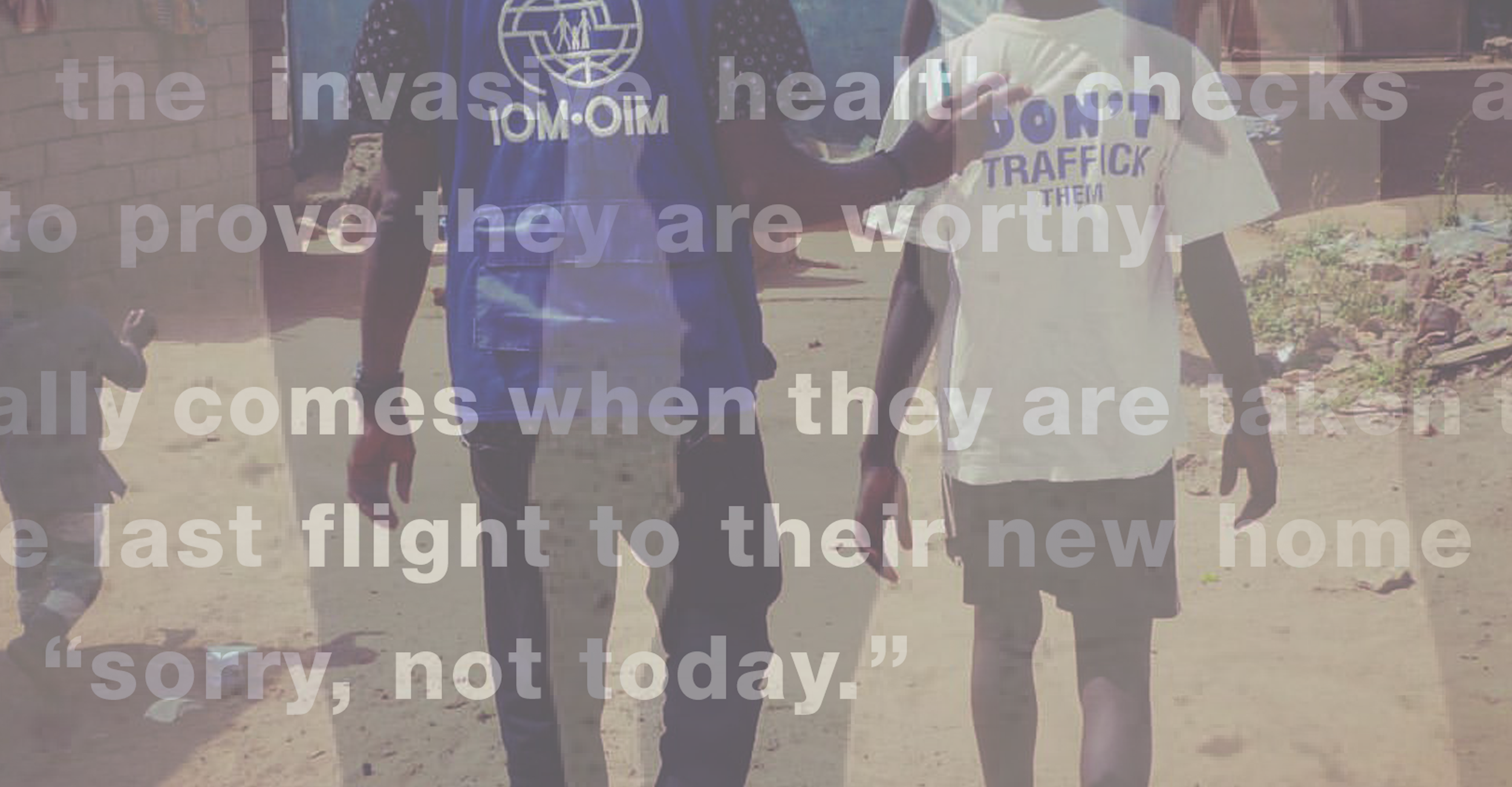
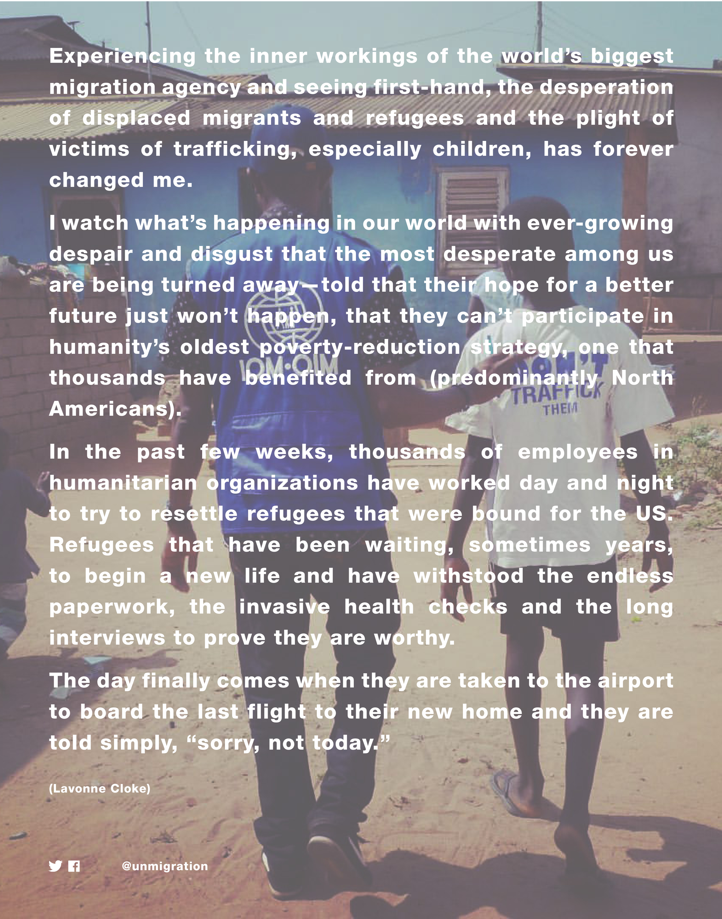
flashback: “sorry, not today”
2016? 2017? idk, somewhere around then.
words + photo by my sister while working with the UN; poster design by me just because the creative inspiration struck.
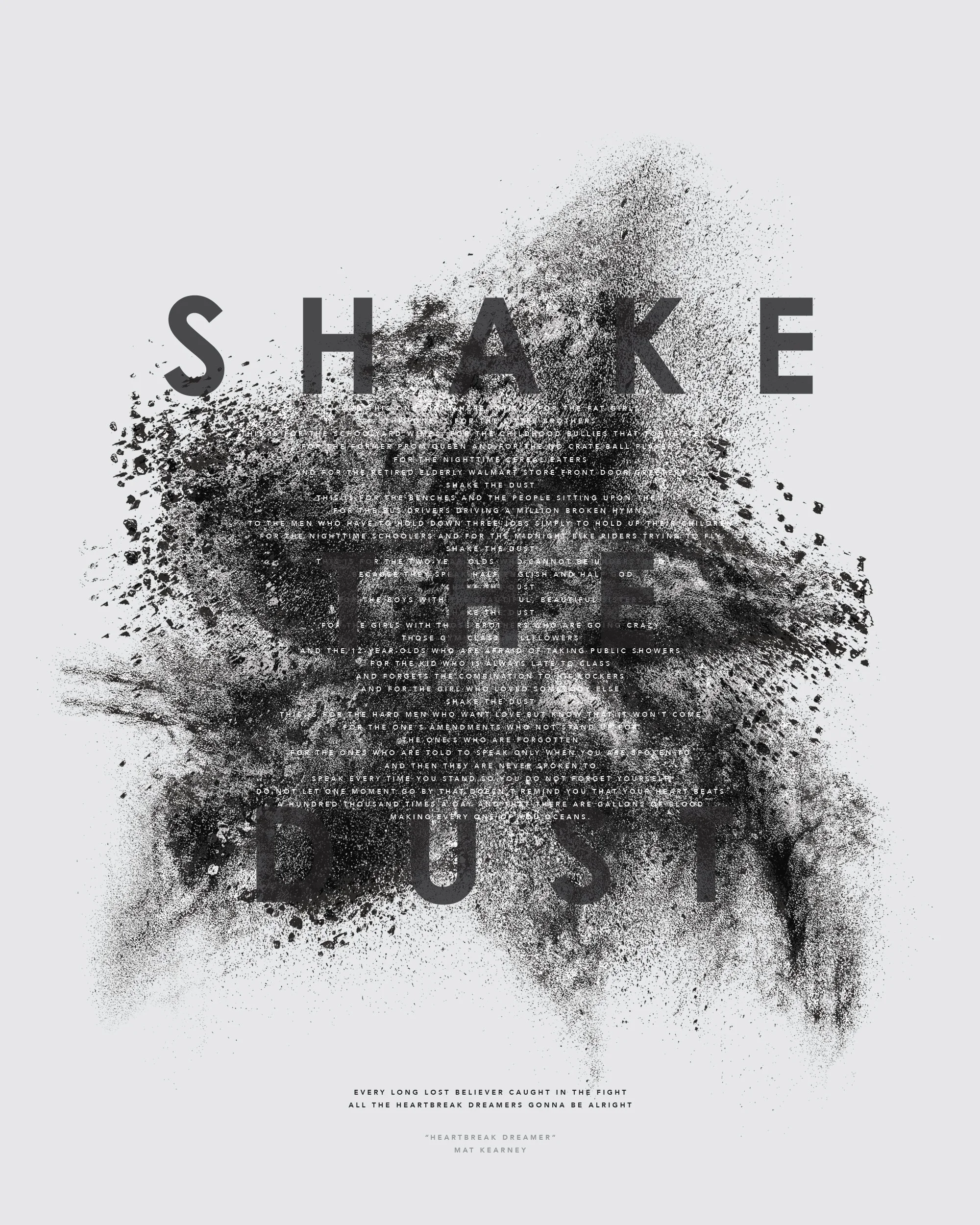
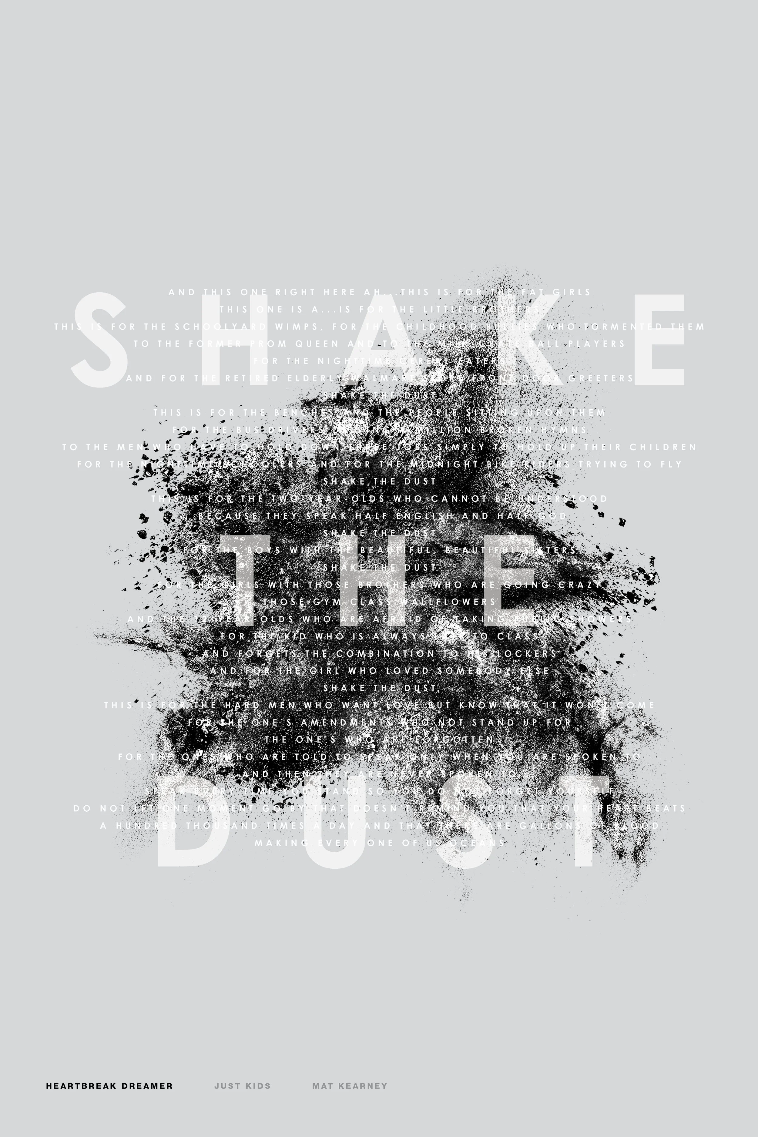
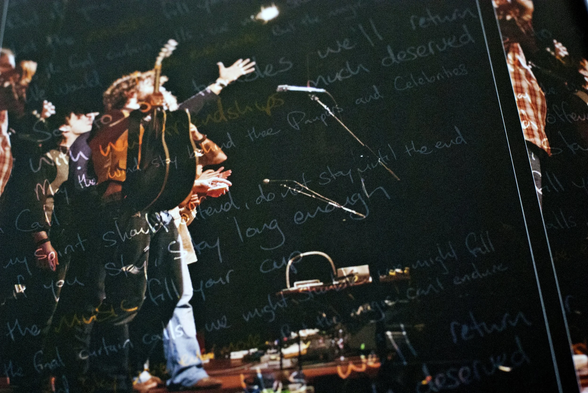
flashback: “heartbreak dreamer”
a digital poster just for fun as a visual for mat kearney’s song “heartbreak dreamer.” the small text in the background are the lyrics of the spoken part of the song, a part i’ve always especially liked, not meant to be legible or read but rather to add visual interest.
—
draft 1 in a few different colours:


![a colouring book for a better world [the story]](https://images.squarespace-cdn.com/content/v1/604bd4d554930a5adb77ab4c/1763146495188-OCXX60HM5W255IVTBZG1/IMG_7133.JPG)
a colouring book for a better world [the story]
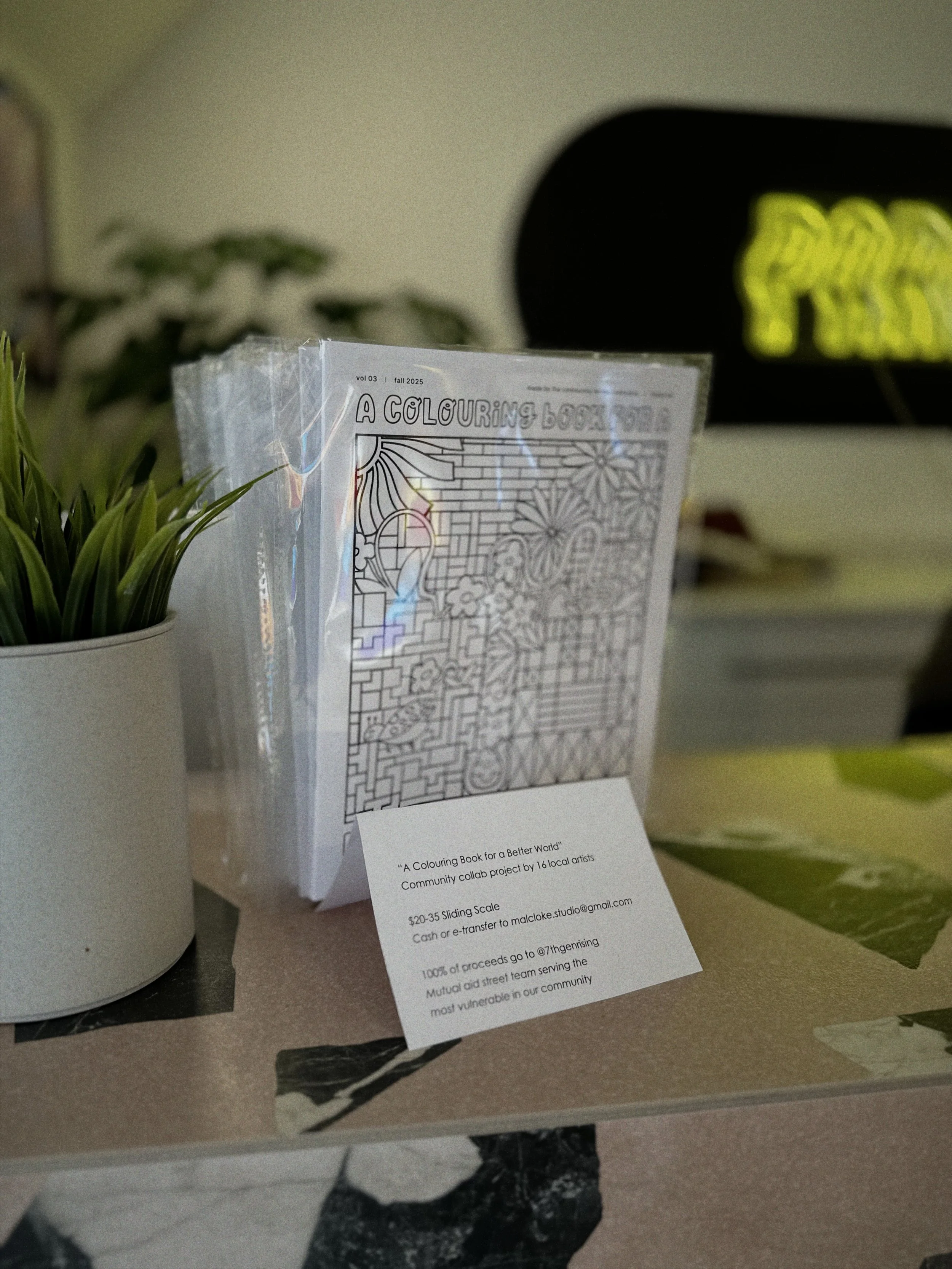
It started with these drawings I did in the summer/fall of 2024.


After being laid off at the end of 2024, I took those drawings and made a colouring book in Jan 2025. I didn’t love it [side quest: I revised this one at the end of 2025] so I made another in the spring and made it better.
I got pretty good feedback on the second one, which I sold a bit locally throughout the summer, so I started thinking about the third.
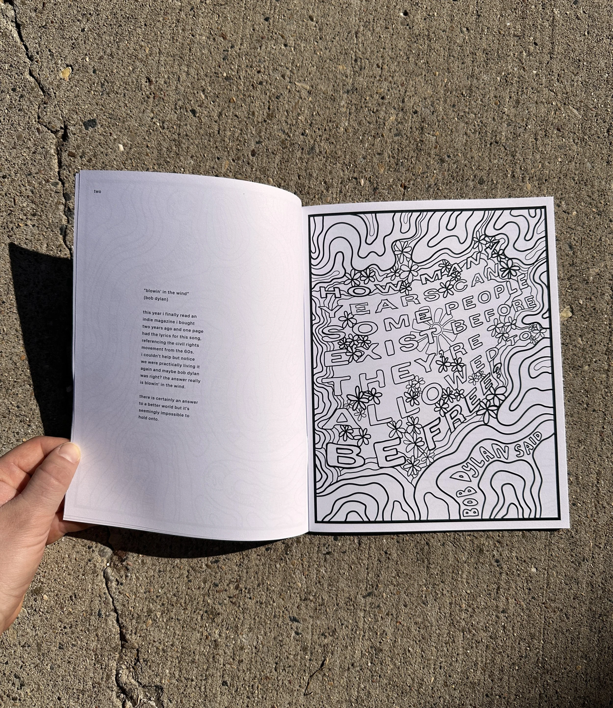
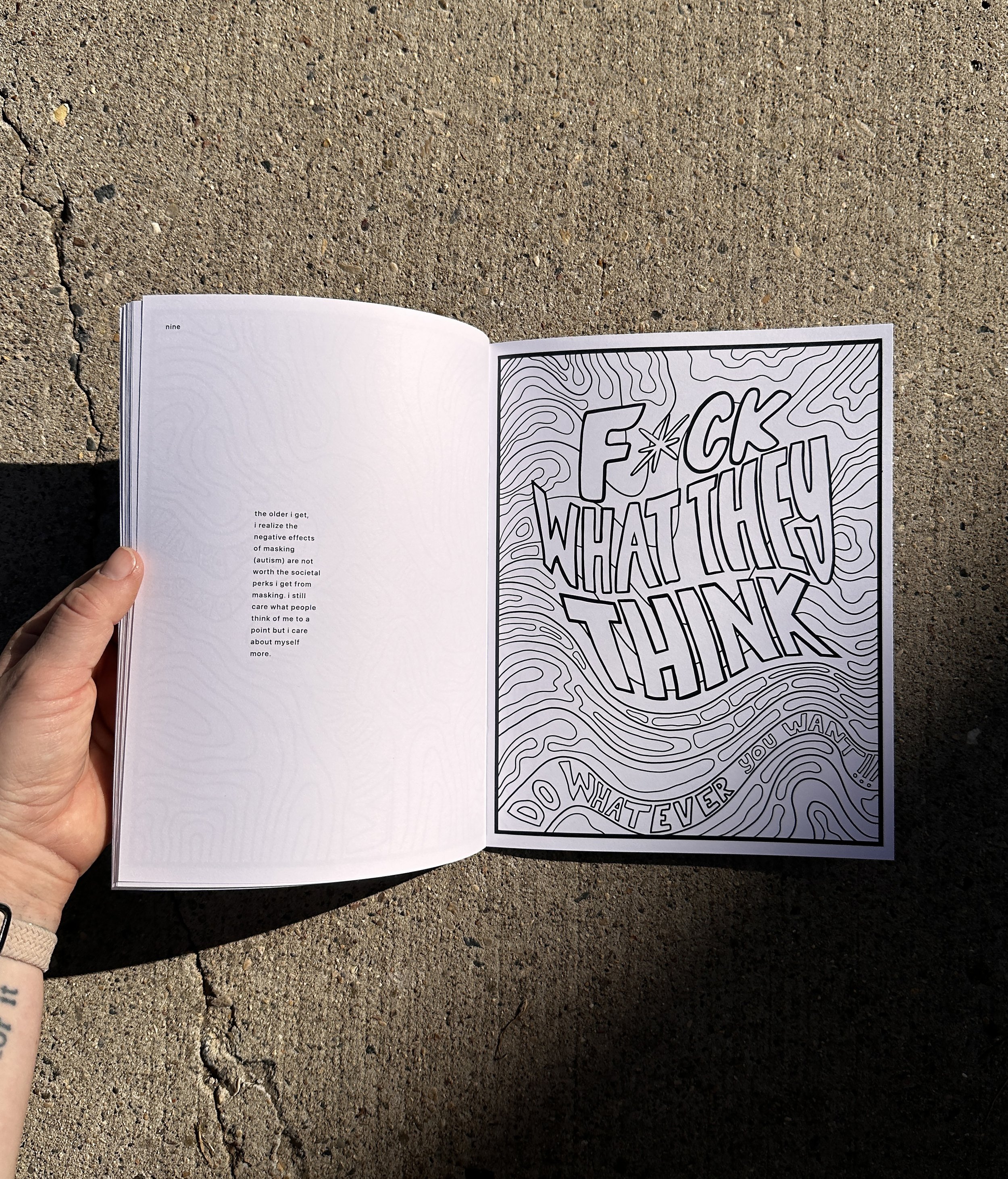
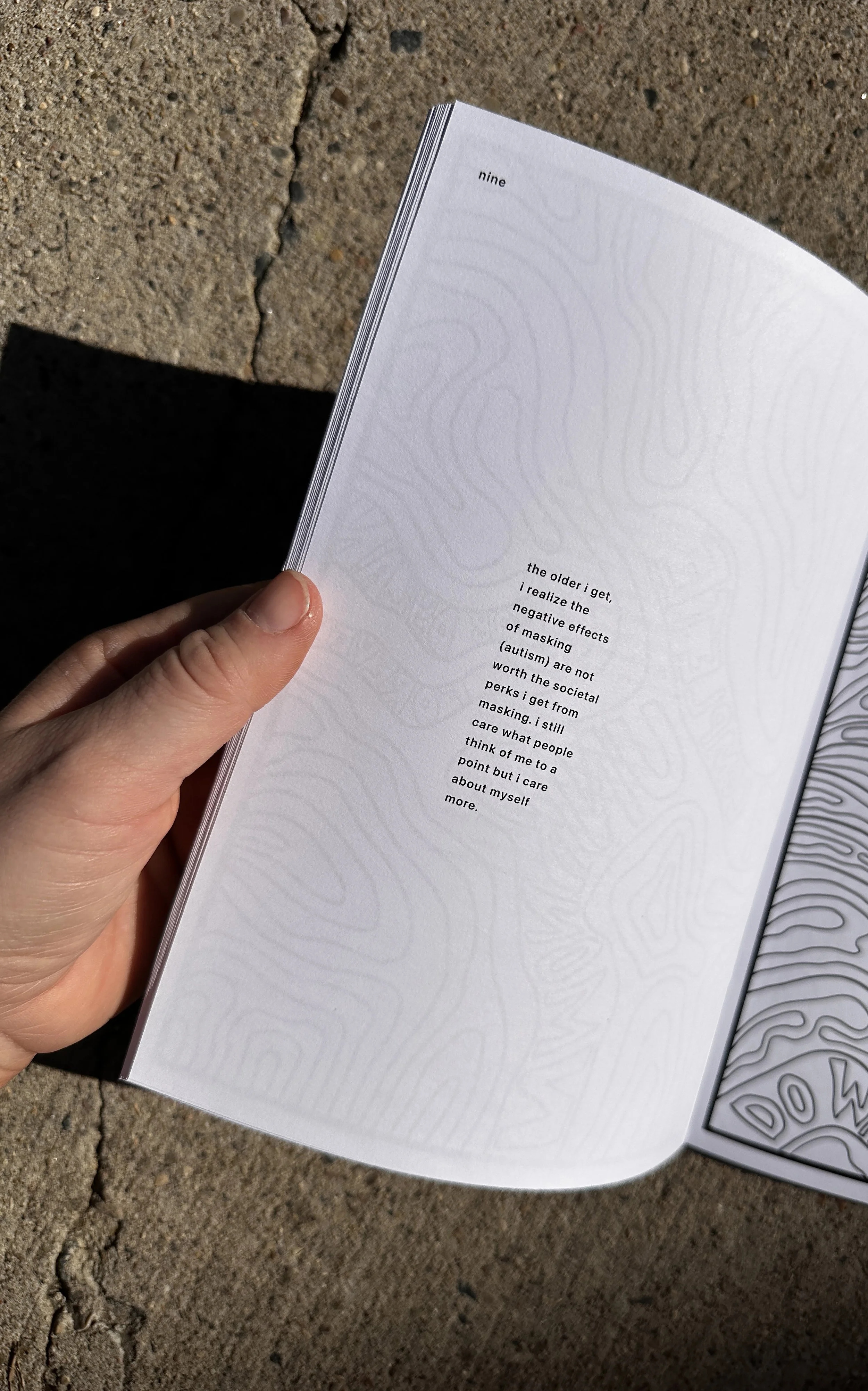

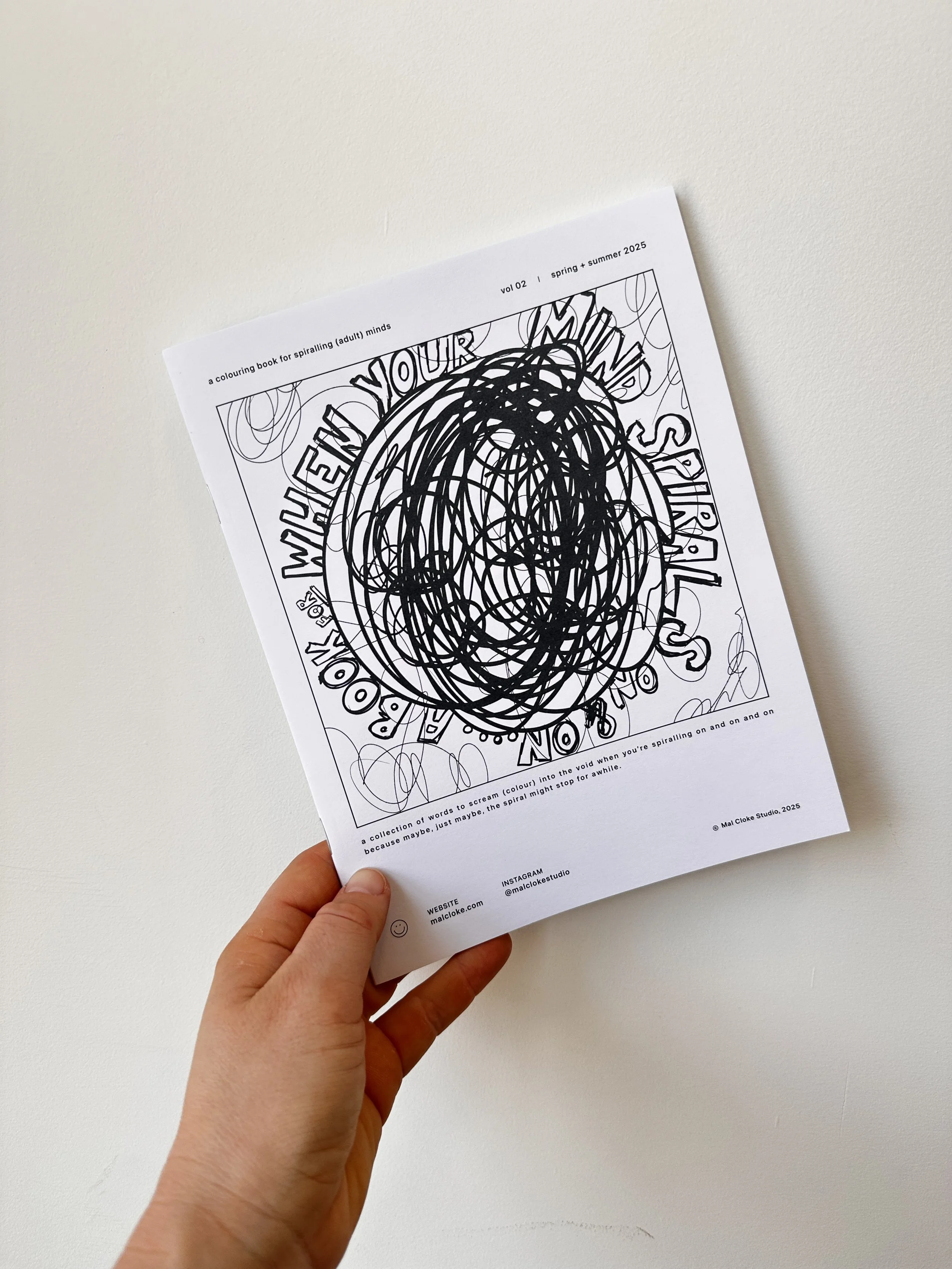
I wanted to do something different this time. I didn’t want to draw a bunch of new illustrations myself. And I wanted to make something that actually made a real, tangible difference somewhere in this weird little world.

I like the saying “do what you can with what you have” when it comes to volunteering or contributing at all; I learned this from my favourite band during the walk era in 2007 with the one-mile barefoot walks before each show. Between the handful of barefoot miles in, too many pairs of TOMS shoes, and a banner I made during class and printed on campus before packing it in my carry-on suitcase for three shows in a weekend, it wasn’t a lot… but they were all things I could do.
And for this, one thing I could do and wanted to do… was make books. So I did.
Was it the most perfect project ever?
Of course, not. But I made it work with what I had, it made a lil difference, and it got me a little more involved with the community to help in a pretty big way.

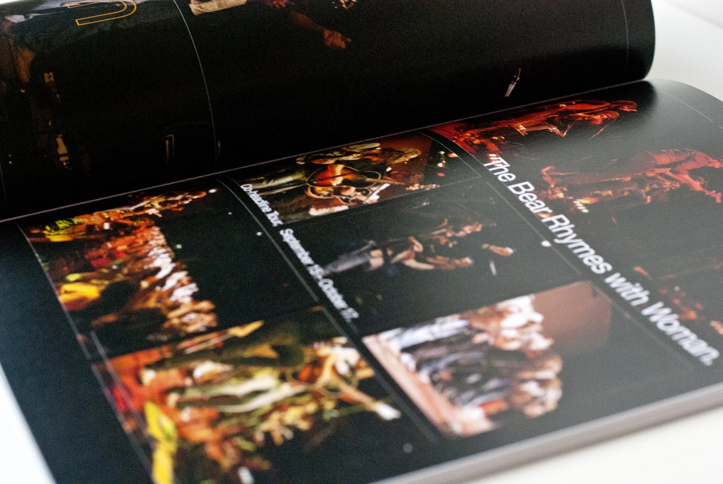
the rock boat no. 12
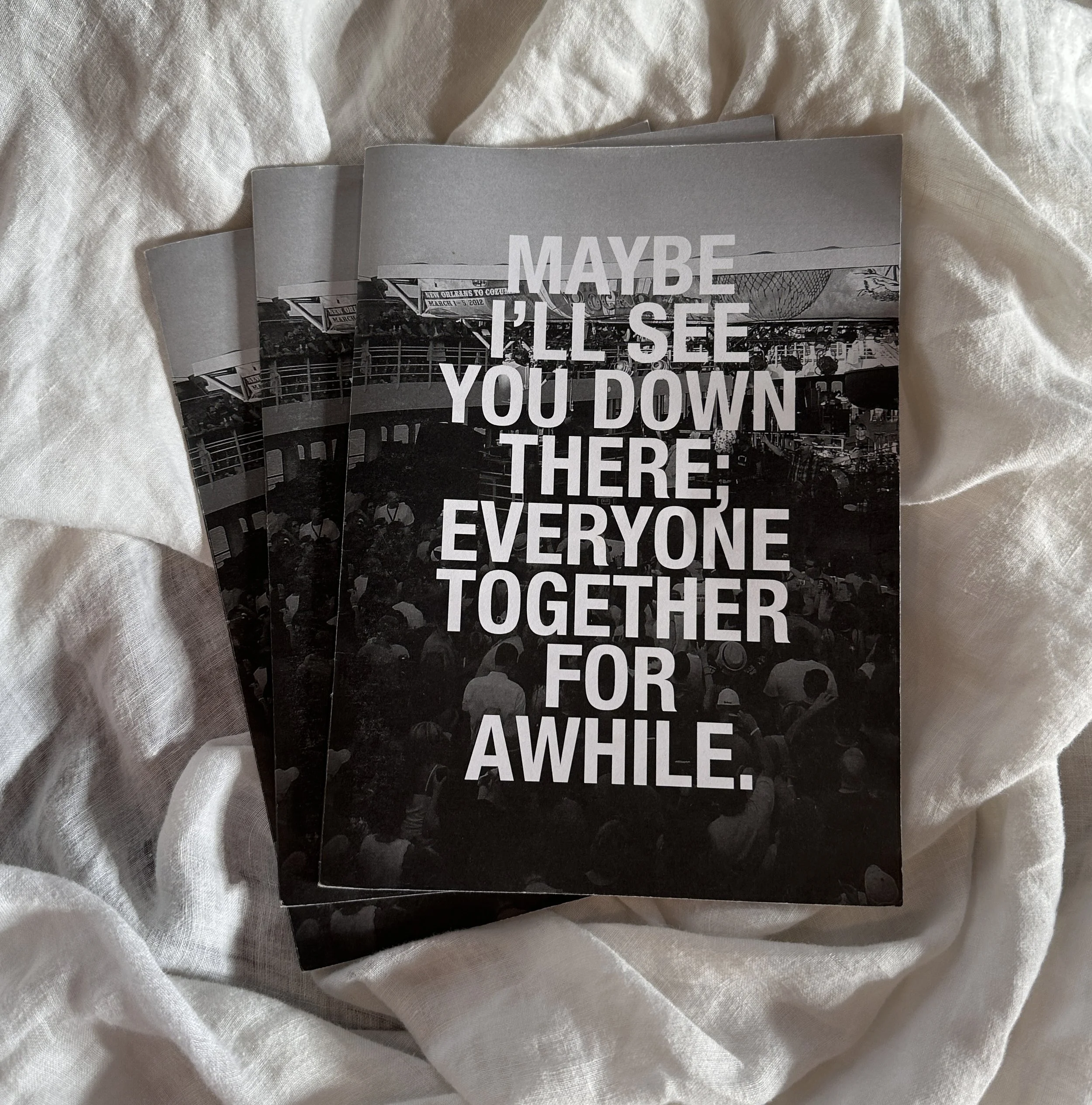

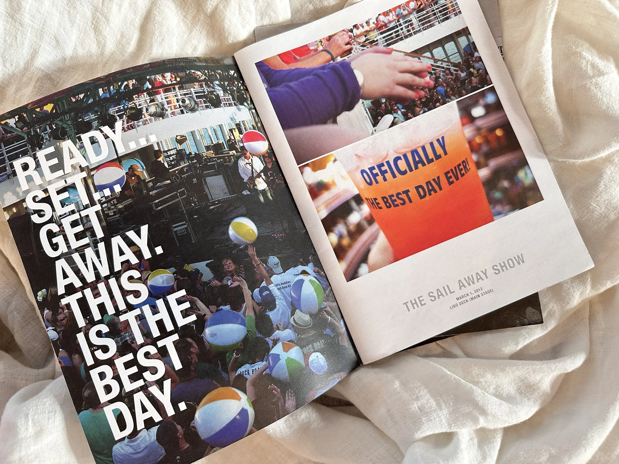
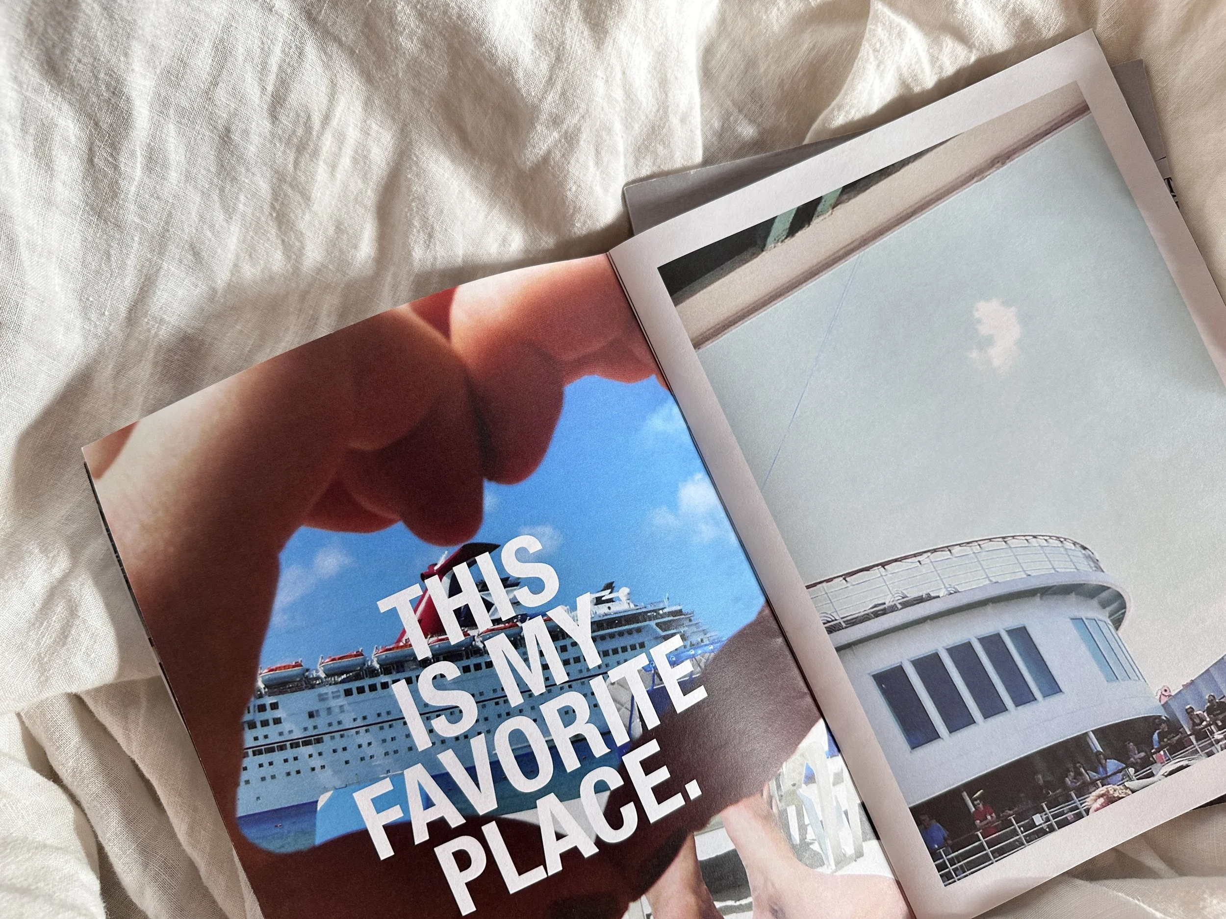
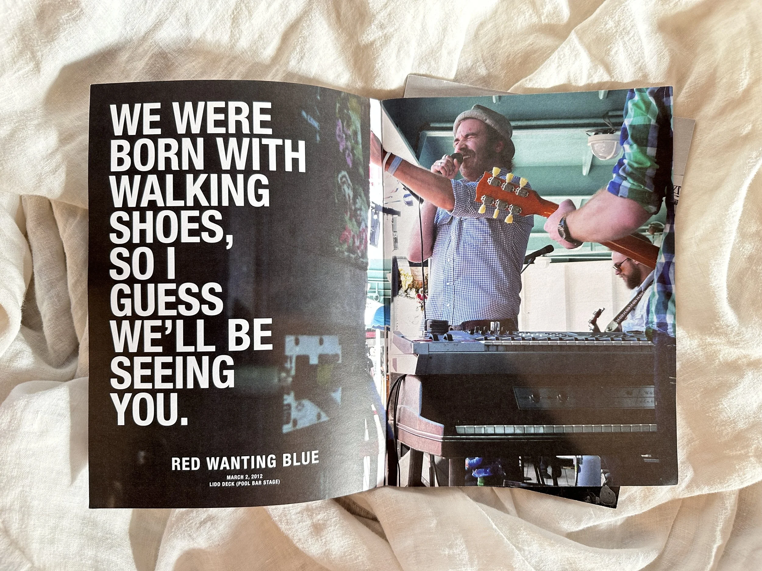
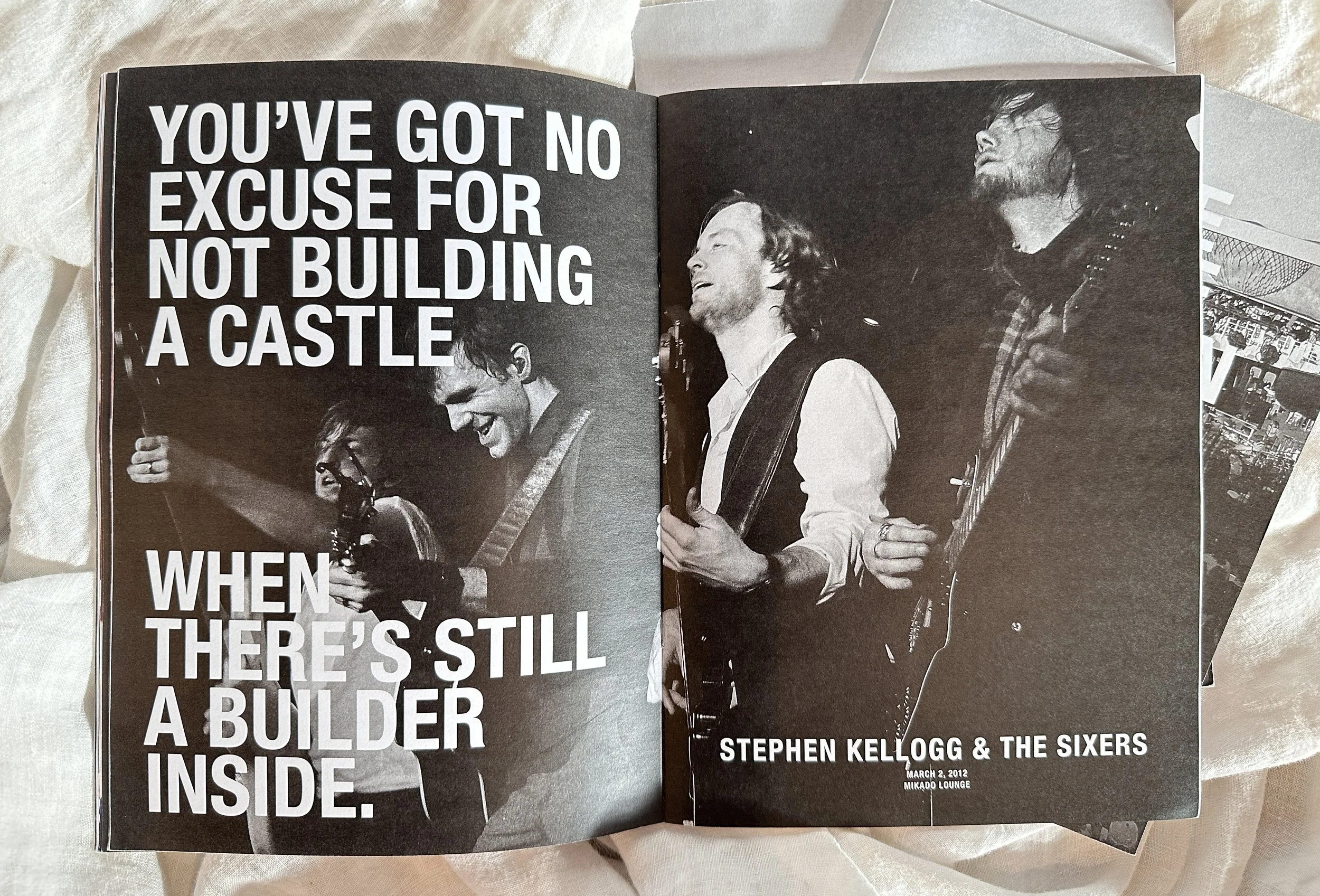
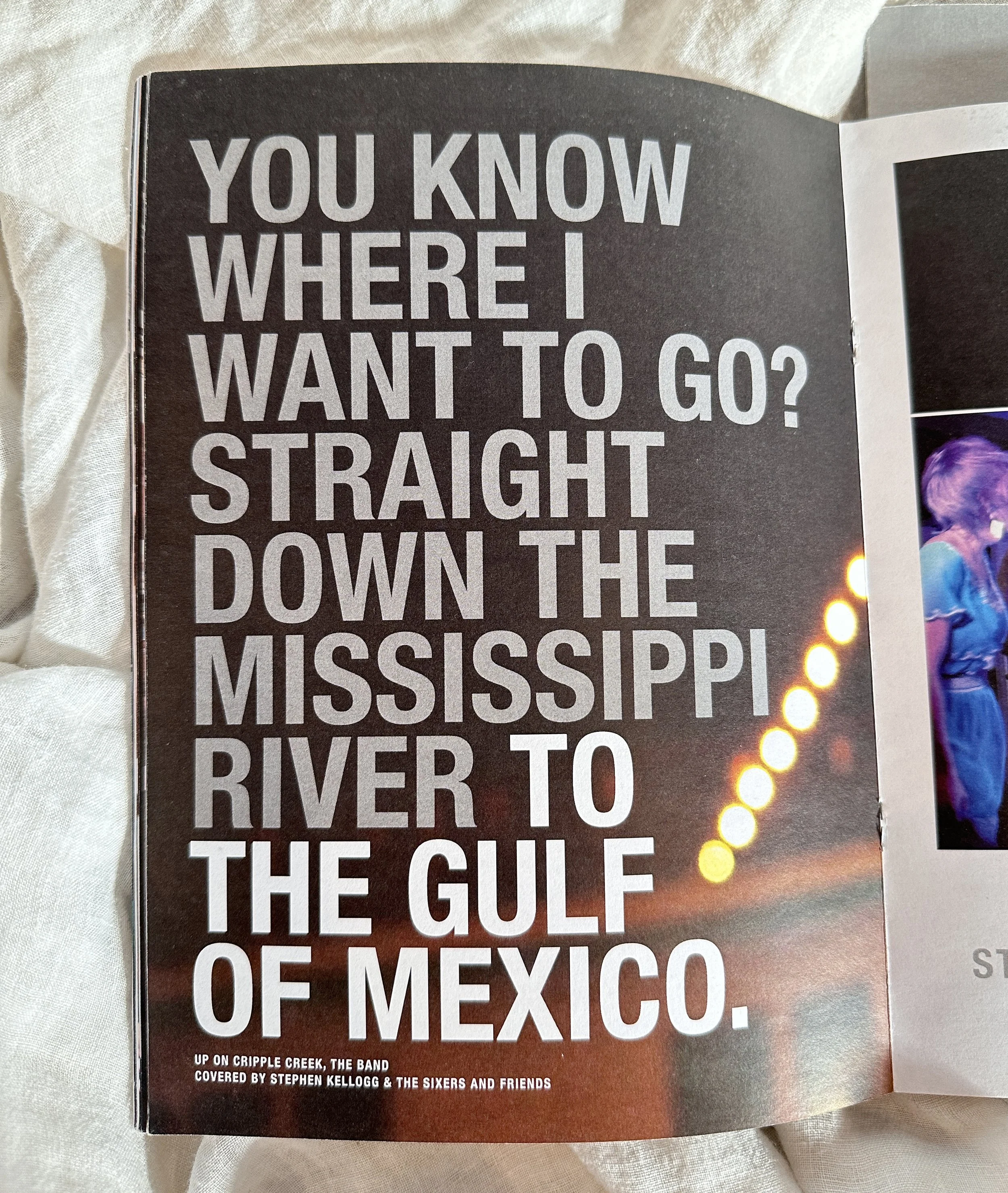
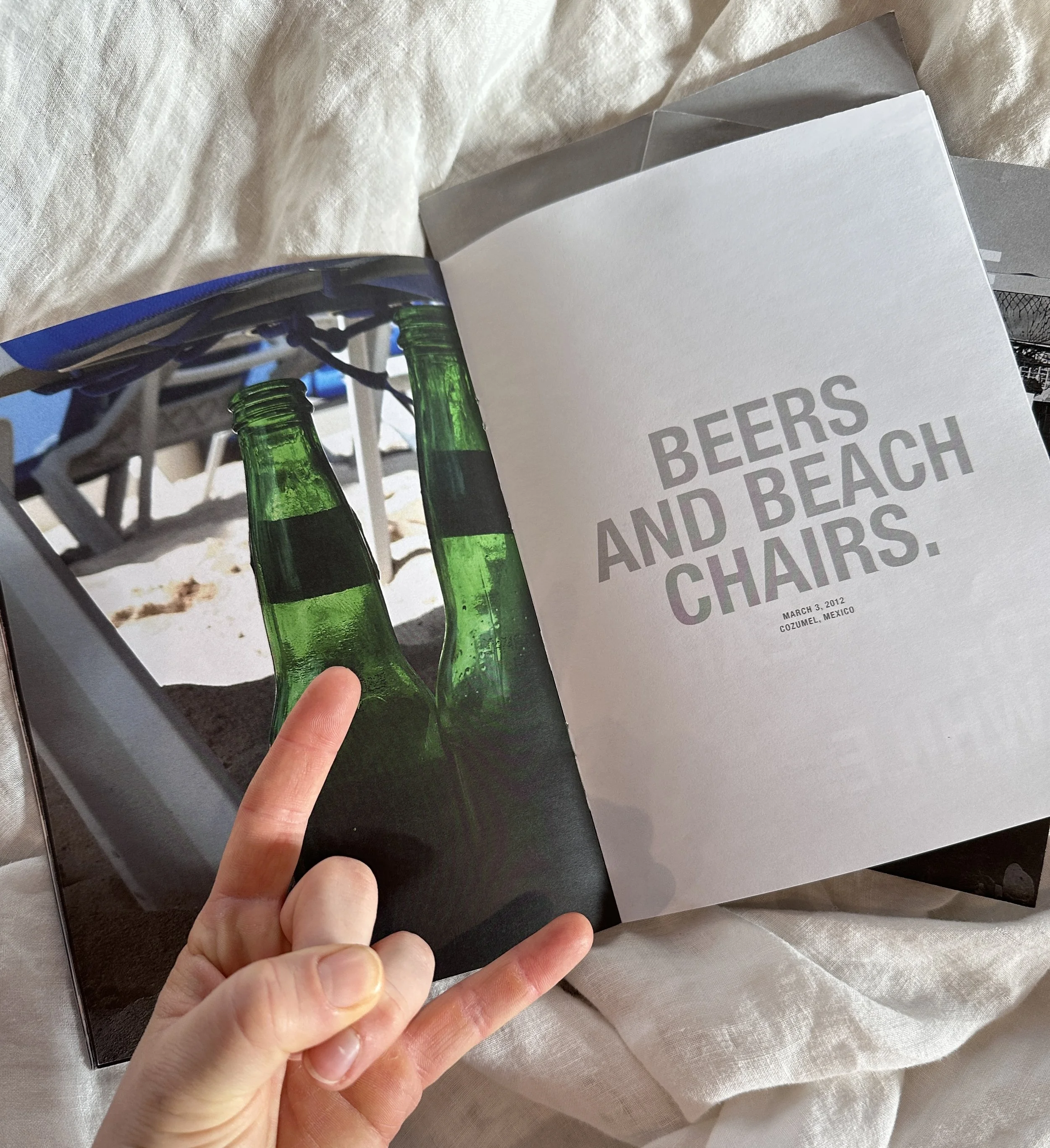
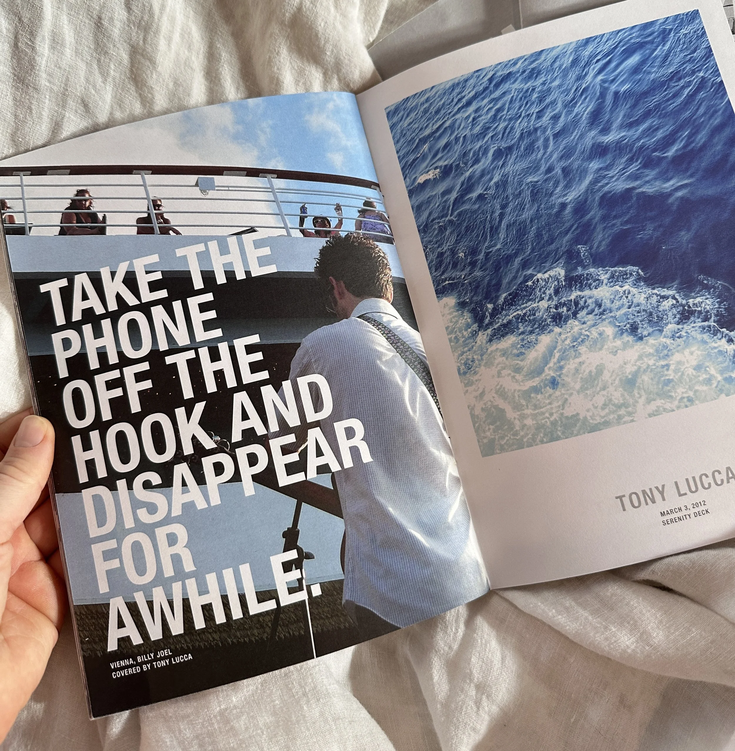
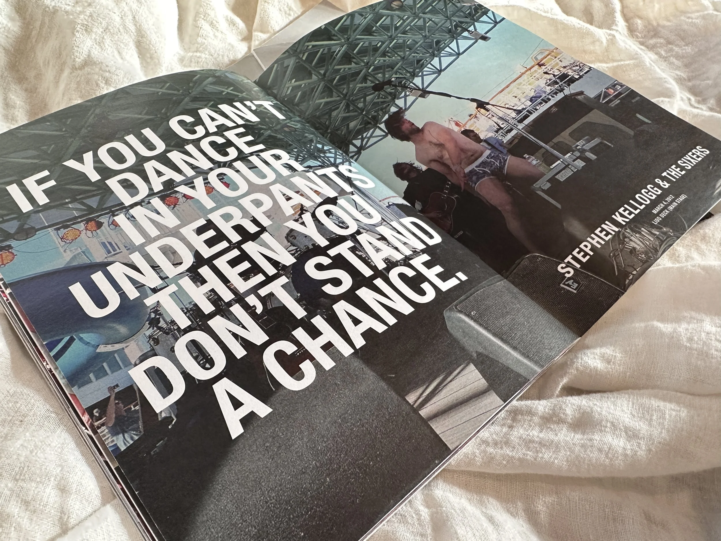
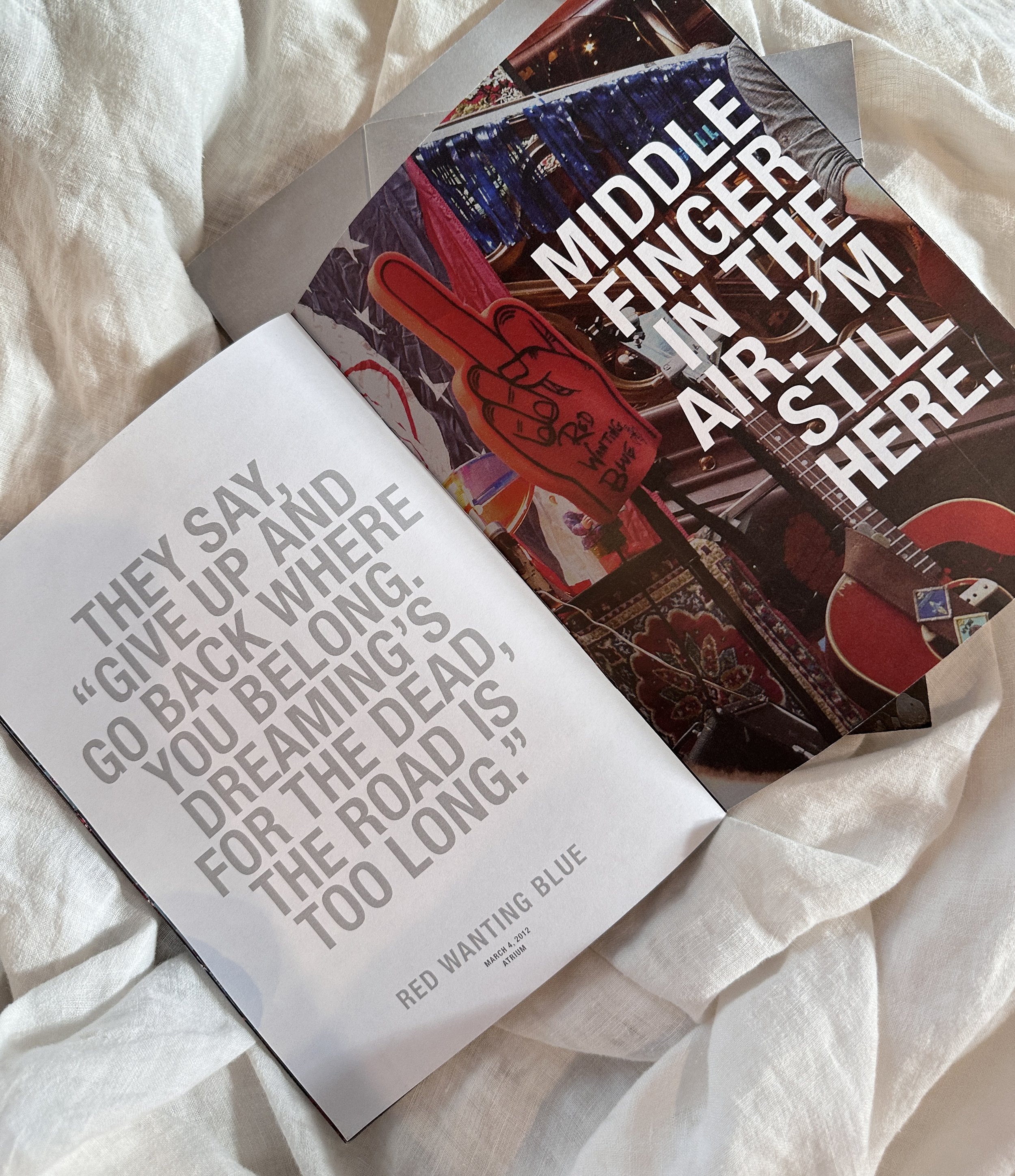
ABOUT
following a music festival [on a boat] i went on once, i made this short editorial book mostly as a keepsake for me but mostly because i like to make books like this.
my intention was never to sell it but i decided to keep it general and focused more on the music than anything to make it more timeless with the potential to share [if this book happens to live longer than me, maybe someone will discover a new favourite from it?]
photos are my own; lyrics throughout were carefully selected, credited, and come from artists on the boat or cover songs performed on the boat that year

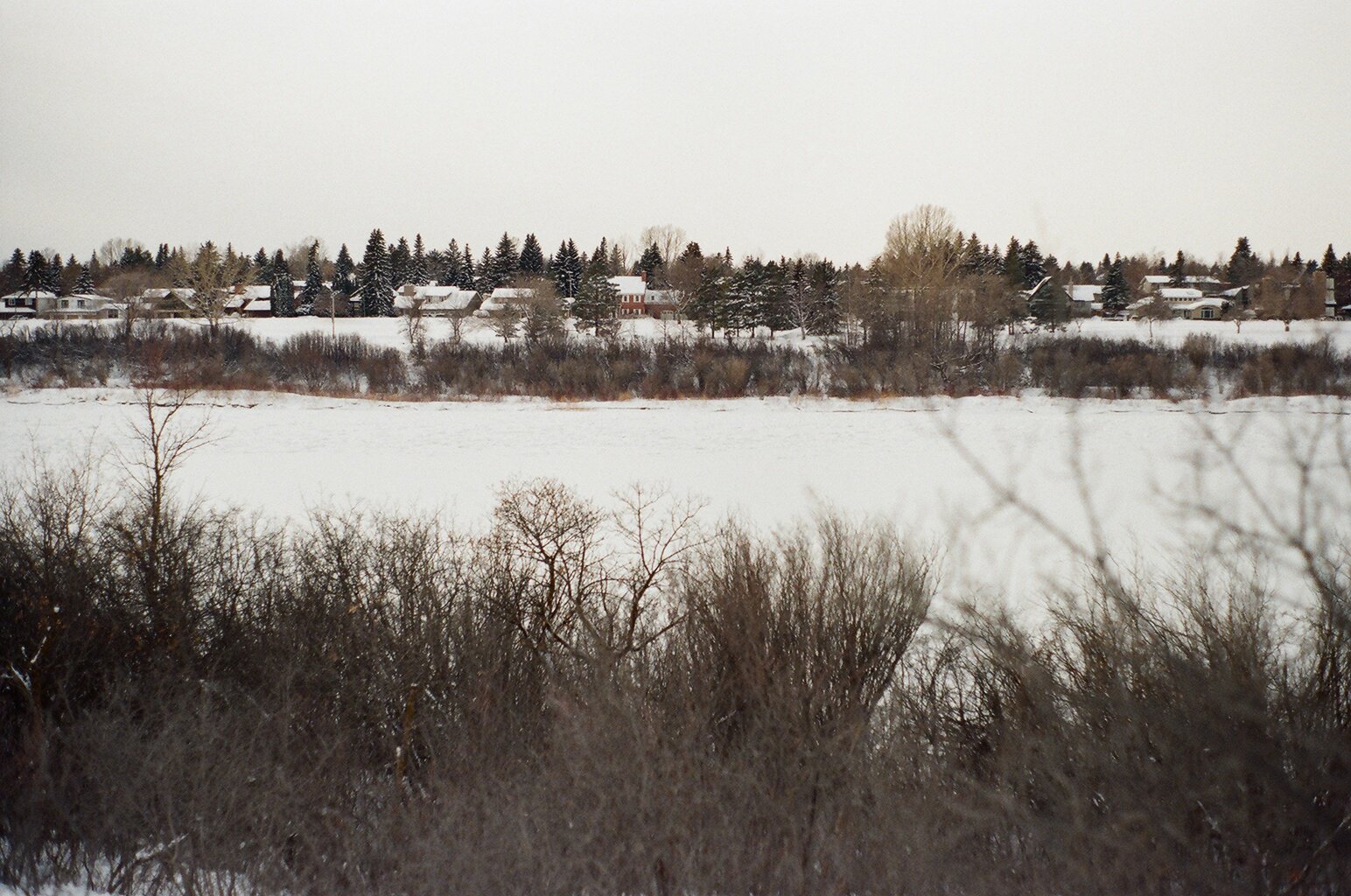
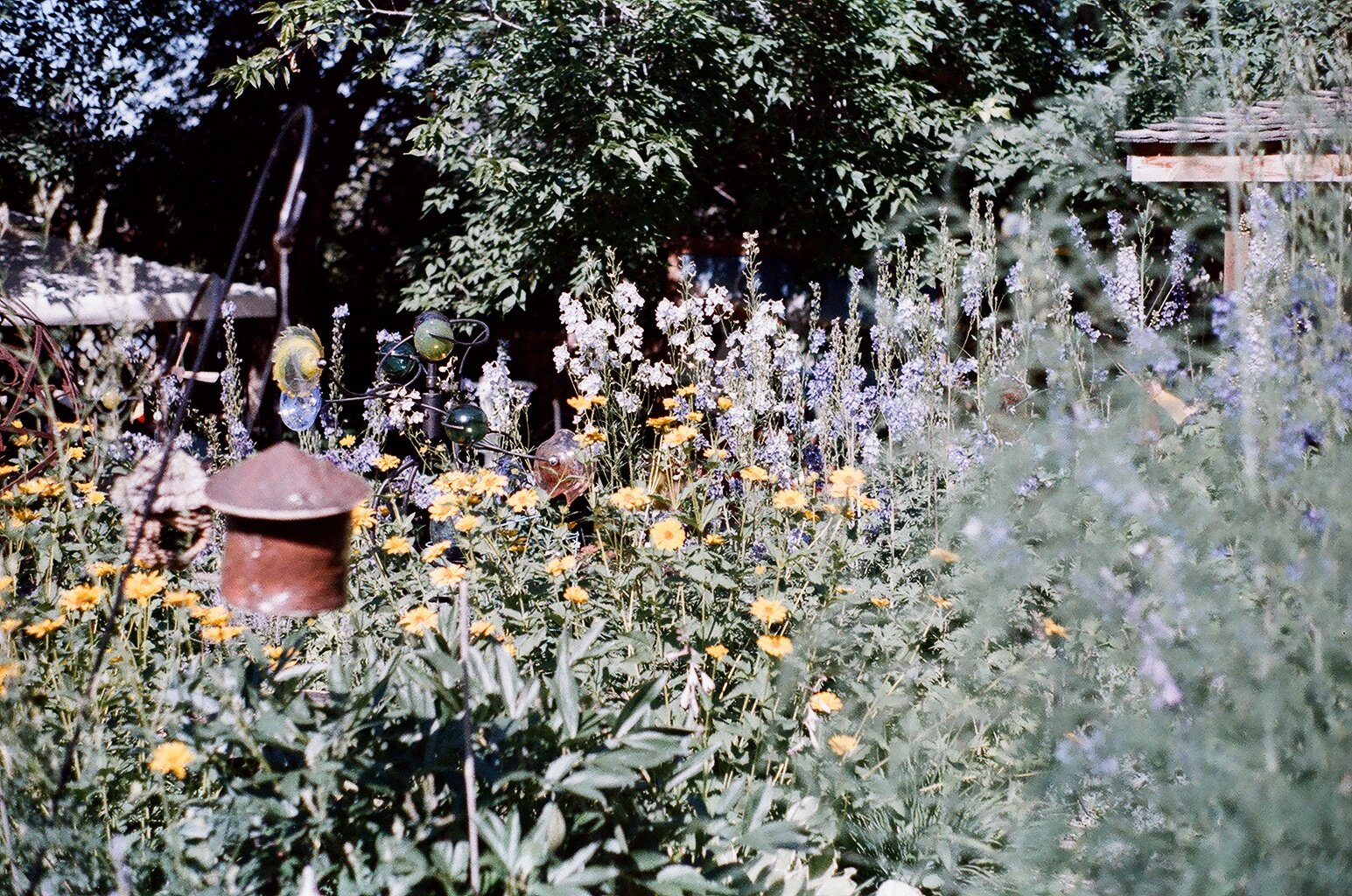
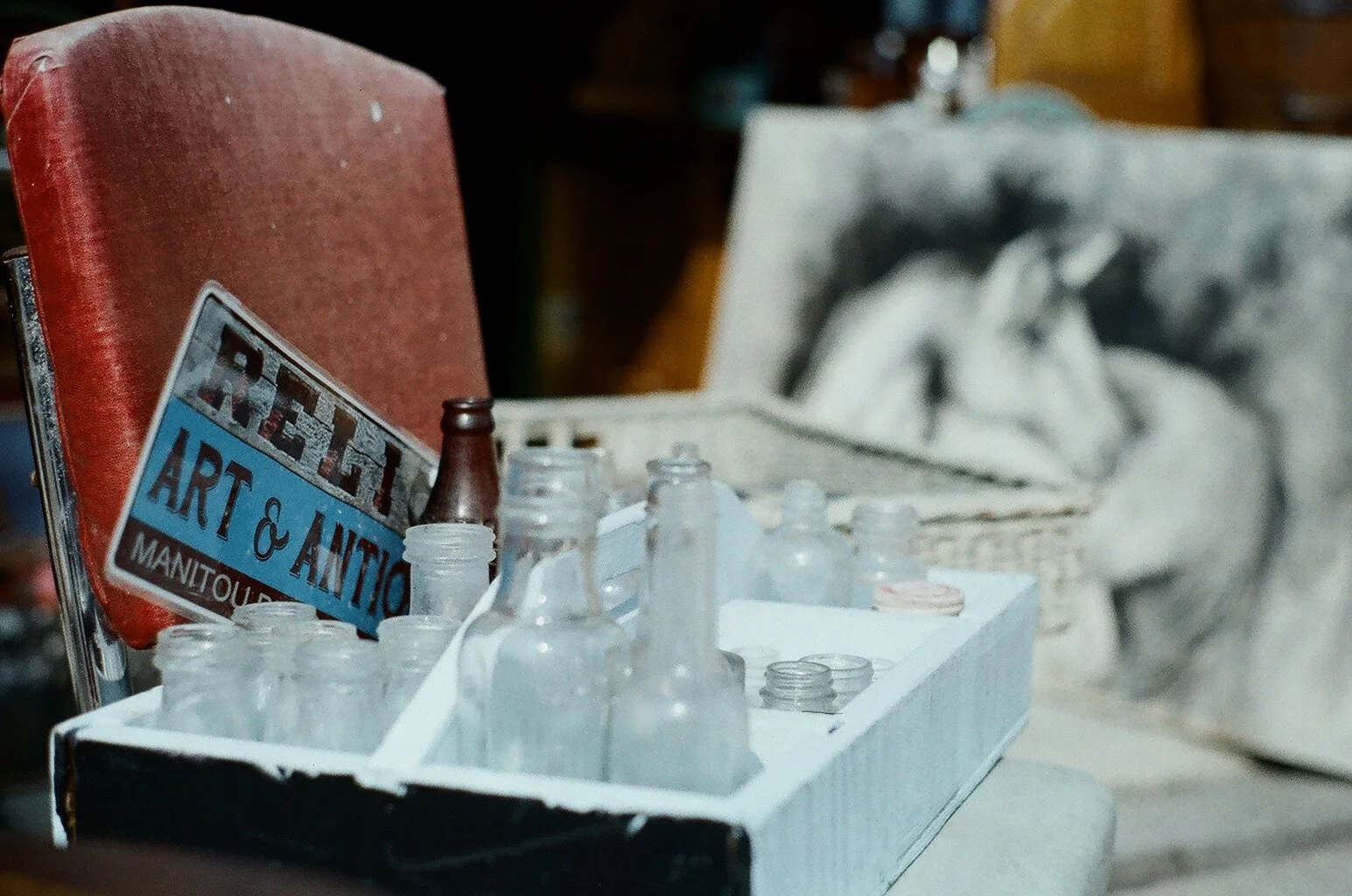
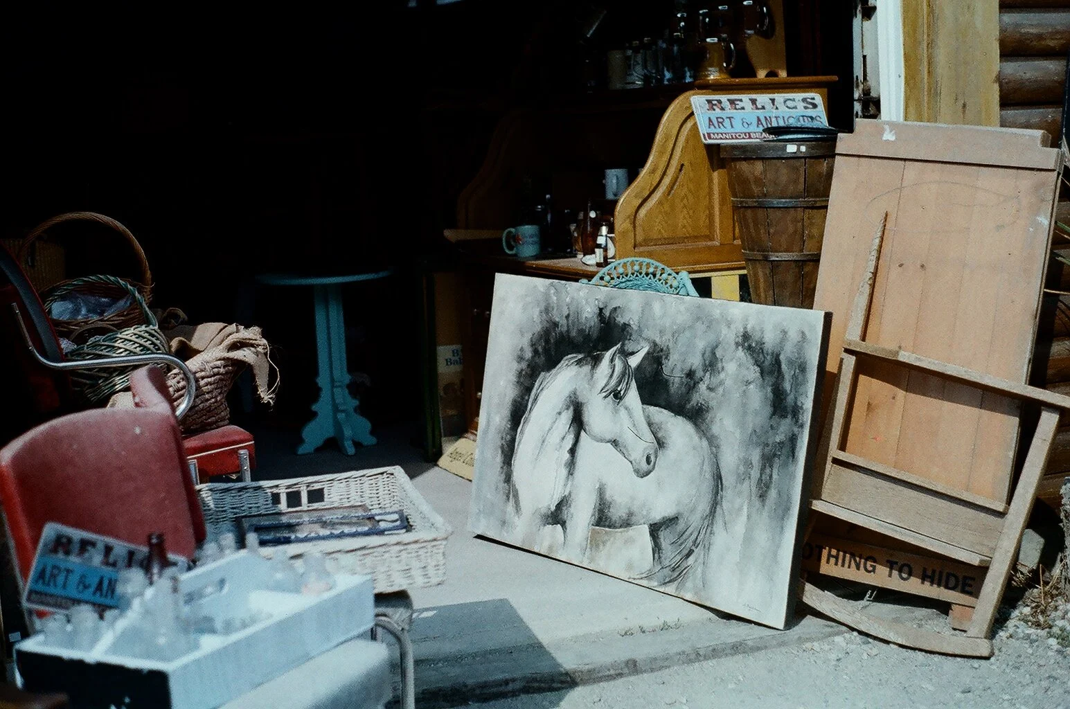
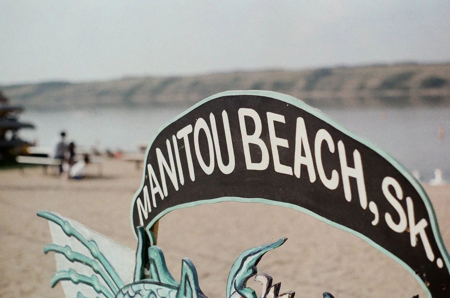
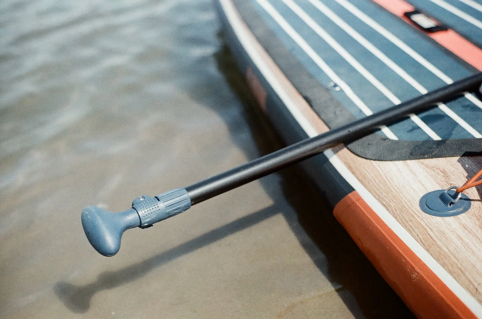
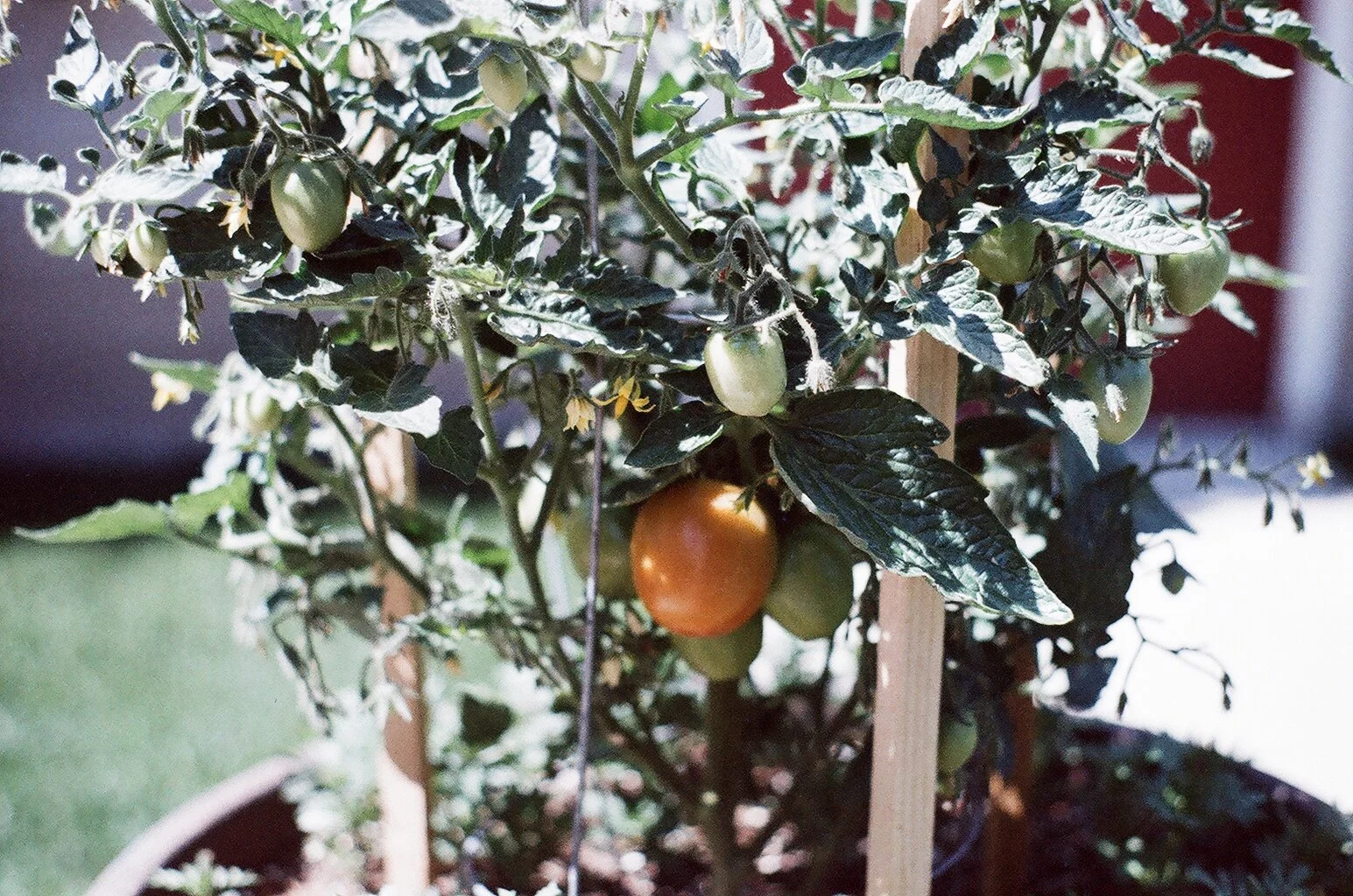
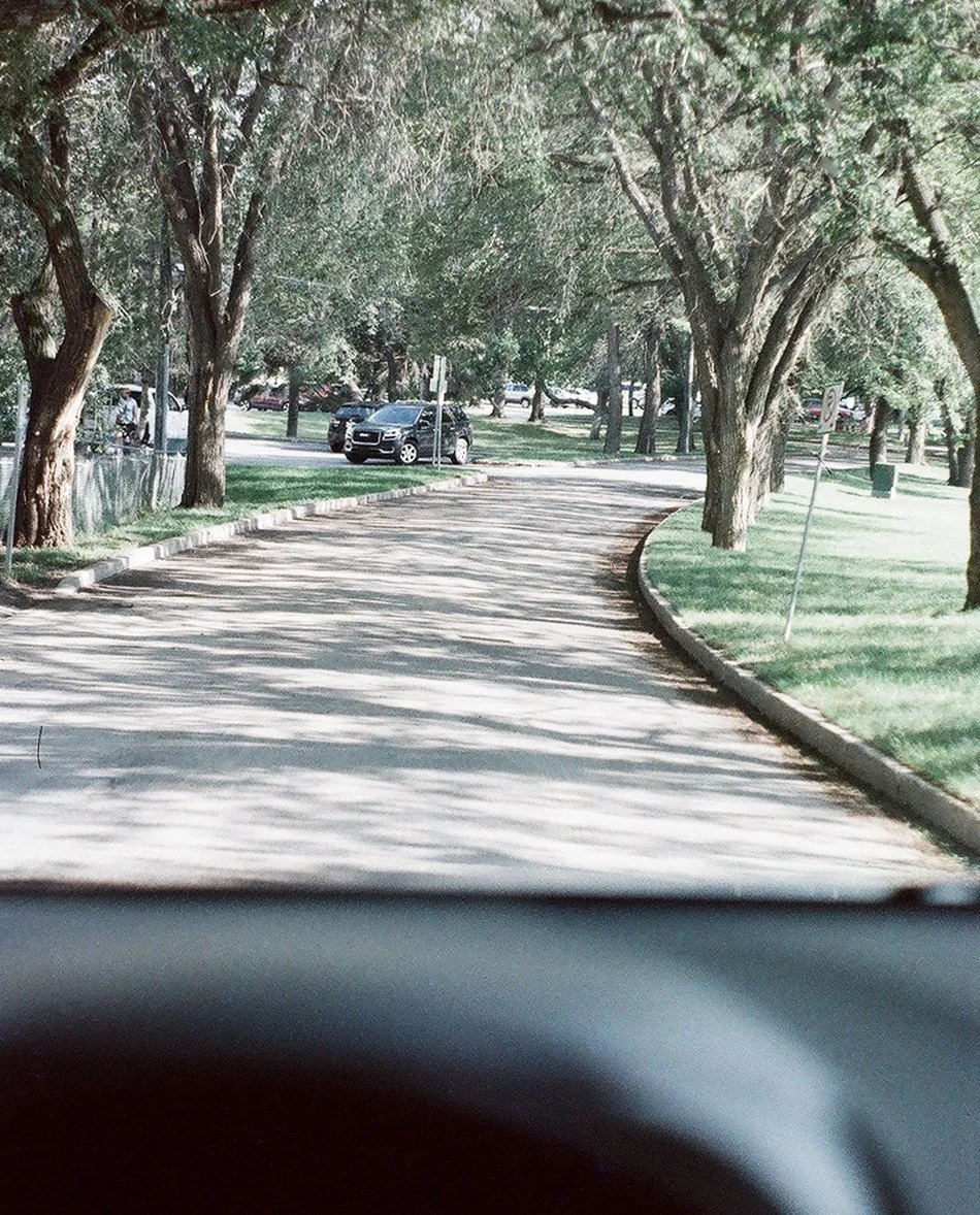
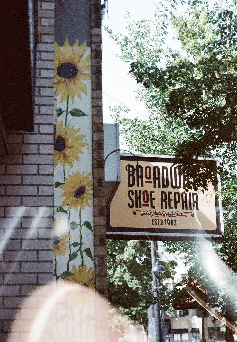
this camera is going into retirement / summer + fall 2025
taken with a pentax k1000; unedited, miscellaneous shots from summer + fall


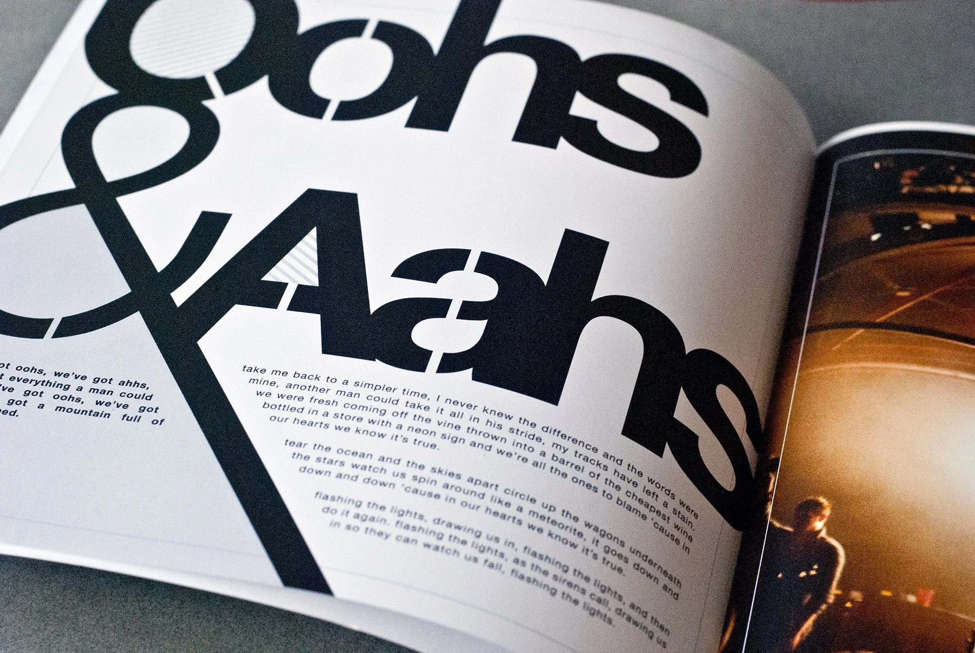
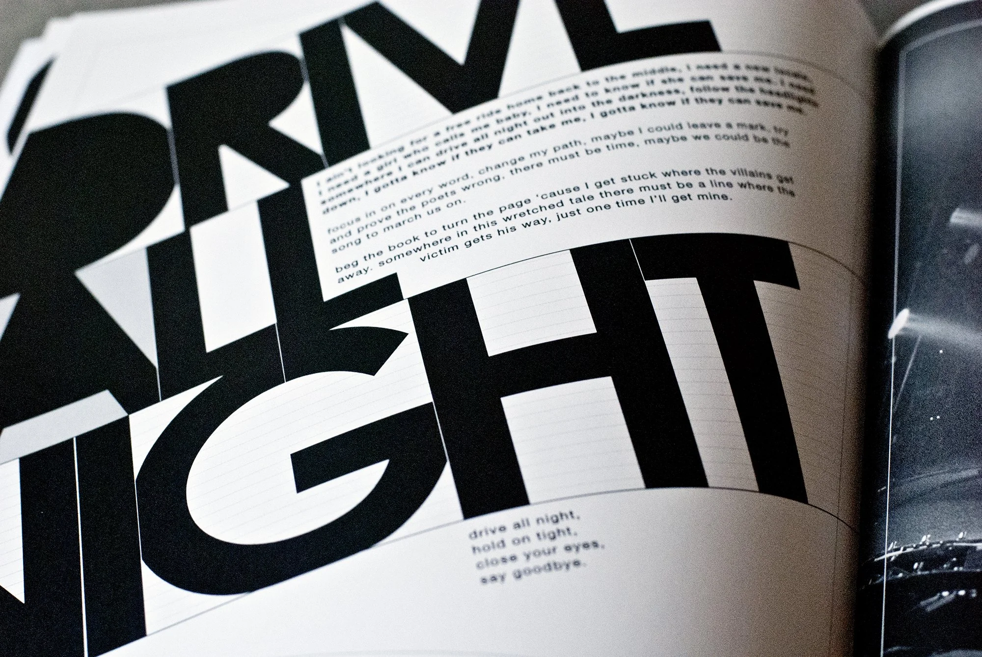
“flashback: “the reckoning” book
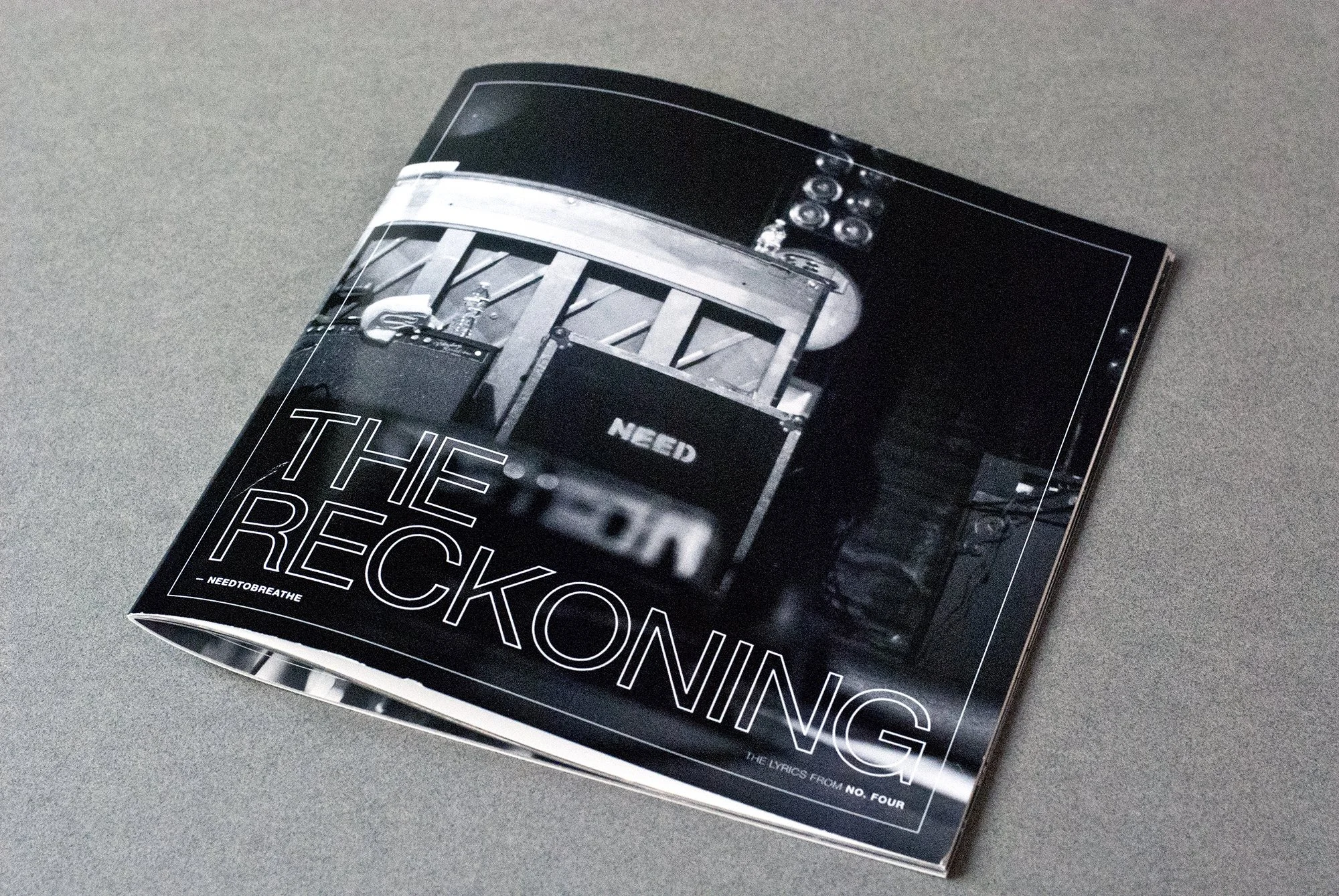
2011
still pretty early in my career, i was itching to explore typography in weird ways, so i made this ‘zine style book for the lyrics from needtobreathe’s newest album at the time “the reckoning.”
the project was fully self-initiated and i self published it online via a print on demand site, mainly just to print a copy myself.
a few fans contributed photos to the project (credit given in the book) and a handful of fans purchased the book as well; any proceeds were fully donated to one world health [the band’s charity of choice at the time].


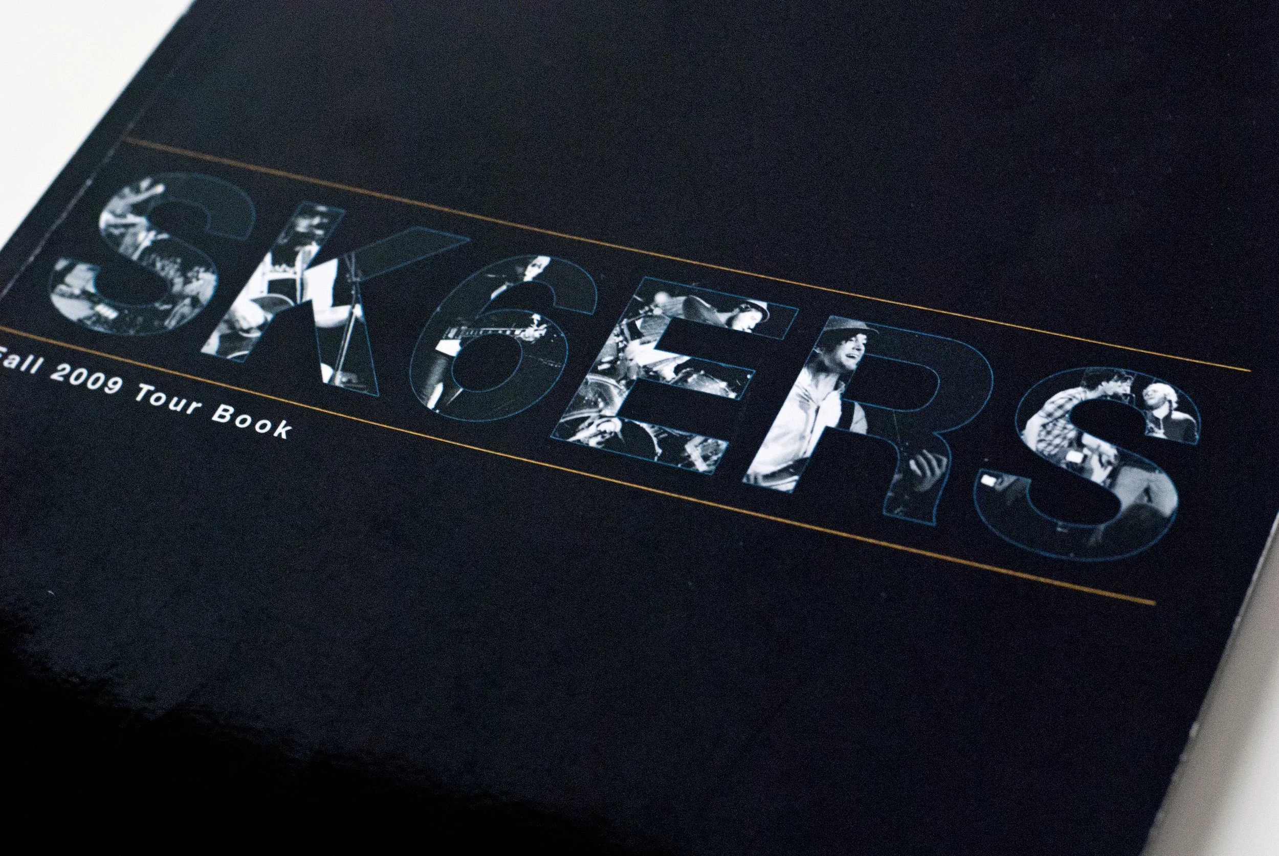
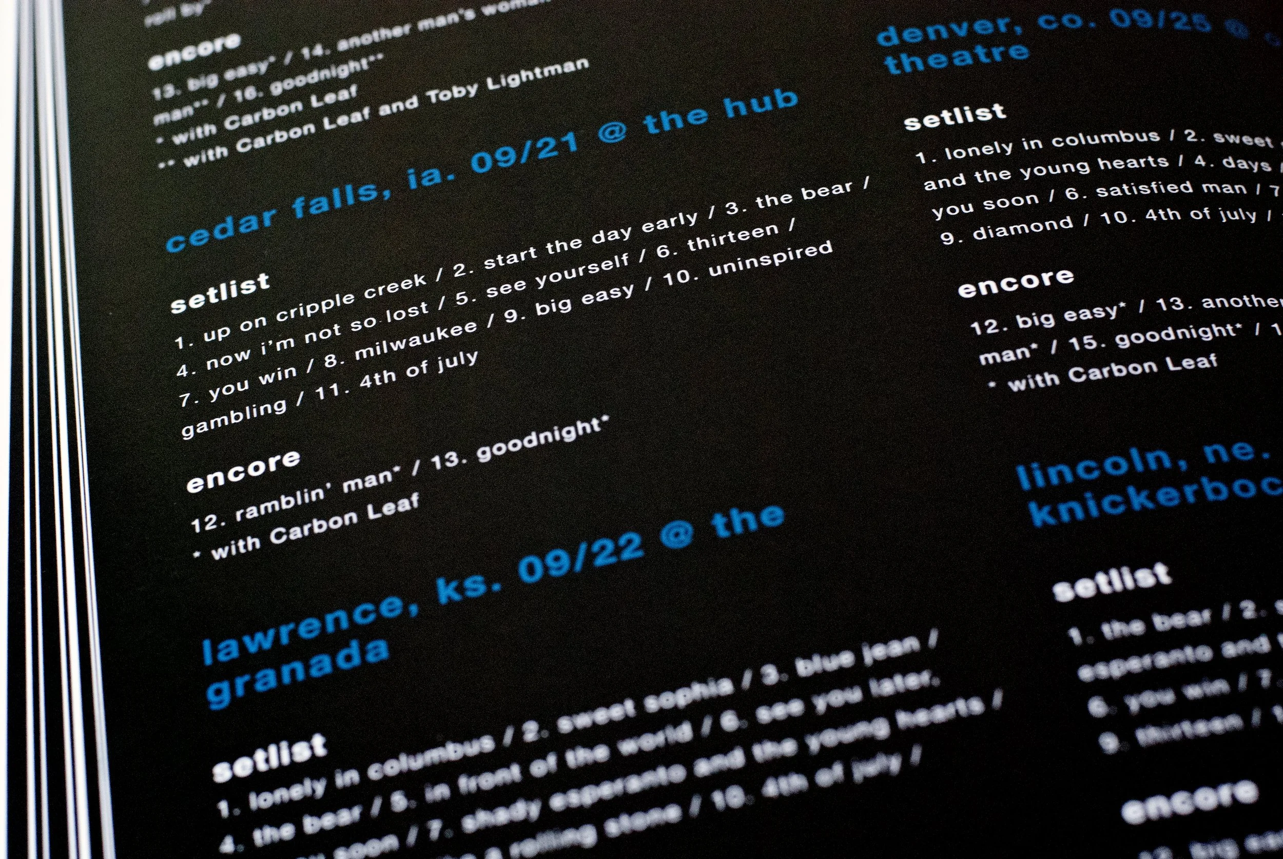
flashback: “sk6ers tour book”
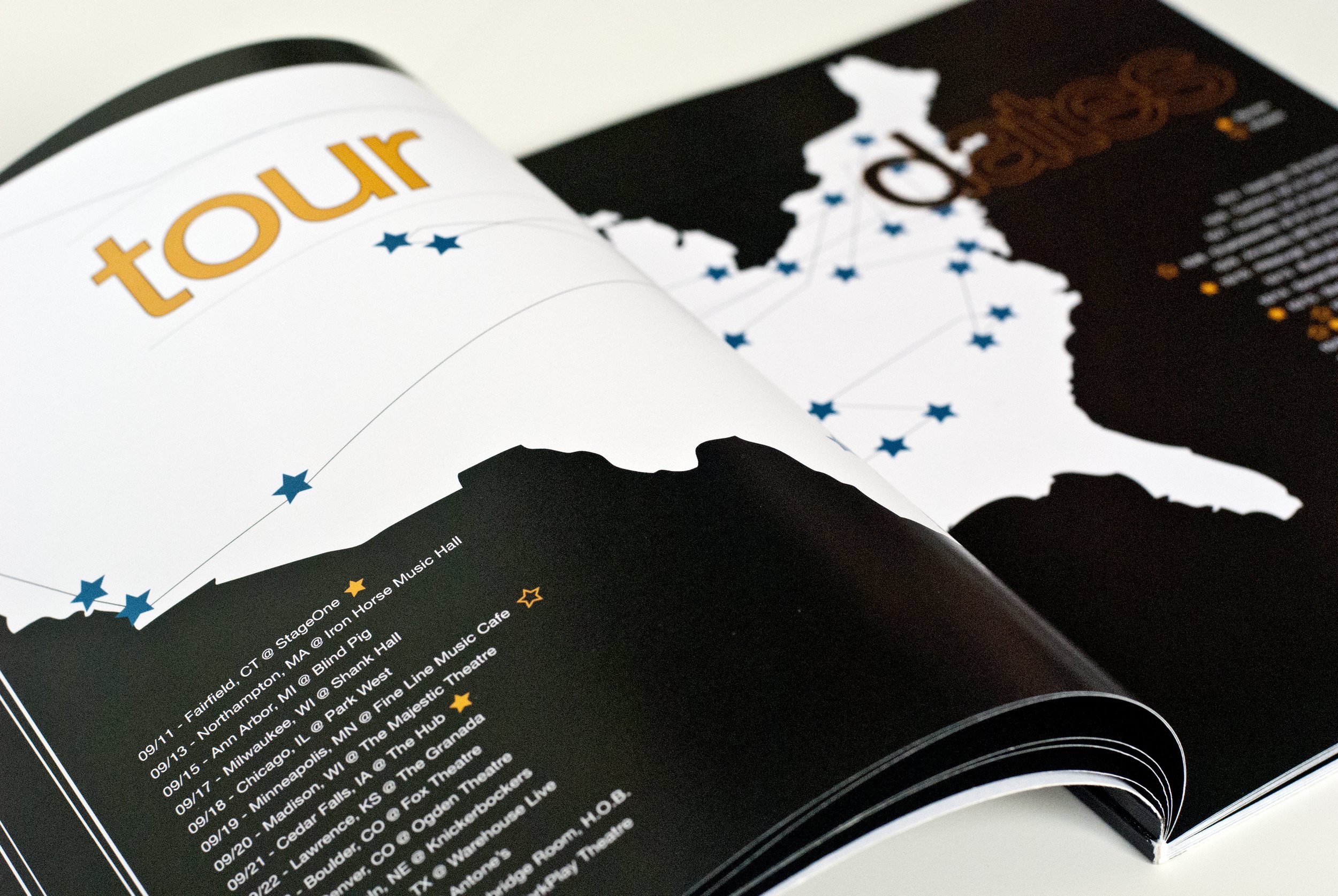
2009
somewhere between school and getting my first design industry job, i thought it’d be fun to make a tour book for this band i loved as the tour was happening. it wasn’t paid work or anything, but they knew about it and even helped a bit with it.
i initiated fans to submit photos, stories, and setlists from each show [credit given] and had the books self-published to a print-on-demand site for a very low cost and allowed fans to order a copy if they wanted to.


“one day, you’ll be cool”
HANDMADE VISUAL JOURNAL [PERSONAL PROJECT]
MAY-JULY 2025
“The only true currency in this bankrupt world is what we share with one another when we’re uncool.”
(almost famous)
—
I don’t know, I just wanted to make a magazine or photo book or something from this lil adventure. I opened up Adobe InDesign as I always have but then got the urge to buy a plain sketchbook and do it all by hand.
The title for this was based off this collection and everything that means; but that collection was actually inspired by this journey, in a way.
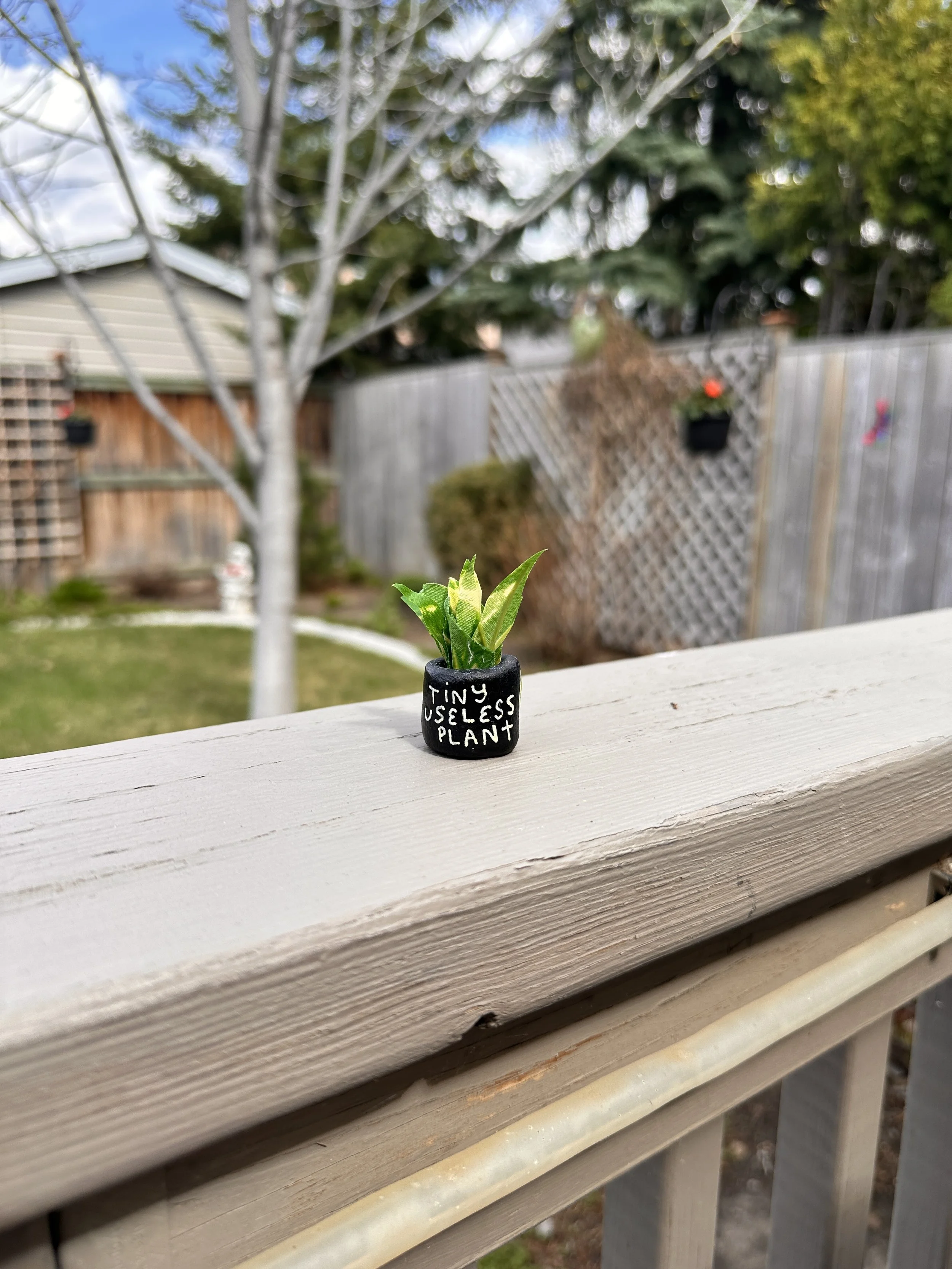
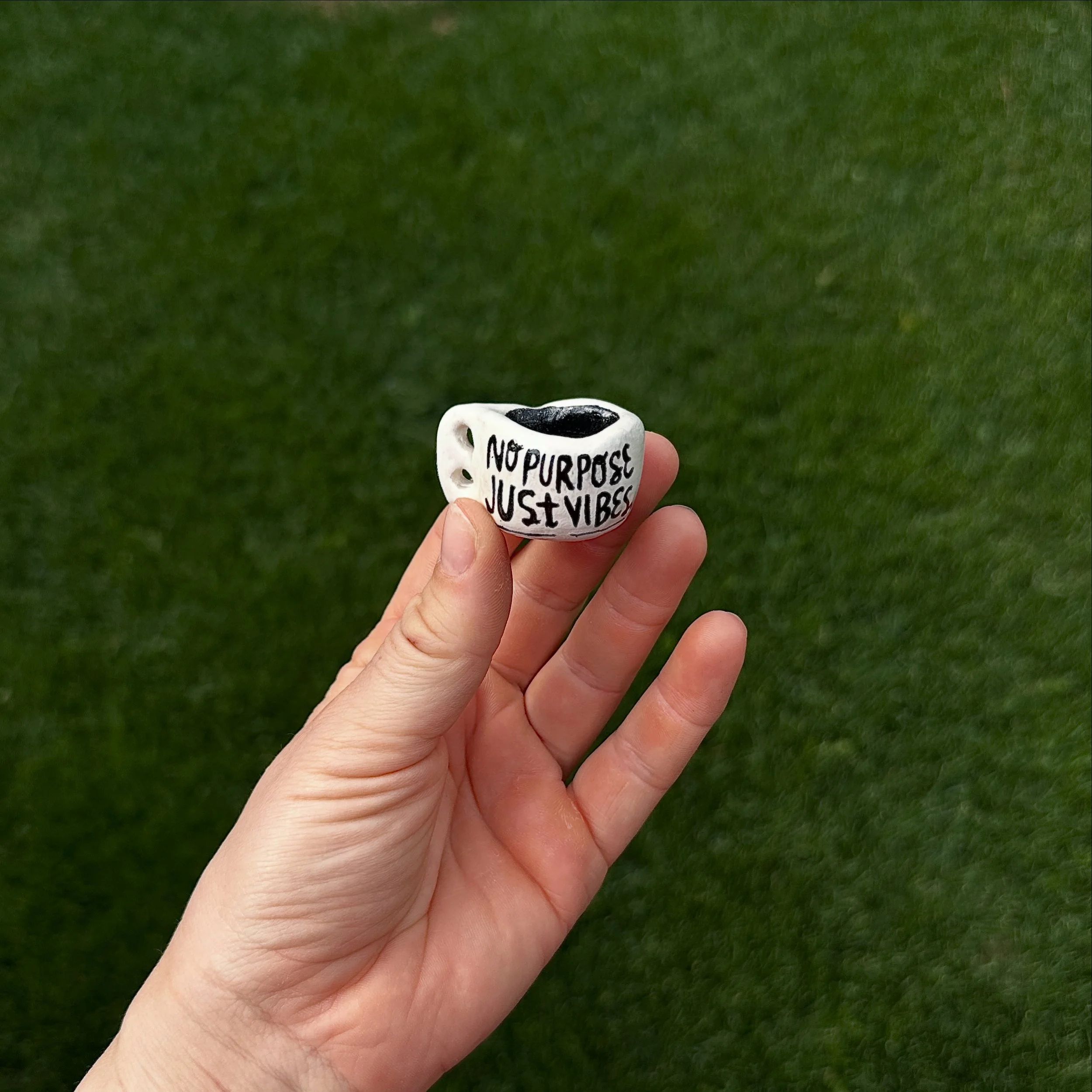
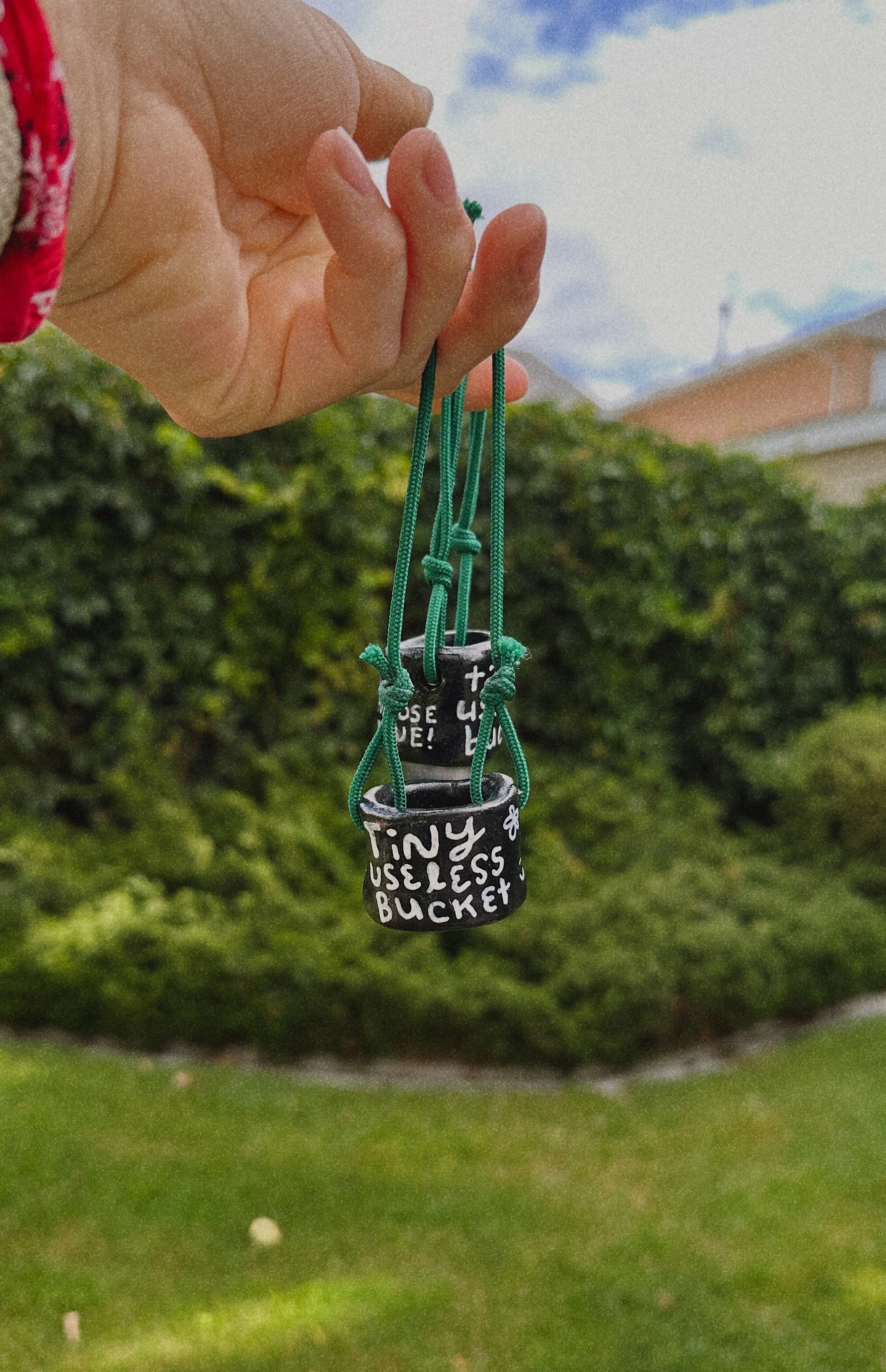
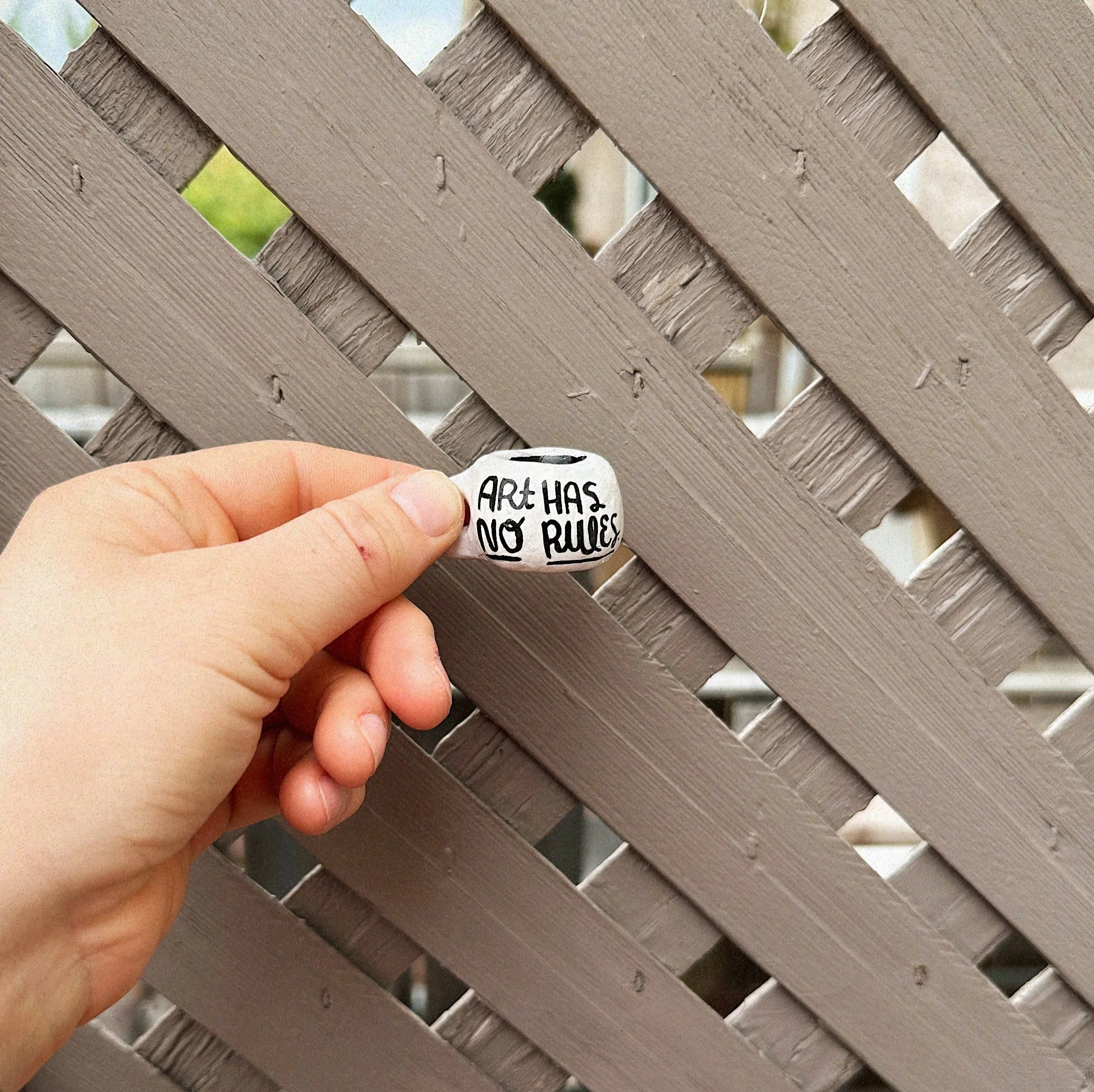
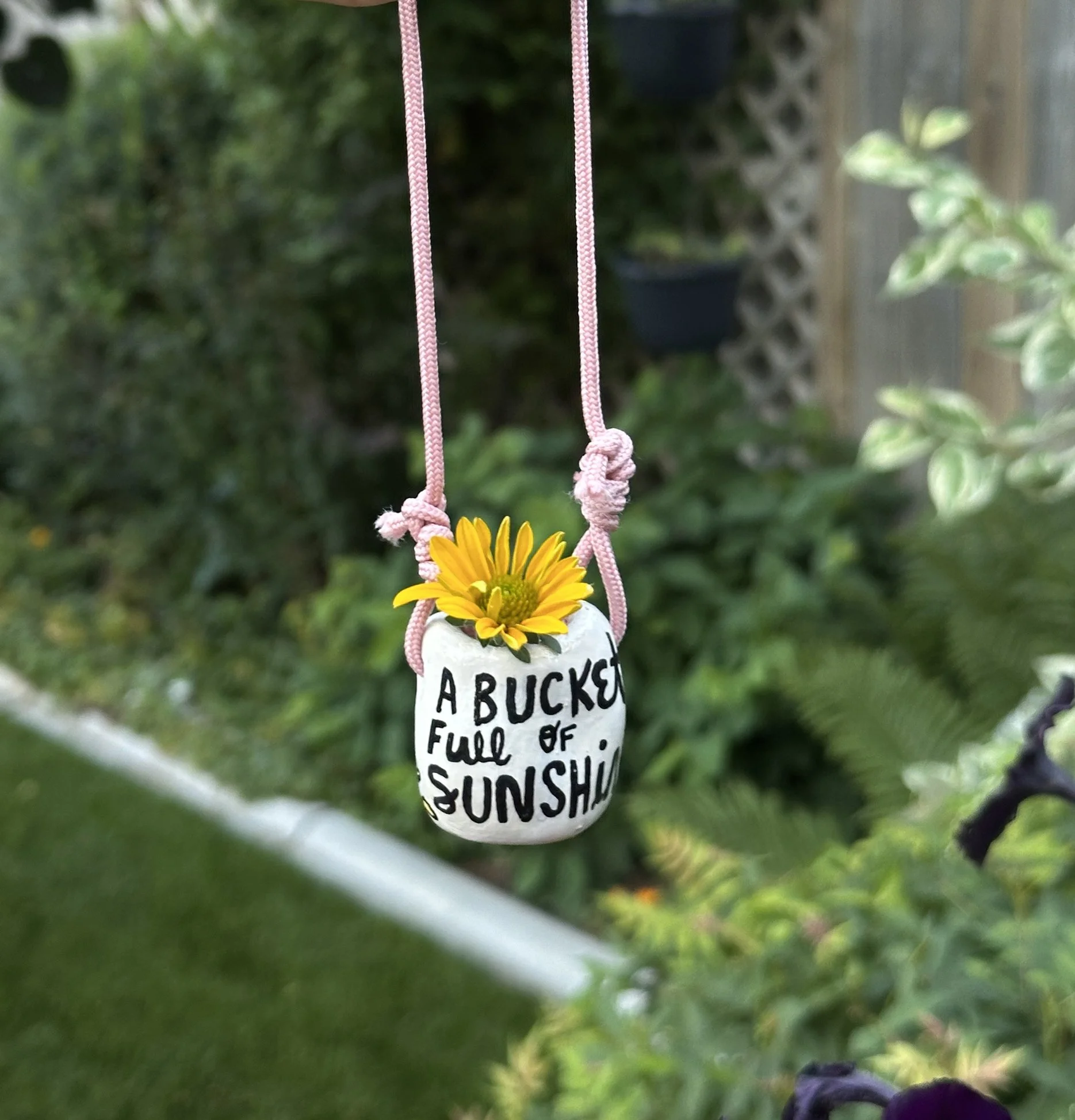
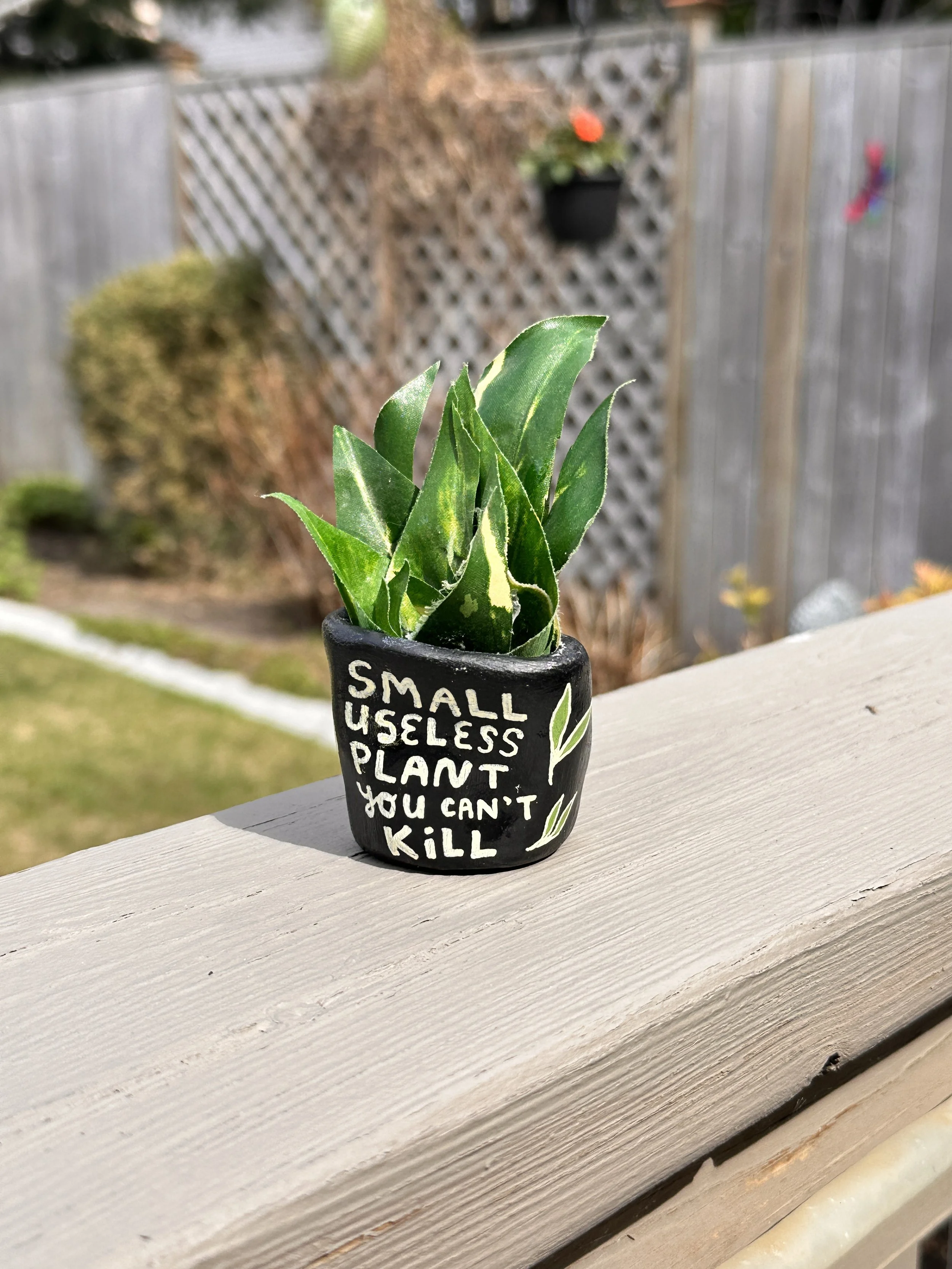
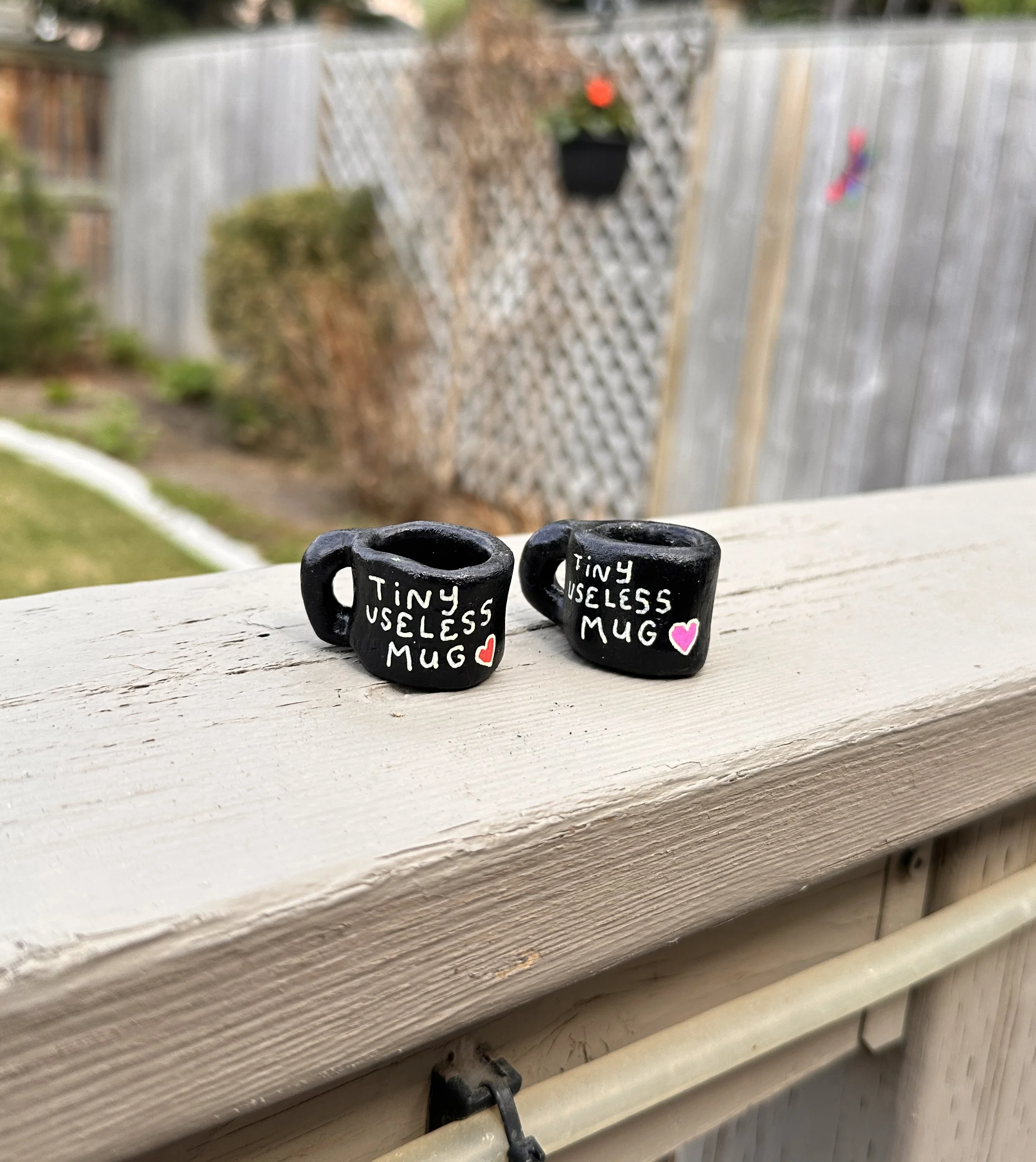
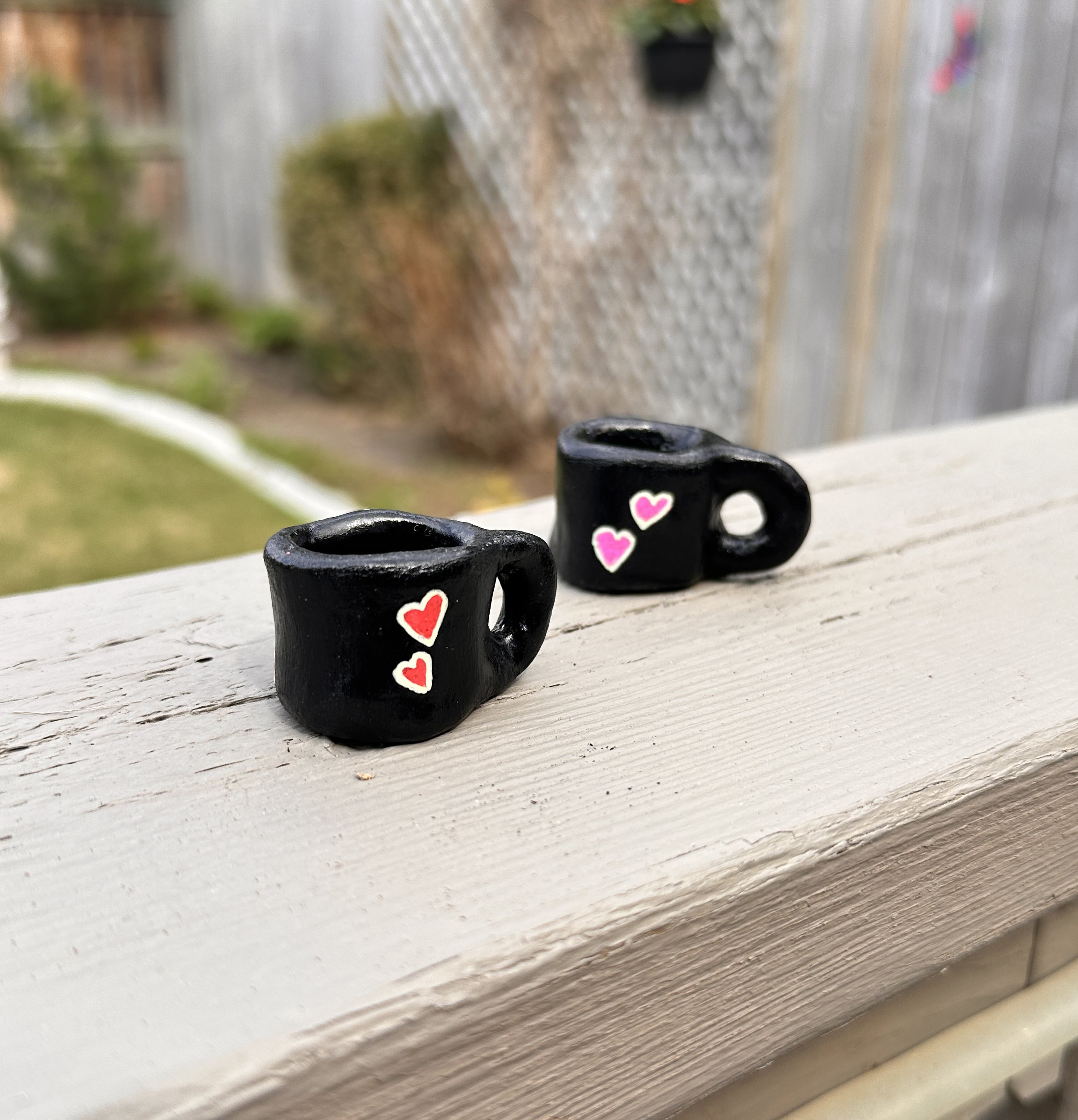
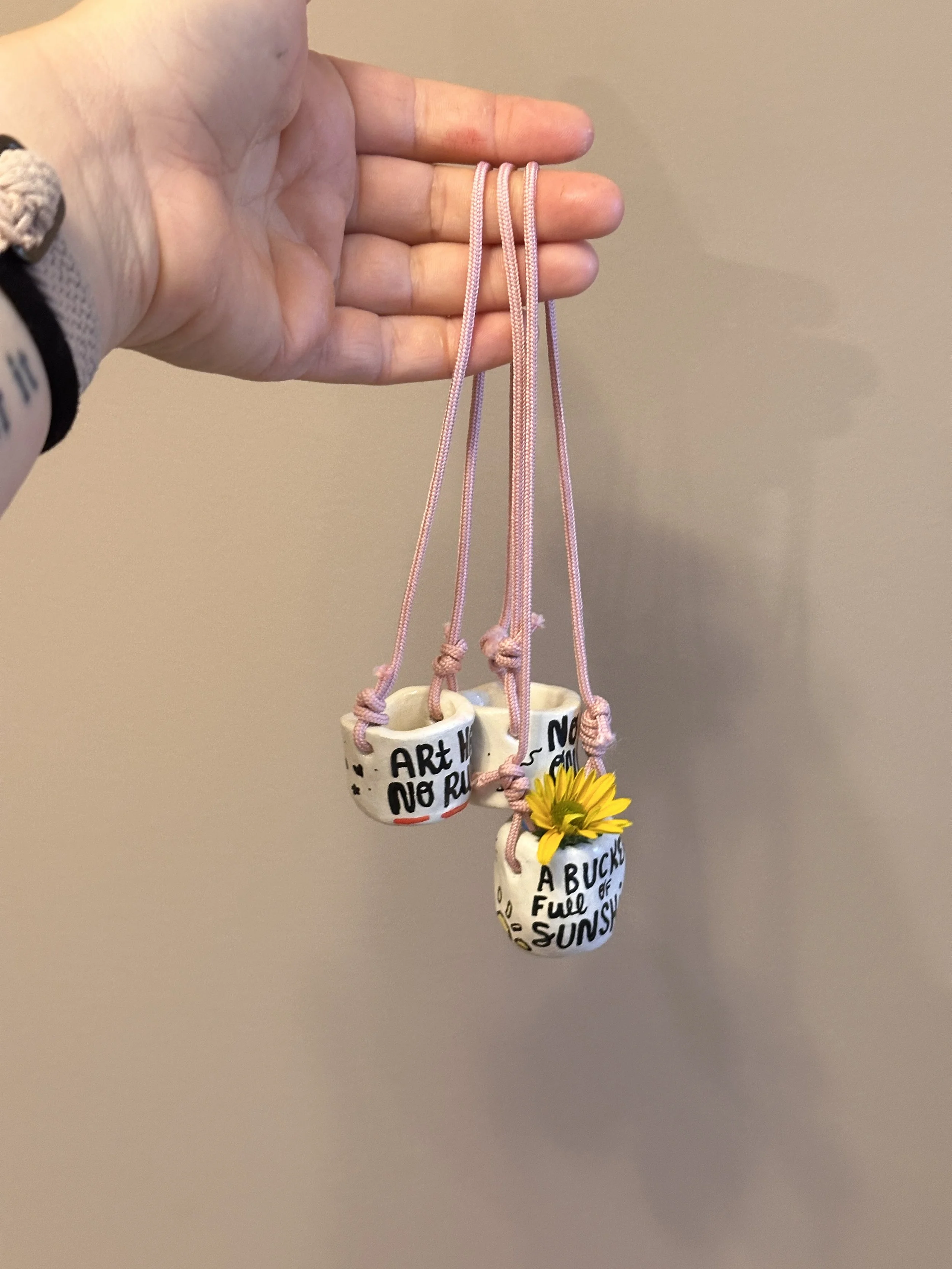
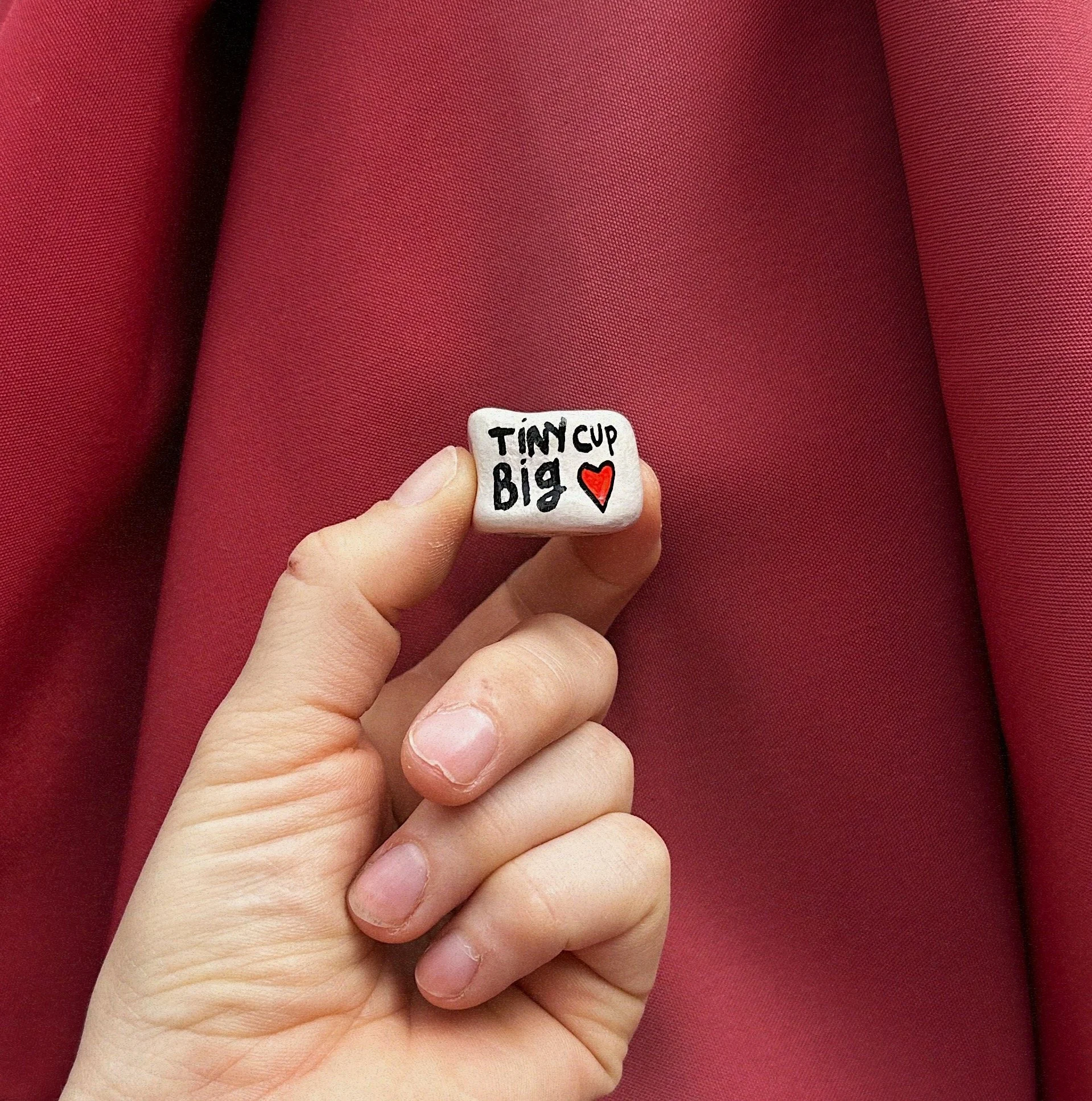
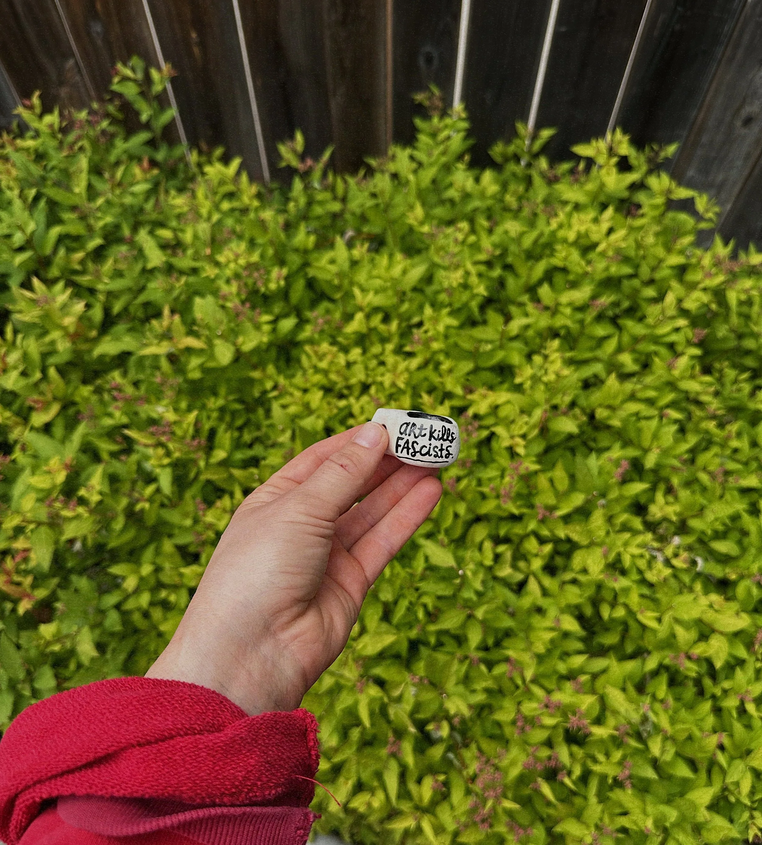
![tiny useless things [exploration]](https://images.squarespace-cdn.com/content/v1/604bd4d554930a5adb77ab4c/1780082179744-X7WKJ8PYIEBTY3KWVKCK/IMG_4906.JPG)
tiny useless things [exploration]
HAND BUILT CERAMICS, AIR DRY CLAY, ACRYLIC, AND A FEW OTHER THINGS
—
an exploration to communicate a message about ableism, self worth and human value, and not giving into this never ending need to ask “am i doing/creating enough?” in order to feel productive/successful. the point of life is not to have some profound, grand purpose; our value is not tied to what and how much we produce. i think it’s a good idea to put one of these tiny useless things somewhere to remind you of this.
TINY THINGS SEEN BELOW:
tiny mugs you can’t drink out of
tiny vases of (faux) flowers
tiny buckets you can’t put water in
tiny (faux) house plants you never have to water


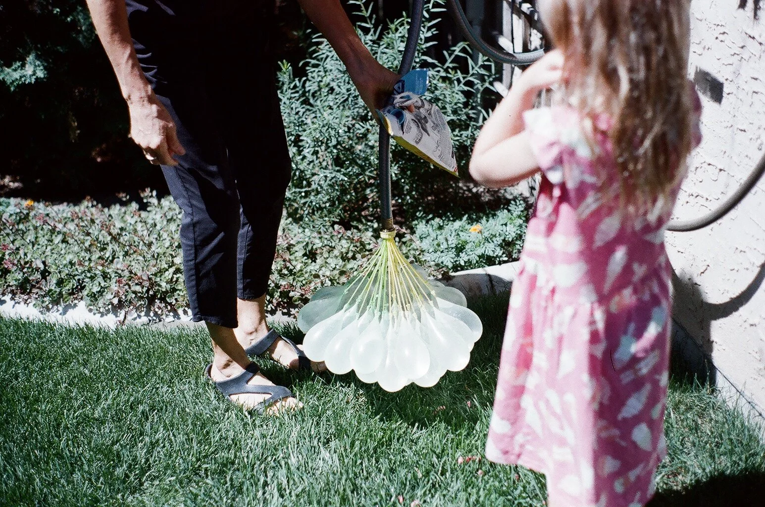
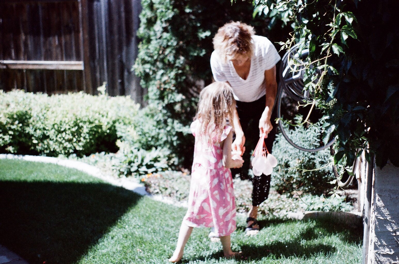
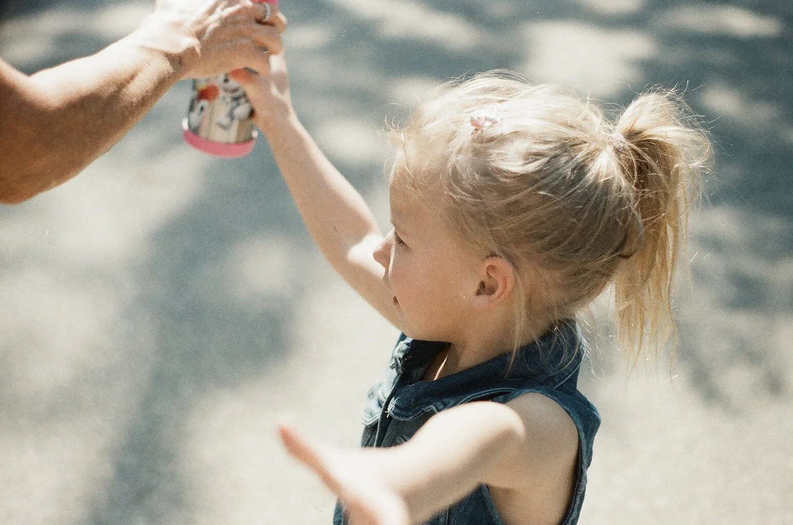
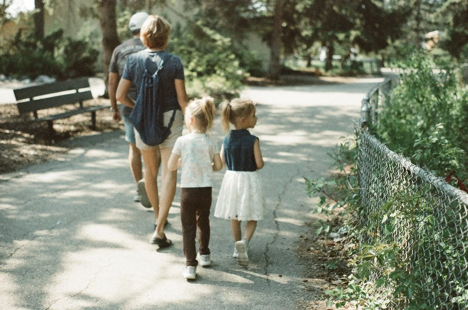
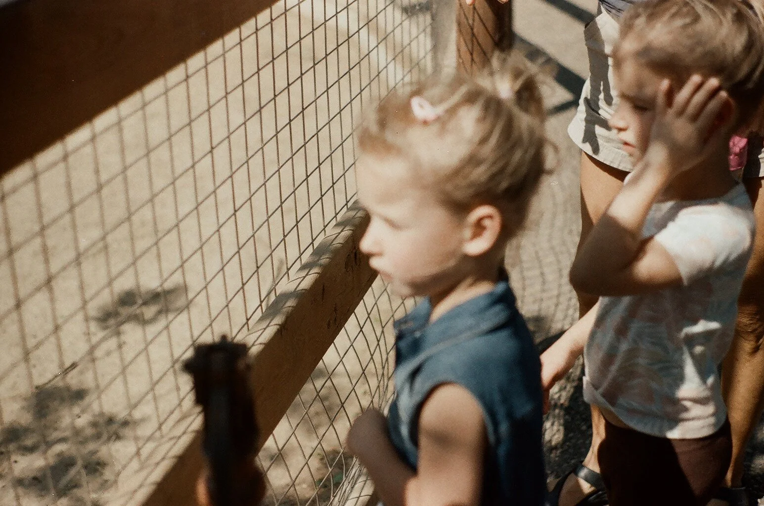
get the heck outside / spring 2025
taken with a pentax k1000; plants, flowers, time outside, and a trip to the zoo


“maybe i just need the beach?”
AIR DRY CLAY, CANVAS, ACRYLIC, JOINT COMPOUND, AND ~ONE MILLION SEASHELLS I’VE COLLECTED OVER THE YEARS
—
nothing more than a fun personal adventure when i was missing the beach during the depths of winter.


flashback: “report to the community”
dimensions when folded 7x10 in; poster dimensions 21x30 in
2012
the report to the community was an annual project i often worked on in my role at usask that summarized the biggest news stories across campus from the previous year and was primarily used as something to give out at campus and community events for free.
what was often a typical brochure/booklet, one day i thought, “maybe it could start as a book but then also be a poster?”
i wanted something that could be hung up around offices and be out of the way [imagine a desk, clutter free] once it was read to maybe make the lifespan a bit longer. the relatively new [at the time] brand slogan words acted as a nice way to introduce the stories, too.


a project that never quite happened: “our six”
In 2019 I was asked to participate in Spreadshow called “Our Six,” a local design show in Saskatoon. “We are all Treaty People” is a refrain for those inside Canadian Treaty boundaries. Participants were asked to design a logo to explore and visually portray the aspects of living within Treaty 6 territory and show the process work next to the final artwork as a visual juxtaposition.
This project was done on a volunteer/community basis and was delayed and then cancelled due to COVID-19. Even though this project never saw the light of day, I still enjoyed the process… so, I suppose some good still came out of it.
initial sketches:


a sneak preview of the final design:

digital concepts and sketches:


![“fire inside” [the story]](https://images.squarespace-cdn.com/content/v1/604bd4d554930a5adb77ab4c/1768518099512-DEQLU47HM1UJEQQDFB0J/2025+fire+inside+version+3+14.JPG)
“fire inside” [the story]
version 01, 02, and 03; version 03 was part of this collection
version one
in the summer of 2024, i made this painting one day just for me. i didn’t spend a lot of time on it and i didn’t have a plan. i just started painting, adding one part at a time and a felt like i was led by a fire inside.
naturally, i named it fire inside. it felt a bit personal so i had no current plans to sell it.


version two
in december 2024, i met this song that i loved.
“never seen a fire, like the one inside her;
even when she’s tired she could melt sierra snow
and make the goldenrod grow”
[broken bow by john calvin abney]
the song felt like music to go with this painting i did, so one night i [impulsively] bought handwritten lyrics of the song from the artist knowing i’d frame them and put them near the artwork. i recklessly ripped the canvas off the original frame and planned to put the lyrics in a frame juxtaposed next to the canvas. again, moving without much a plan, i updated the original painting to be a little more bold [and, of course, fix some parts to the original canvas that i no longer loved].


version three (the final version)
in april 2025, i had just bought this small (about 11x14 in) wood frame from a thrift store and wasn’t sure what to do with it, but it felt like a good piece for a collage…
at the same time, version two didn’t feel right anymore. i still loved the song and the handwritten lyrics, so i reframed those on their own.
and then i started recklessly cutting up the canvas art just enough so that it fit onto this wood frame. again, not much of a plan here other than knowing i wanted to collage it back together to fit in this new-but-old frame. i sorta wanted it to look like a bit of a rough mess because that is often what the fire inside looks like.
once the canvas was back in place, sort of, i added a bunch of random things to build on the story [paint, oil pastel, ‘zine cut outs, construction paper cut outs, etc] to the canvas once again led by the fire inside. no plan, no vision, just purely led by an inner fire and knew it was done [three versions later] when i felt it.
[sold in aug 2025, a few months after sharing it for sale]


![connection [mini story]](https://images.squarespace-cdn.com/content/v1/604bd4d554930a5adb77ab4c/1745600009314-YW9HKF9VNKDJLUXIB960/FullSizeRender_VSCO_crop.jpg)
connection [mini story]
mildly inspired by bob dylan’s “talkin WWIII blues”
“i’ll let you be in my dreams
if i can be in yours”


this is bob, the lil art thing i made for myself

awful quiet / winter 2025
taken with a Pentax k1000; i love when i take three months to finish a film and when i get the photos developed i see photos i forgot i took :]