

As the lead in-house designer for Peter Lucas Project Management, my primary focus was to further build their visual brand identity.
overview of work done:
a detailed brand guidelines document,
refreshed all logo variations using a grid system,
created or refreshed a variety of brand assets, included brand merch/apparel design
maintained excellent organization of all assets for easy work flow to ensure efficiency and brand consistency

The below video is a quick overview of the brand guidelines document.
I am choosing not to show too many details of this document publicly. If interested, please request to view.
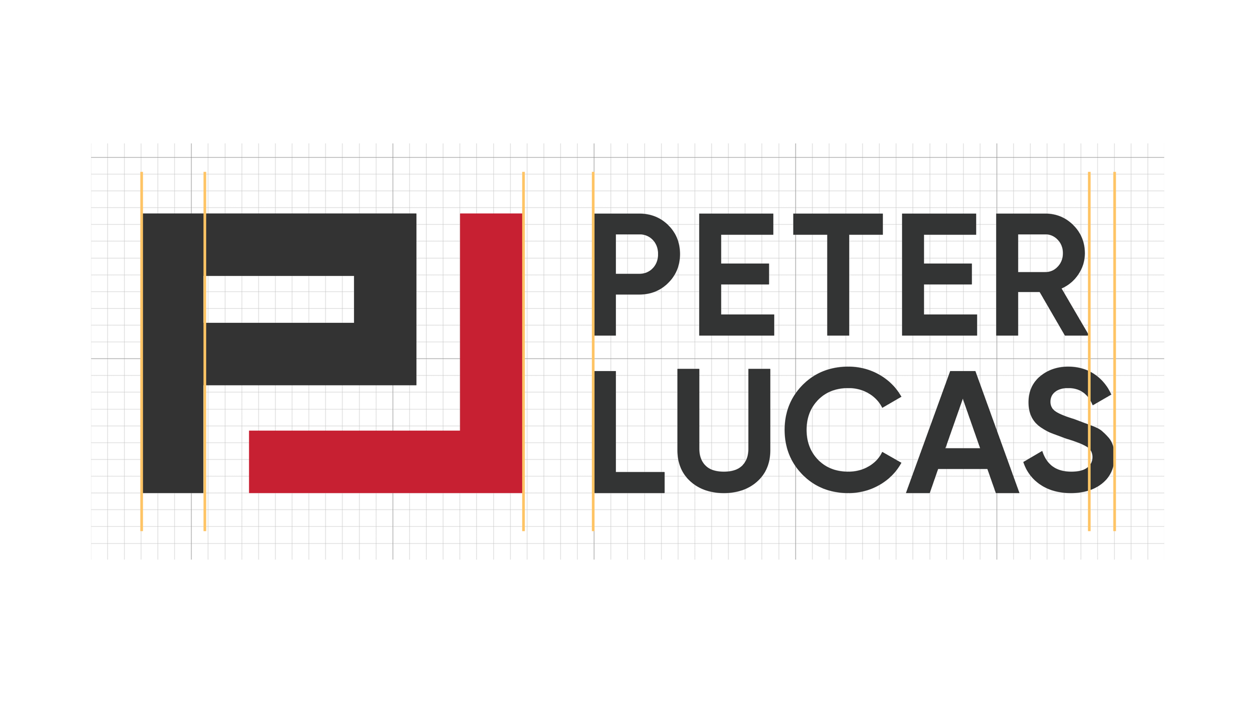
The logo ‘refresh’ was to clean up the typography and spacing between elements to better align with the rest of the brand.
This was not a redesign and I wanted to keep the logo mark as close to the original as possible as it’s recognizable to the brand.
The result? The difference between the old and new is minimal but now it is based on a grid to ensure consistency across all versions of the logo (I didn’t create the original logo).
The below images show a comparison of the updated logos from the original.
The logo mark is only used on its own in circumstances when a primary logo is near or within the document and shouldn’t be used alone without a primary logo (some exceptions apply, such as merchandise).

X
The width or height of each part of the P and L as well as the minimum white space around the logo. X is 4 grid spaces.
Y
The white space between the P and L in all directions. Y is 3 grid spaces.
The logo mark remains the same on each version of the logo and every form of measurement for the following versions of the logo are based on multiples of X and Y.
ORIGINAL
I tested a few different grid options and found that the shown grid system was the closest to the original logo mark meaning each component was extremely close to either 3 or 4 grid spaces in size and only needed small adjustments to be exact.
The square logo is best used on social media, in visual marketing documents and cover pages, and on signage when it best fits the space.

LETTER SPACING/KERNING
On this version there is approximately 1 to 1.5 grid spaces between each letter of the logo type.
ORIGINAL
The kerning of the logo type felt a bit tight between some letters and the weight (Futura PT Medium) of the uppercase letters didn’t align with the brand aesthetic.
NEW (left), ORIGINAL (right):


The horizontal logo (two lines) is best used on official documents such as letterhead, and on signage when it best fits the space.

LETTER SPACING/KERNING
Approximately 1.5–2 grid spaces between letters in order to appear like the square version as well as ensure justification.
LINE
The line separating the logo mark from logo type is 1 grid space. This is thin compared to other components to in order to be a subtle separator.
ORIGINAL
The logo type wasn’t justified, the spacing between components didn’t follow any grid stucture, and the kerning of the logo type felt tight.
NEW (left), ORIGINAL (right):


The horizontal logo (one line) is best used on official documents such as letterhead, and on signage when it best fits the space.

LETTER SPACING/KERNING
Because the height of the logo type increased, there is approximately 6 grid spaces between letters in order to appear like the other versions and to be clear when small.

ORIGINAL
The height of the logo mark is not the same height as the logo type, the spacing between components didn’t follow any grid stucture, and the kerning of the logo type felt tight.
NEW (left), ORIGINAL (right):


While the difference is subtle, the result is that the overall aesthetic of the logo looks cleaner, more modern, and more legible.
The tagline mark was an additional and optional brand asset for the tagline (not in place of the logo) to primarily use on more social, marketing, and engagement pieces when the tagline in plain text didn’t seem like enough.
Colour options were the three primary brand colours: Dark grey, red, or reversed (white).


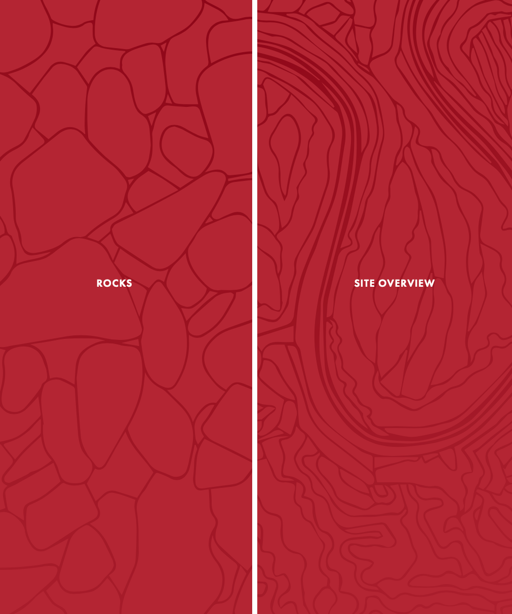
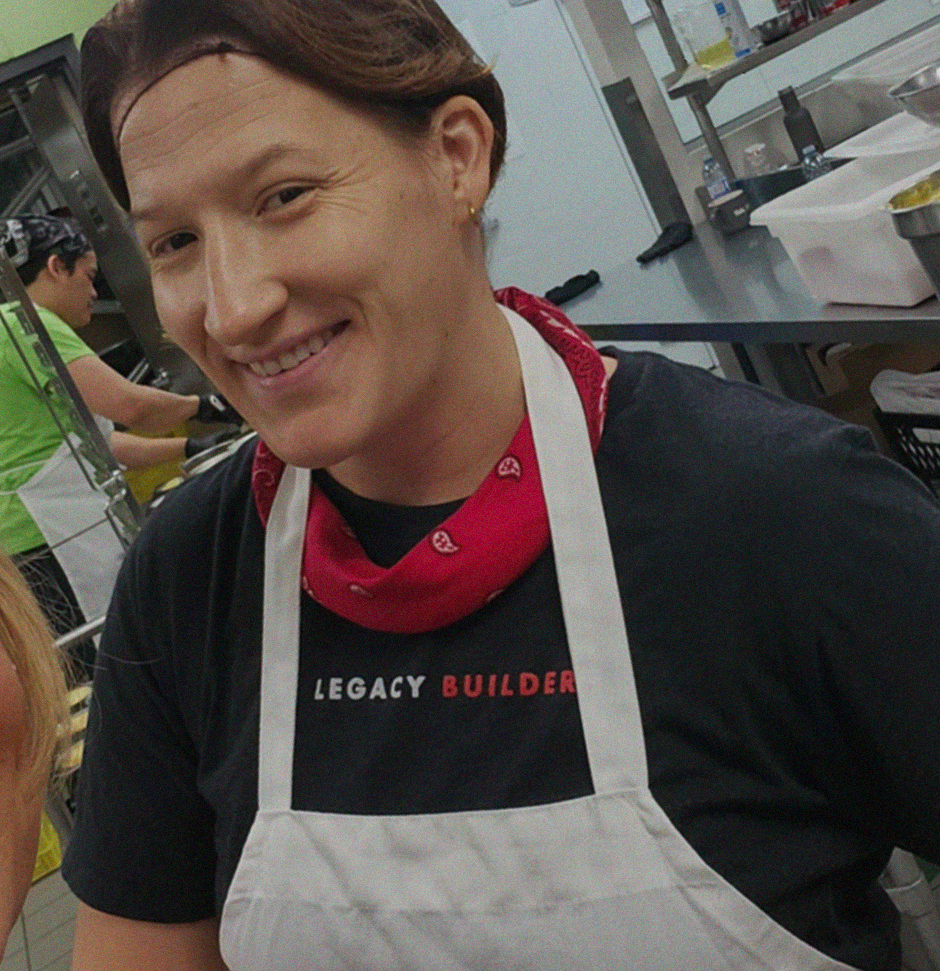
Below is the updated brand t-shirt, which includes an updated tagline, most common brand colour options for the shirt itself, and a great use for one of a few branded pattern backgrounds which were used in a variety of marketing materials.

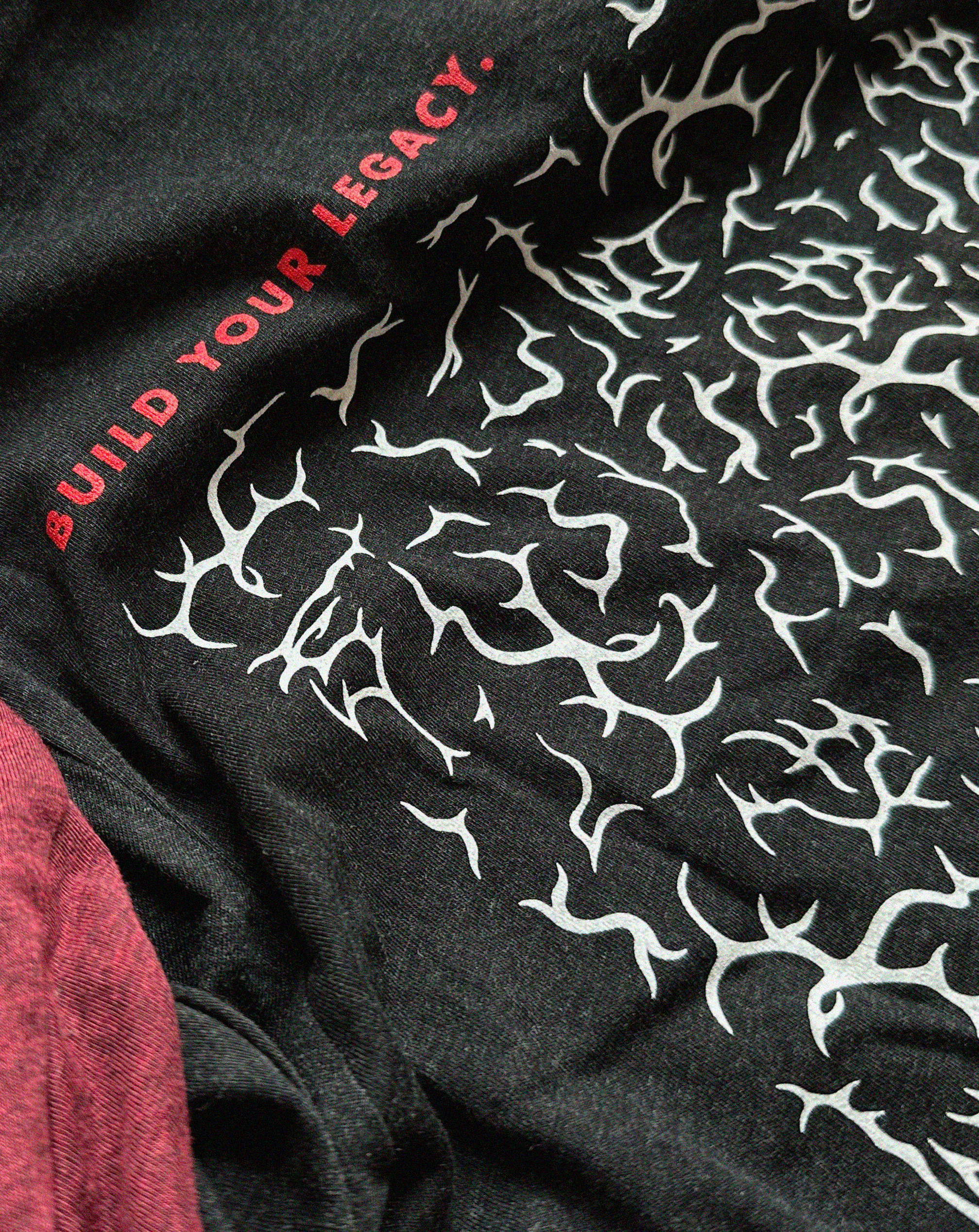
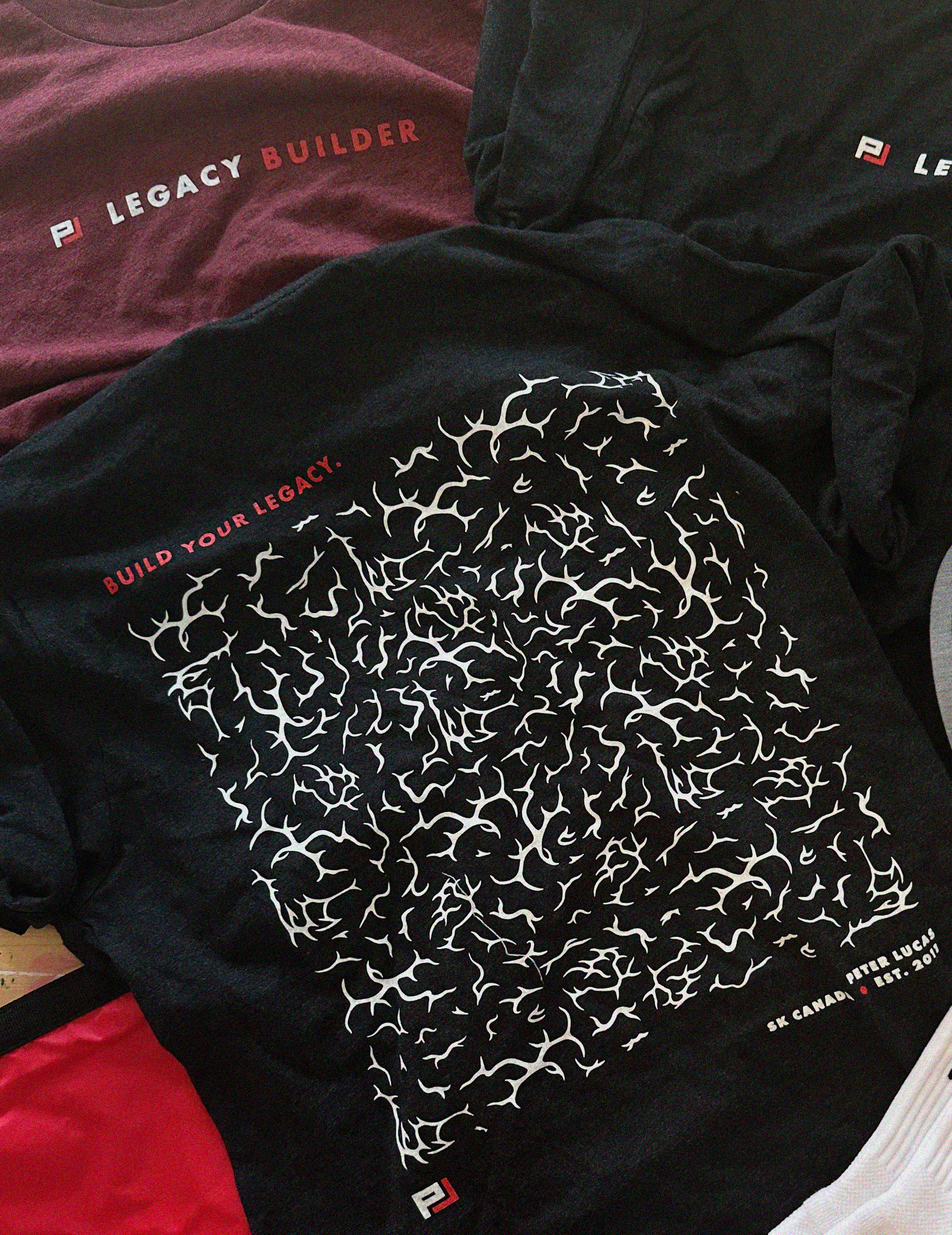
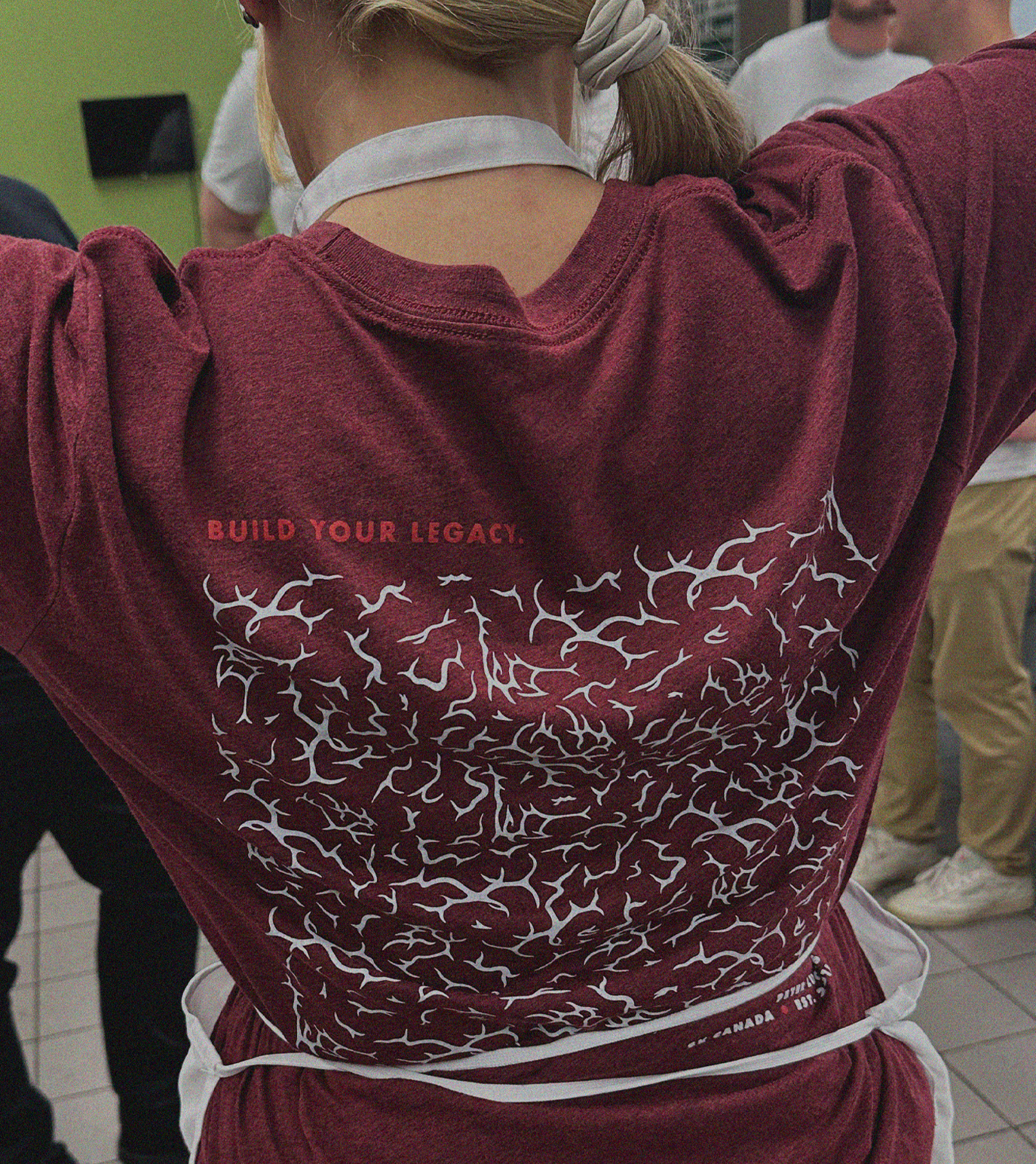
The illustrated brain pattern was drawn by hand using pieces of a previous brand element and then duplicated to create the full pattern.
The other patterns, the site overview and rocks, were traced quickly off of a couple licensed brand photos.