the rock boat: a digital onboard experience
for a ux design class through brainstation, i redesigned an app* for the rock boat, a music festival that takes place on a cruise ship.
*not a real client project. i did, however, think there is a need to improve the current app so i wanted to explore possibilities.
skills highlighted:
research, concept development, information architecture and user flows, wireframes, brand identity visual design, prototyping, user testing
Problem?
Users said it’s hard to keep track of a festival schedule when you’re in the moment—they just want to quickly glance at what shows are coming up.
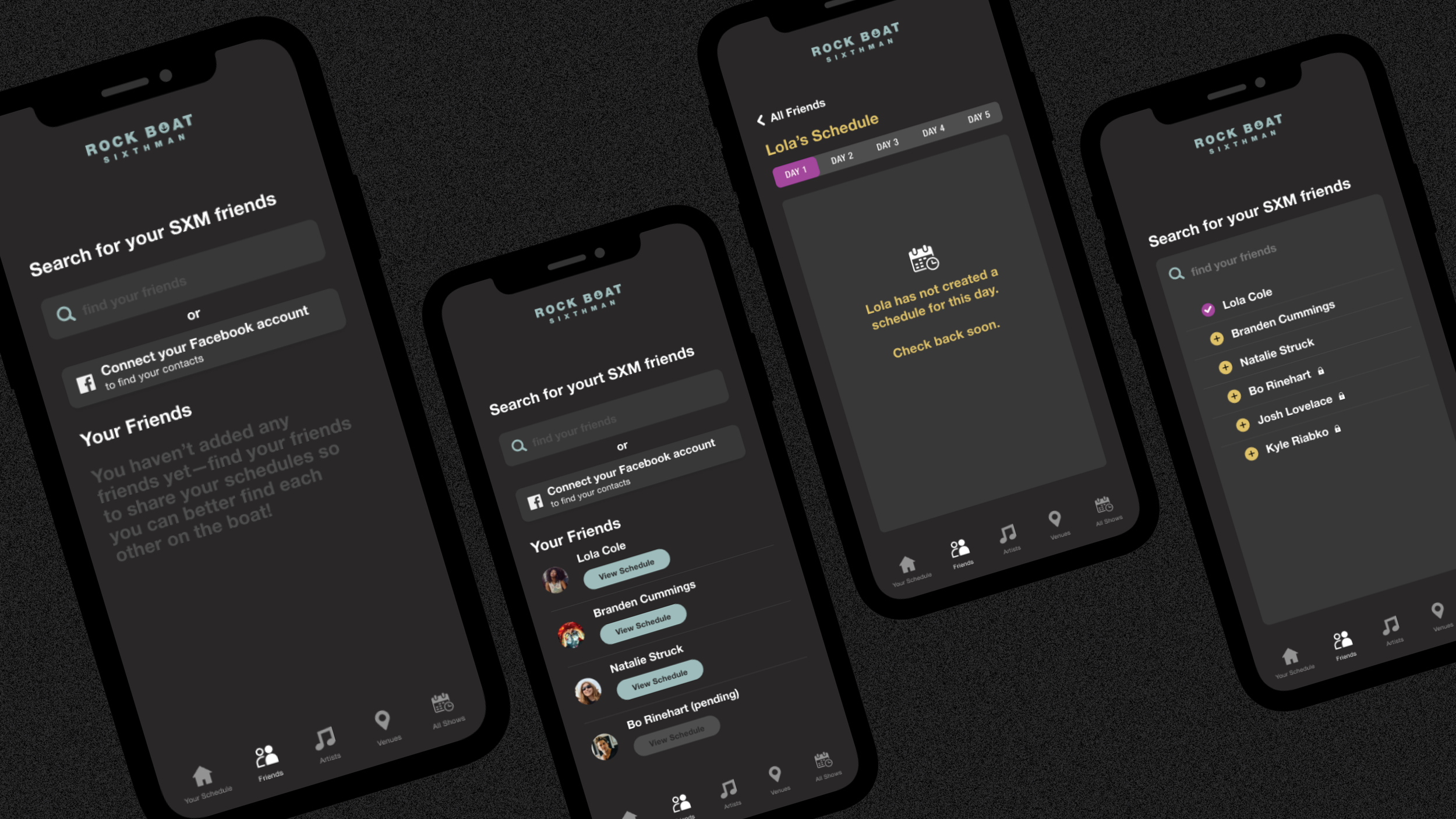
They also said they have no easy/cheap way communicate to meet (or find) their friends onboard once off the grid. A ship can be like a mini city and sometimes if you lose someone, you lose them for hours or even most of the day.
Solution:
(one)
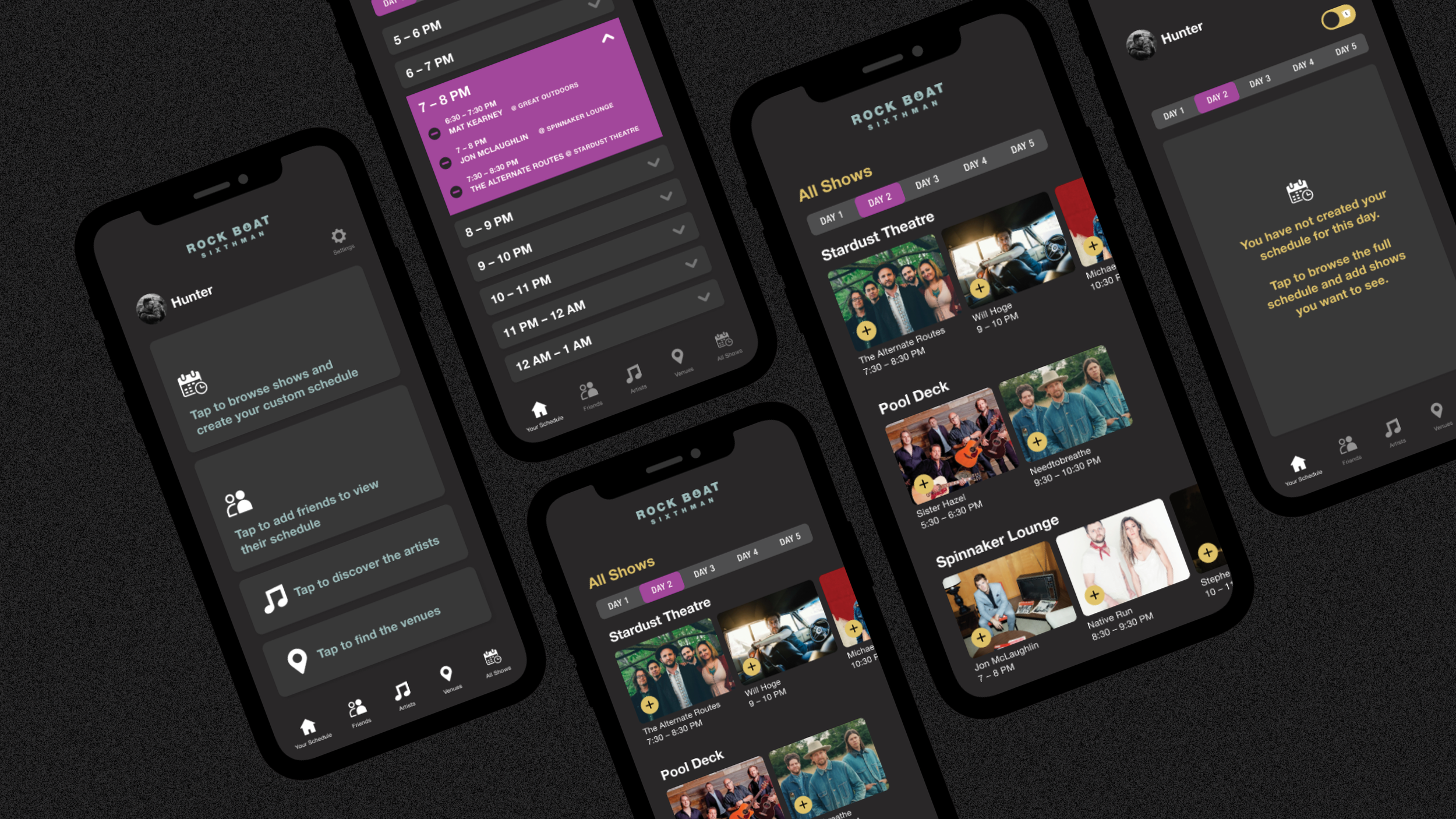
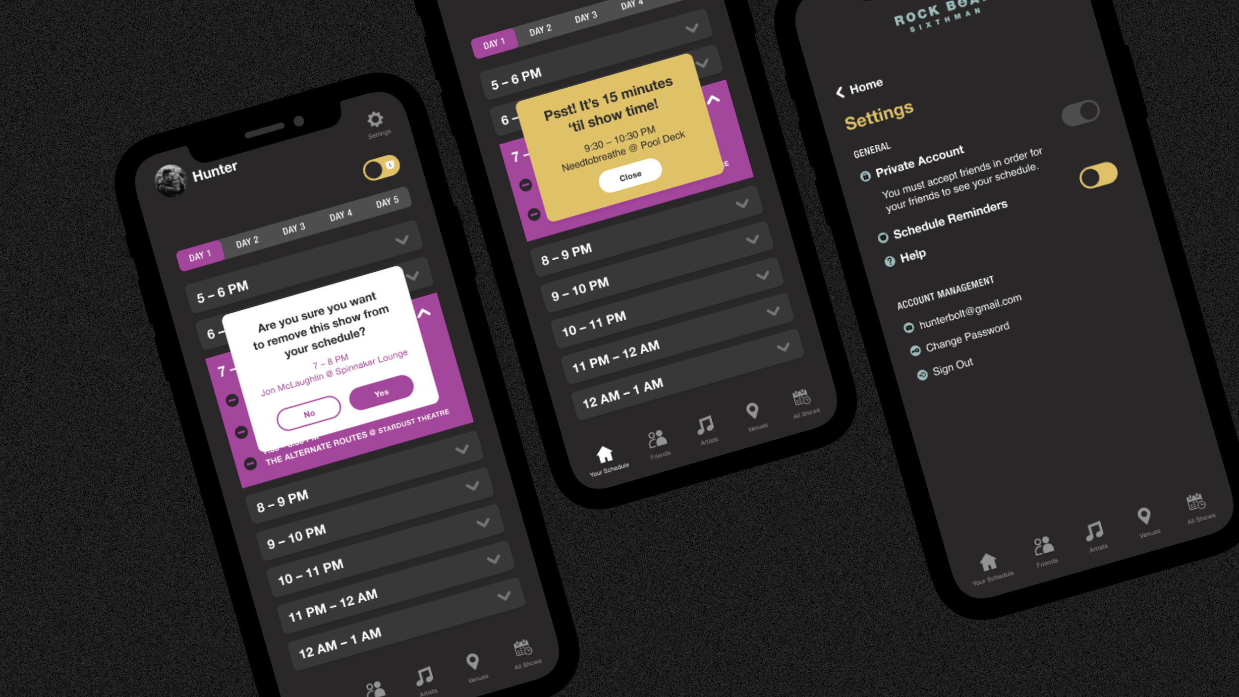
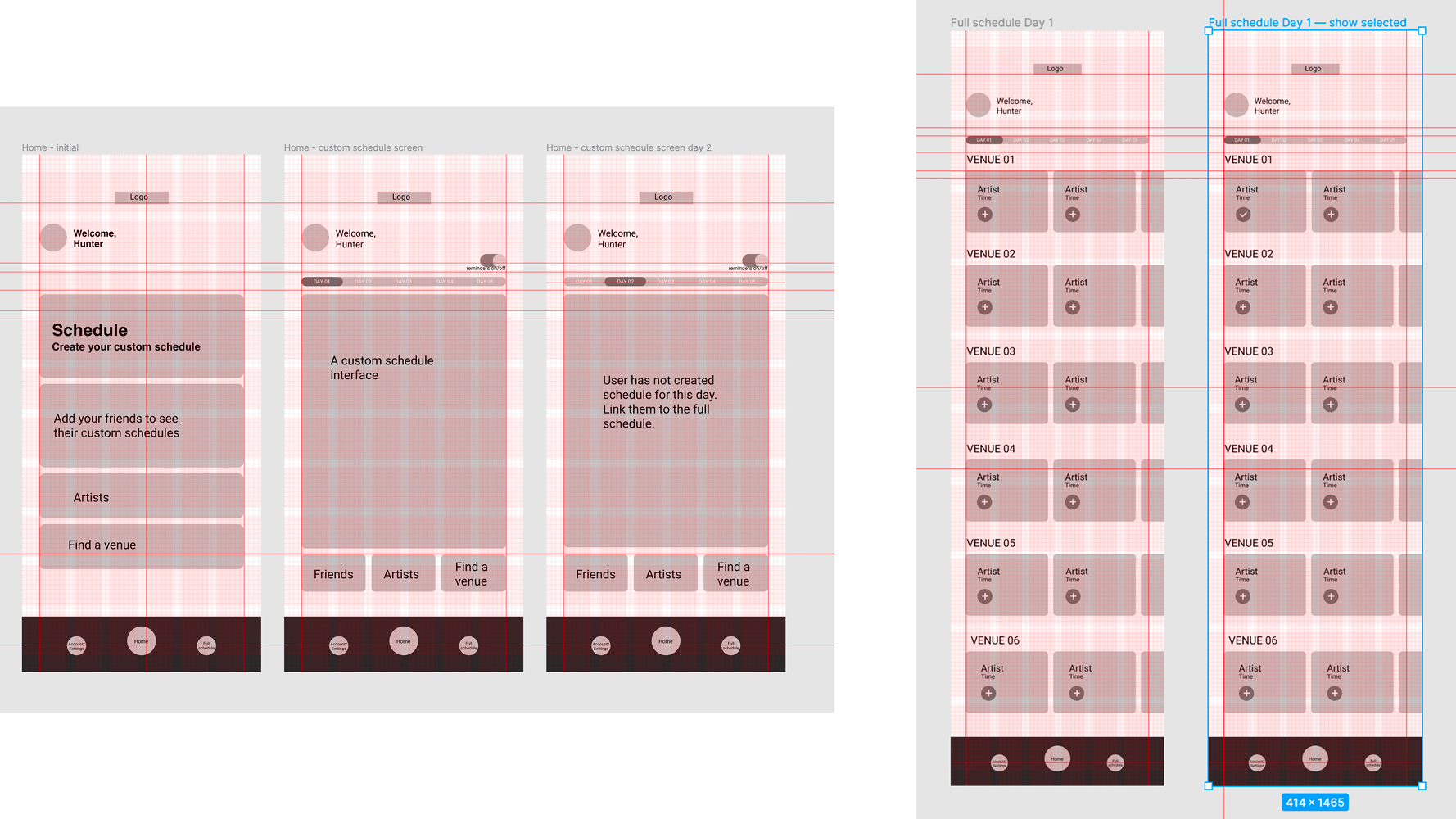
Create a schedule of the full festival with the option to add shows to create a custom schedule which would show only selected shows for the day. This wouldn’t need wifi/service in regard to their own profile.
(two)
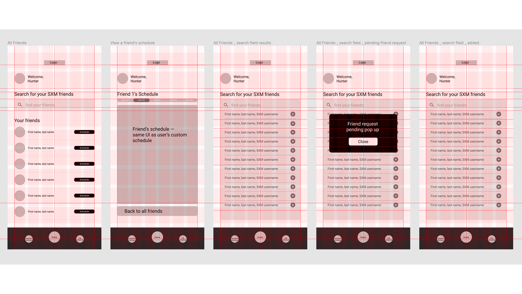
Allow users to share their custom schedule with friends on the app pre-boarding or at port stops (would need wifi or service). This way, if you lose track of your pals, you’ll have an idea of where they might be.
It’s not a perfect solution since users would be able to edit their own schedules onboard and it wouldn’t sync with their friends without service—but it would be an improvement.
Main feedback from users that would generally improve the overall festival experience?
(1) Being able to customize the schedule to only show the shows they want to go to for a quick overview of the day, and;
(2) Being able to find your favourite concert pals easier after splitting up.
Since we usually have access to the internet everywhere we go and don’t think otherwise, perhaps the biggest challenge was to figure out a way to give users all this without wifi or cell service.
While it is possible to buy internet to use onboard, users say it is expensive, isn’t reliable, and that they don’t usually bother as they don’t come on this trip to be connected.
The average age for users is people (men and women equally) in their 30s, 40s, and sometimes 50s. Based on the collective research (I asked a Facebook group of thousands of real users who attended the festival), I decided to keep the app to the point, giving users only what they need without being distracted by too many unnecessary features.
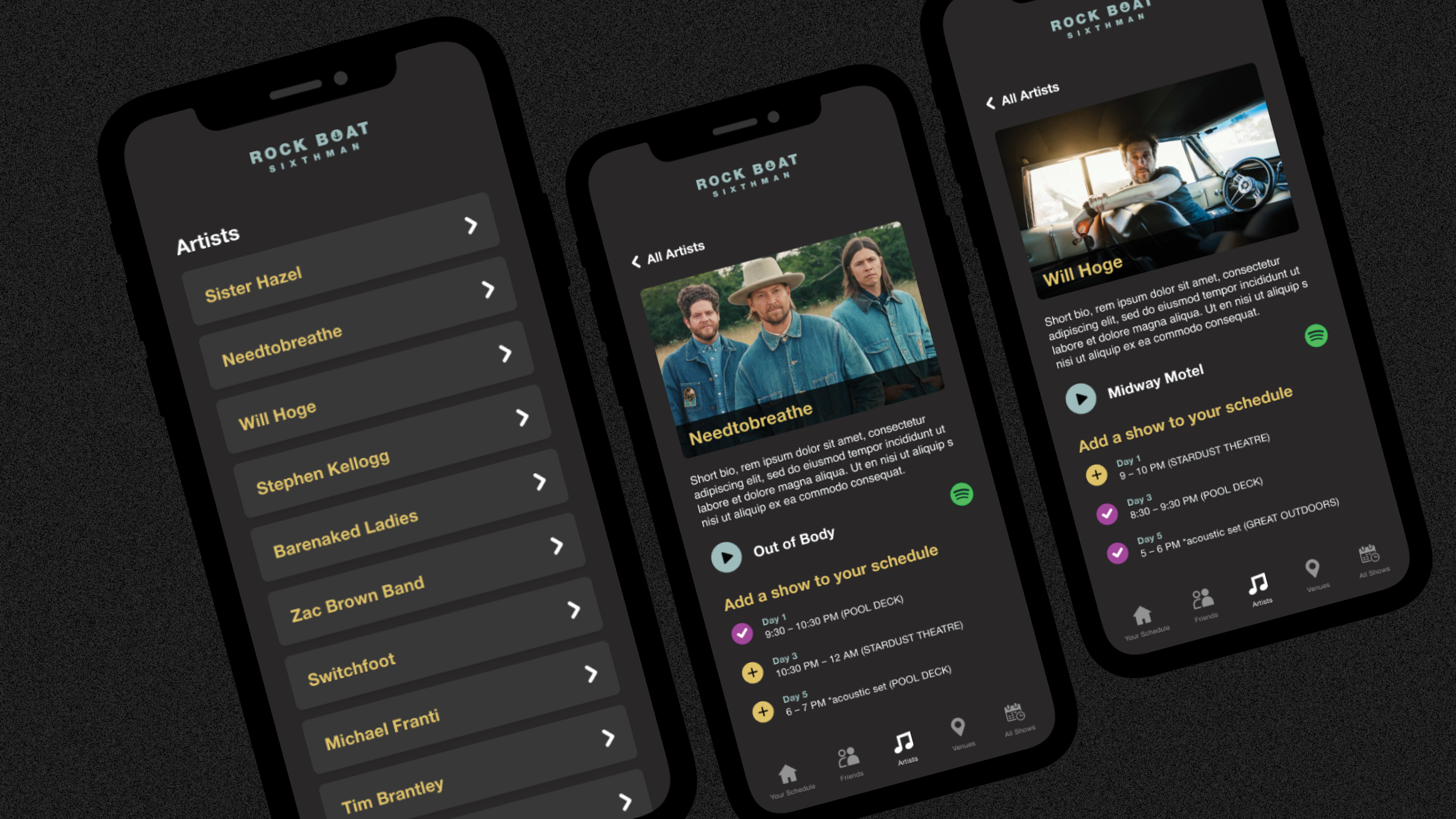
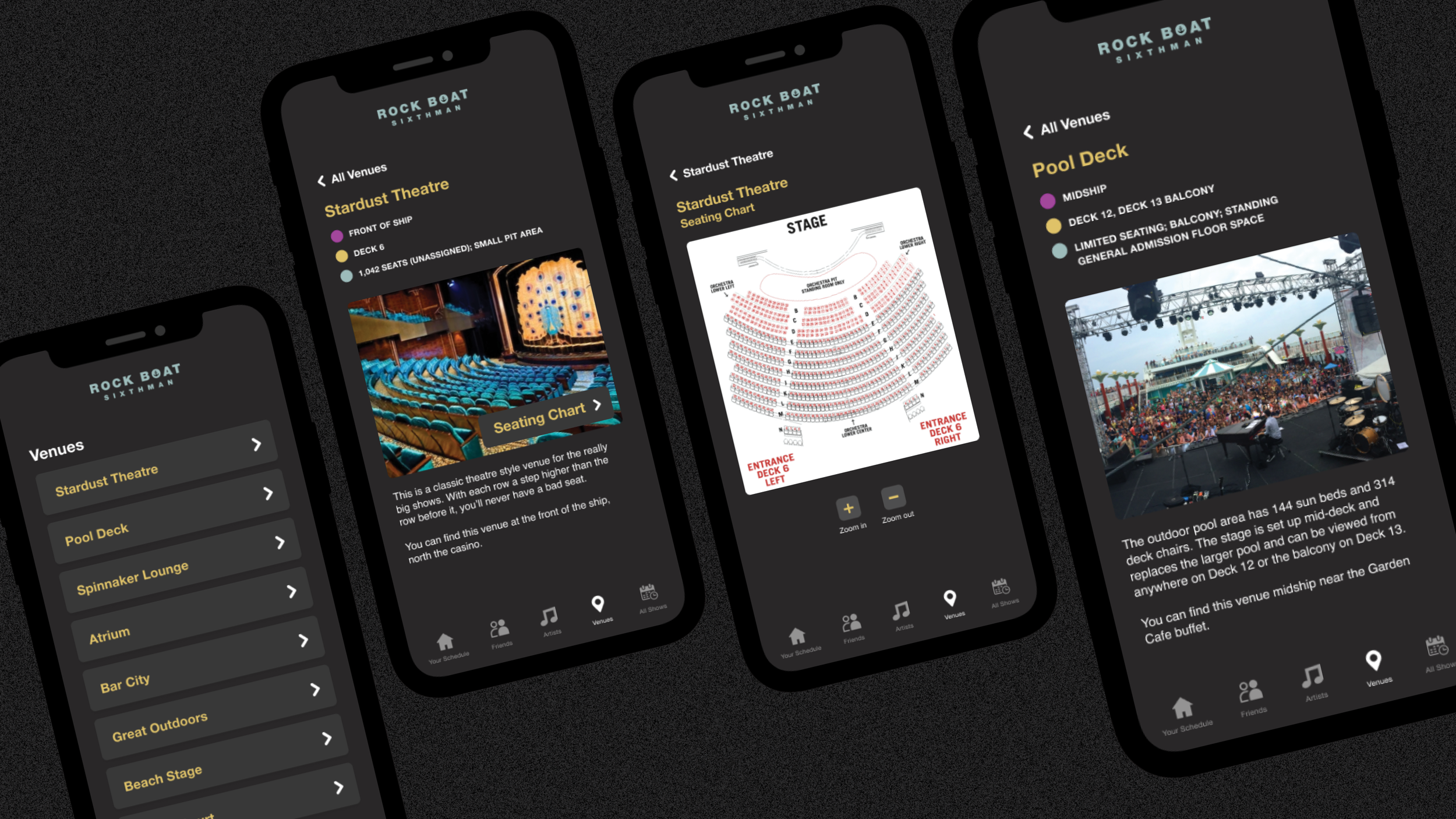
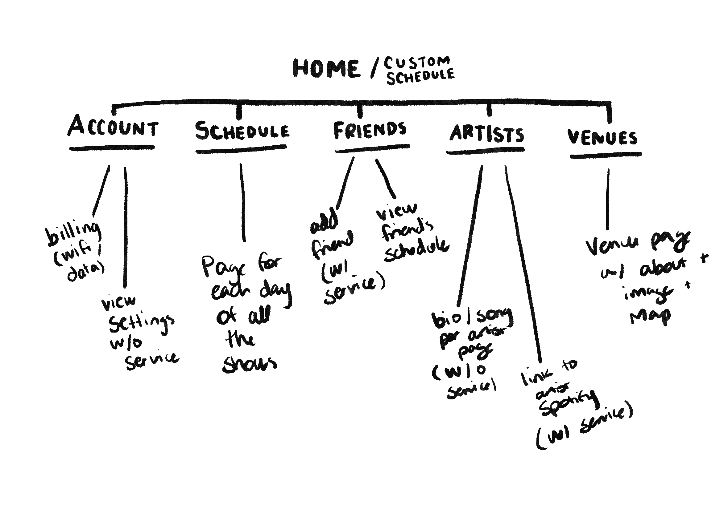
I decided on these six key pages:
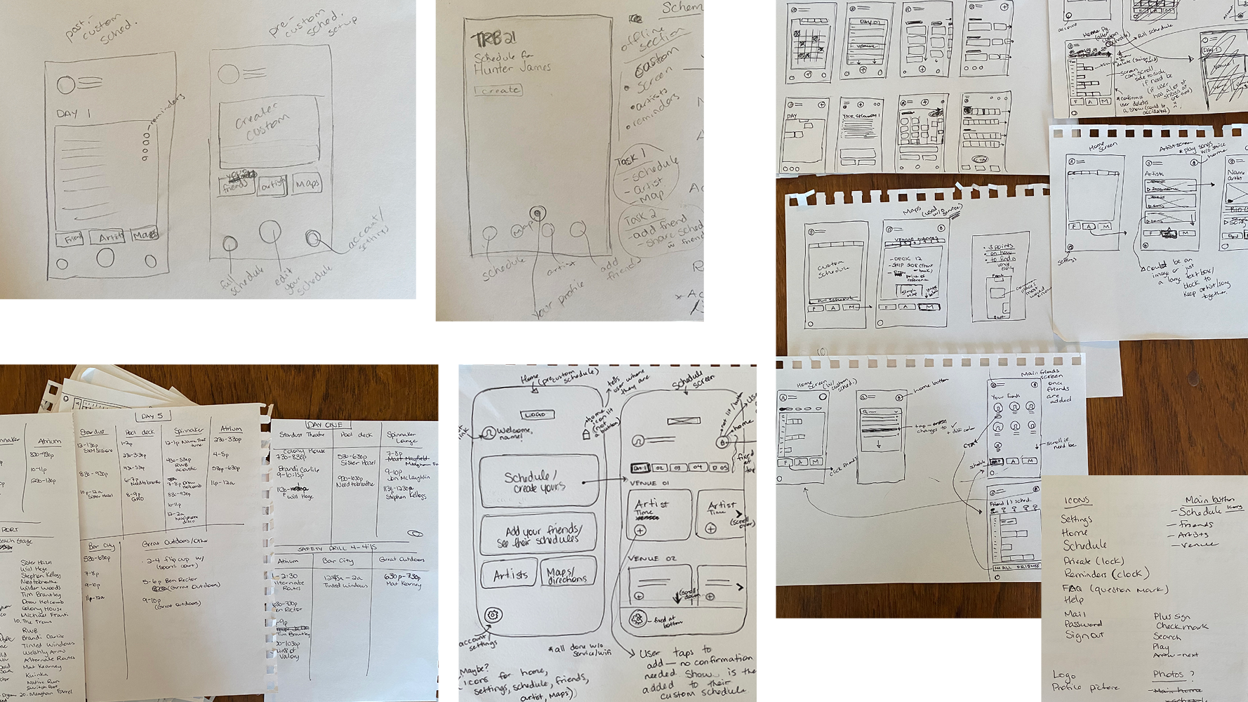
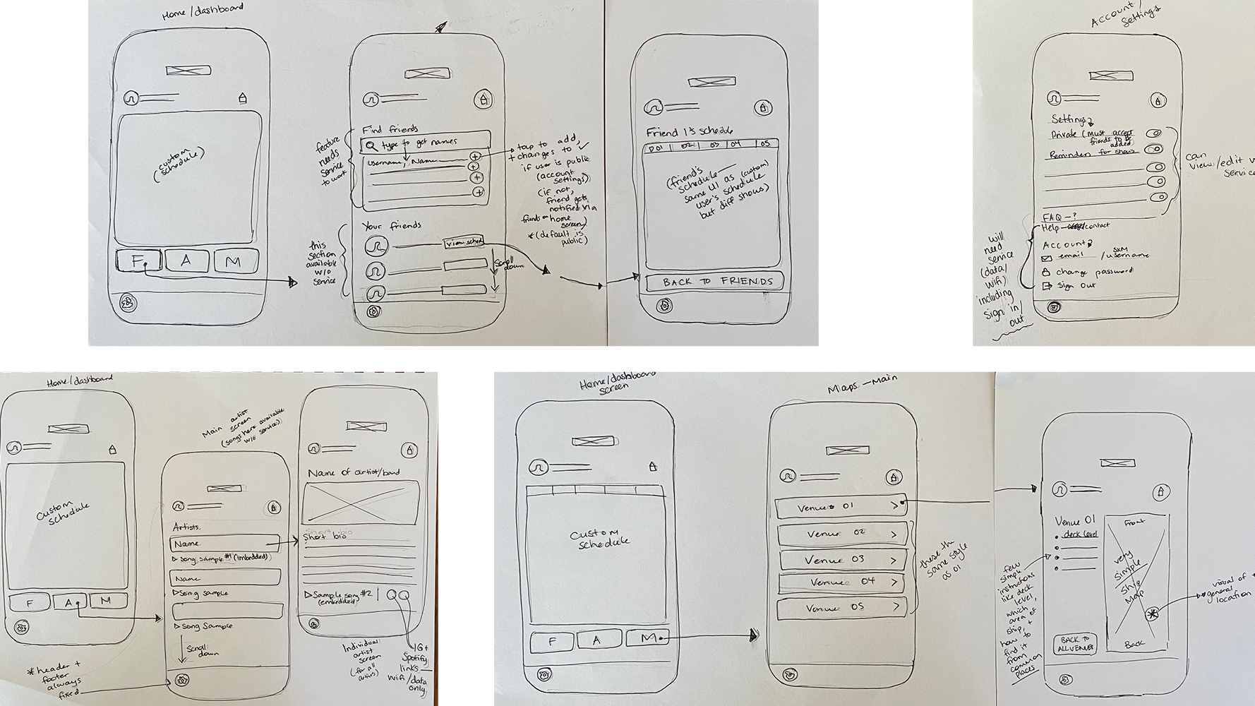
Below are a few (very rough) sketches and wireframes.
About my process:
I get user and client feedback at this stage but I emphasize the imperfections and that they are only ‘big picture concept.’
I don’t spend too much time making iterations at this phase unless something is completely off and tend to treat this stage just as a way to get the ideas out there.
As soon as I see the ideas as physical sketches or wireframes and am in general alignment with the client or user’s feedback, I have enough clarity to move on to refining the details as well as adding the brand visuals.
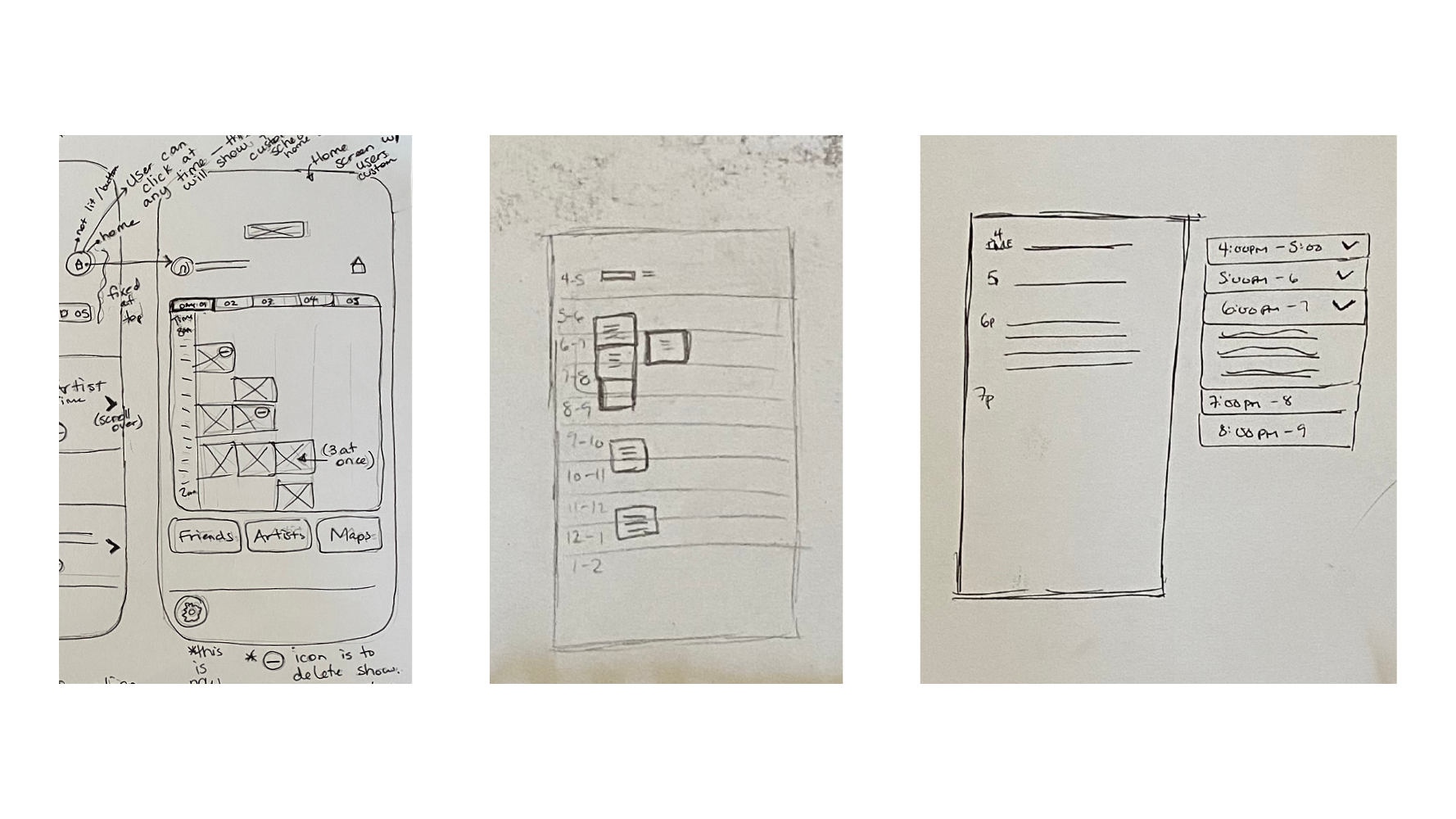

The challenge?
The custom schedule screen was the most challenging screen due to most users typically keeping their festival days busy. At first I wasn’t sure how to make it work while keeping it clean and simple.
I skipped doing a sketch or wireframe of this screen all together and it wasn’t until much later in the process that the expandable/collapsible drop downs for each one hour time slot (and organized by day) came to me, likely once I saw other pages with more visual clarity.
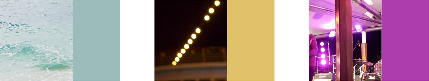
The brand aesthetic ended up being something between a rock concert and something nautical.
The blue represents the sea, the yellow and magenta represents stage lights, and the dark mode feels better on the eyes when you’re looking at the screen either outside in the sun or in a dark venue.
The below final screens show the home screen, a couple instances of a custom schedule (complete and incomplete), the full schedule, some reminder pop up notifications, the friends screens, a page for each artist (for discovery), and a page for each venue (for information).