usask stories
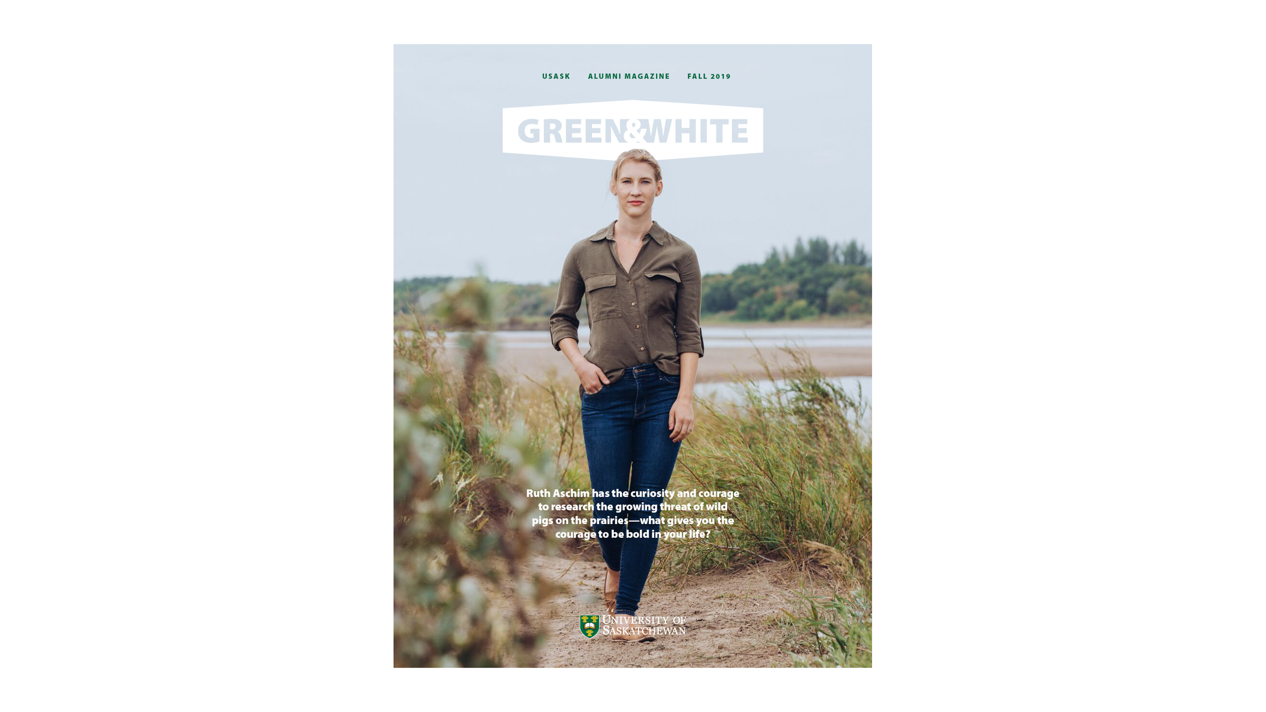
as part of an overall usask campus rebrand my team was executing, one asset was this graphic shaped like the notable building signs outside each building on campus.
long overdue for a new cover design for the alumni magazine i had been working on for years, i realized one day that that this graphic and the shape of it just screamed “magazine cover masthead.”
[my editor finally gave me a yes]
when this new cover was received well, my team and i agreed to bring this to many other campus publications to create some much needed brand consistency among those.
skills highlighted:
visual identity design, brand adherence, magazine/editorial branding, editorial design, creative direction, visual storytelling, graphic design, logo design