the story behind the art: “all lemons”
from this collection
“all lemons”
mixed media collage on upcycled canvases [8]
the main purpose of this work was to upcycle and reuse stuff nobody wants; most of the paint and materials were stuff i no longer wanted but didn’t feel like i could toss, stuff i rescued from thrift stores, pieces of my old artwork i didn’t want or like anymore, and the background is made from a lot of magazine cut outs that i saved from a literal dumpster once.
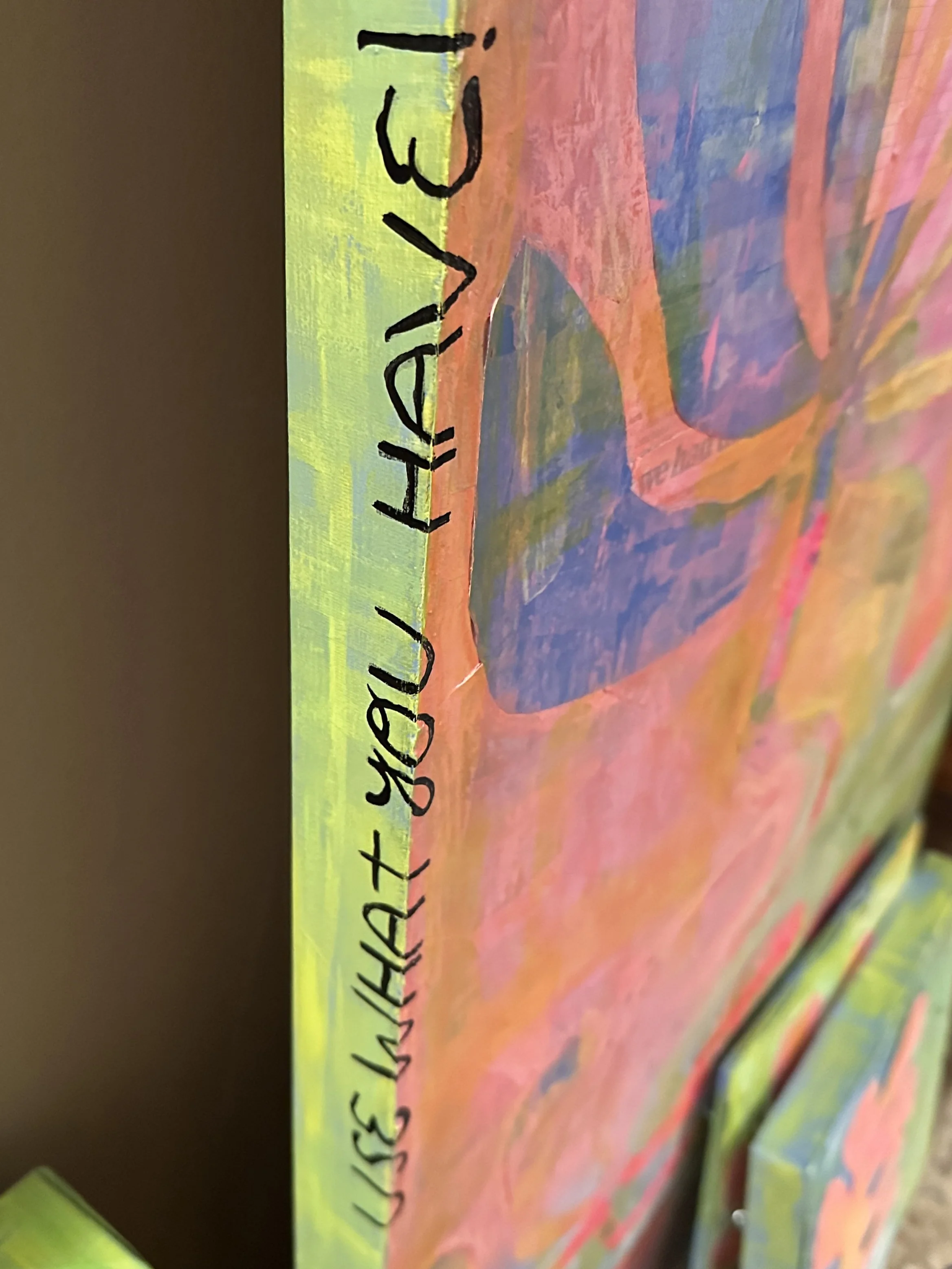
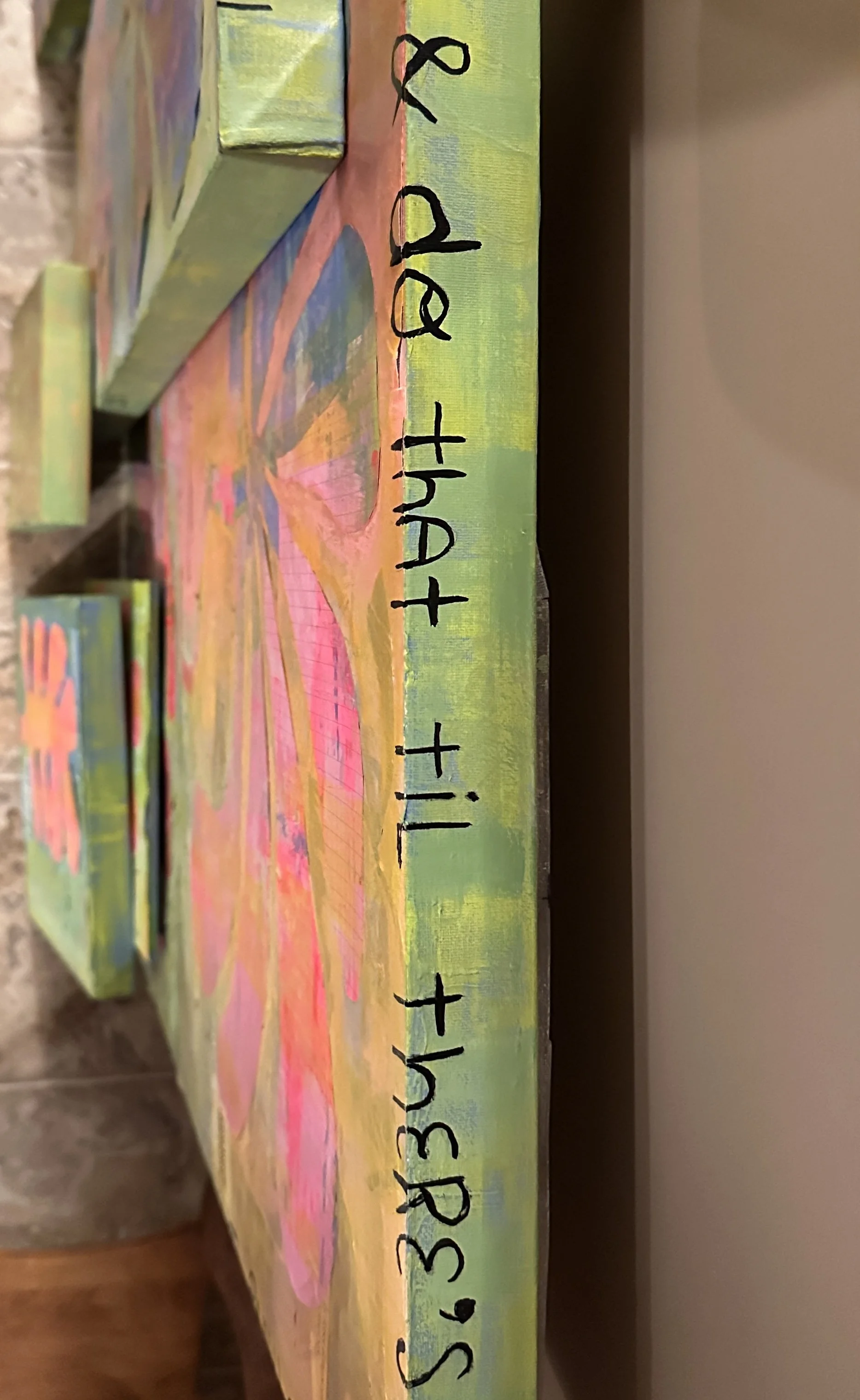
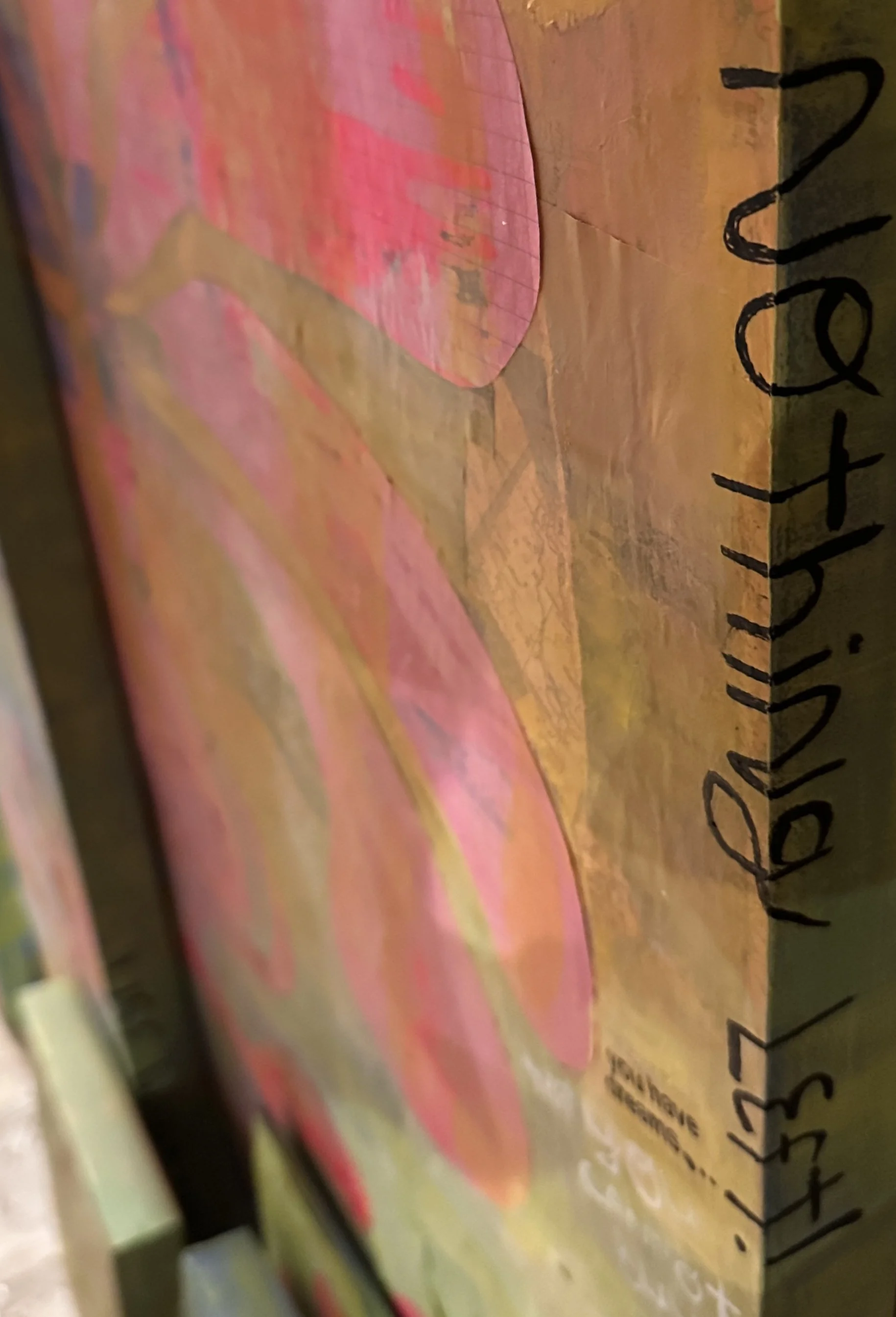
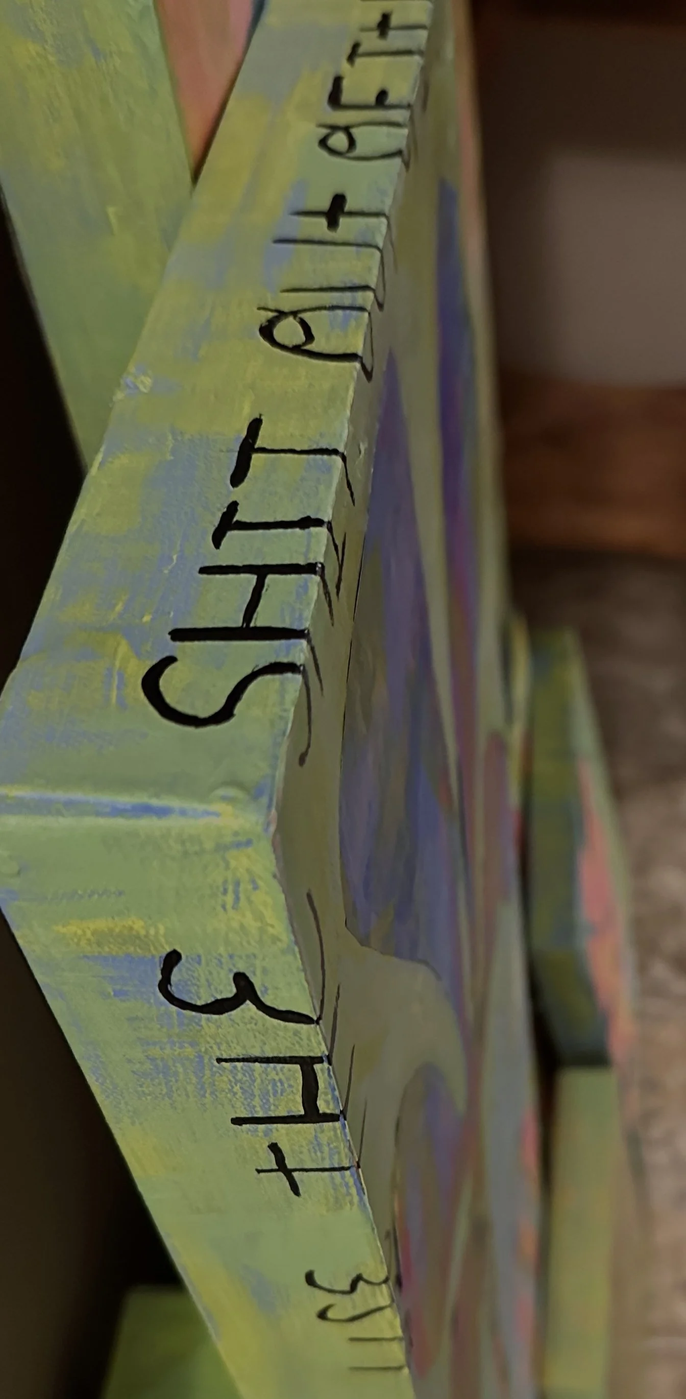
these pieces are made of ‘lemons’… and into something new and likely impossible to duplicate. the work is unrefined and chaotic with layers i can’t even recall and every part of each canvas including the sides have a purpose, is being used, and has something to say.
[not yet available to purchase; done for artist exploration and development]
——
read more below
“headstrong” details
20×20 inches
my hope is that when people see this work it inspires some sort of action towards a better way of thinking, being, and living.
avoid buying new products you don’t need and to shop secondhand more [even if brand new is within your budget——amazon, dollar stores, and temu fit many budgets]. plenty of stuff already exists in thrift stores, in secondhand online marketplaces, estate/garage sales… they might just require an ounce more effort than hitting ‘add to cart’ and having it show up in a day or two but at what cost?
buying second hand may be about saving money for some, but it should be about taking small, intentional steps for everyone, which goes for anything in regards to sustainability efforts.
“’til nothing’s left”
23.5 x 38.5 inches
the process:
while working for an estate sale set up, i found a crate full old national geographic magazines. i always thought they were cool but was told, “nobody will buy those, there’s too many, throw them all away.” reluctantly, i did… but i took a few.
the backgrounds of the first five canvases come from those. the others are from other old magazines also found at estate sales——“earthly paradise” started as a collage of cut outs from a 1975 playboy mag […the more you know]. that particular issue had a lot of hippie/nature type of photoshoots happening… so i thought it fit.
“something to love”
12x36 inches
i was a bit more intentional with the background collage of “headstrong” and “work/play” [the two 20x20s], which i did last, because i wanted the magazine pieces to tell a bit more of a story and i had the magazine material to work with so that’s why you may see slightly more of the background on those.
“work/play”
20×20 inches
“headstrong”
20×20 inches
after each, each canvas got a watered down layer of acrylic——enough to show a paint colour but not be opaque. for most, i painted graph paper in similar colours in a chaotic way. no structure, just paint to paper. when the paper was dry i did cut outs [end of life matisse-style] of different typical botanical plant shapes and glued those on.
for the last two [the 20x20s], i did a little of that but didn’t want to make them too much the same so i also grabbed some of my old oil pastel plant doodles and made use of those.
“earthly paradise”
8×10 inches
“think and feel”
11×14 inches, on wood board
after all this, i just filled in the gaps with acrylic and oil pastel to make the background and foreground feel like one and feel more complete. some backgrounds ended up needing to be more opaque, some less so. there were always a few pieces of words and phrases on each that i wanted to ’stick out’ more than others though so i did my best to maintain those throughout the process.
“time and change”
12×12 inches
“treasure”
15×10 inches
and lastly…
i added words [of course] and decided to make the edges feel like part of the painting to add to the story of nothing wasted or using all we’ve got.