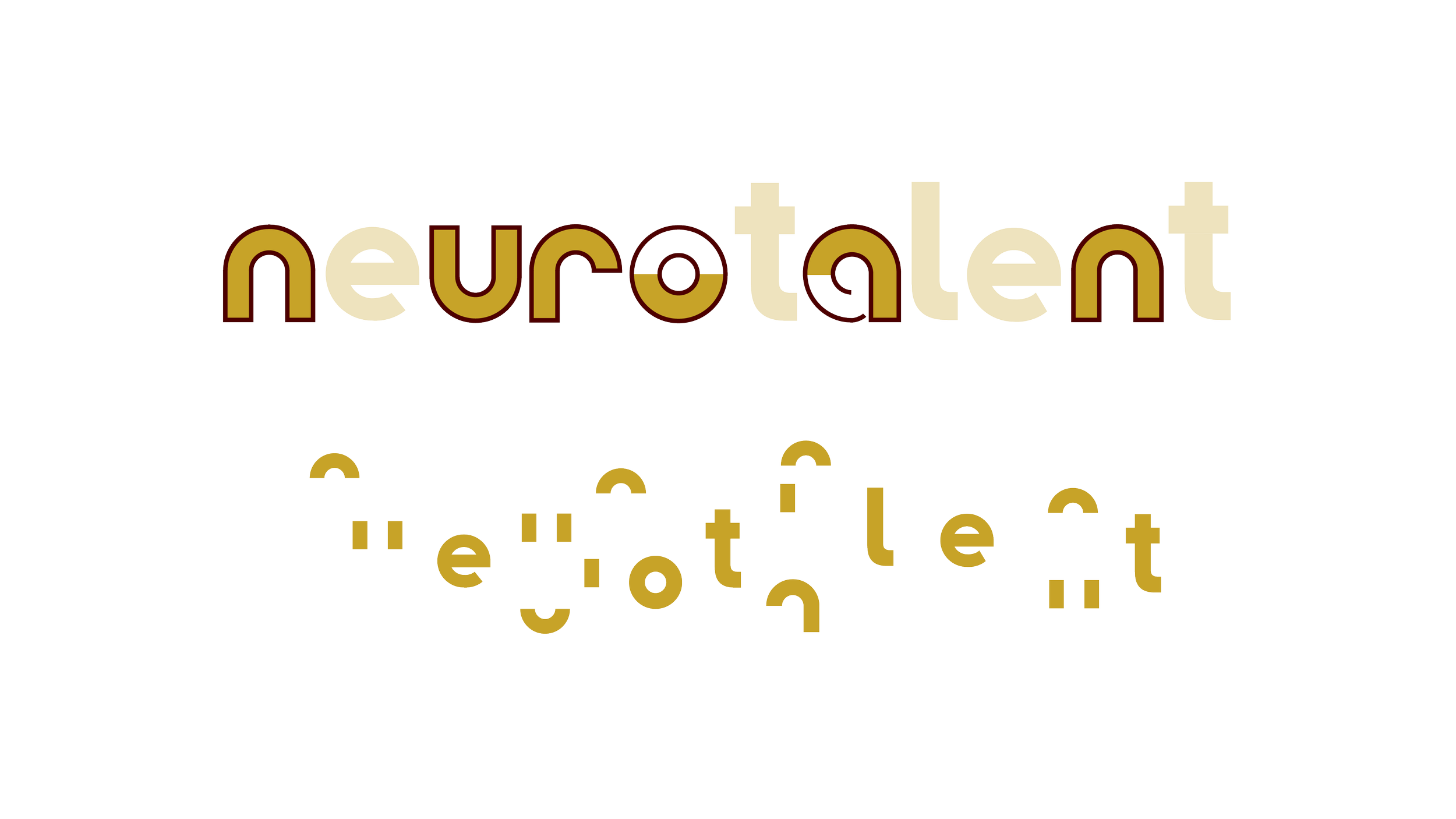
I created a visual brand for start-up, NeuroTalent Consulting, a company whose mission is to create a better hiring experience and outcome for neurodivergent talent.
The icon symbolizes new beginnings, transformation, and growth. In other words, it reminds us of new possibilities and a new way of hiring. The logotype was then built custom from various forms within the icon.
Brand visual identity creation
Logo design
Brand guidelines
Social media template creation
Creative direction
Graphic design
Custom type design
The letter forms are deconstructed below to give a better sense of how I put the shapes together to create the logo type.
An early concept; The bottom exploration found itself as part of an alternate logo.
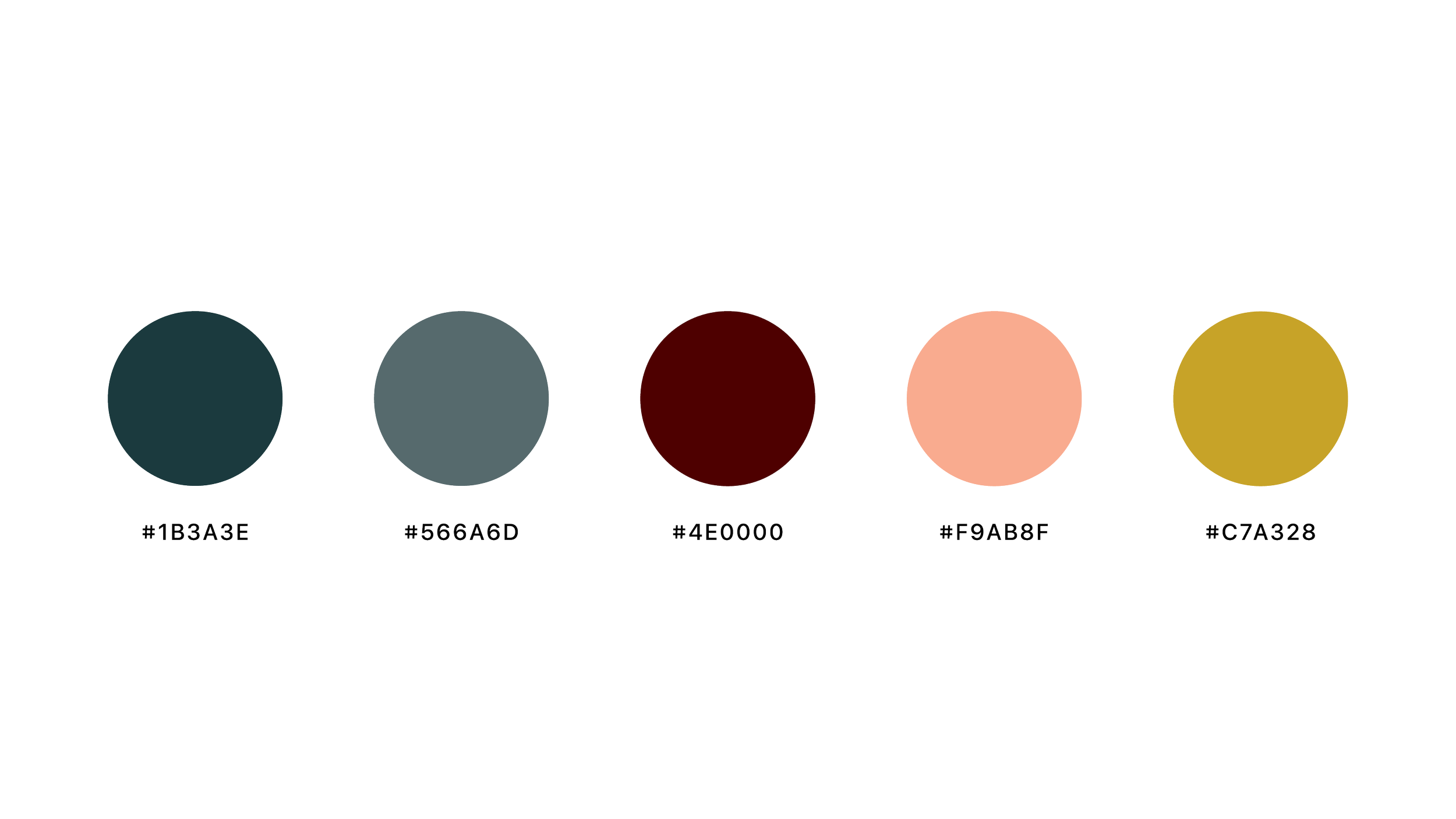
Colour palette
With all the different elements and visual options, a vibrant and diverse colour palette for a company with inclusion and diversity at its core, a bright and colourful palette made sense.
Teal combines the calming properties of blue with the renewal qualities of green and represents open communication and honesty; burgundy and coral work together to portray ambition and wealth at the same time as warmth and acceptance; and a deep yellow to portray diversity.
With having a diverse colour palette, I paid close attention to accessibility and tested some colours at colourcontrast.cc to find which colourways would be most accessible for different circumstances.


