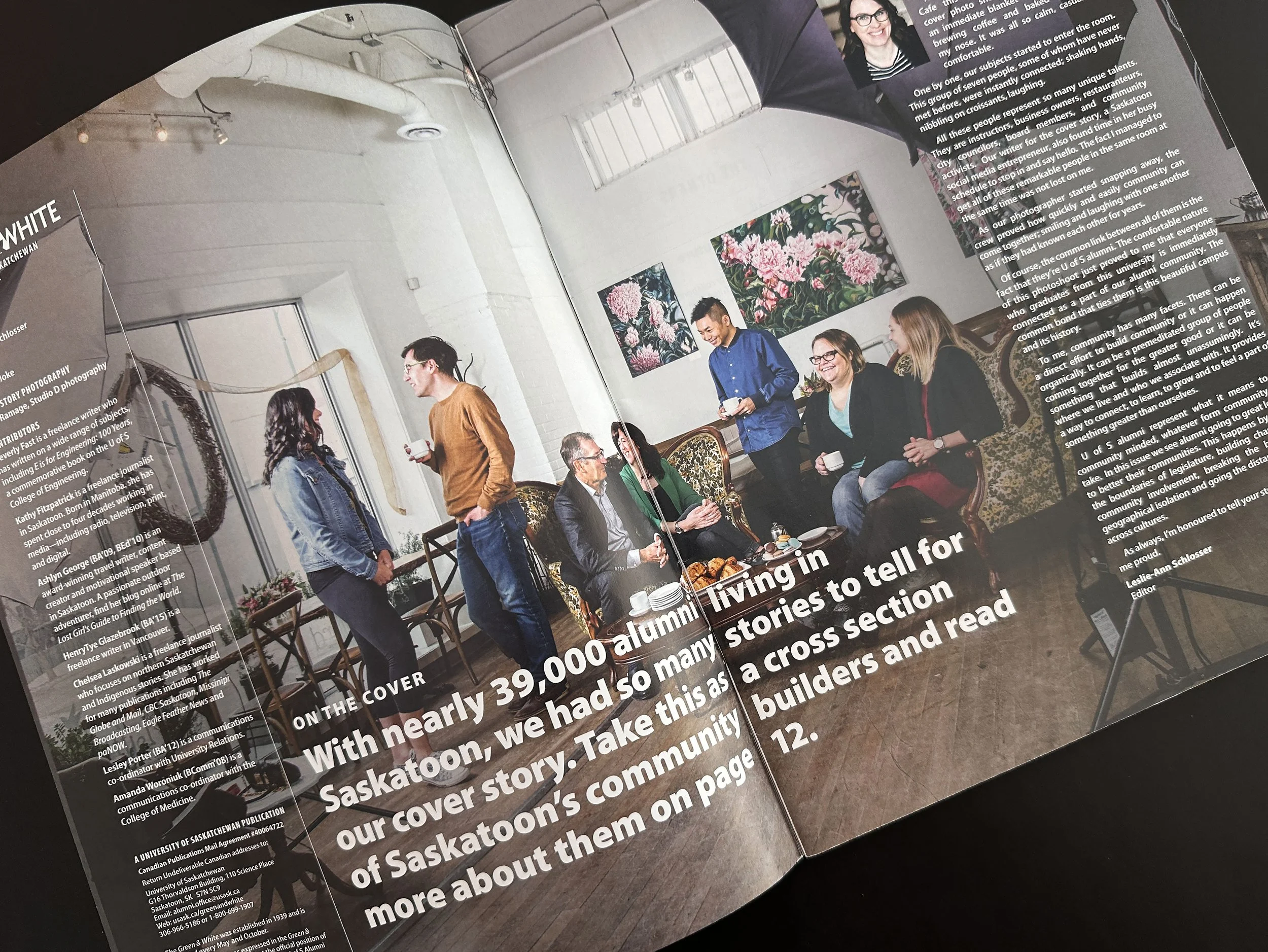
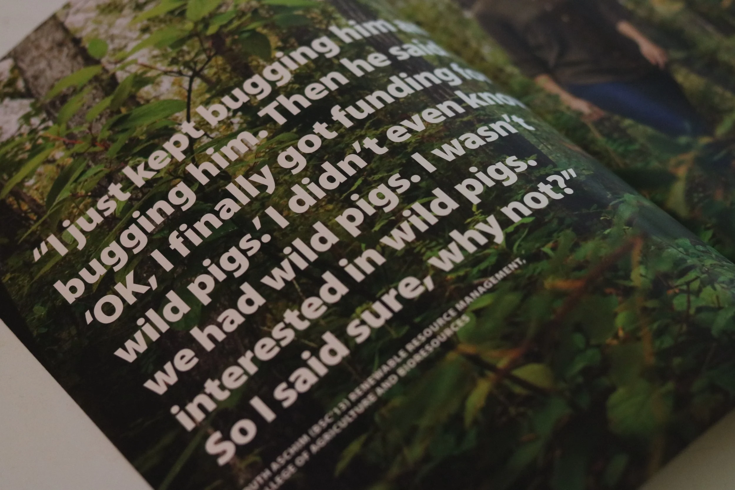
This is a brief overview portraying strategic creative direction for two of my favourite issues of the USask alumni magazine, Green & White, that I worked on during my years there.

Visual content organization/planning
Creative direction
Graphic design
Visual storytelling
Photo editing

The theme for the fall 2019 issue (selected by the editor, John Grainger) was ‘courageous curiosity’. My focus for this was to work with the images (a mix of professional photoshoots, supplied photos, or stock photos) as well as finding the little nuggets (as I like to call them) for pull quotes in the stories that generally encompass that theme specifically.

John wasn’t set on any particular feature article being a cover story and gave me a lot of creative freedom, so when I saw the quote by Ruth Aschim (inside front cover) that felt fearless and adventurous, I knew that was the one. We (John, Ruth, David Stobbe [photographer], and I) then worked together to capture a few feature photos to work with that quote.

The intention for the cover photo was for her to look boldly courageous. I had an idea to have her a bit further away and walk directly toward the camera looking focused—and when I saw the shot on Dave’s camera I immediately knew it was the one.

“I had an idea to have her a bit further away and walk directly toward the camera looking focused—and when I saw the shot on Dave’s camera I immediately knew it was the one.”

The theme for the spring 2018 issue (selected by the editor, Leslie-Ann Schlosser) was ‘community’. We knew the cover story was going to be this one [which featured a handful of local alum-turned-entrepreneurs] and we wanted to create a feature story shoot that would show the character of all the people mentioned in the one story in their element as well as give it a real, authentic community feel.

I visualized this shoot this way rather than just on location somewhere posing and I wanted the cover photo (the group shot) to actually look like a real meeting of community entrepreneurs gathering for lunch.

At the time I had just seen some of Studio D YXE’s work and I had a feeling they’d be good for this kinda work. I wasn’t able to attend the shoot but I communicated the vision the best I could to Leslie-Ann. The cover shot, which was taken at a local lunch restaurant/bakery, turned out to have a very welcoming feel—and the inside front cover shot was a mere extension and candid version of it.

The ‘dirty frame’ of the inside front cover shot worked to show the real meet-up of entrepreneurs because that’s exactly what it was. Yes, they were posing for photos for the magazine, but they were also starting real conversations with their fellow alum between shots—and I think showing this really set the stage for the audience to want to continue reading.

My only regret from this? Not being able to add more photos from the shoot into the magazine—but at least you can see some of the photos here.

“Yes, they were posing for photos for the magazine, but they were also starting real conversations with their fellow alum between shots—and I think this really set the stage for the audience to want to continue reading.”