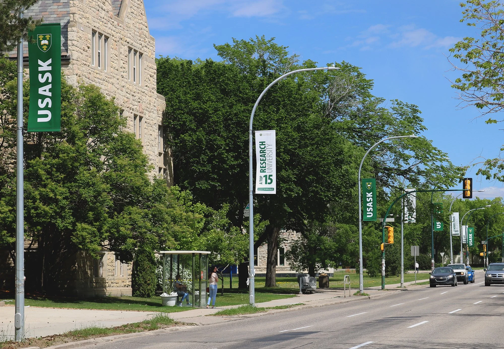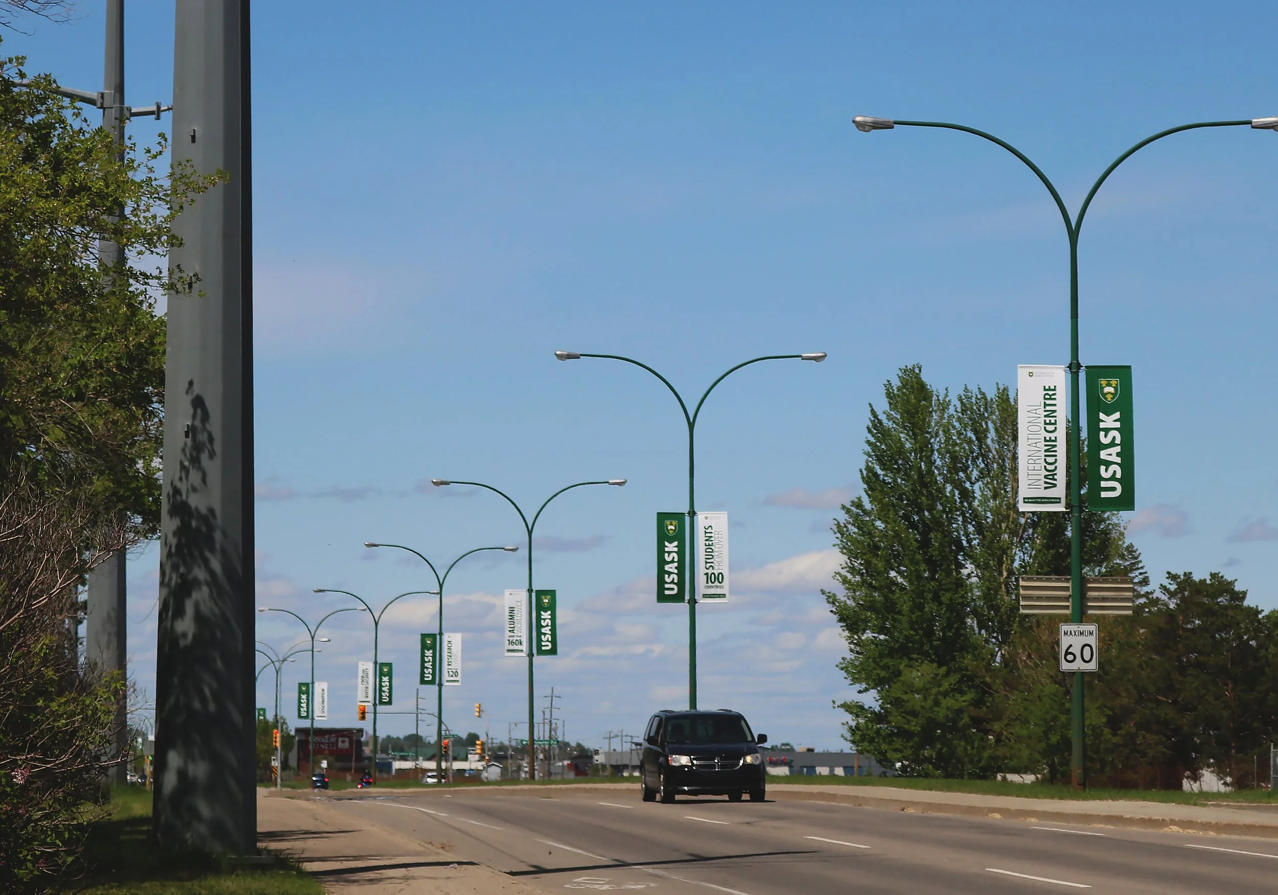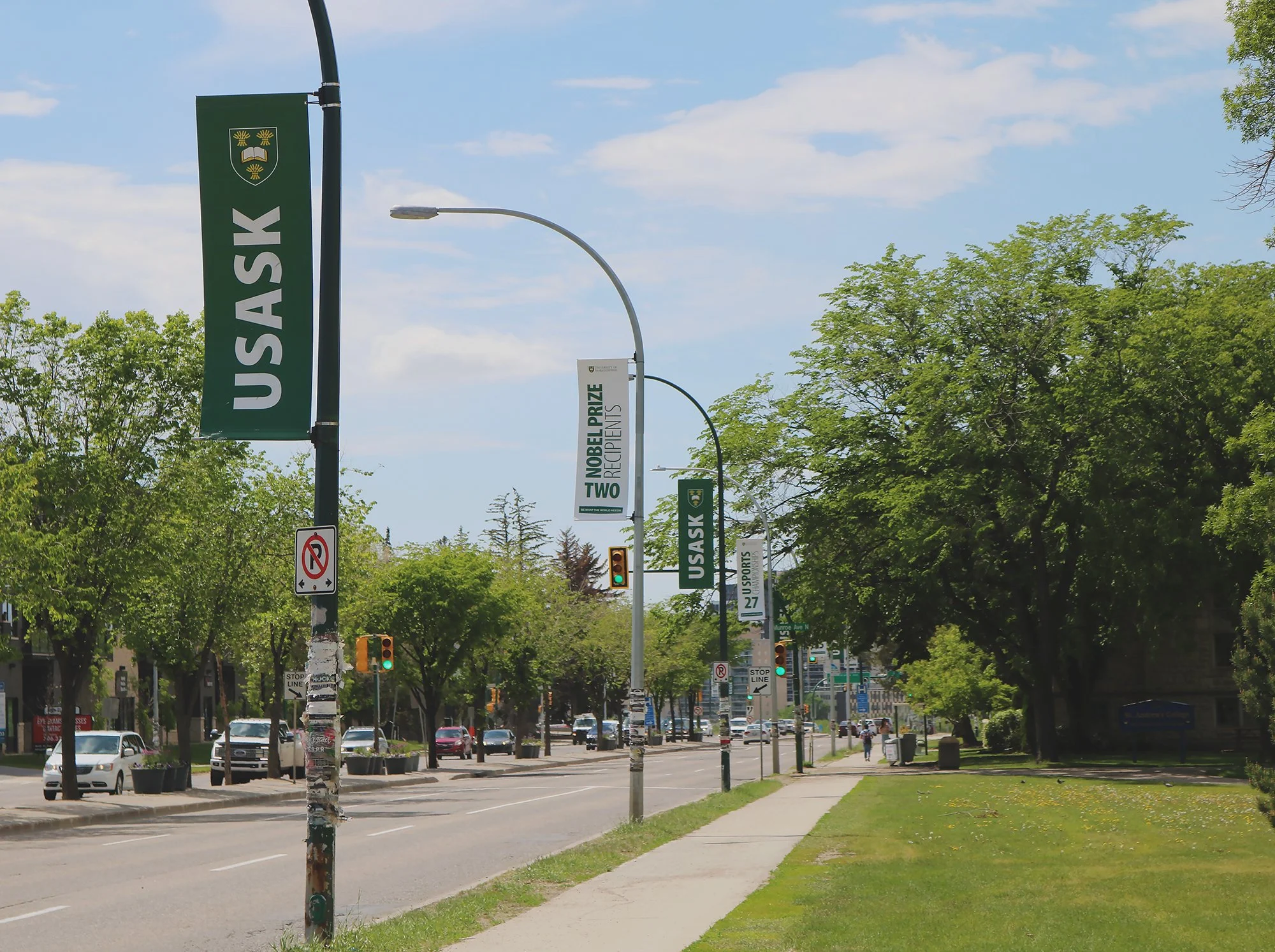
usask on college dr/preston ave
as part of the marketing and communications team at usask, i got to come up with a new concept for a redesign of the street banners that hang along campus on college drive and preston ave.
it’s a lot of space that gets a lot of traffic and since we just did a slow launch of a general campus rebrand, it was a good opportunity to get the new visuals out there in a good way.
skills highlighted:
brand design, creative direction, visual storytelling, user experience design, graphic design, concept strategy and execution
i was given freedom to create something with not many limitations. and a big part of the rebrand was changing our green from a bright green and back to the green that was in the logo.
you could say i was newly obsessed with this green again (the bright green got tiring)… so, i took a bit of an unconventional approach:
i didn’t care about the text or graphics or anything; i only wanted to create a visual pattern using colour that one would easily recognize as campus.

colour is a valuable tool of a visual identity and since the brand colours are already pretty well known across the city and province and the alumni magazine is called green & white, i knew that creating an alternating pattern of green and white would be visually effective.
we, of course, couldn’t leave them totally blank.
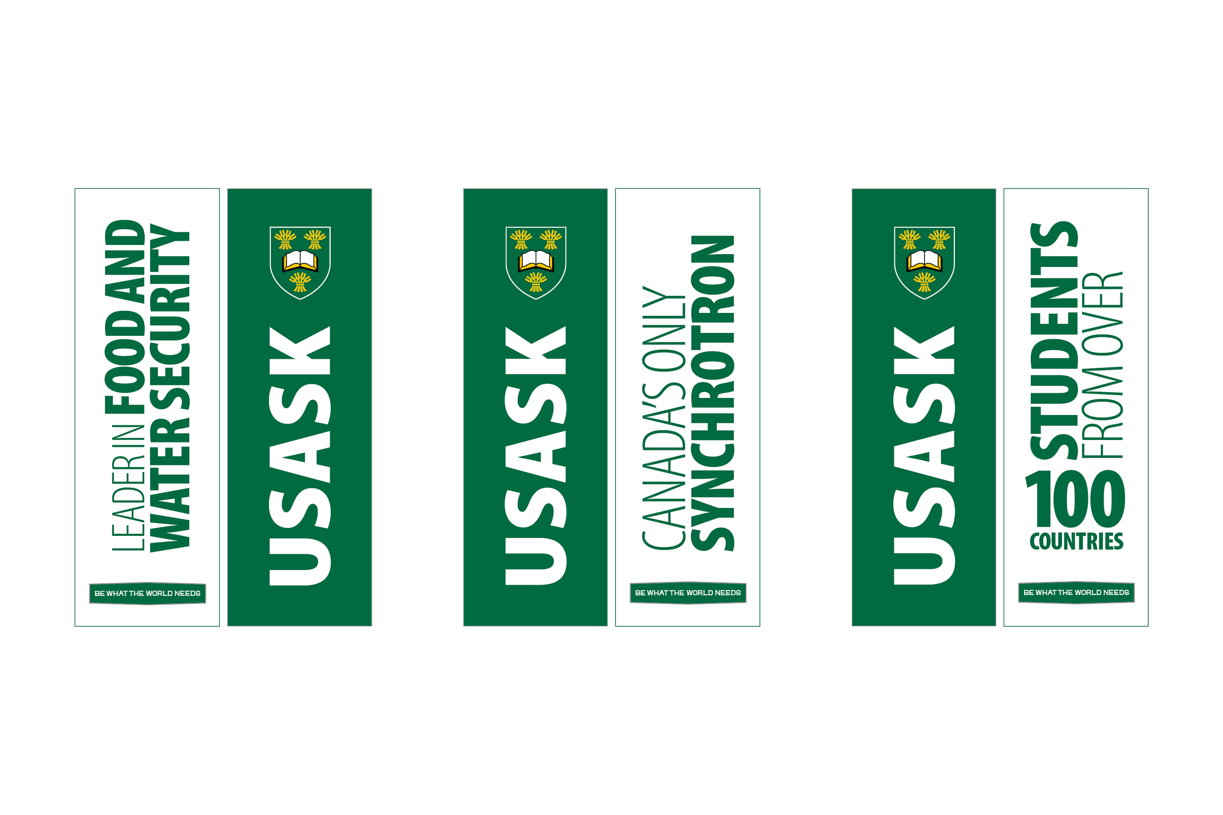
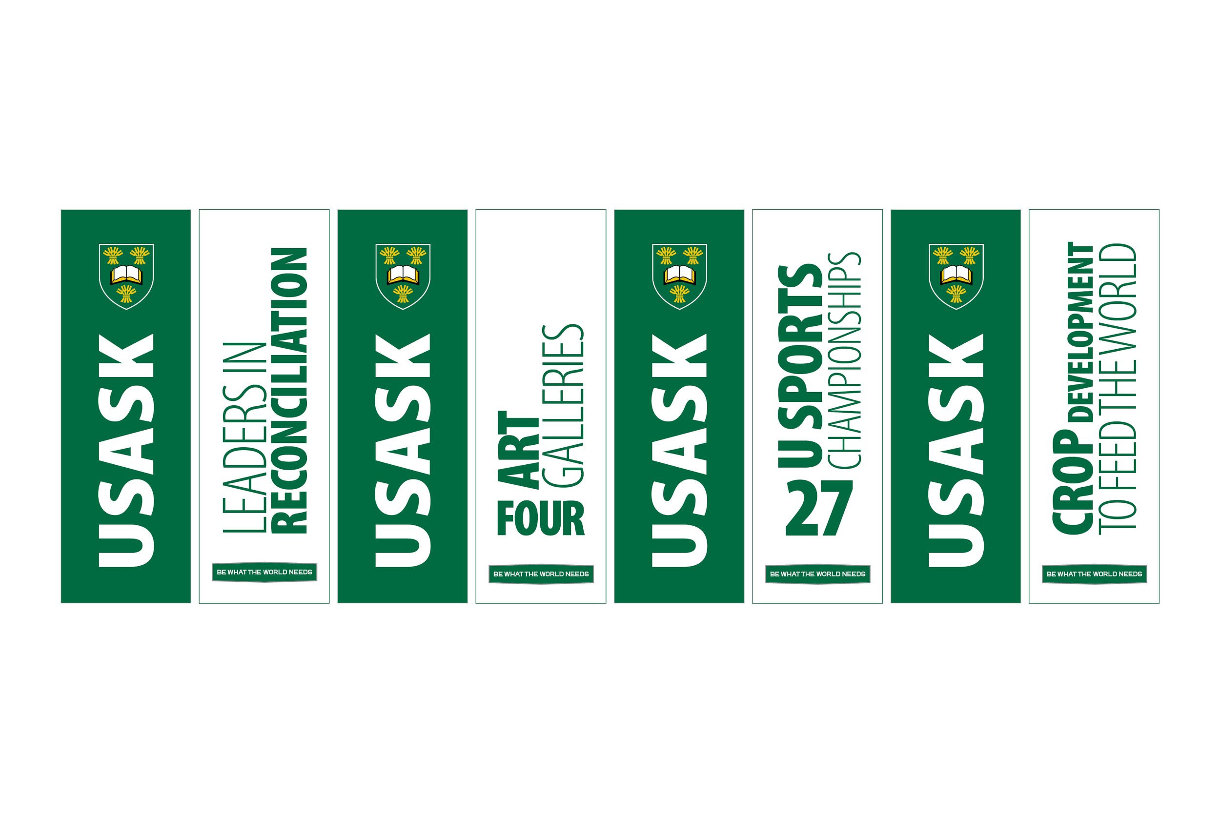
the green banner:
i knew ‘usask’ in all caps and vertically would be the best use of space and the logo crest would fit better with the five letters rather than the full logo. occasionally, we separated the crest from the text for merchandise so i knew, with a good reason, it was okay to do.
brand ‘rules’ can always be broken…you just need to know what you can get away with.
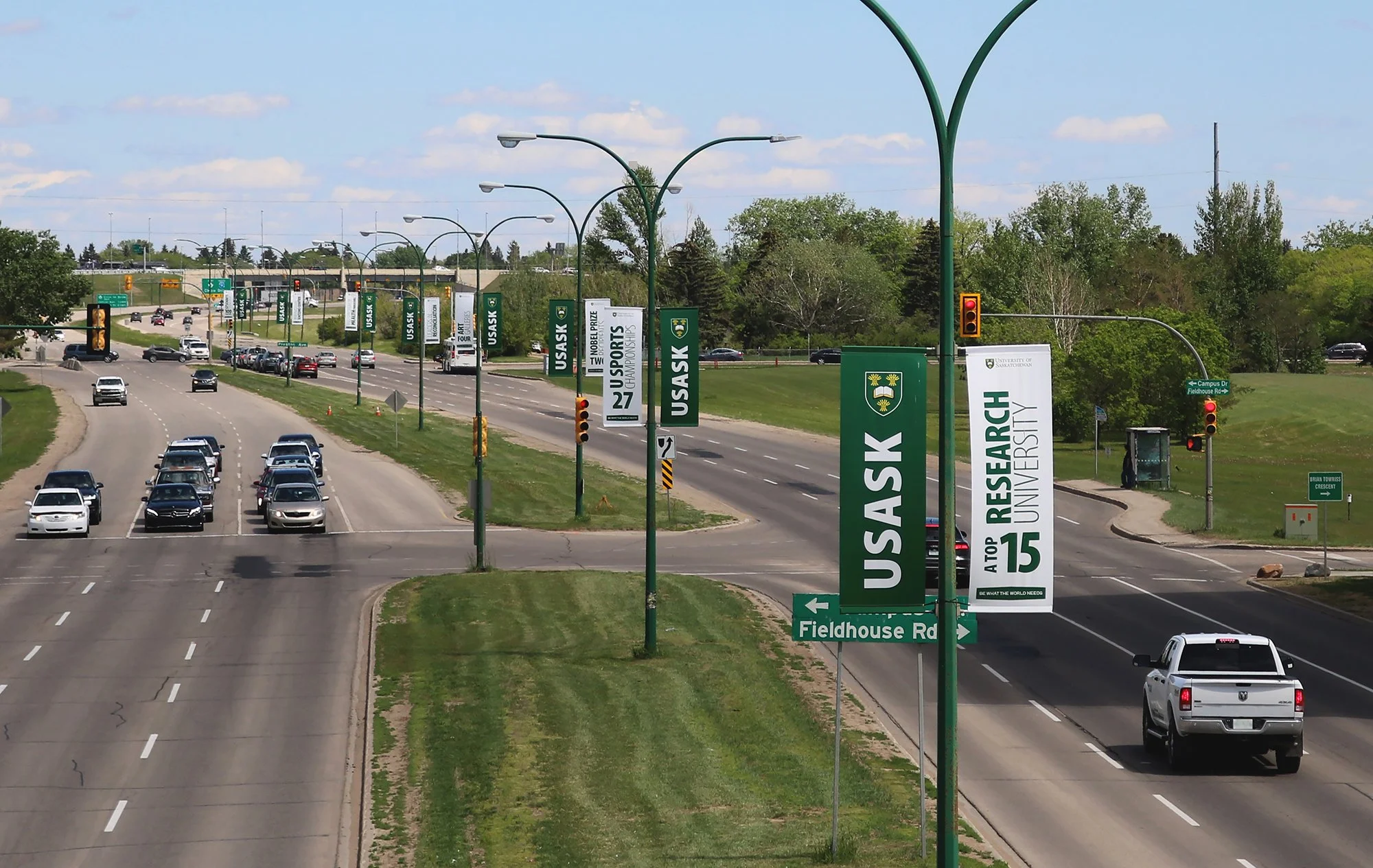
white banner:
i left the text on the white banners up to my colleagues who are good with copywriting and suggested “just some well known facts about campus” in as little words as possible. i arranged the words provided however they fit best on each banner so each fact was as big as possible.
putting the logo and tagline icon on these was done more for necessity rather than readability, but i think the tagline icon did add another layer of brand recognition.