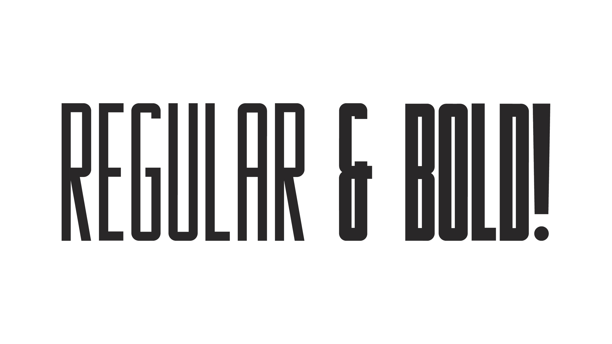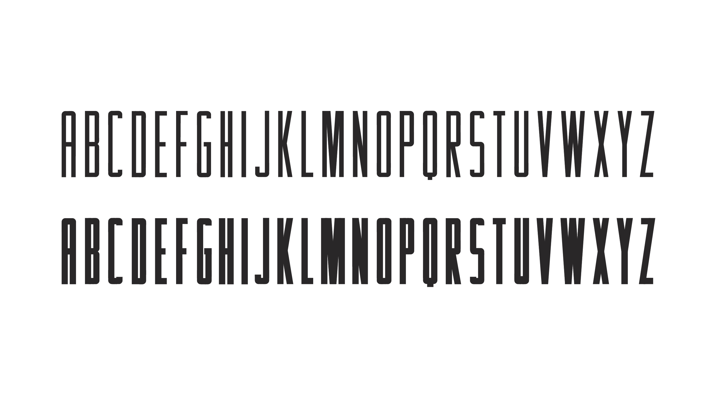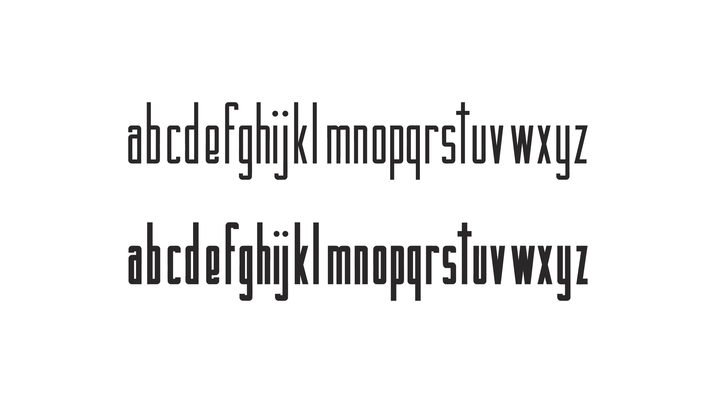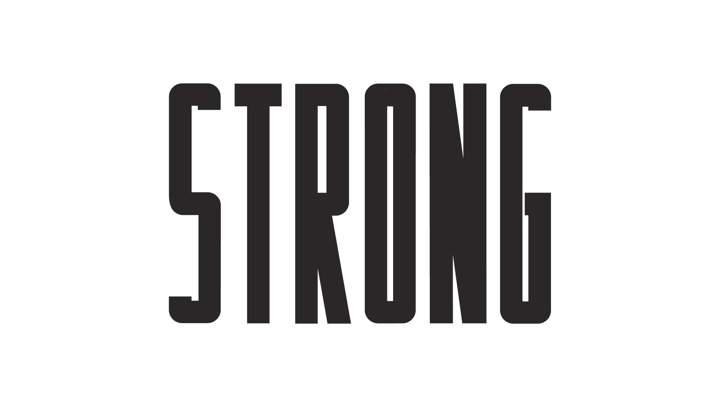


“Fighters” is a display typeface I designed for one particular issue of the USask alumni magazine.
CREATIVE DIRECTION, EDITORIAL DESIGN
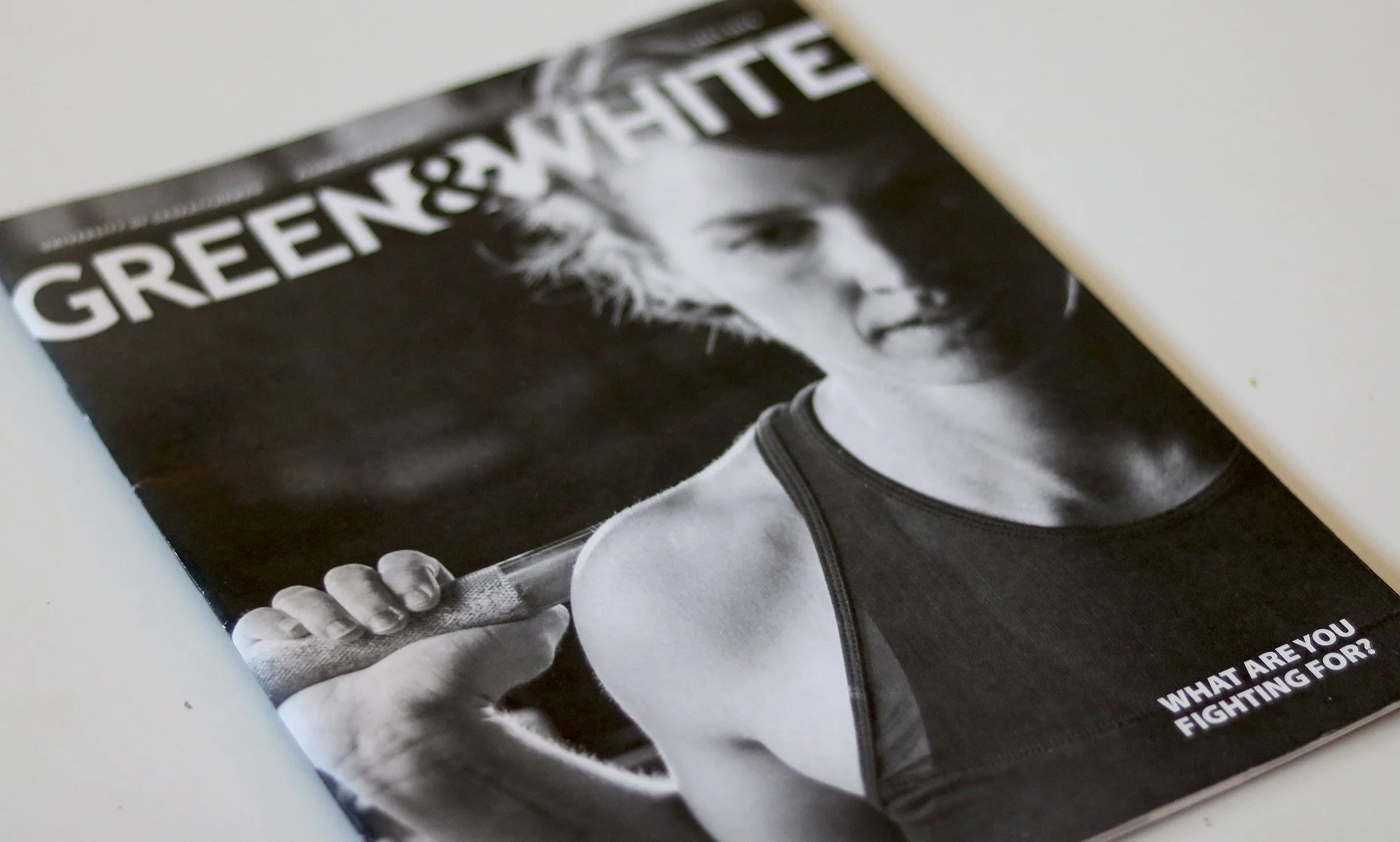
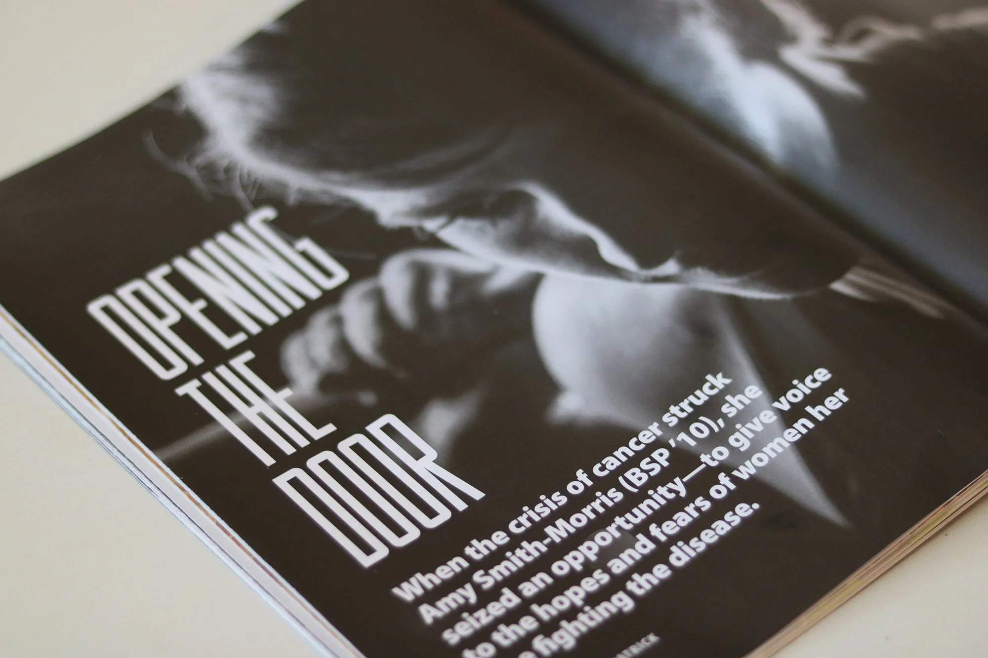
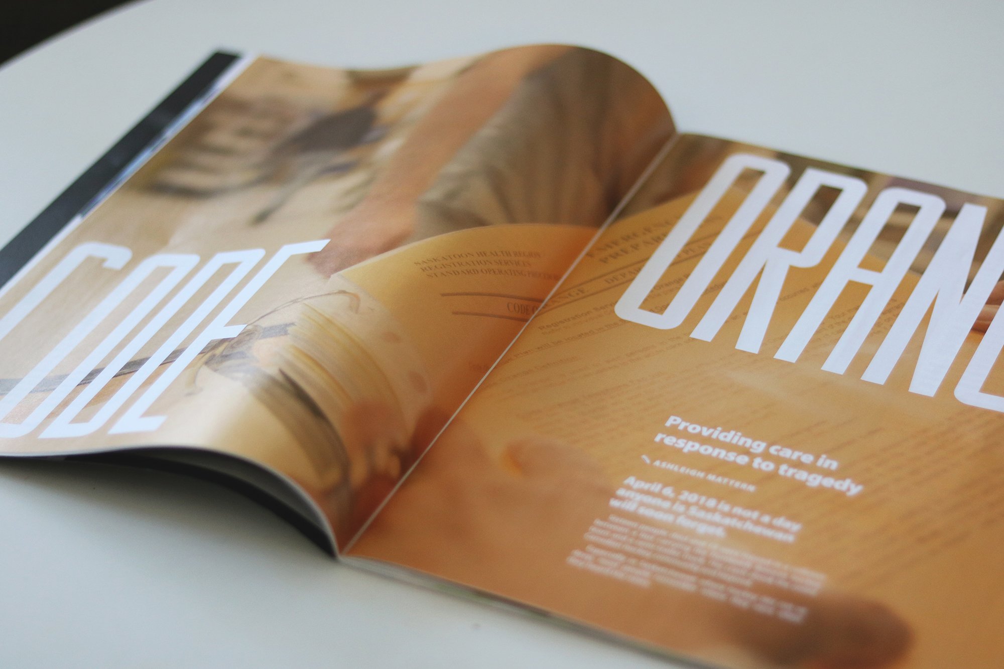
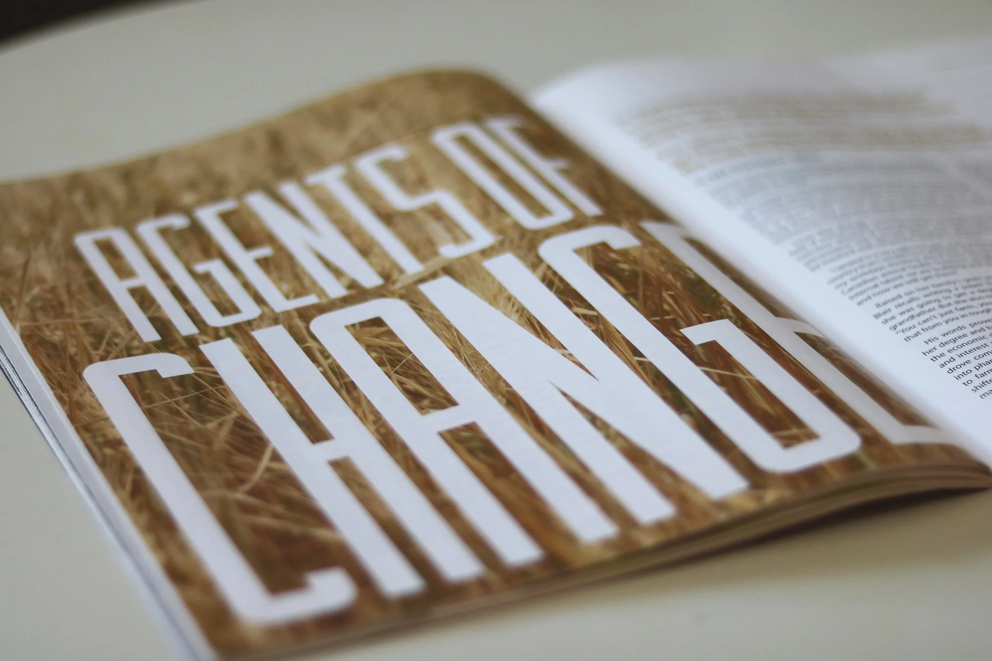
for this particular issue of the bi-annual usask alumni magazine, Green & White, I created and installed this typeface to use as the main heading font for feature story titles and the inside front cover heading.
the theme of this issue was ‘fighters’ and was all about showing strength in a variety of ways. early on, i didn’t feel like the usual photography style and brand type matched the energy of the stories.
after some unsuccessful display font searching because nothing fit my vision, i decided to make my own.
The cover story was about a local powerlifter / cancer survivor at a gym… and I’ve always loved gritty strength sport photos of athletes in action and the emotion they portray.
The macro close up cover photo and the inside front cover photo of the chalk explosion captured the mood I wanted to convey throughout the entire issue… and the typeface on the inside front cover helped this.