
a brief overview of some of my logo + visual identity work for various organizations and events
*PAGE IN PROGRESS
SELECTED WORK:
USask initiatives [soon]
other logos and marks for non-profit organizations, small businesses, or local events and initiatives [soon]
[design process for brand work]
through experience, i’ve learned that whether we make something new [a logo or a whole brand identity] or we are designing in-house within an established brand, the biggest challenge is maintaining consistency long after creation.
when creating or managing visuals for brands, i ensure everything i do is timeless and functional and is designed with space to adapt and build.
to do this, i visualize the big picture [all the different aspects that comes with a visual brand identity] and then work from the bottom up to fill in the details + aesthetics. i’ve found through some trial and error that working this way is decisive and can minimize endless revisions.
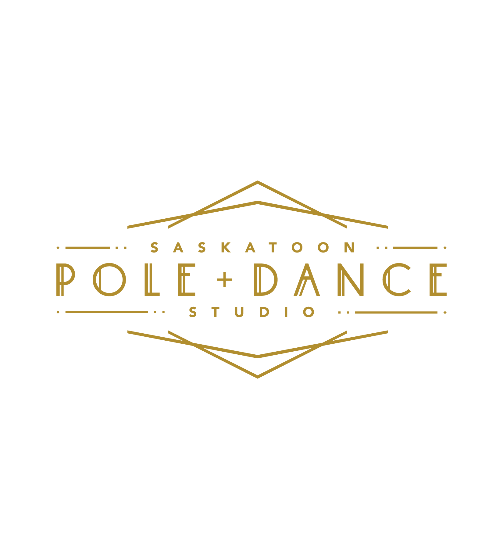
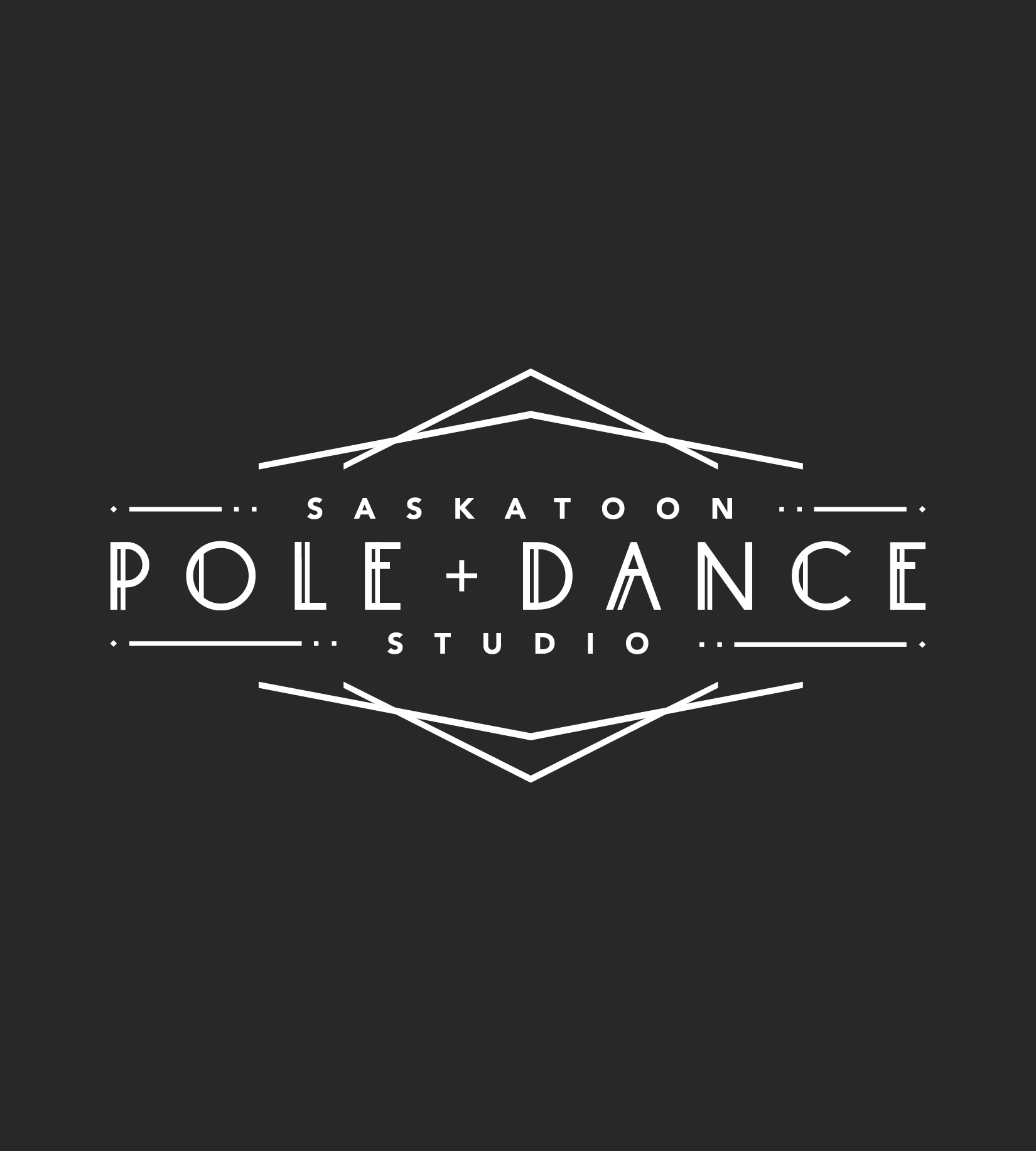
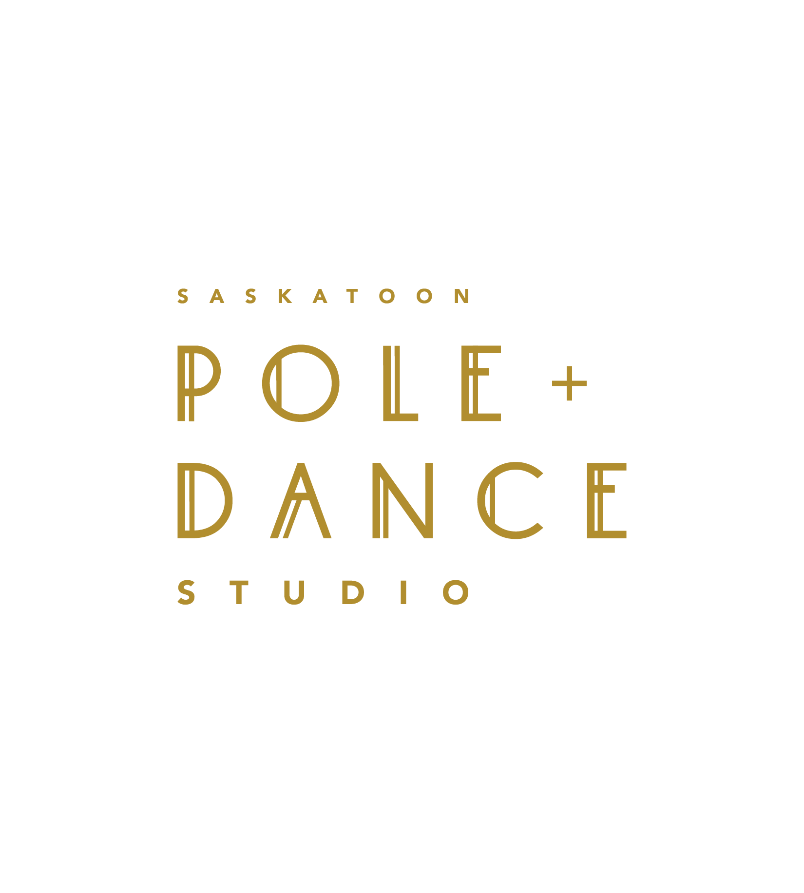
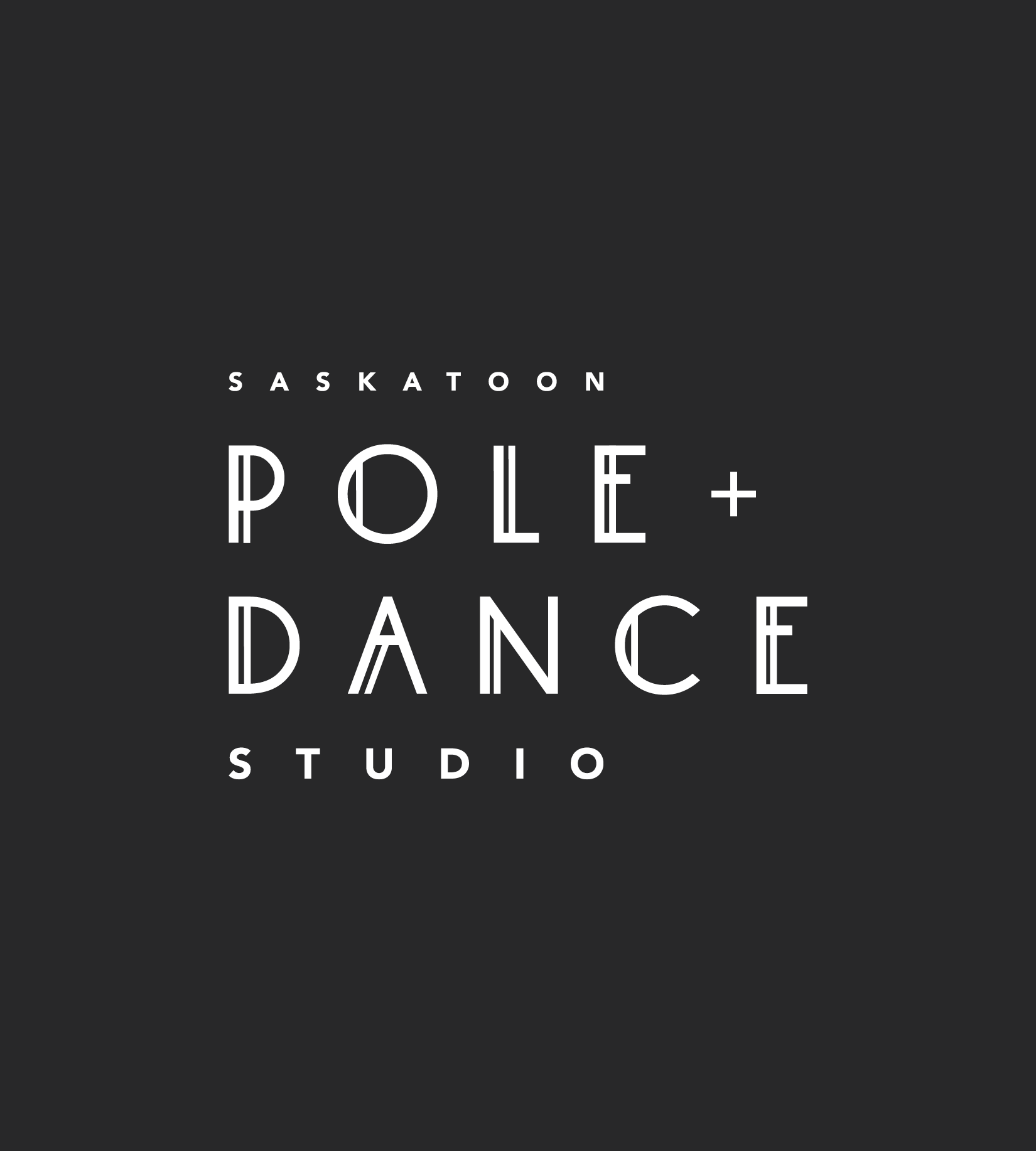
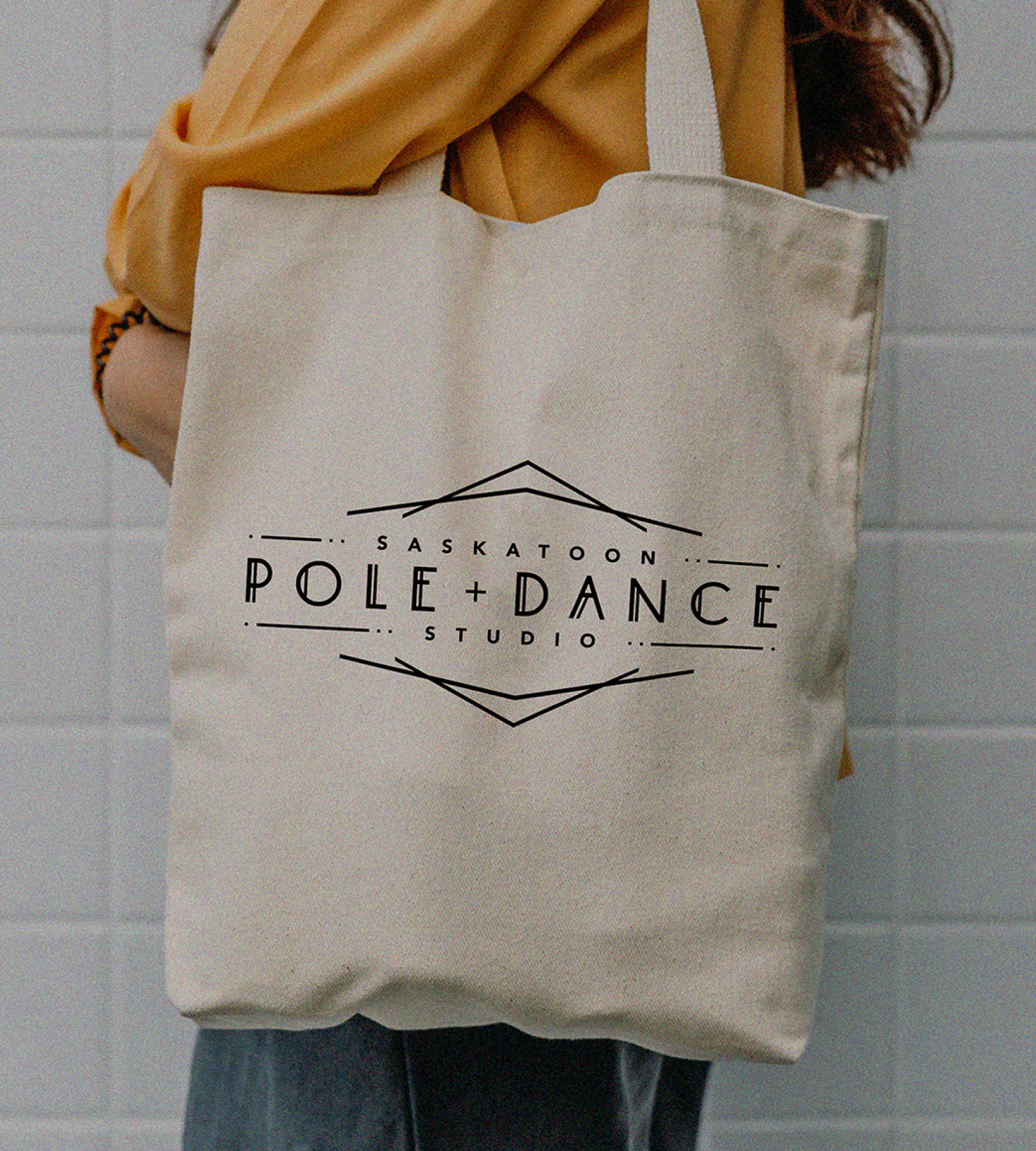
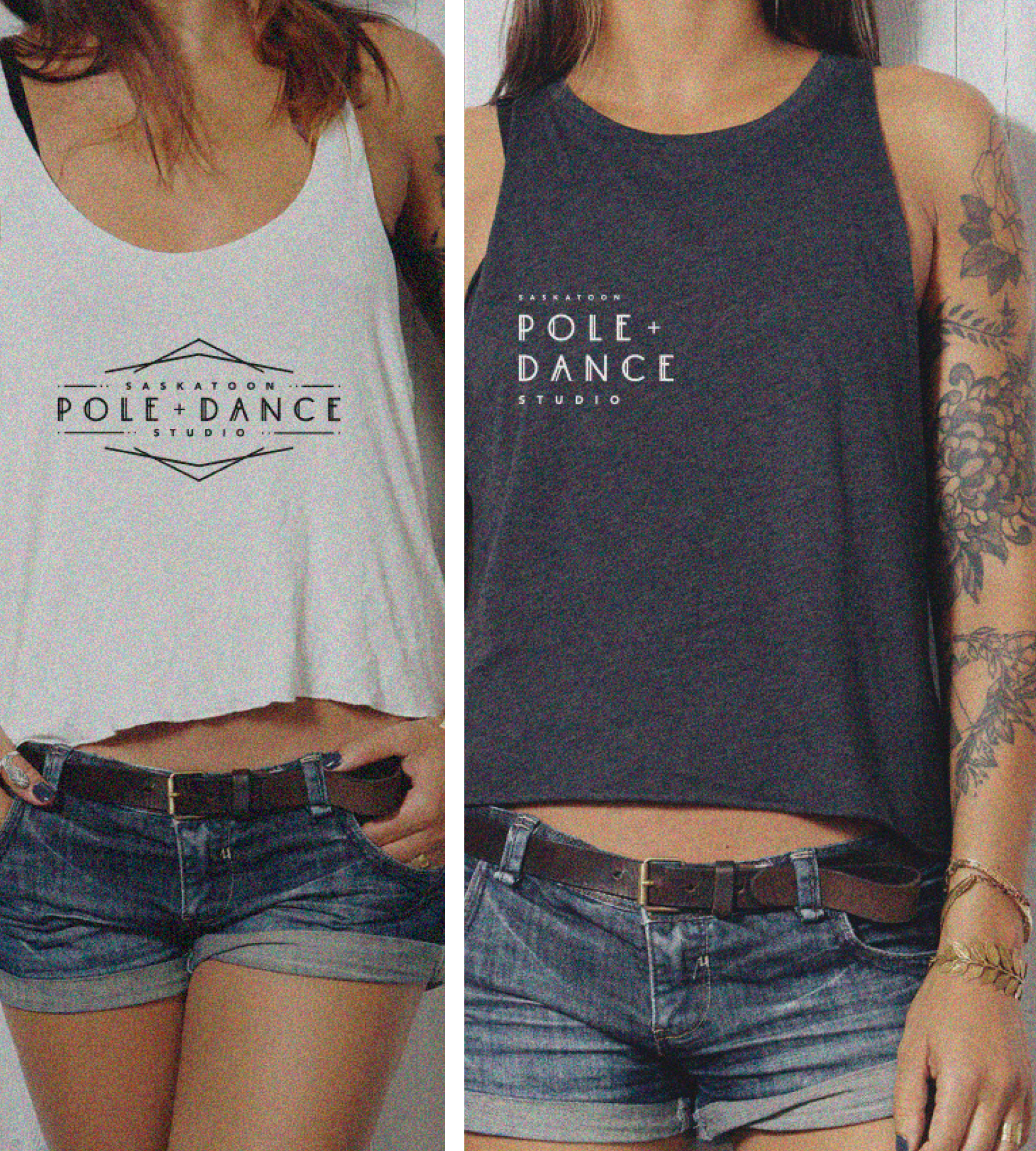
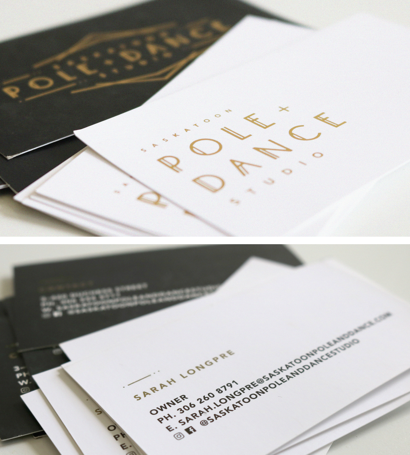
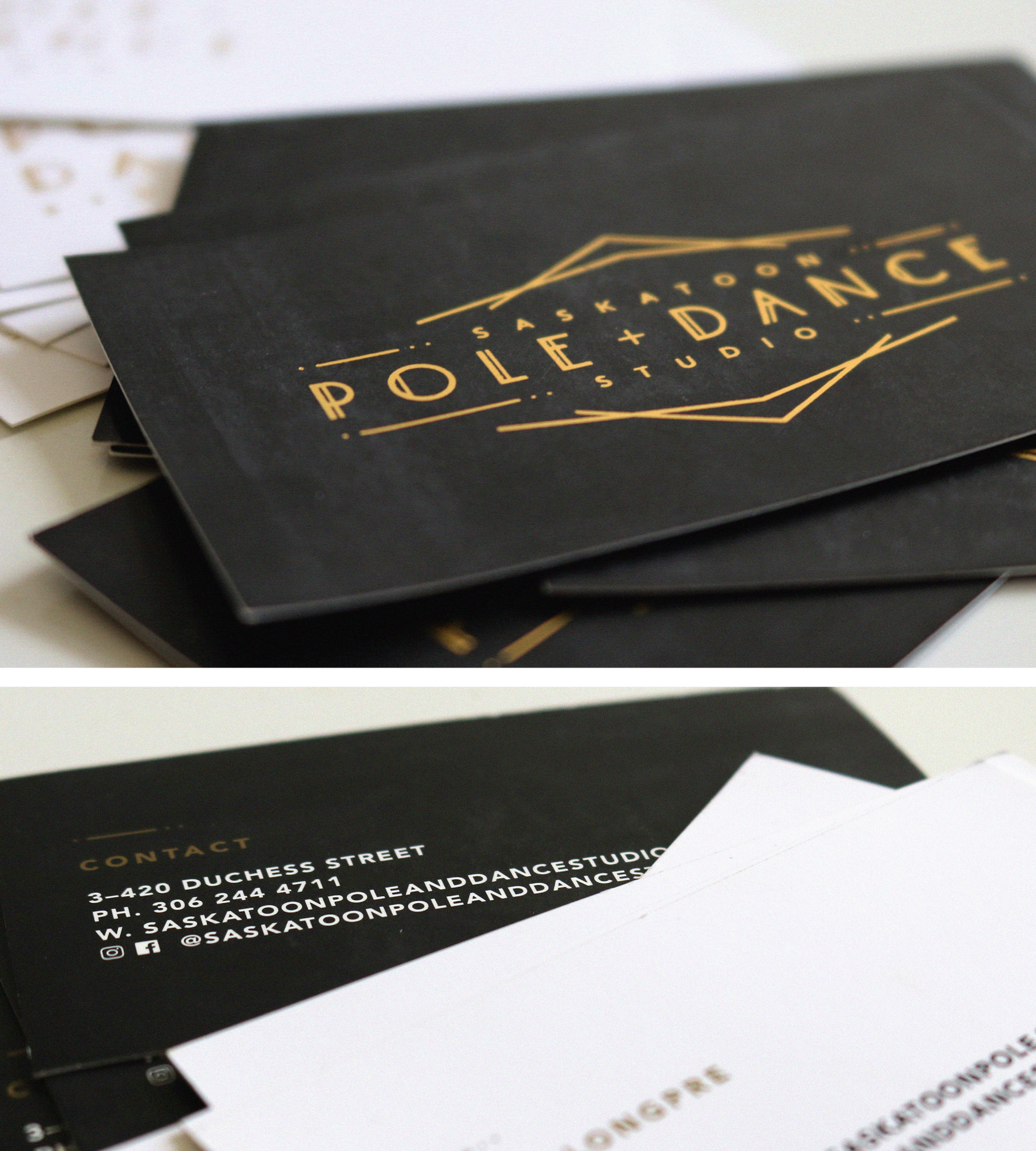
Saskatoon Pole & Dance Studio
Logo design including two versions in three different colour options [colour, all black, all white] for different use cases,
two different styles of business card,
mock ups for brand merchandise,
social feed mock ups for brand inspiration and consistency, and;
brand colour palette and typography.
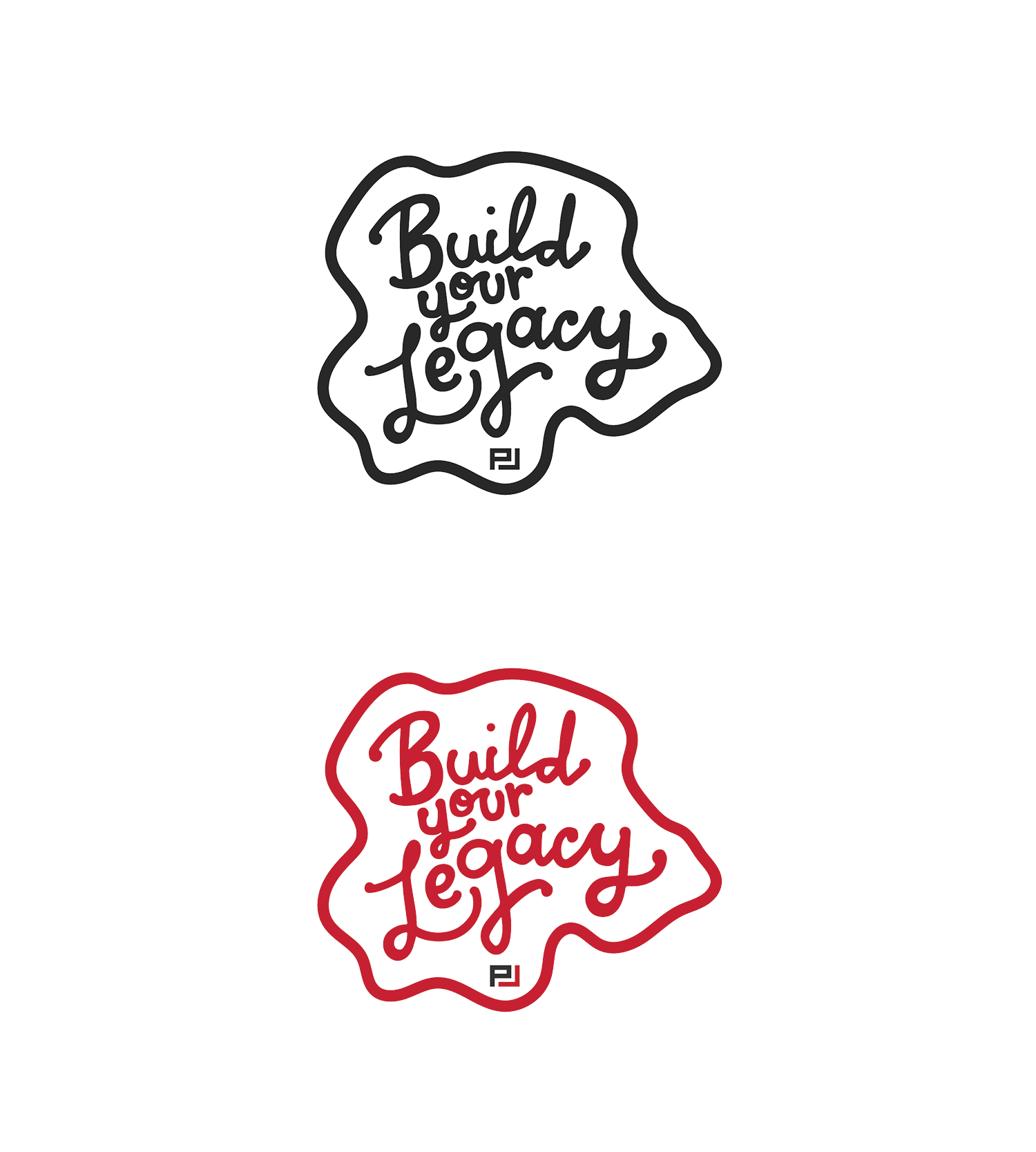
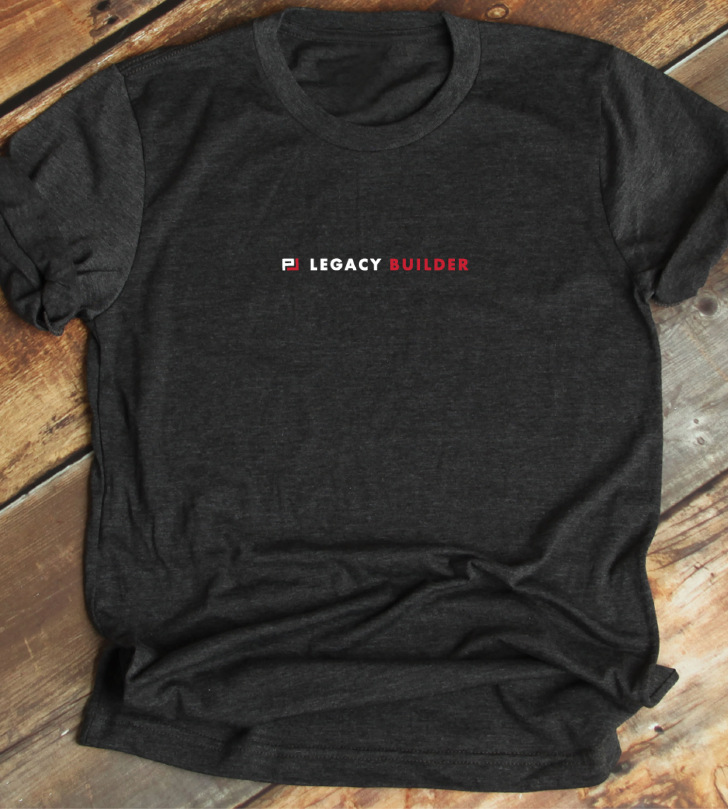
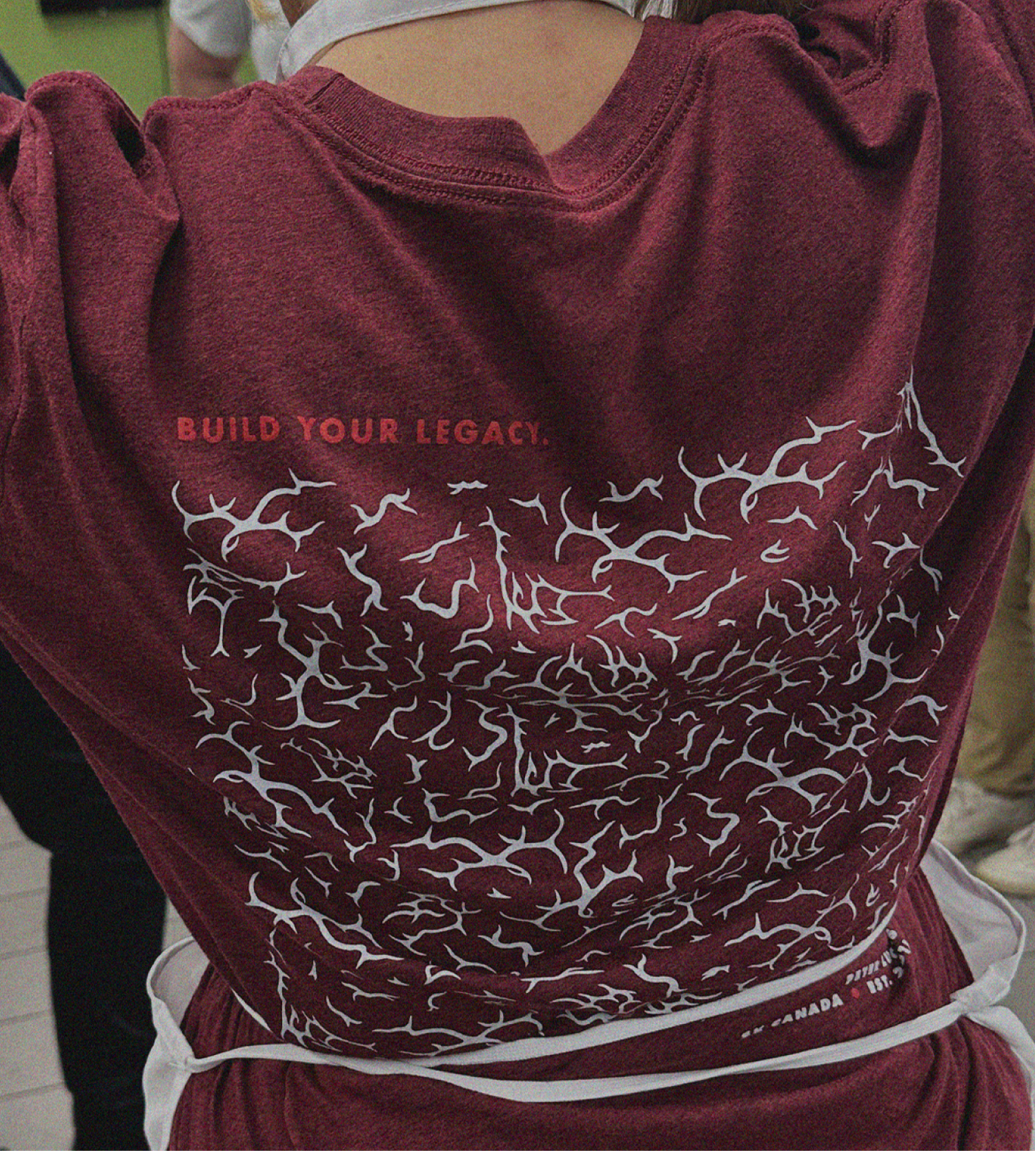
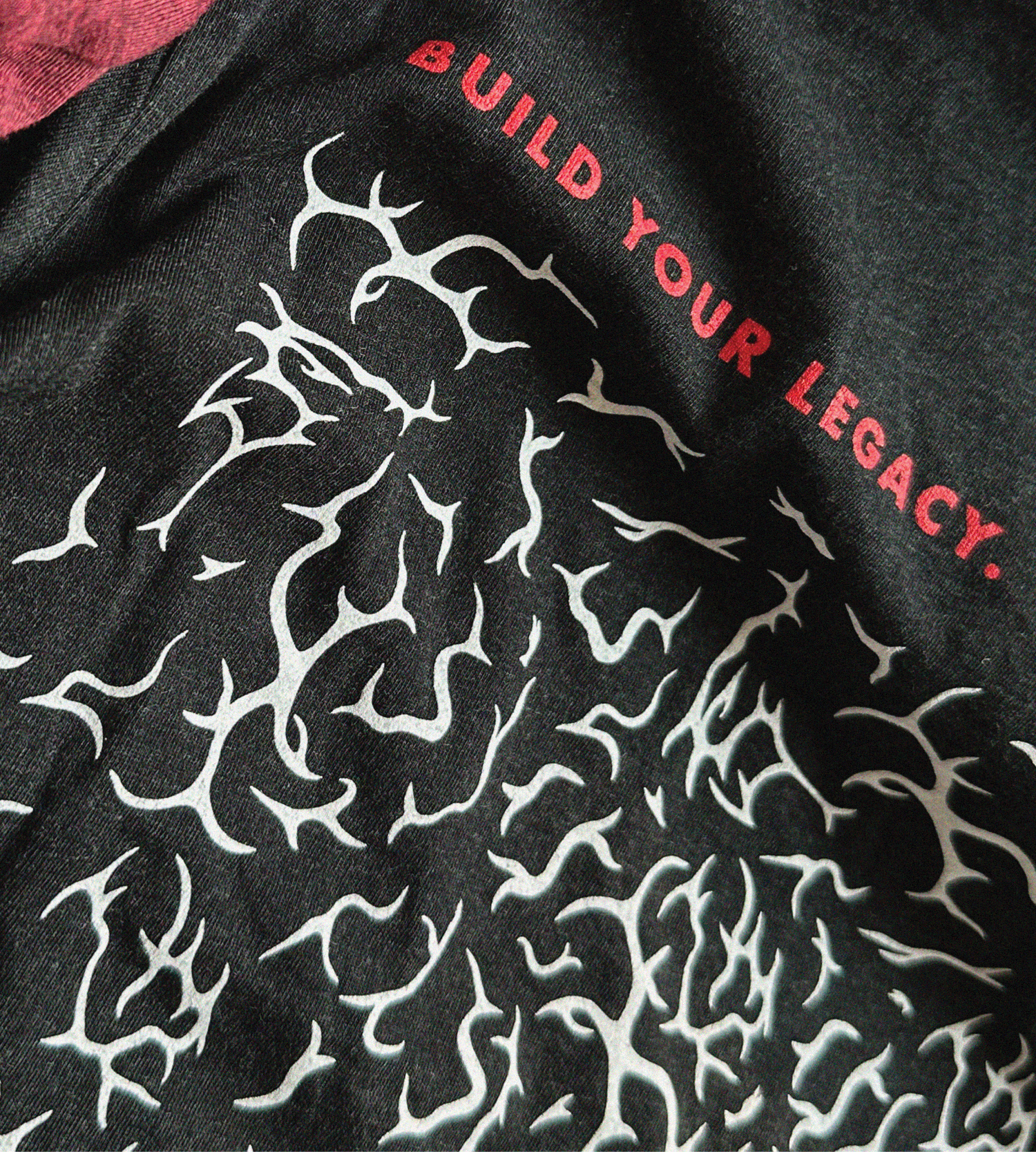
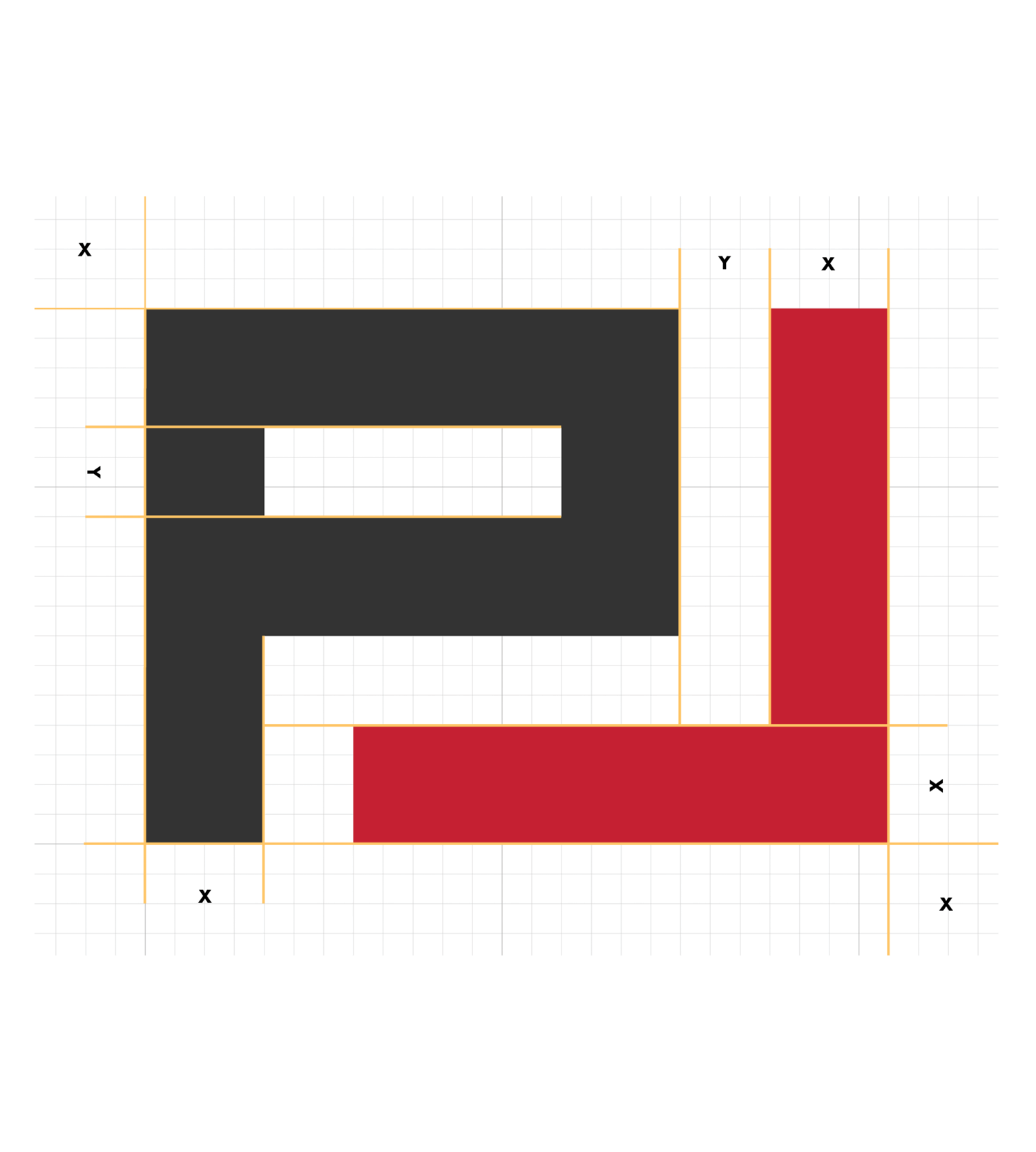
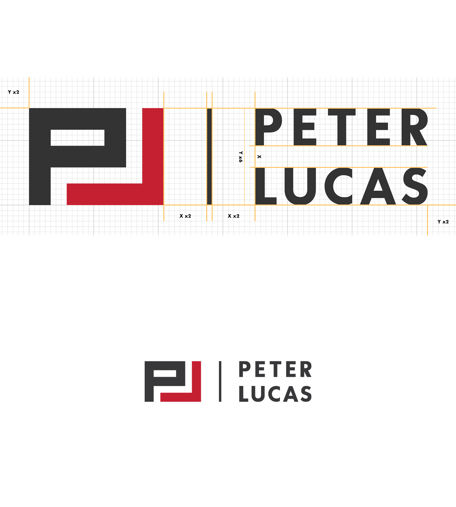
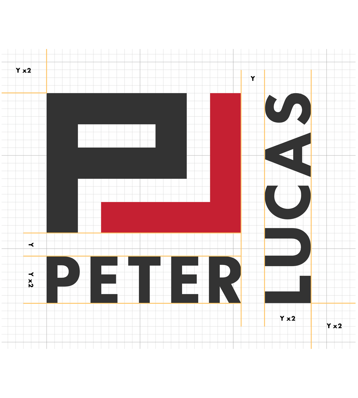
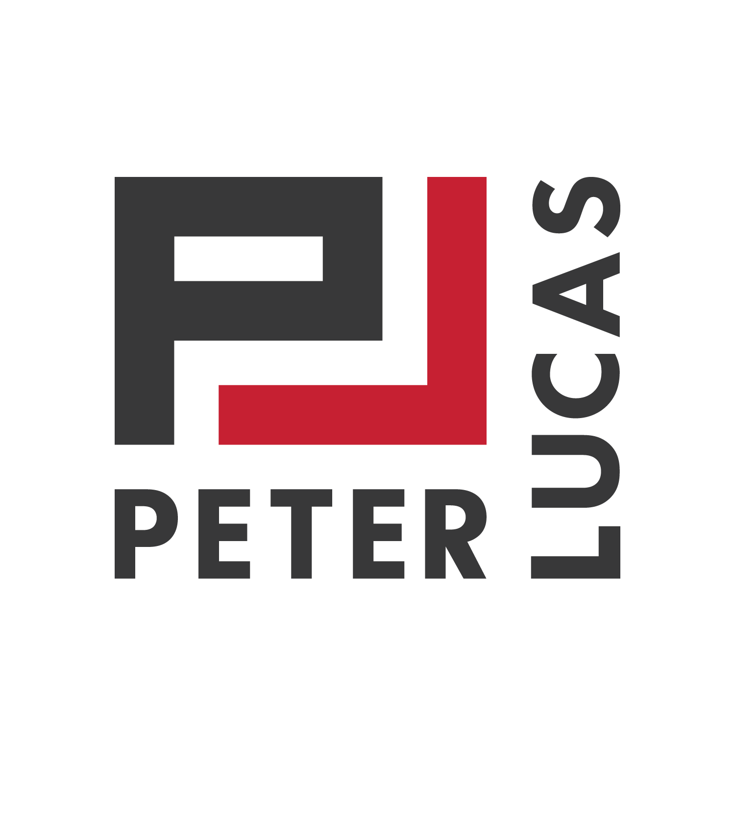
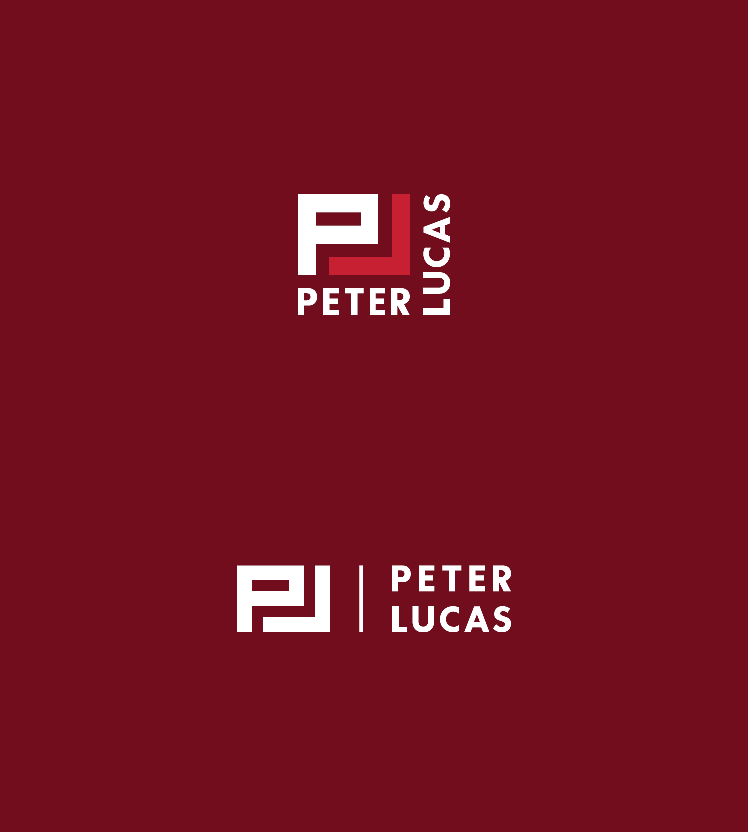
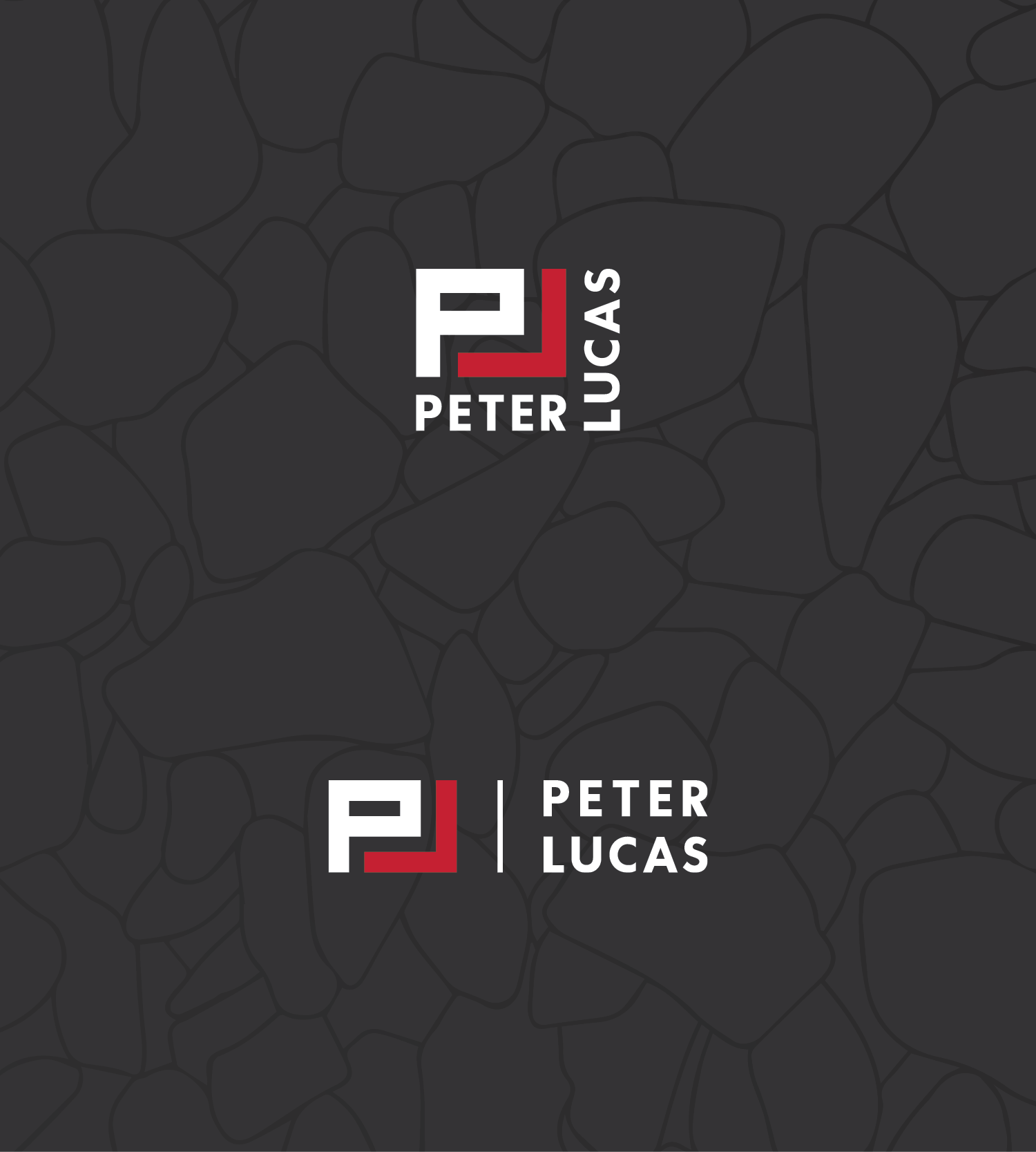
Peter Lucas Project Management
Logo design clean up of all versions for better consistency using a strict grid system and created an illustrated brand tagline mark in each primary brand colour to use in conjunction with the logo.
Created other brand assets such as branded pattern backgrounds, updated brand merchandise, and a variety of social and presentation templates for greater brand awareness and consistency.
Expanded brand colour palette for better brand flexibility and accessibility and created a brand typography system to maintain across all materials, and;
Created an in-depth brand guidelines document [inquire for a password for this page or see the video below for a brief overview].

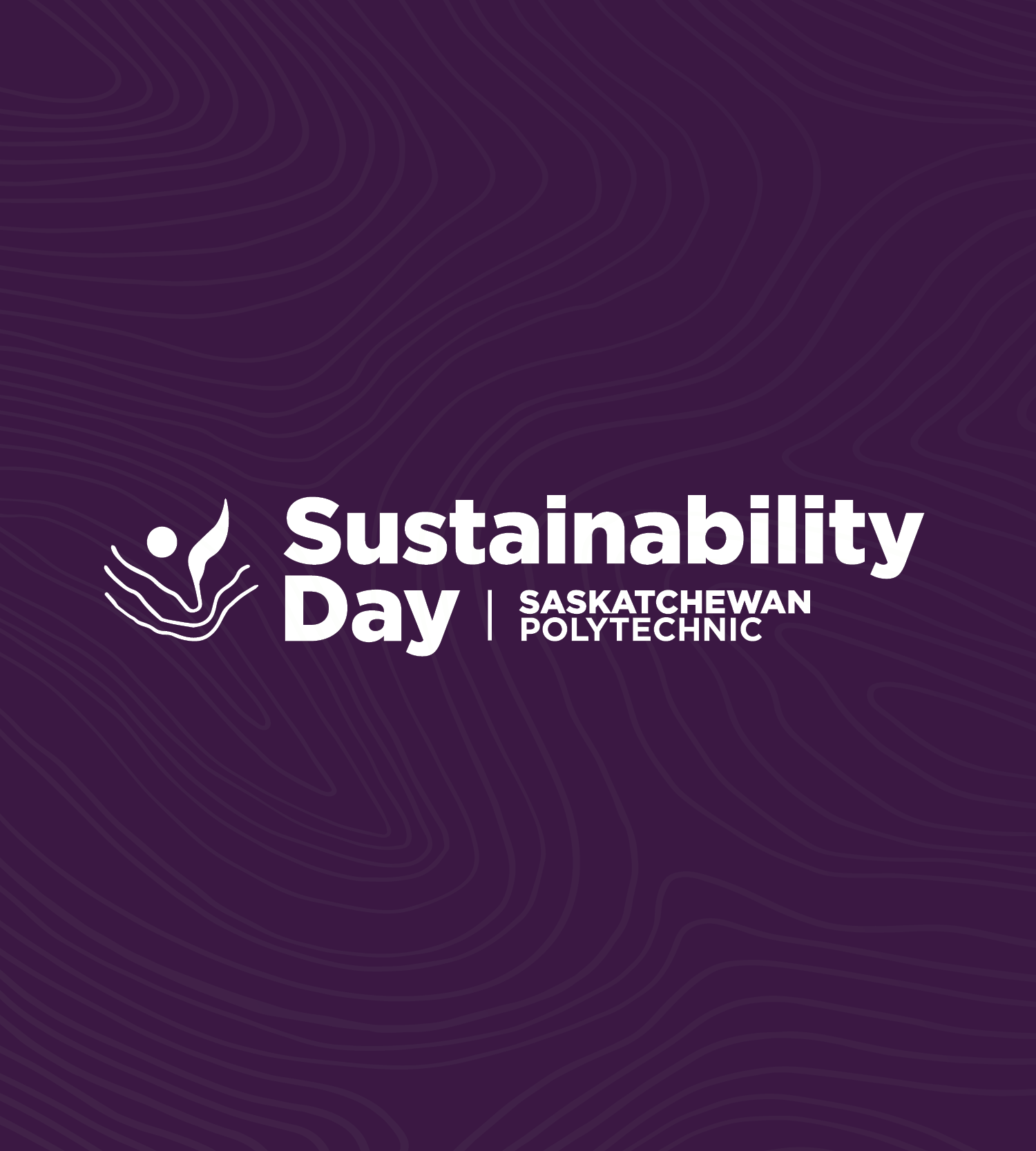
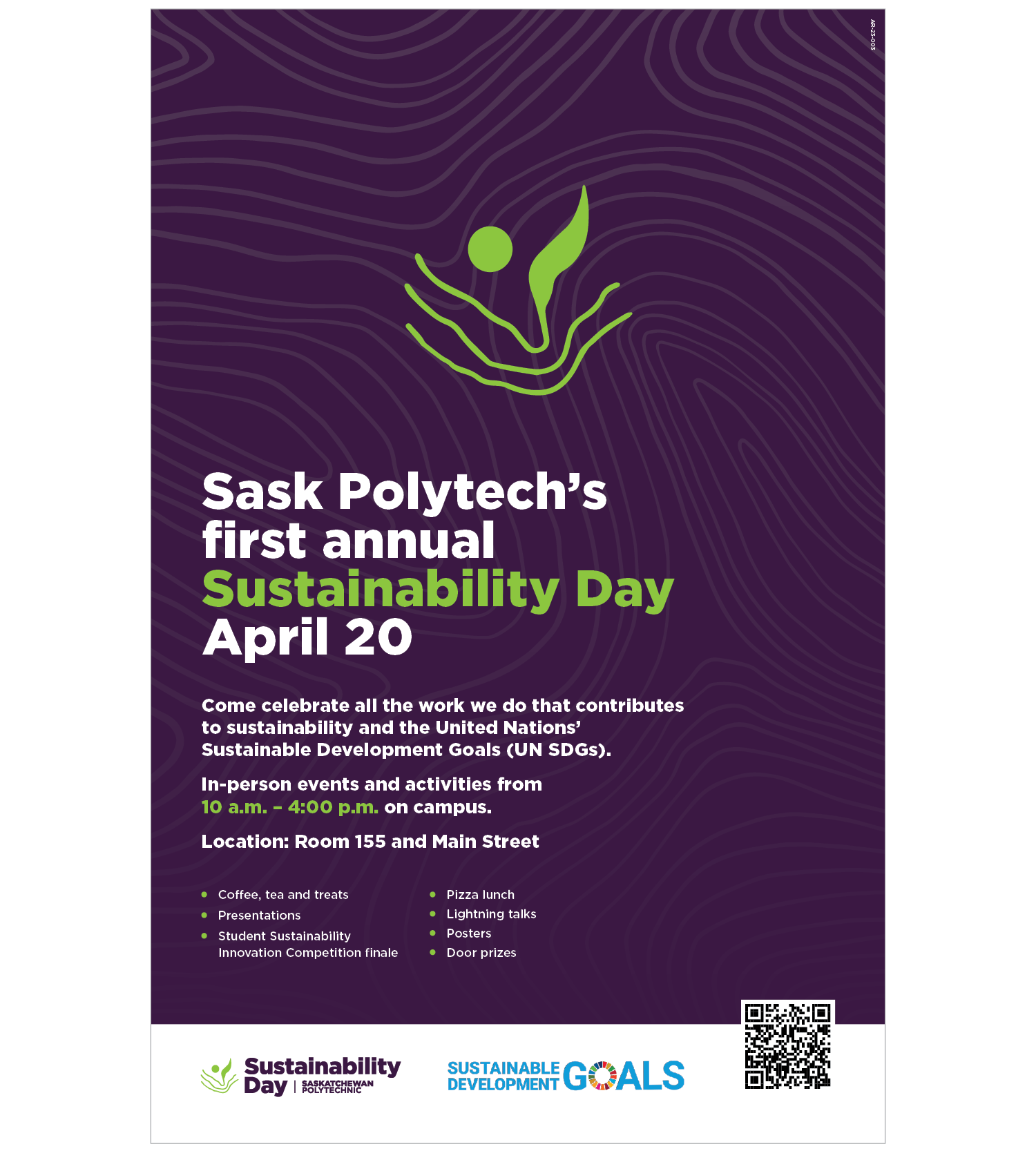
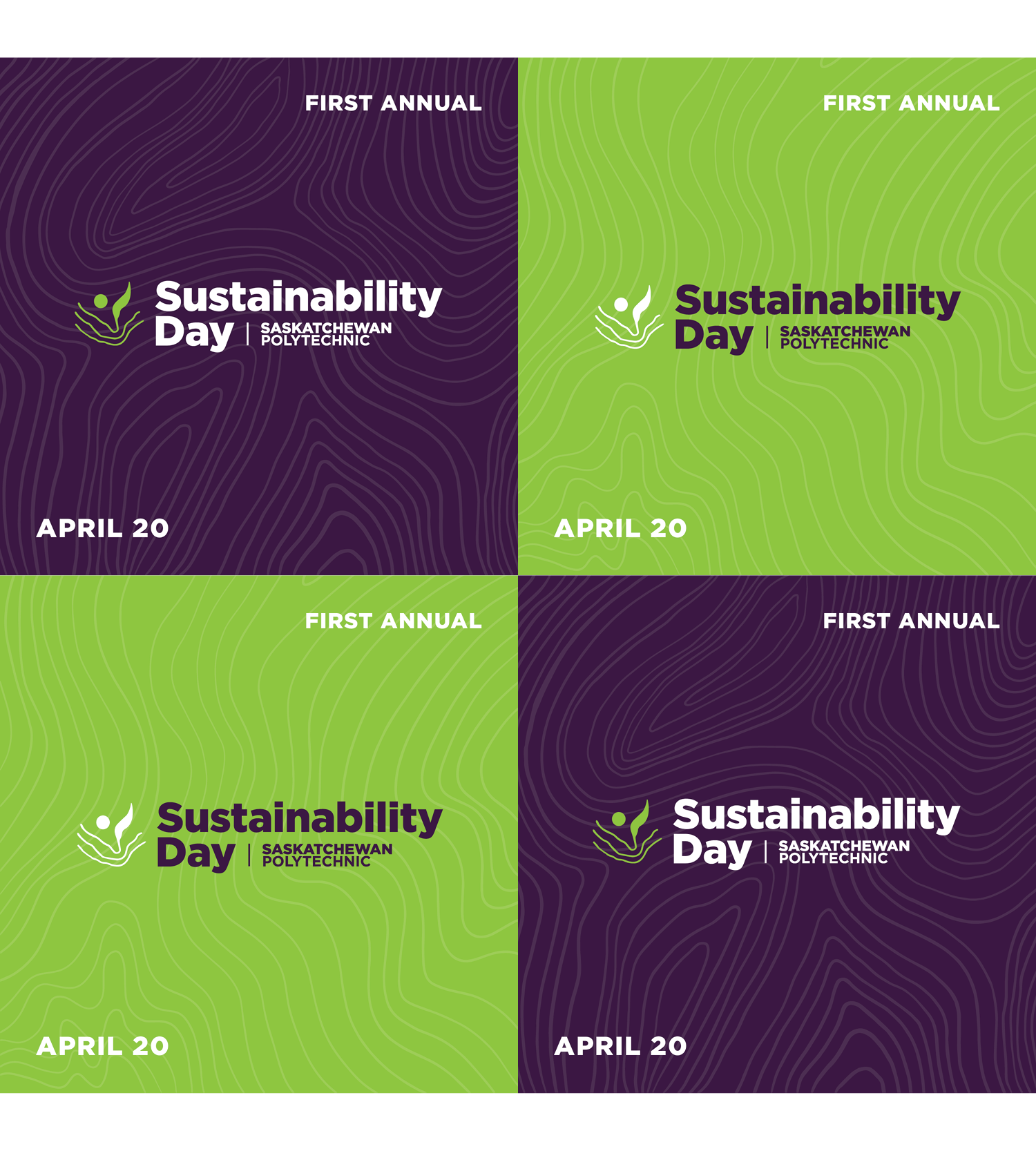
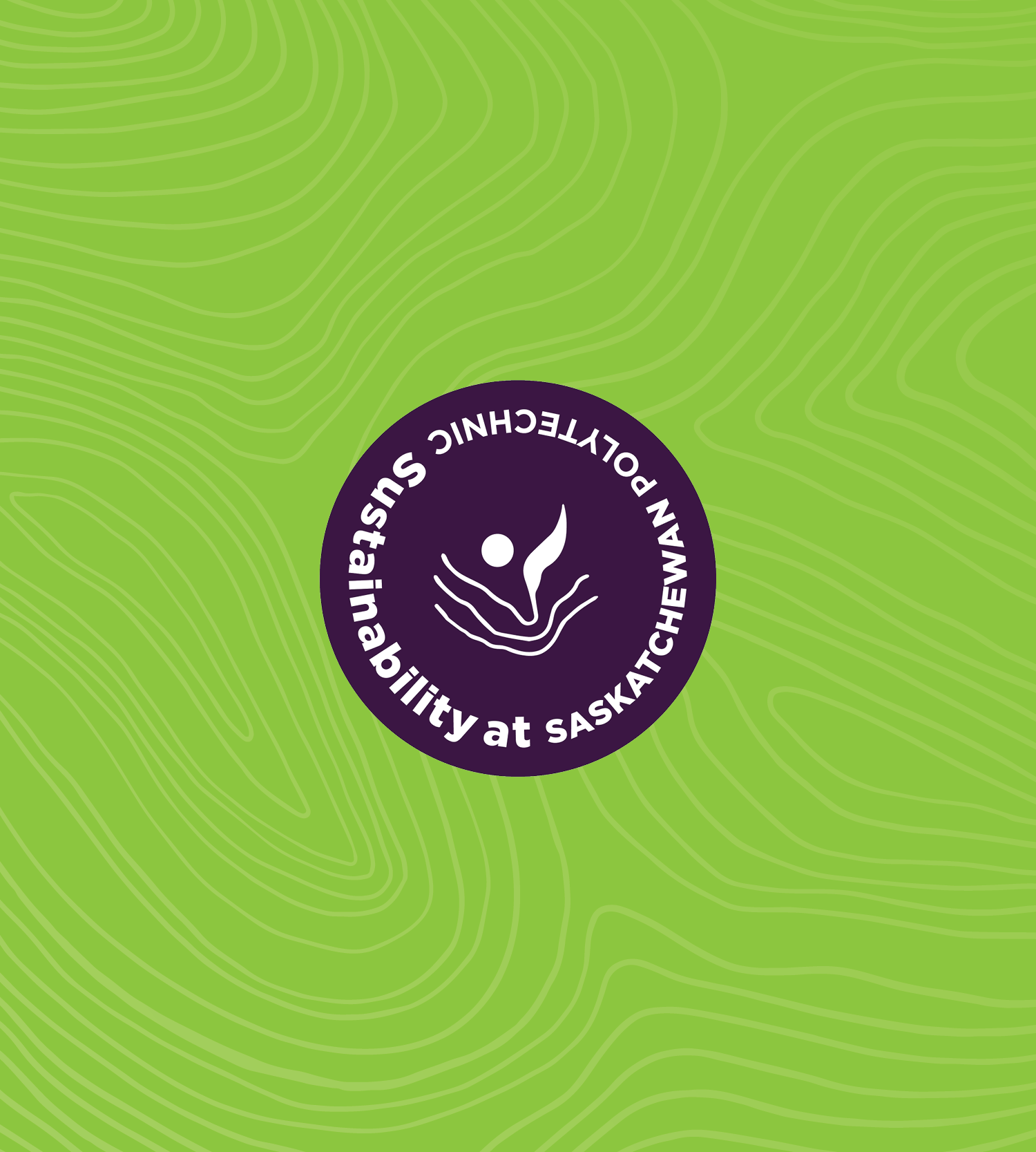
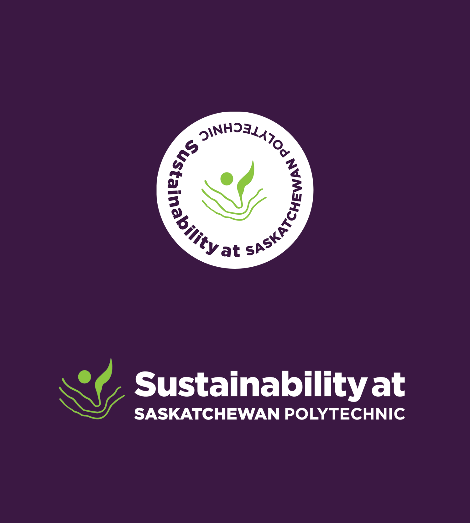
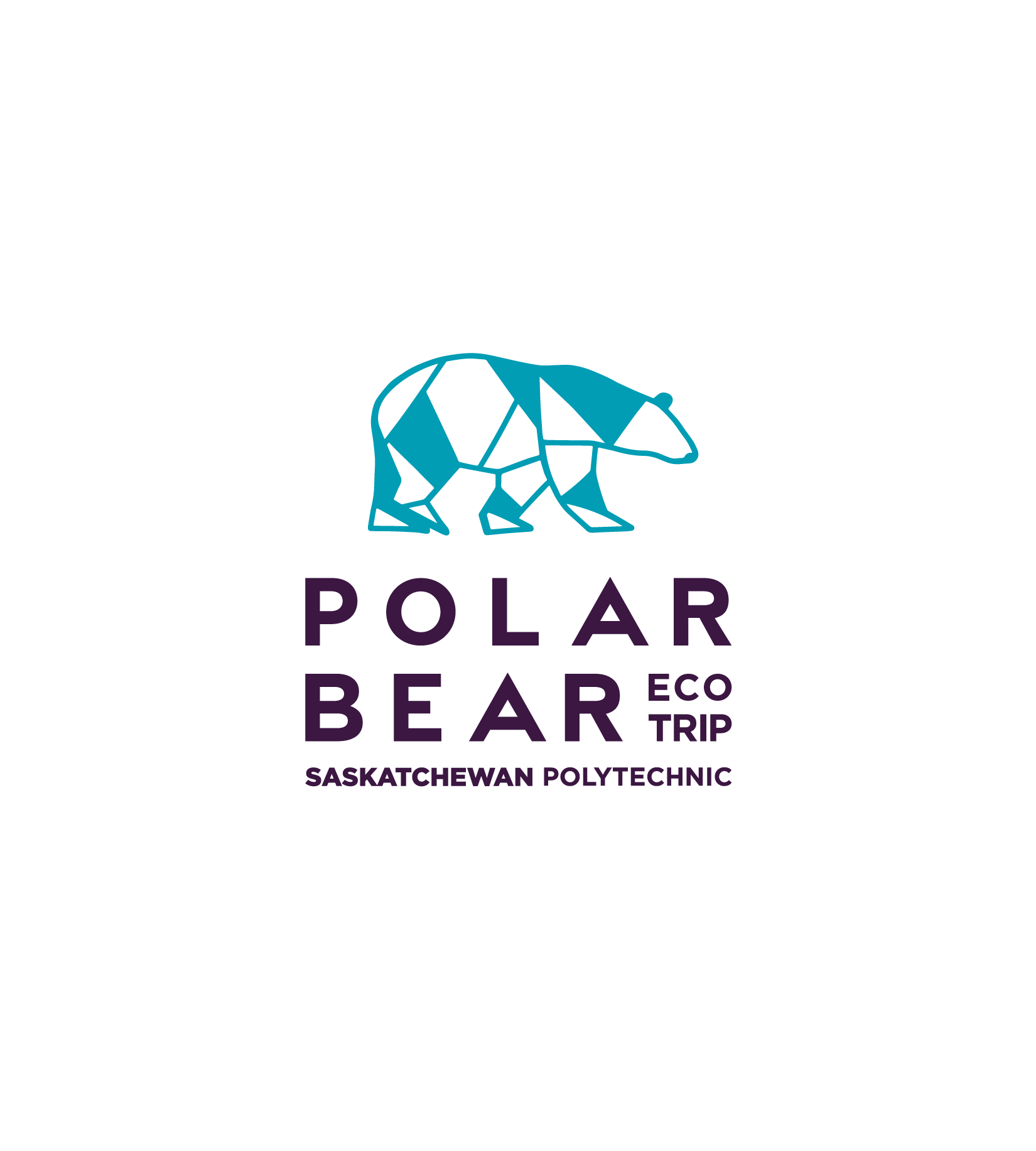
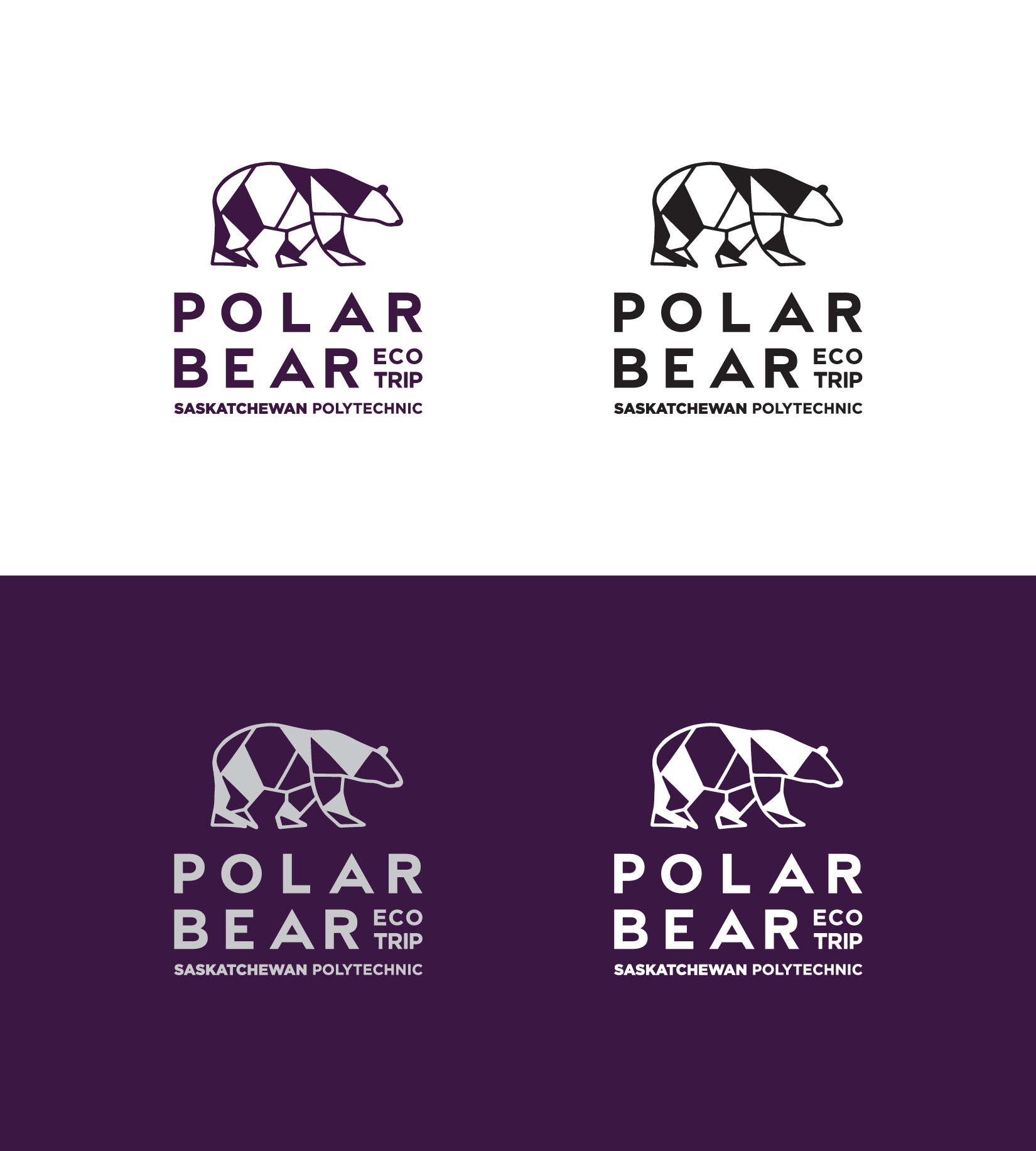
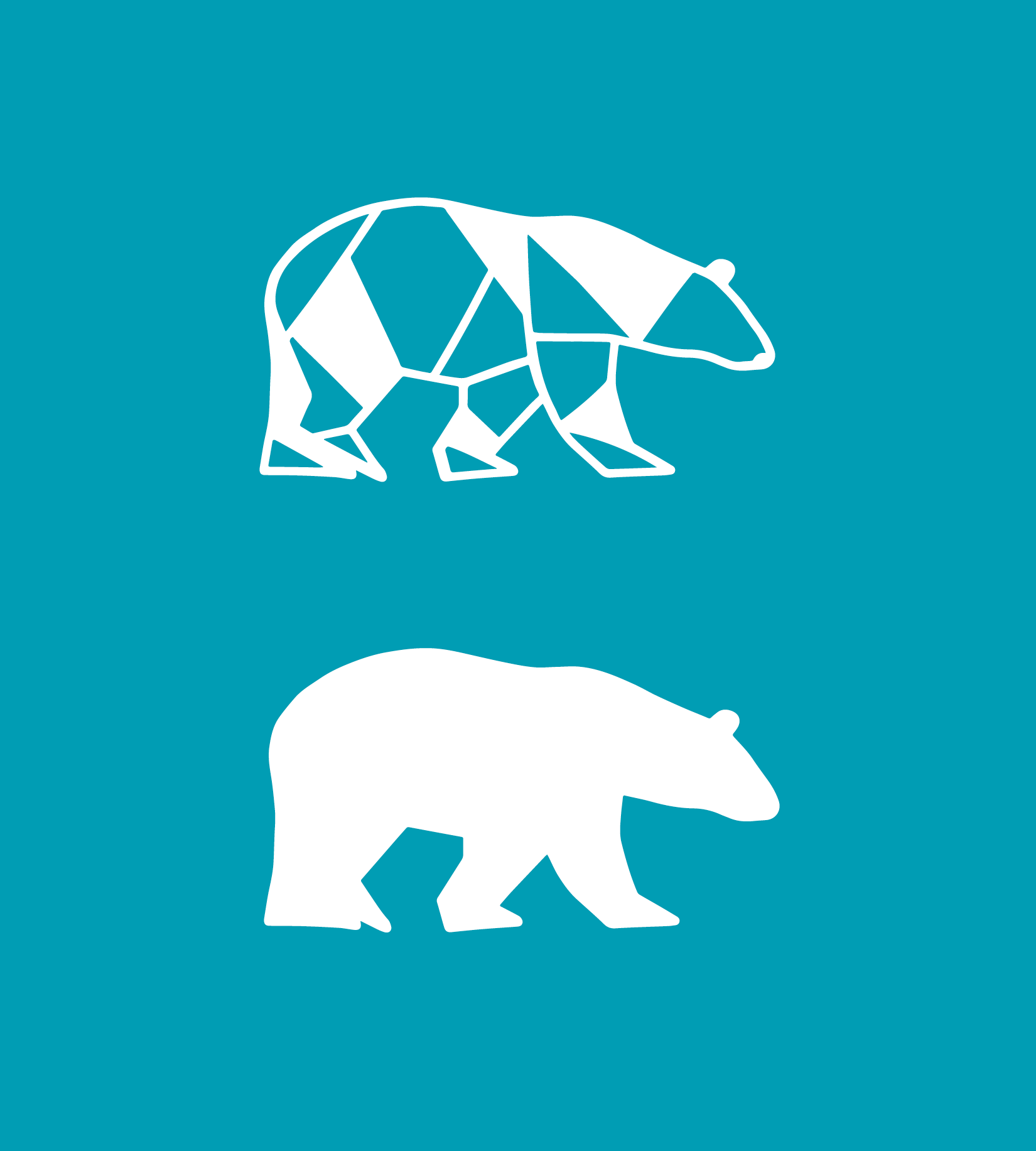
Saskatchewan Polytechnic initiatives
Logo and identity design for two campus campaigns / events:
Sustainability Day
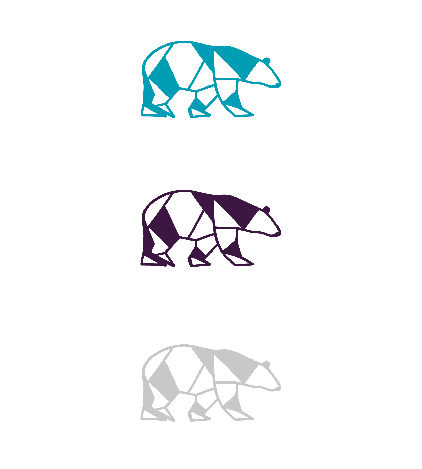
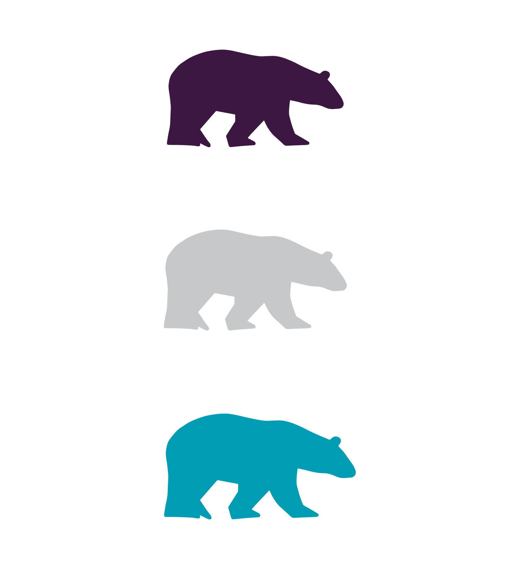
Polar Bear Eco Trip
These were created in multiple colour variations that aligned with the primary Sask Polytech brand for wide usability as well as to be able to use as a stand alone icon without the logo type [two icons for PB].
Created a few additional assets such as backgrounds and identifiers for specific use cases [for SD]