

This is a mobile app idea for a floating music festival called The Rock Boat.
UX, UI, AND VISUAL DESIGN CONCEPTS. [THIS IS NOT A REAL WORLD PROJECT BUT IT IS BASED ON A REAL EVENT WITH A POSSIBLE NEED].
This was completed as a project for a ux design class through Brainstation.
SKIP THE PROCESS; JUMP TO THE FINAL SCREENS.
Problem?
Users said it’s hard to keep track of a festival schedule when you’re in the moment—they just want to quickly glance at what shows are coming up.
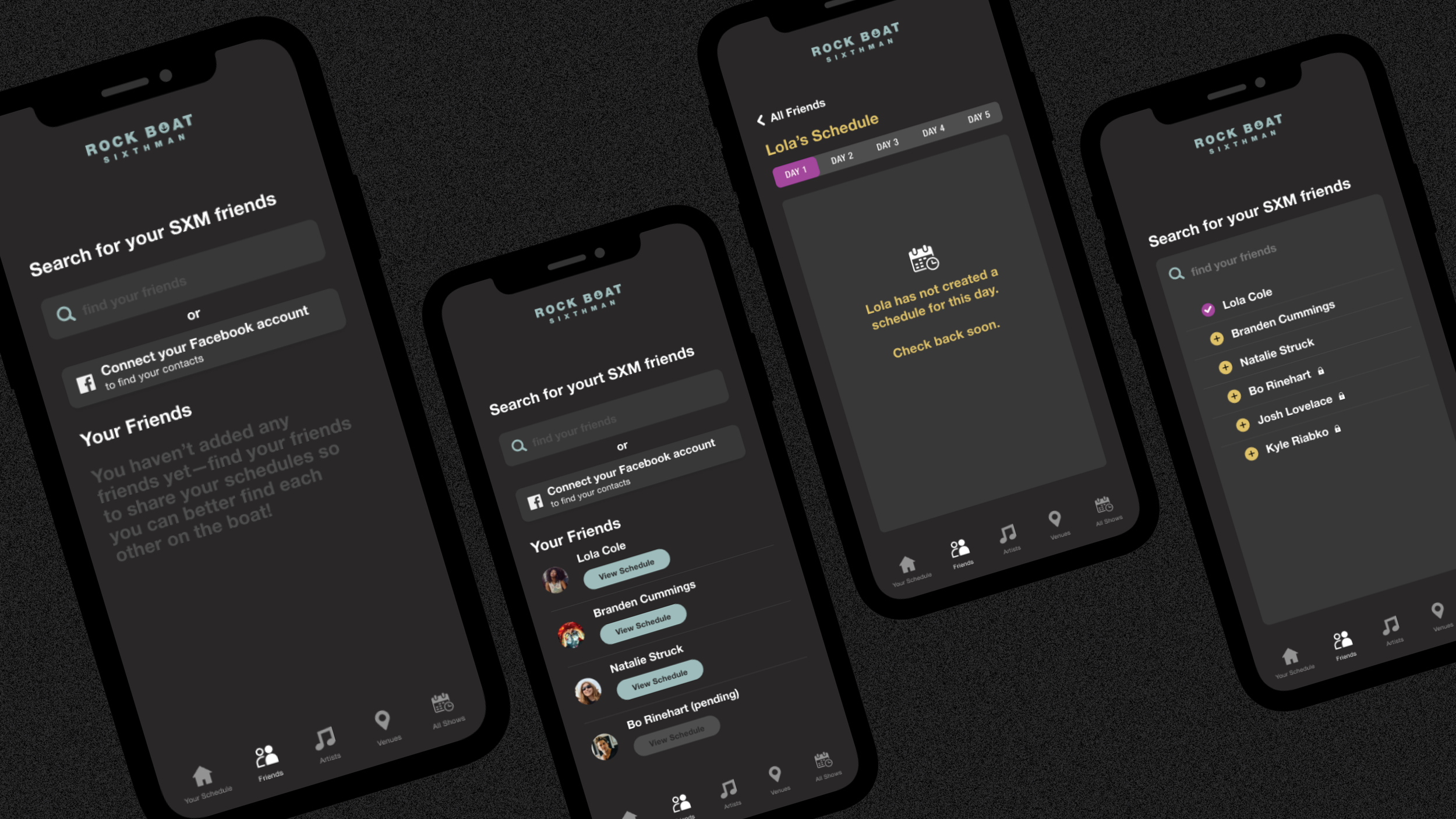
They also said they have no easy/cheap way communicate to meet (or find) their friends onboard once off the grid. A ship can be like a mini city and sometimes if you lose someone, you lose them for hours or even most of the day.
Solution:
[one]
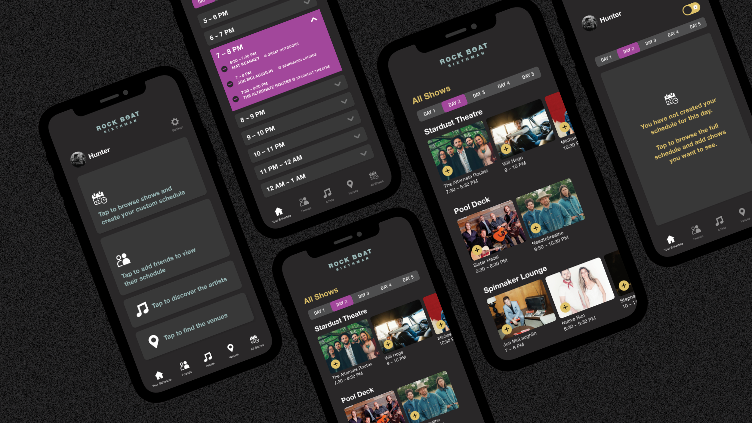
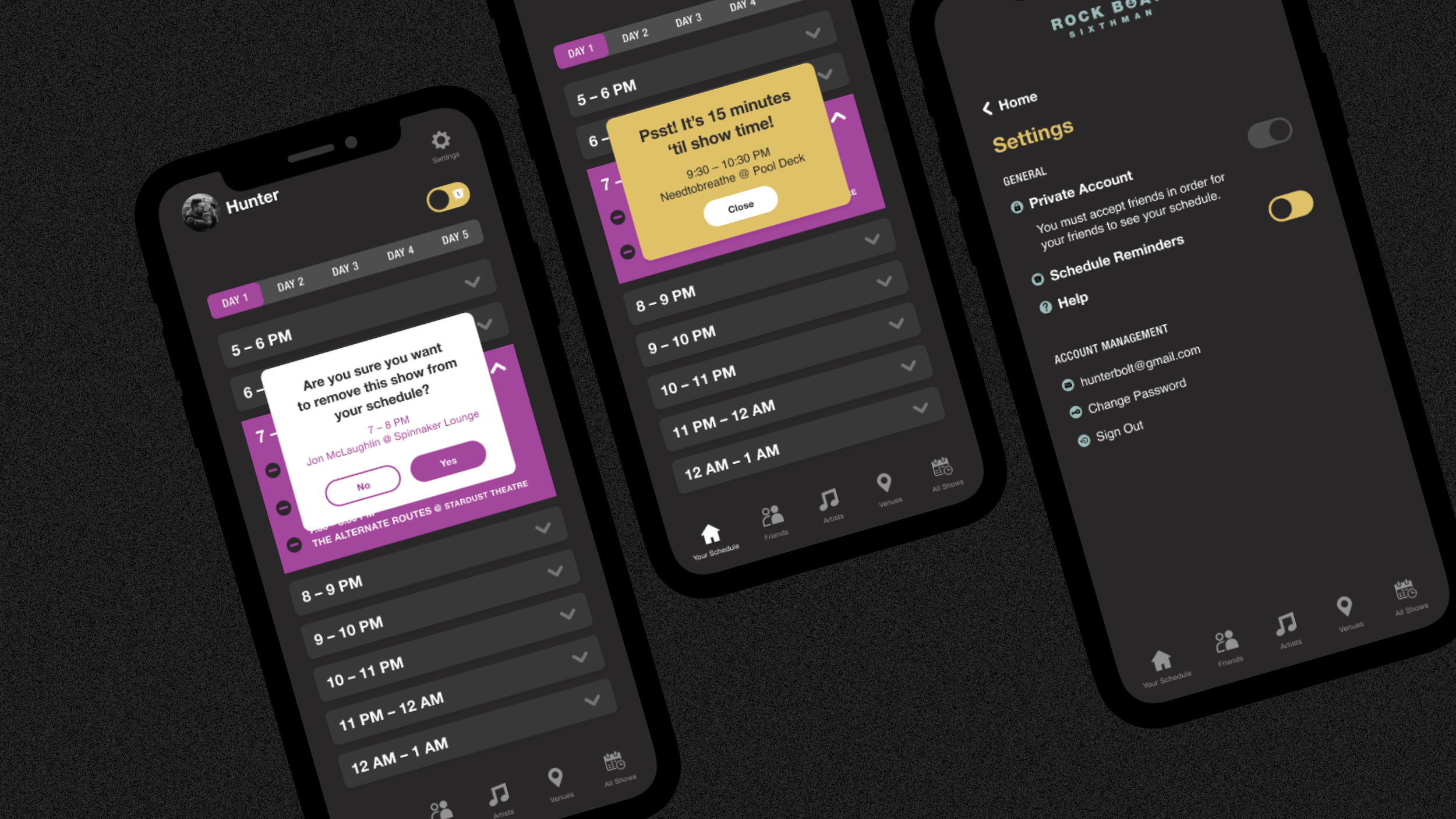
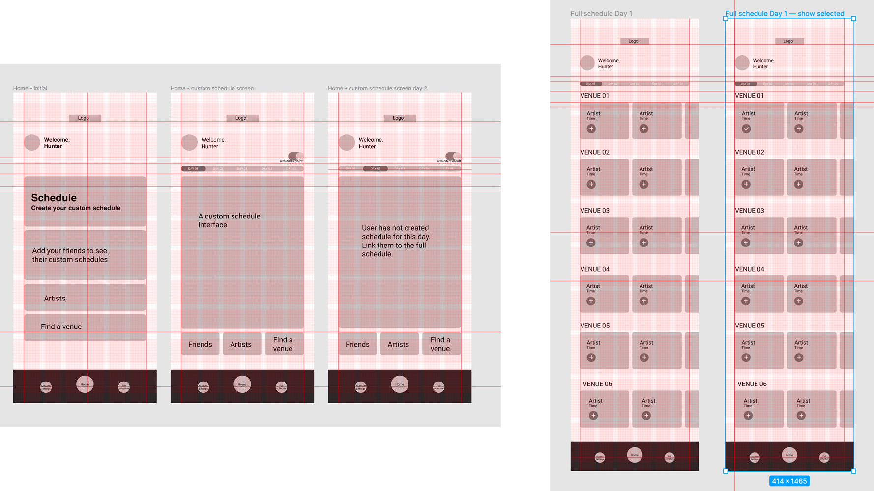
Create a schedule of the full festival with the option to add shows to create a custom schedule which would show only selected shows for the day. This wouldn’t need wifi/service in regard to their own profile.
[two]
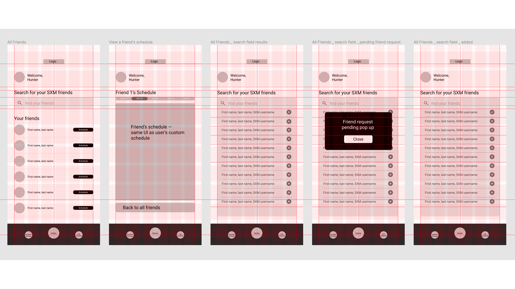
Allow users to share their custom schedule with friends on the app pre-boarding or at port stops (would need wifi or service). This way, if you lose track of your pals, you’ll have an idea of where they might be.
It’s not a perfect solution since users would be able to edit their own schedules onboard and it wouldn’t sync with their friends without service——but it would be better than nothing.
What was some common feedback from [real] users that would generally improve the overall festival experience?
[one]
Being able to customize the schedule to only show the shows they want to see for a quick overview of the day, and;
[two]
Being able to find your concert pals easier if you happen to split up or lose track of ‘em.
Since we usually have access to the internet everywhere we go and don’t think otherwise, perhaps the biggest challenge was to figure out a way to give users all this without wifi or cell service.
While it is possible to buy internet to use onboard, it isn’t always reliable and can be expensive. Besides, many users say they like being disconnected from the internet for awhile.
After some researching [I asked a Facebook group of thousands of past attendees], I decided to keep the app simple and to the point, giving users only what they need without risk of being distracted on their phone by too many unnecessary features.
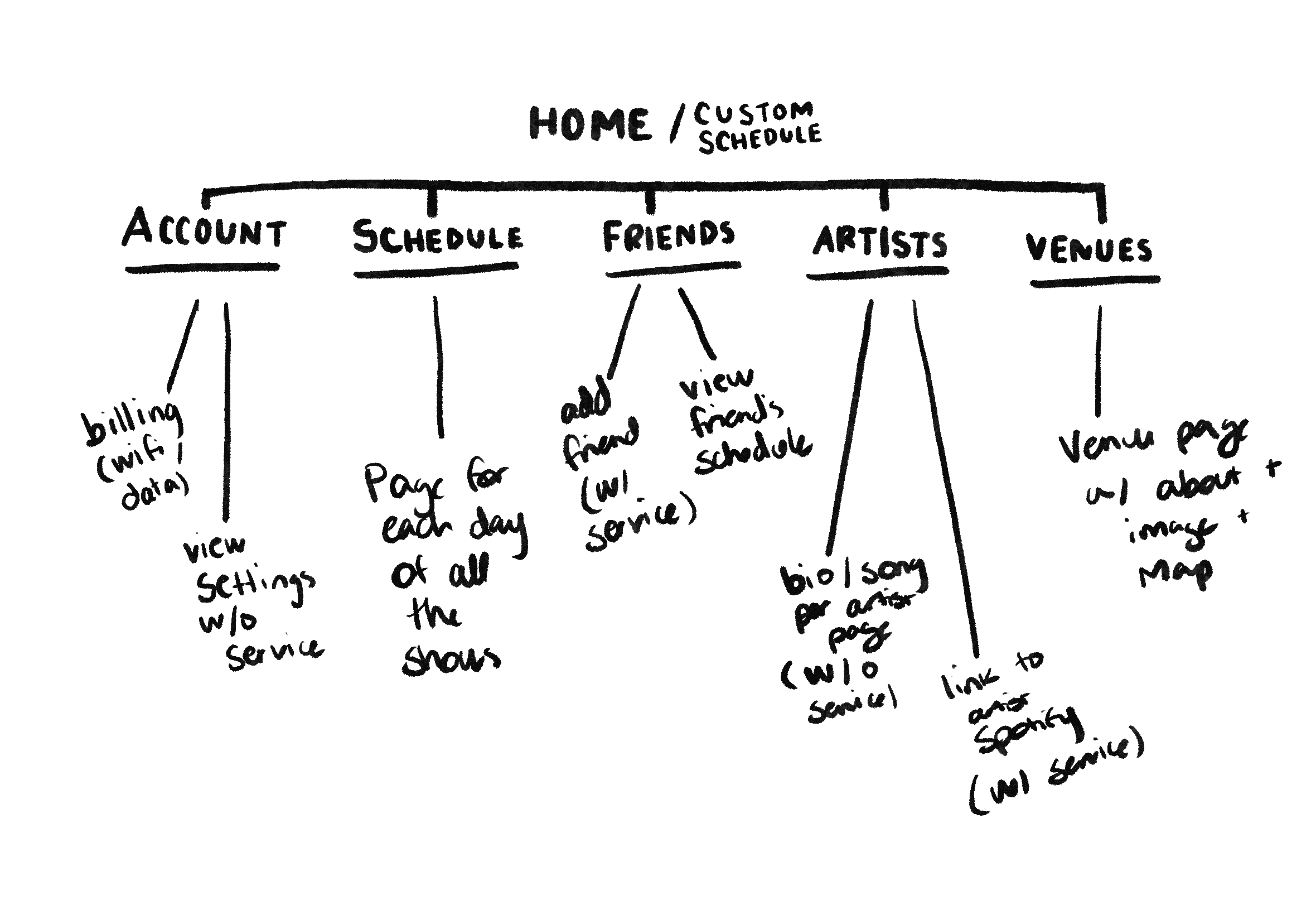
From there, six key pages were born.
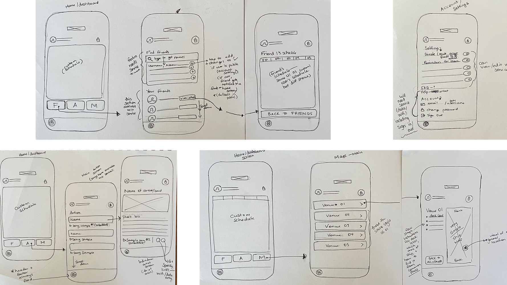
I naturally brought the ideas in my head to life as big picture concepts.
[about my overall design process]
I avoid details in sketches or wireframes as I tend to fixate on them too much if they’re there. I aim to walk through these concepts with clients or users if I can to explain the big picture. Once everyone feels it’s on the right track and we’re on the same page, I move on.
I have always done things this way in most of my design work, no matter what kind of project it was [print/editorial, brand, etc] and it’s always been beneficial.
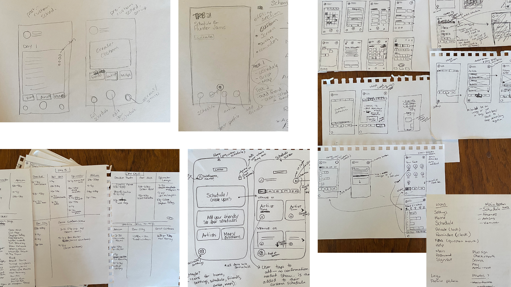
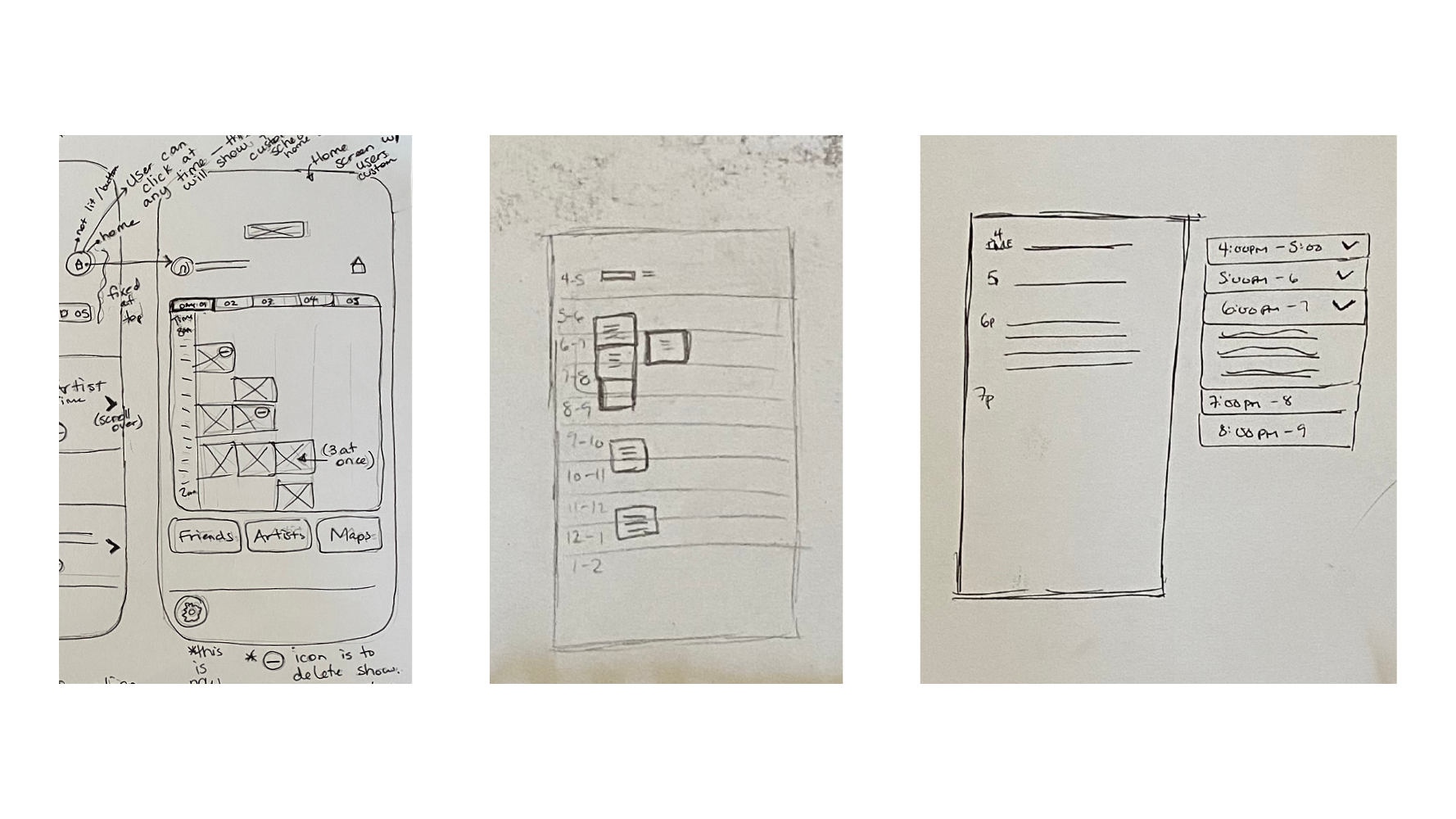

Another challenge was the custom schedule screen due to most days being busy and at first I had no idea how to make it work without looking terribly overwhelming. So, I left it, moved on, and hoped the muse would come to me later.
Sure enough: the expandable / collapsible drop downs for a one hour time slot organized by day became a very clear solution once I had a better visual for the rest of the pages. I went back and sketched this idea out but I didn’t really need to… it was that clear.
Sometimes the design process can be like this; you just gotta leave it and come back later with a new perspective.
[the visuals]
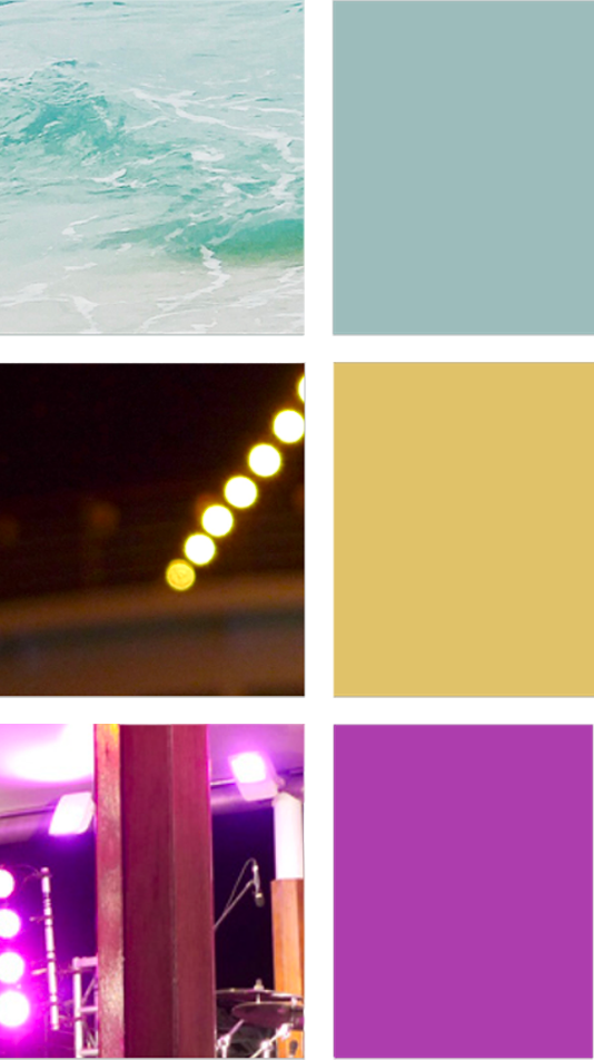
I came up with the brand style quickly as this wasn’t the point of the class; accessibility and function were my priority. I settled on a colour palette that reflected the sea and stage lights.
Dark mode usually feels better on the eyes when you’re looking at the screen outside or in the dark [night time, concert venues] so I chose the three colours to work accessibly together with that.
Final screens include:
home screen,
a complete and incomplete custom schedule,
the full schedule page,
a couple of reminder pop up notifications,
your friends screen,
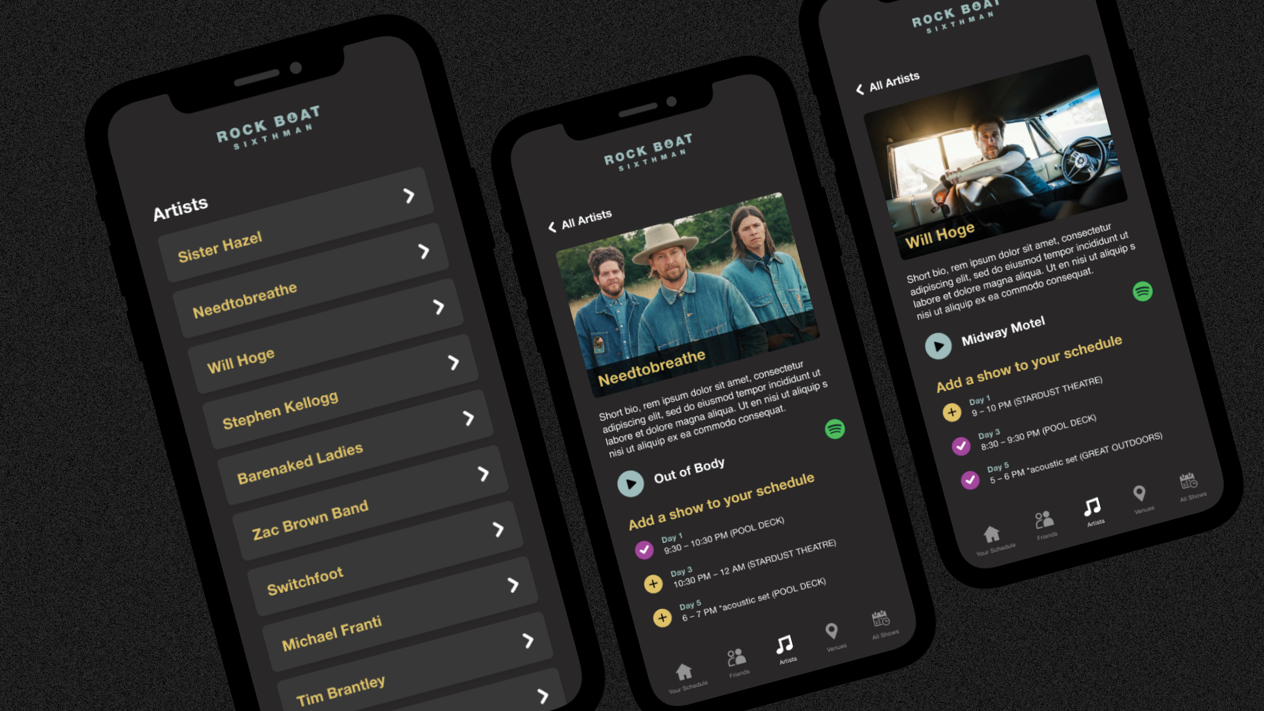
a page for each artist to initially discover, and;
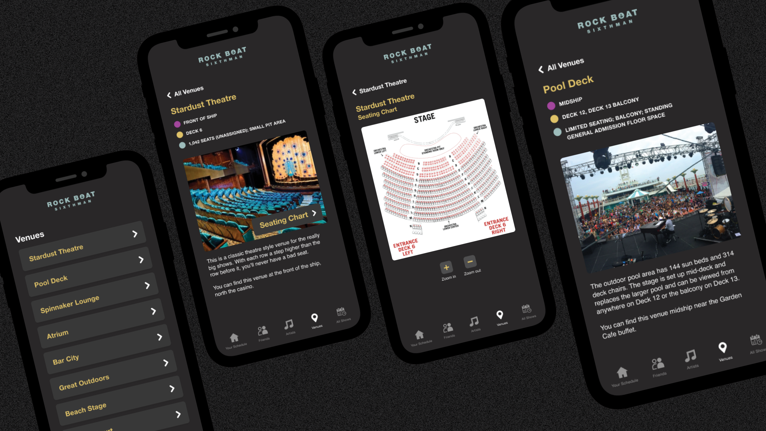
a page about each venue onboard.