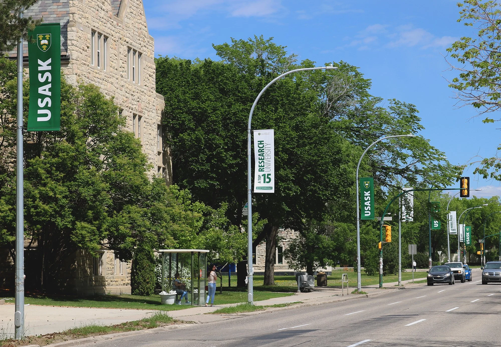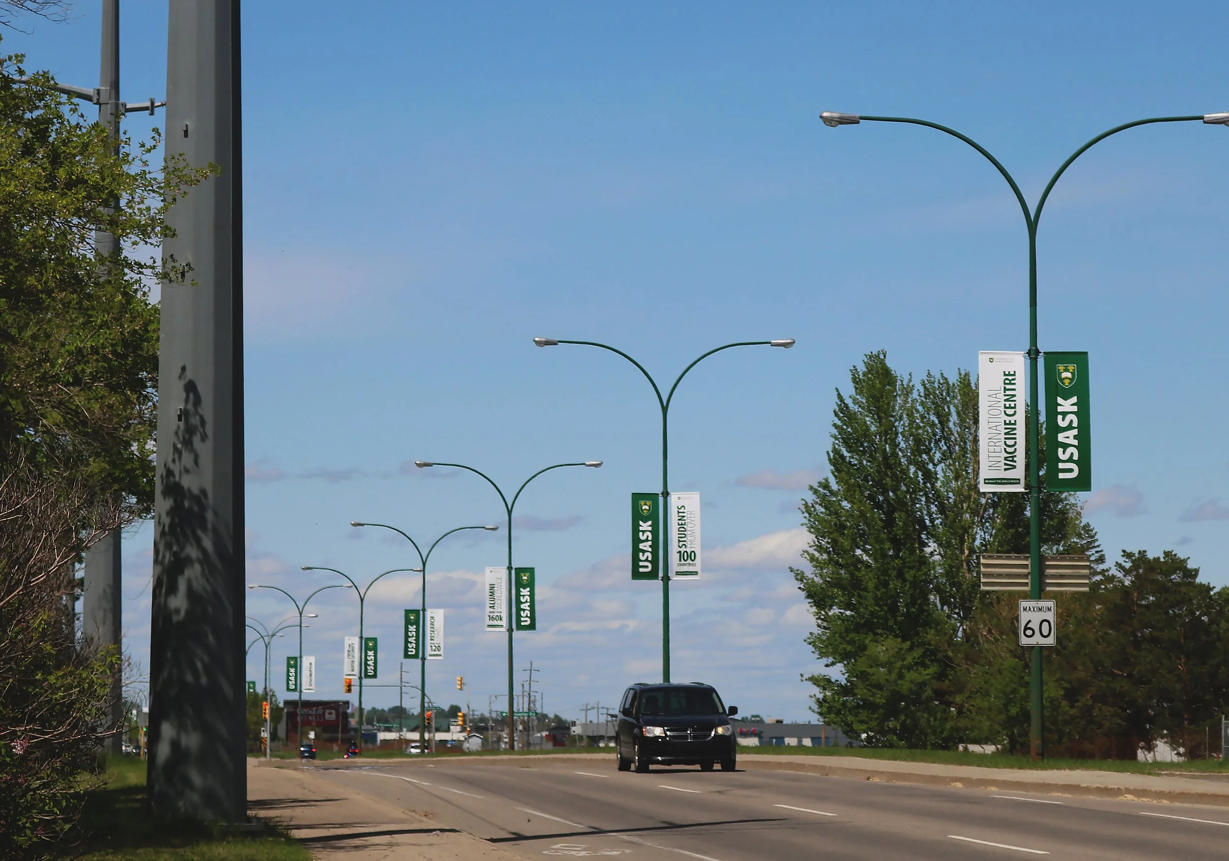

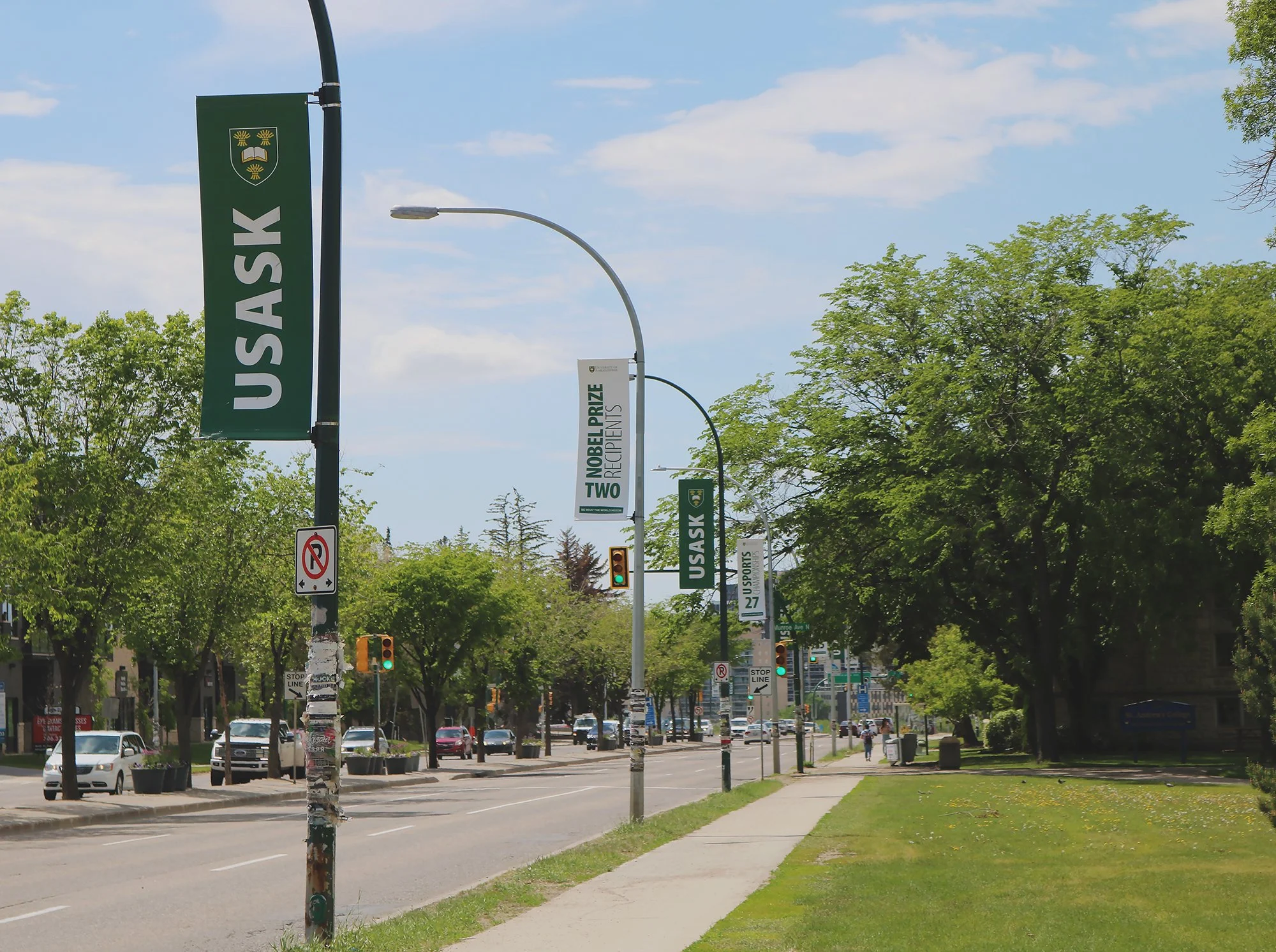
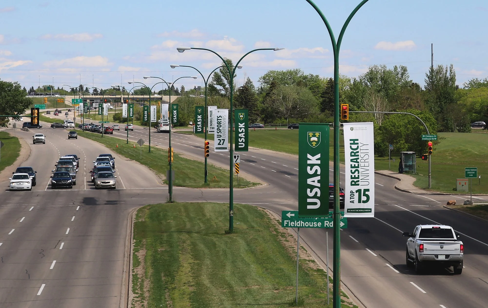
usask street banners on college dr/preston ave
CREATIVE DIRECTION, PHYSICAL EXPERIENCE DESIGN, GRAPHIC DESIGN FOR EXTERIOR SIGNAGE
these banners run along two adjacent streets of campus and get a lot of traffic [and foot traffic].
since the marketing team on campus [where i did this work] had just did a soft launch of a rebrand, it proved to be a strong opportunity to get the new visuals out there in a way that was incredibly simple to take in while on the go.
an unconventional approach: i didn’t care about the text or graphics. [subtext: i did care, it just wasn’t a priority].
a big part of the rebrand was changing the green from a bunch of different shades of vibrant green to the original campus green reflected in the logo and, of course, white. that’s it.
since the colours were so minimal i wanted to create a clear visual based on those two colours… something like a coloured pattern.

colour can be a valuable tool alone.
since the brand colours are already pretty well known across the city and province and the alumni magazine is called green & white, i knew that creating an alternating pattern of green and white would be highly recognizable right off the bat.
we, of course, couldn’t leave them totally blank.
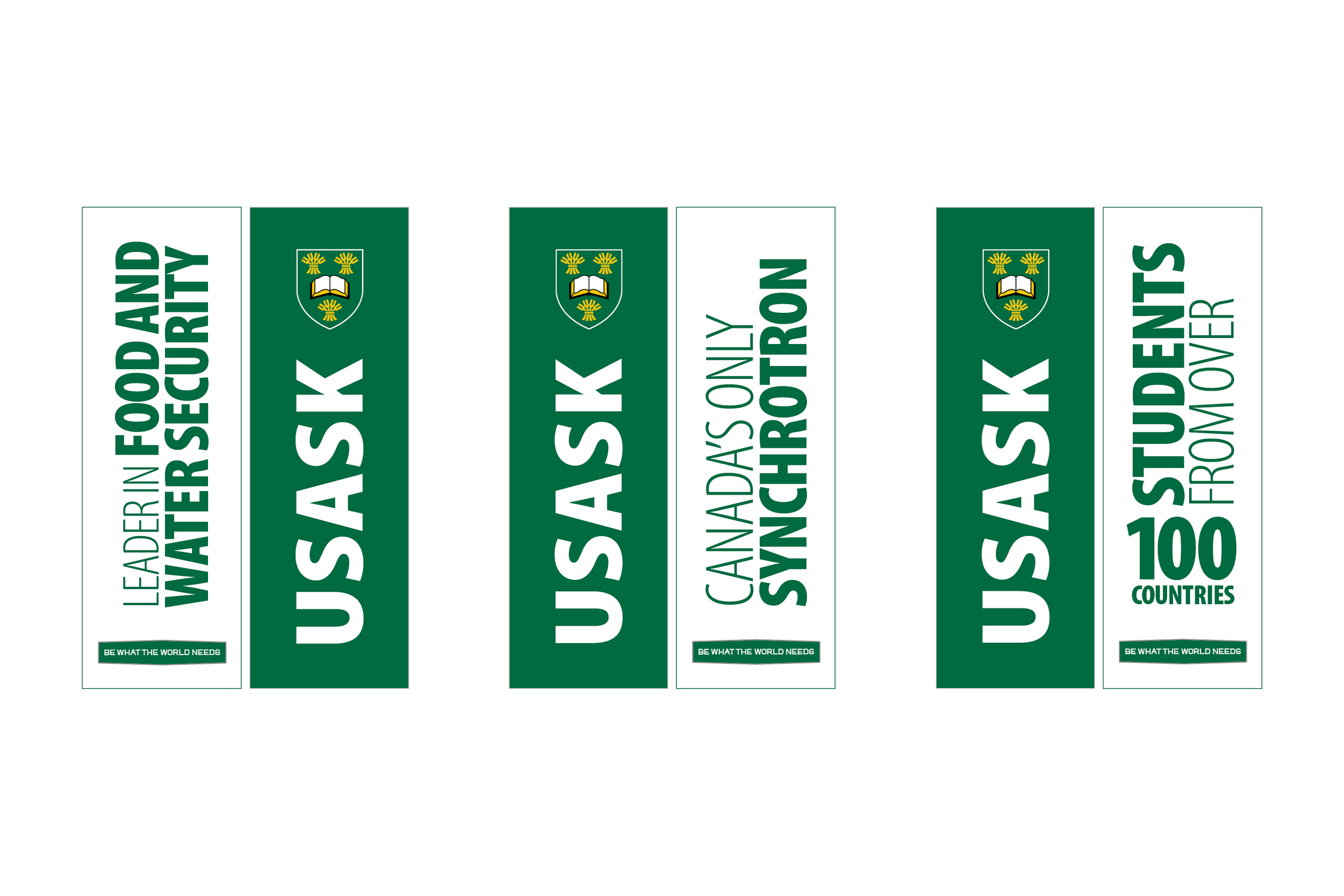
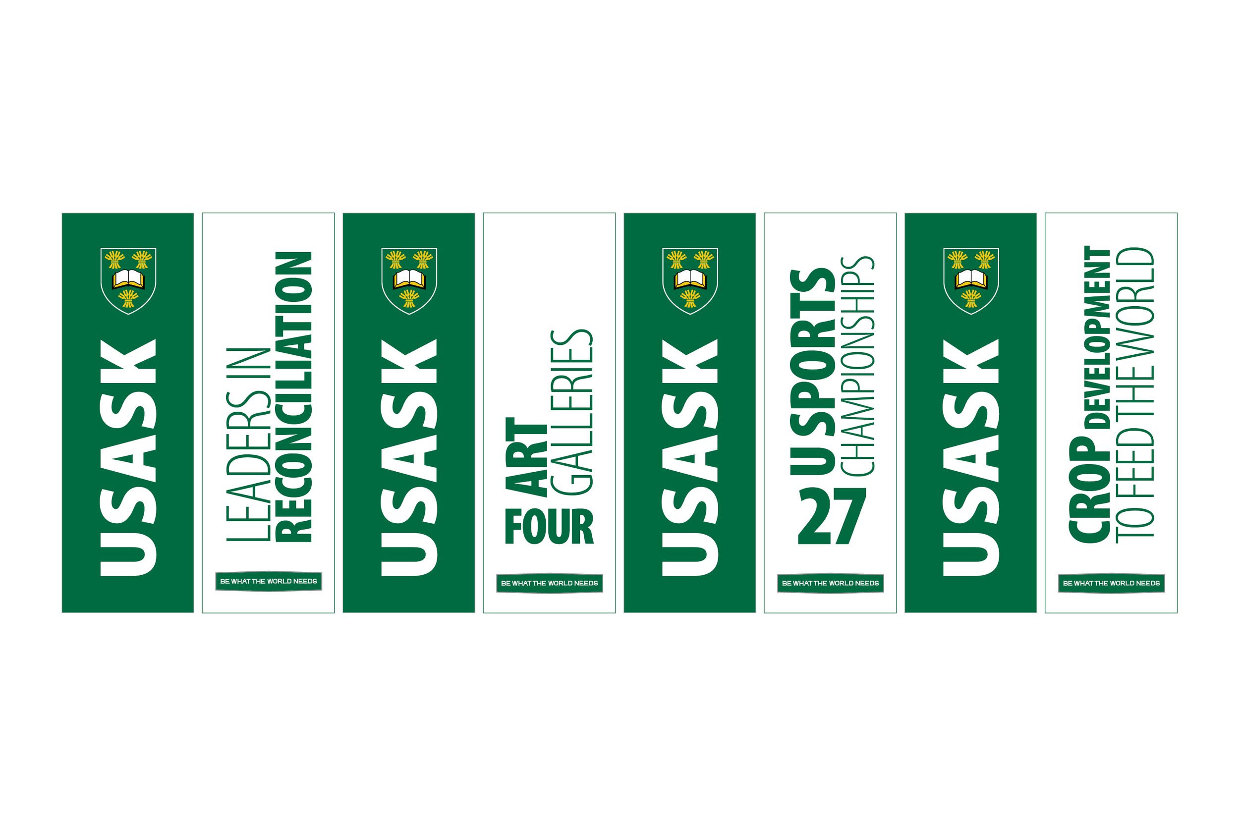
green:
i bent the logo rules [just a bit… with approval] to make this one fit better while being far more legible from a distance. we separated the crest from logo text occasionally for merchandise, so i knew it wasn’t out of the question.
white:
i left the text on the white banners up to my colleagues who are good with copywriting and suggested “just some well known facts about campus” in as little words as possible. i then arranged the facts however they fit best on each banner so the text was as big as possible to make them legible.
to me there is nothing worse than a street banner with great artwork on it but you can’t actually see or read it from afar.