
A redesign of the cover + inside visual branding for multiple campus magazines across campus to bring them all together and better tell the whole usask story.
CREATIVE/ART DIRECTION, EDITORIAL DESIGN, BRAND STORYTELLING
with a wider campus brand redesign underway, my team thought it was time for a rebrand of the alumni mag [green & white]——and i wanted to push it a step further to get the college ‘zines onboard, too.
the goal was to make all of these publications look like they came from the same place; they may all be different subjects [colleges], but the consistent visual brand communicated at least one thing in common.
JUMP TO:
1 THE REBRAND OF A HANDFUL OF CAMPUS ‘ZINES
2 TWO OF MY FAVOURITE INSIDE FRONT COVERS
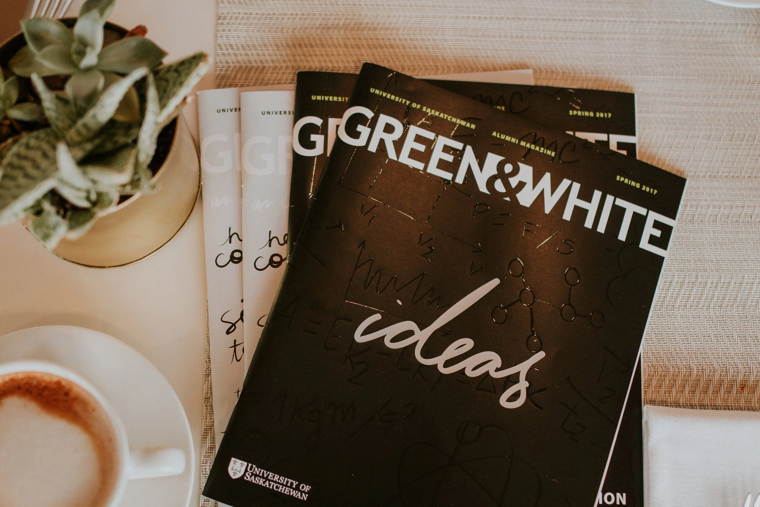
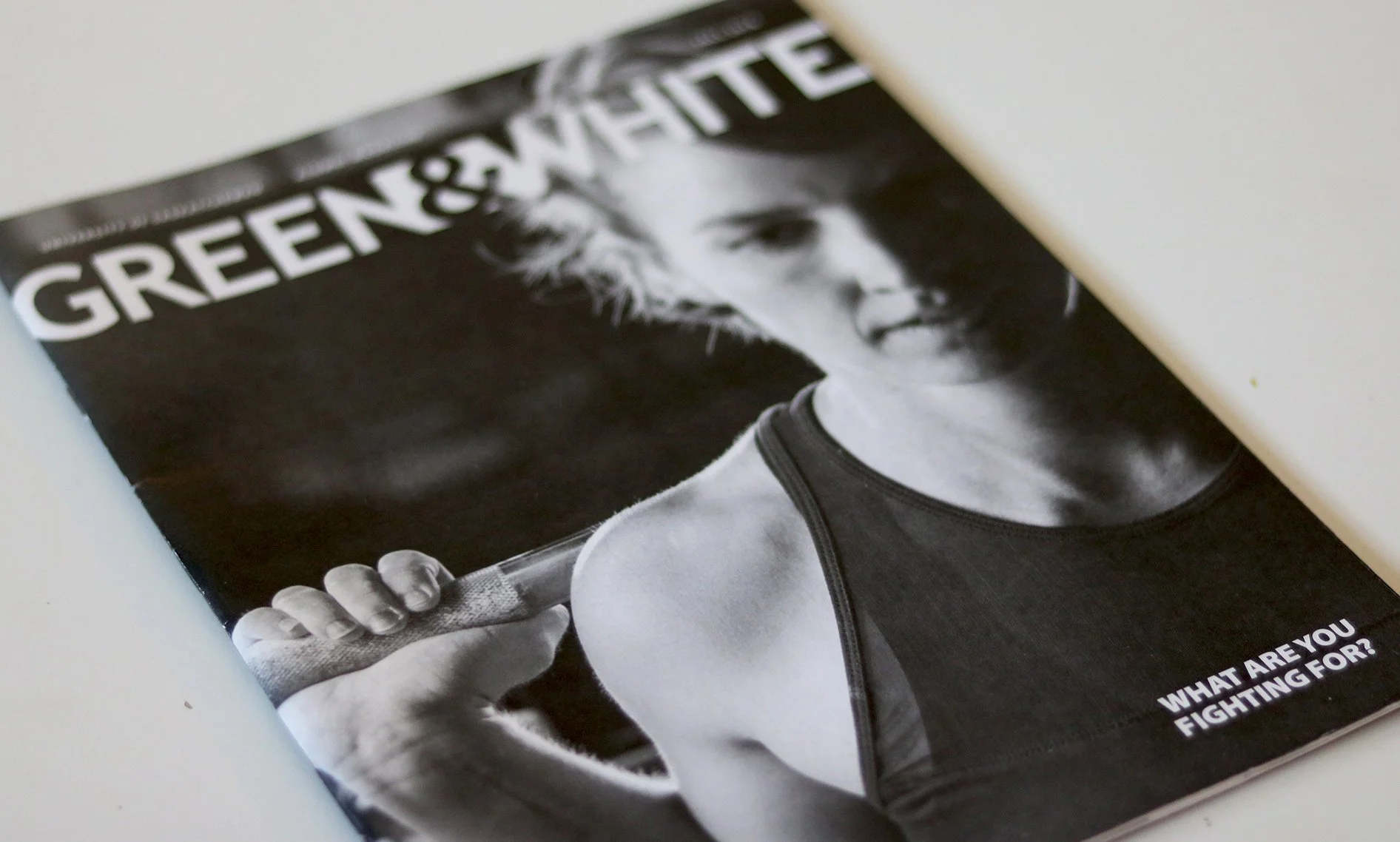
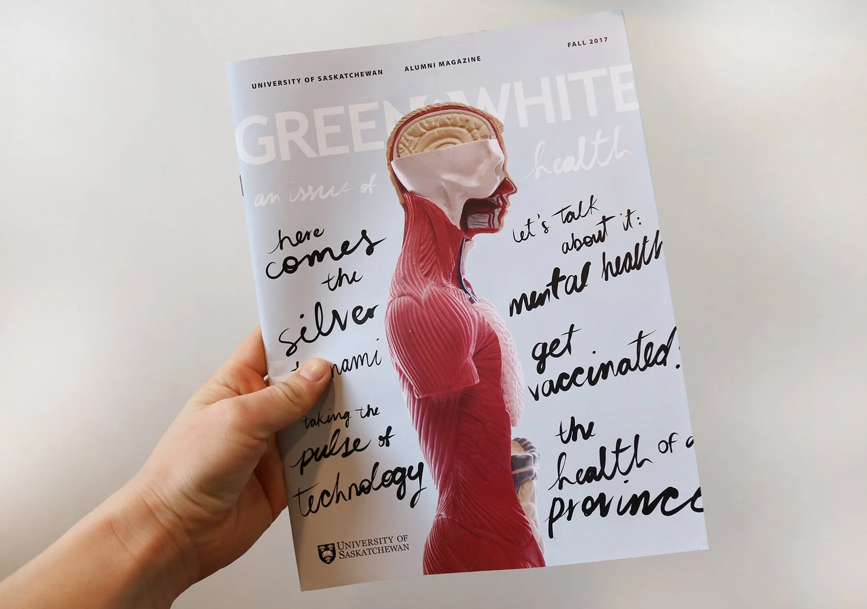
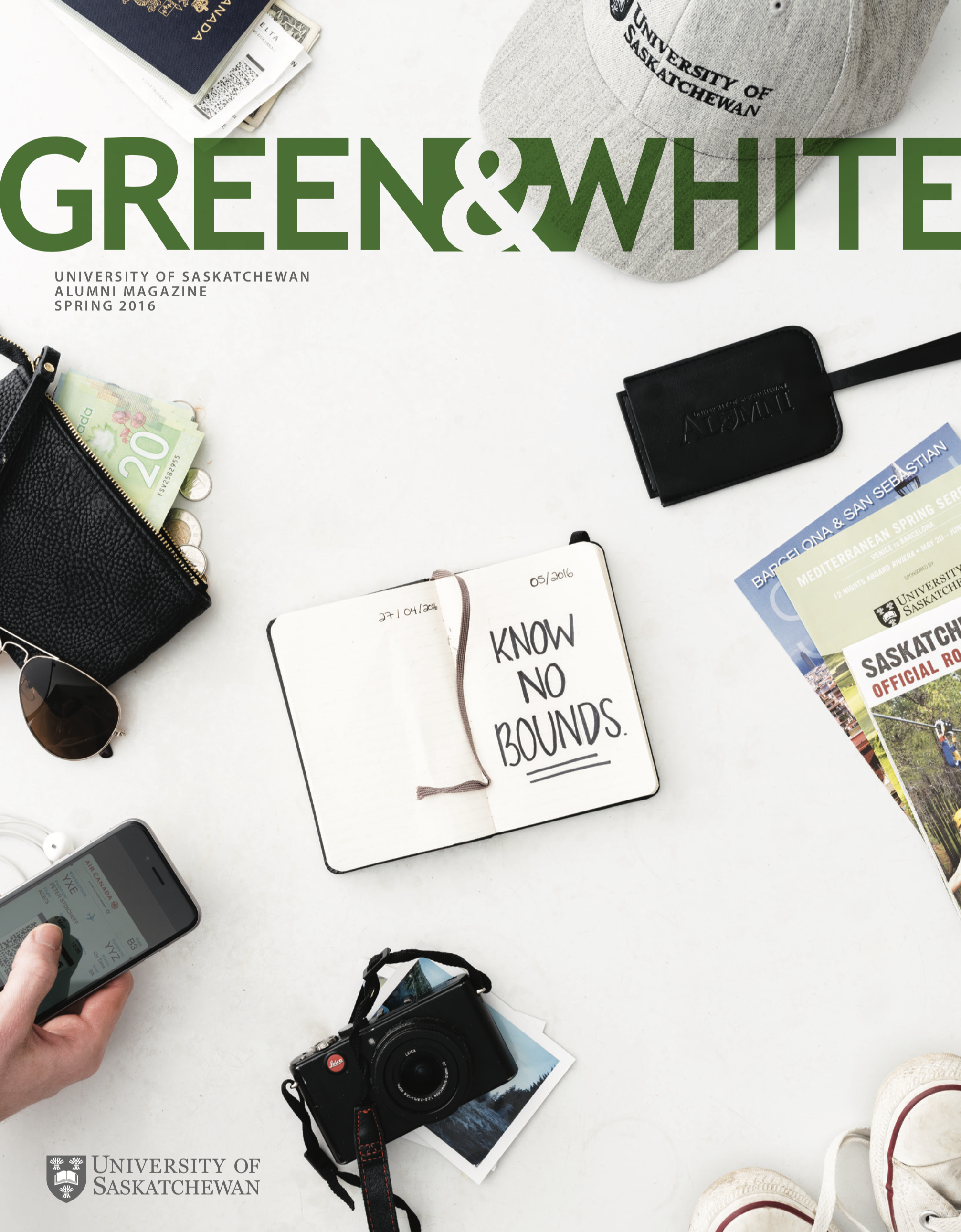
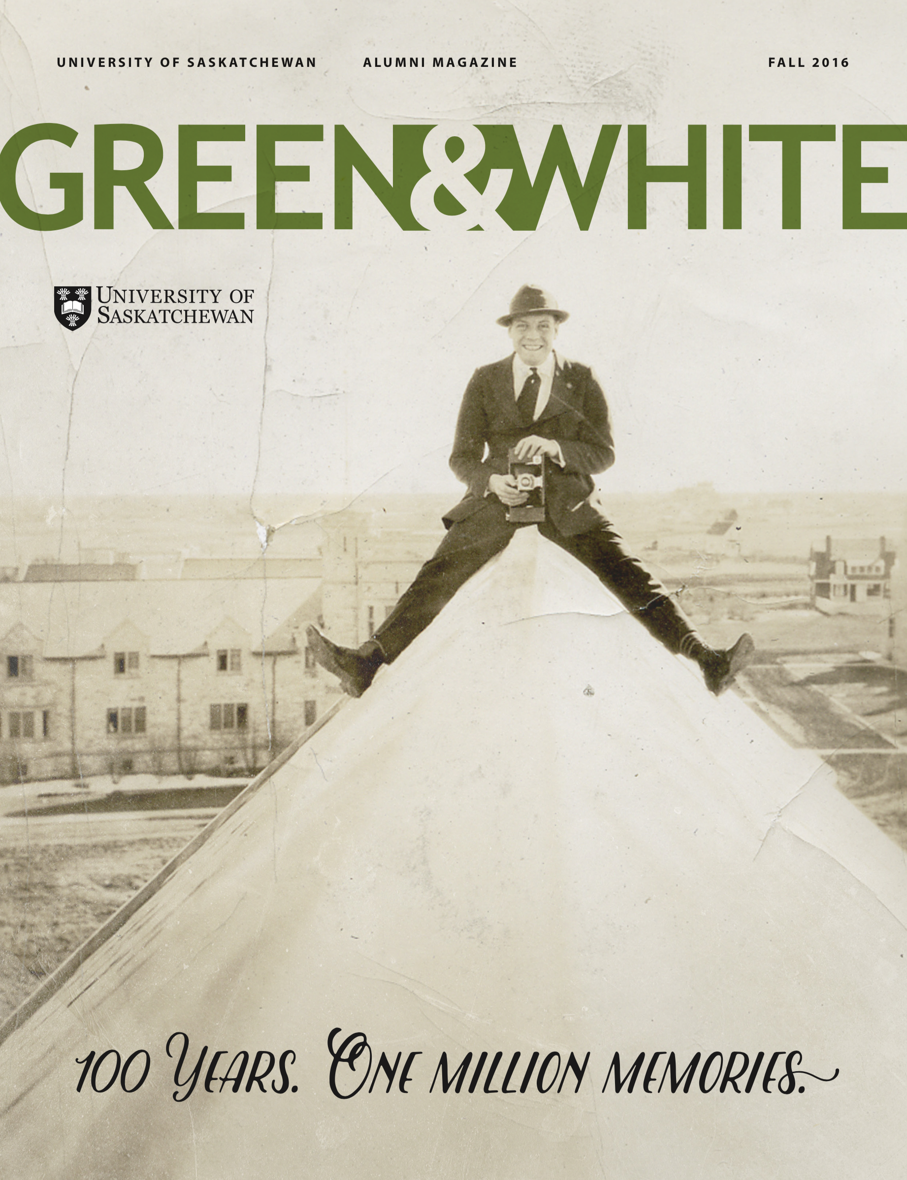
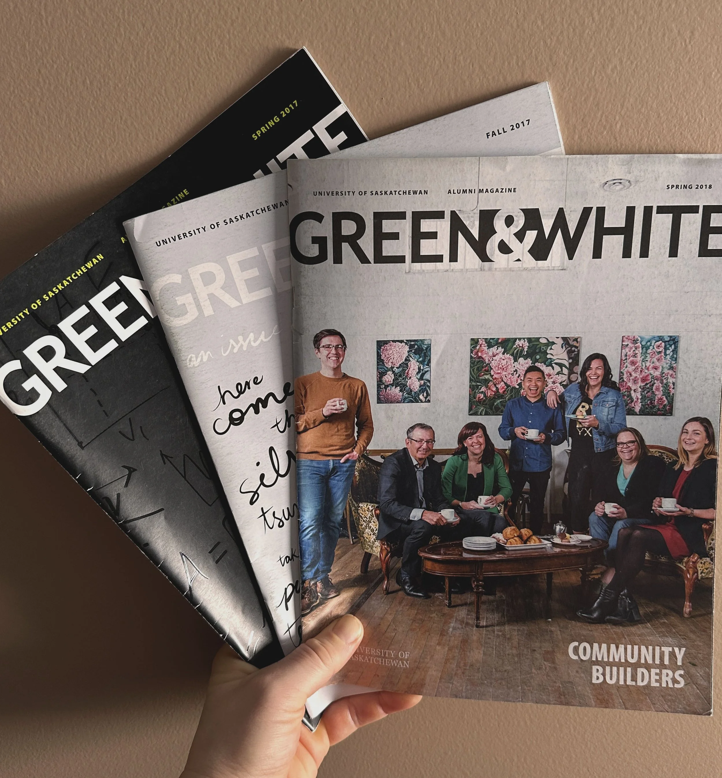
2 A COLLECTION OF COVER ART FROM VARIOUS ISSUES OF THE ALUMNI MAGAZINE PRE-REBRAND

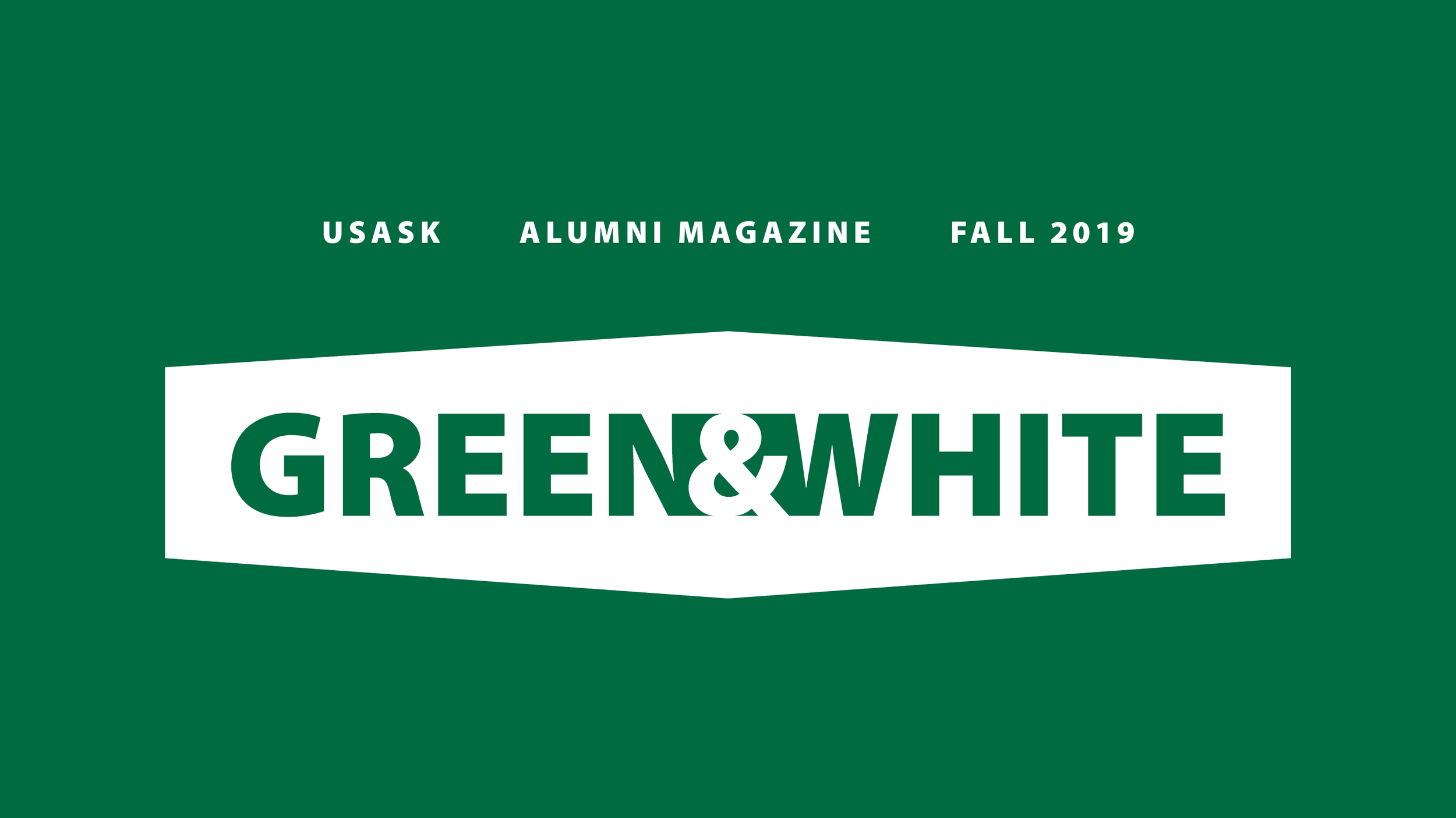
one of the main graphic elements in the campus rebrand was the icon shown above, which was also used as the [new] tagline, “be what the world needs” on various marketing collateral.
in other words, this icon was about to be extremely recognizable… and right away i saw this icon as a natural container for the masthead of every single [different] publication. since this is primarily shipped out to users and not seen in magazine racks, i wanted to get away from the look that is best suitable for a magazine rack. basically, i wanted to make it smaller, which meant more page for cover art/photography and more flexibility with it.
the entire campus rebrand was focused on bringing it back to a classic university style [simple], too, so i felt the icon being smaller and nicely centred at the top with plenty of breathing room on either side was aligned with that.
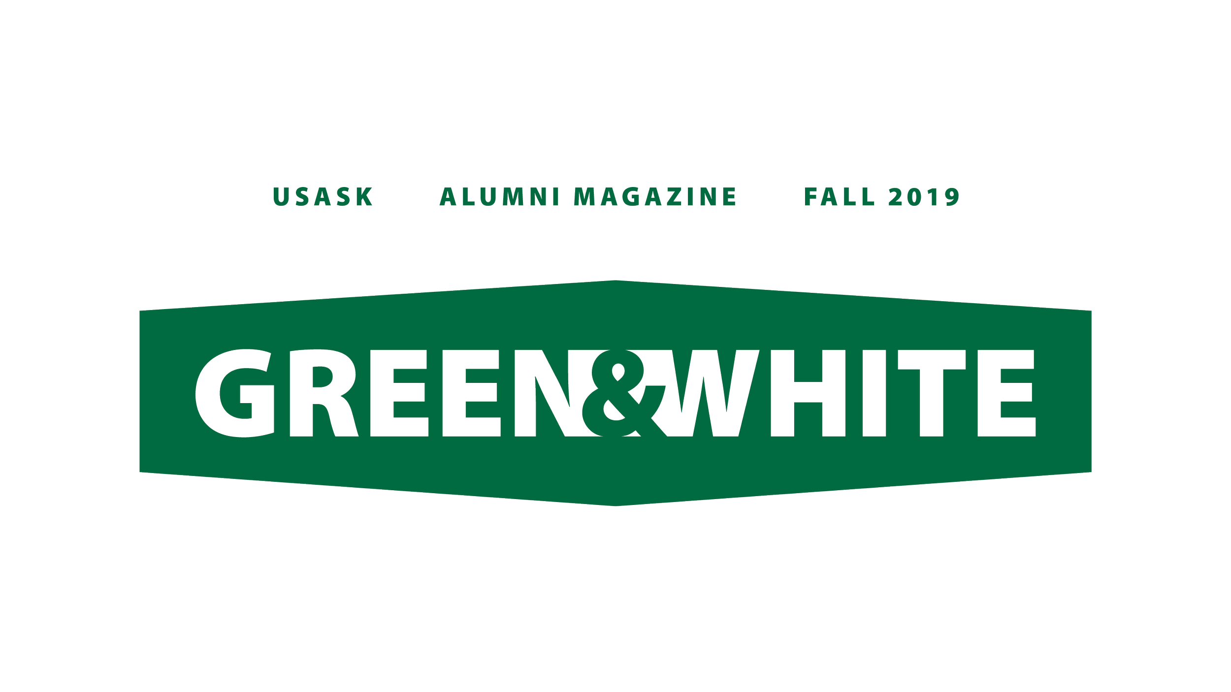
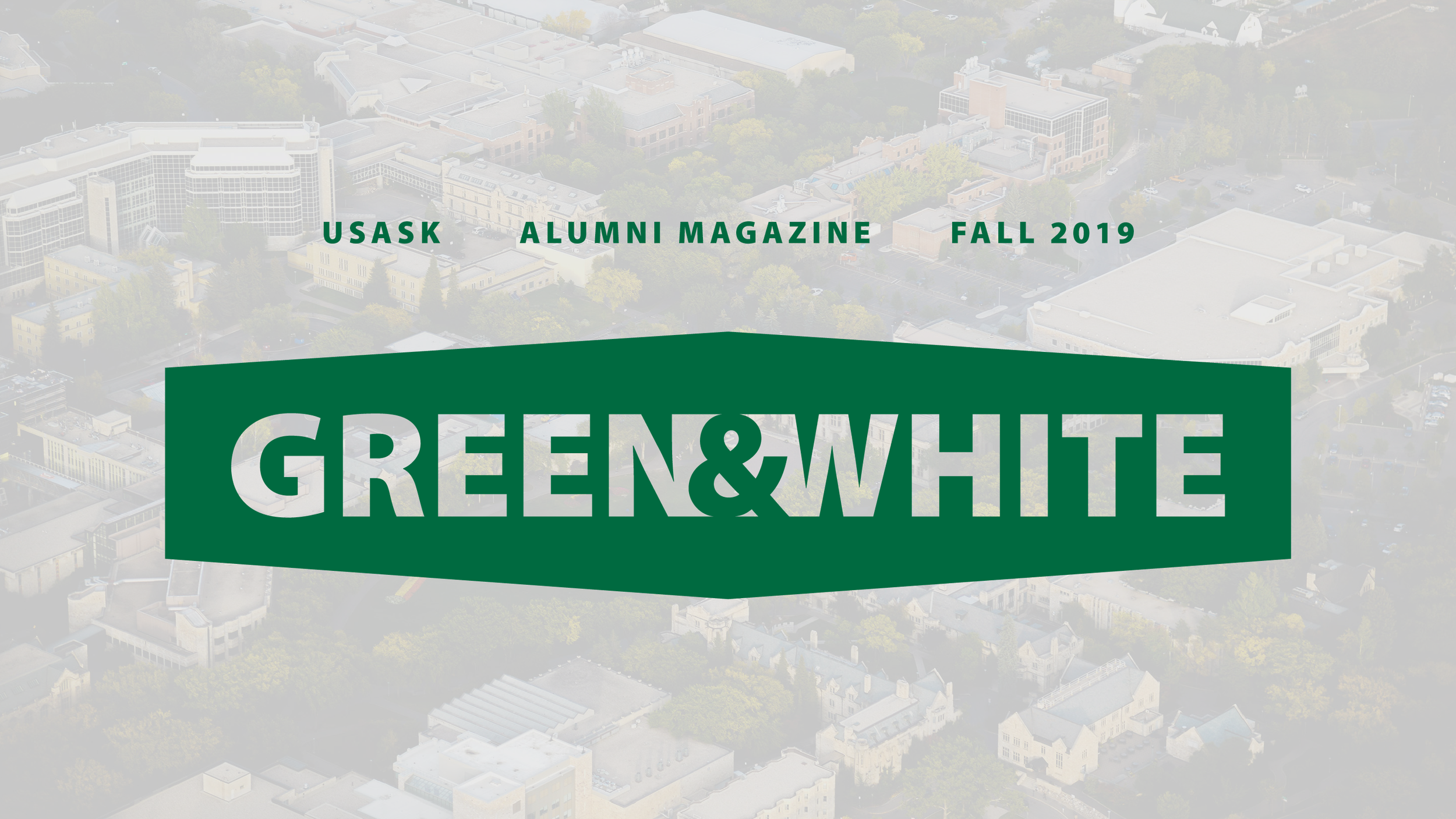
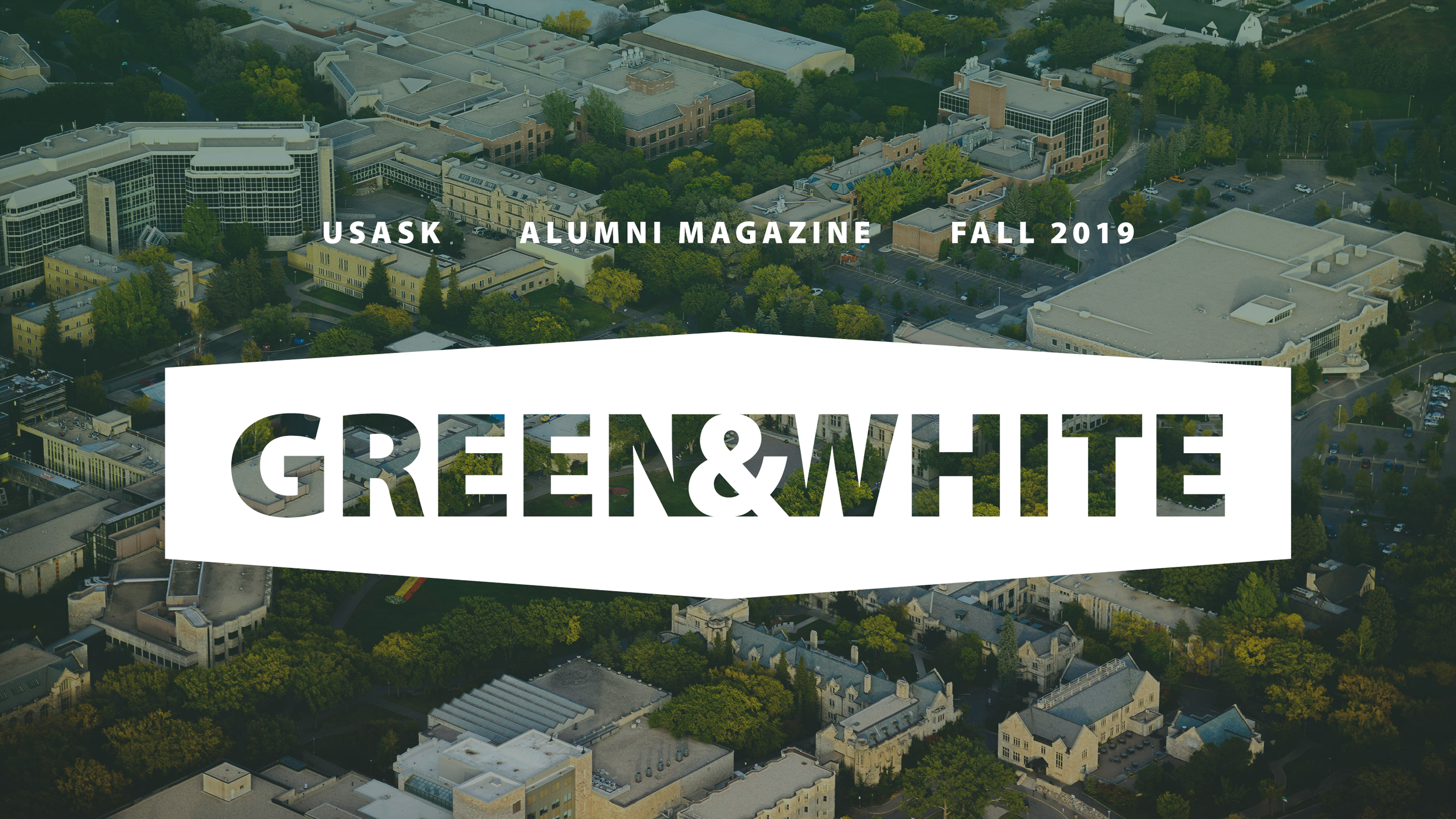
When the final design was legible in both colour instances to accommodate a variety of cover artwork, it was done.
I [very briefly] played with the idea of putting it on the top left but with such a symmetrical icon and symmetrical lettering [the & being centred and joining the letters was something we wanted to maintain], it looked oddly placed on the left.
——
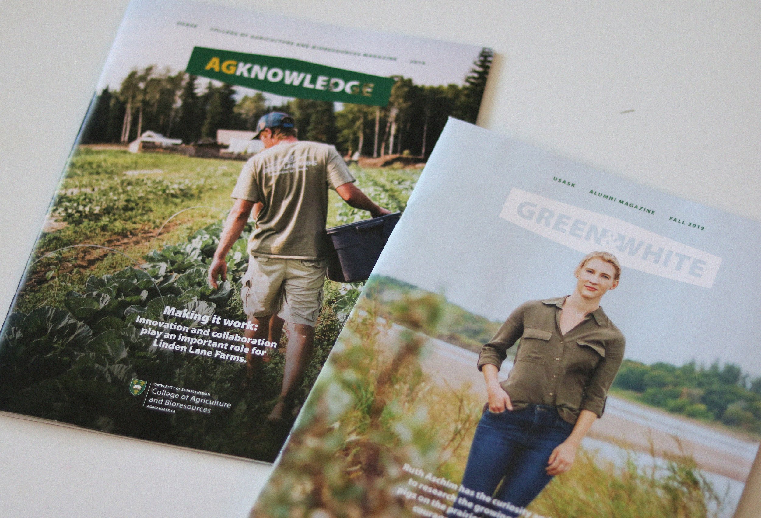
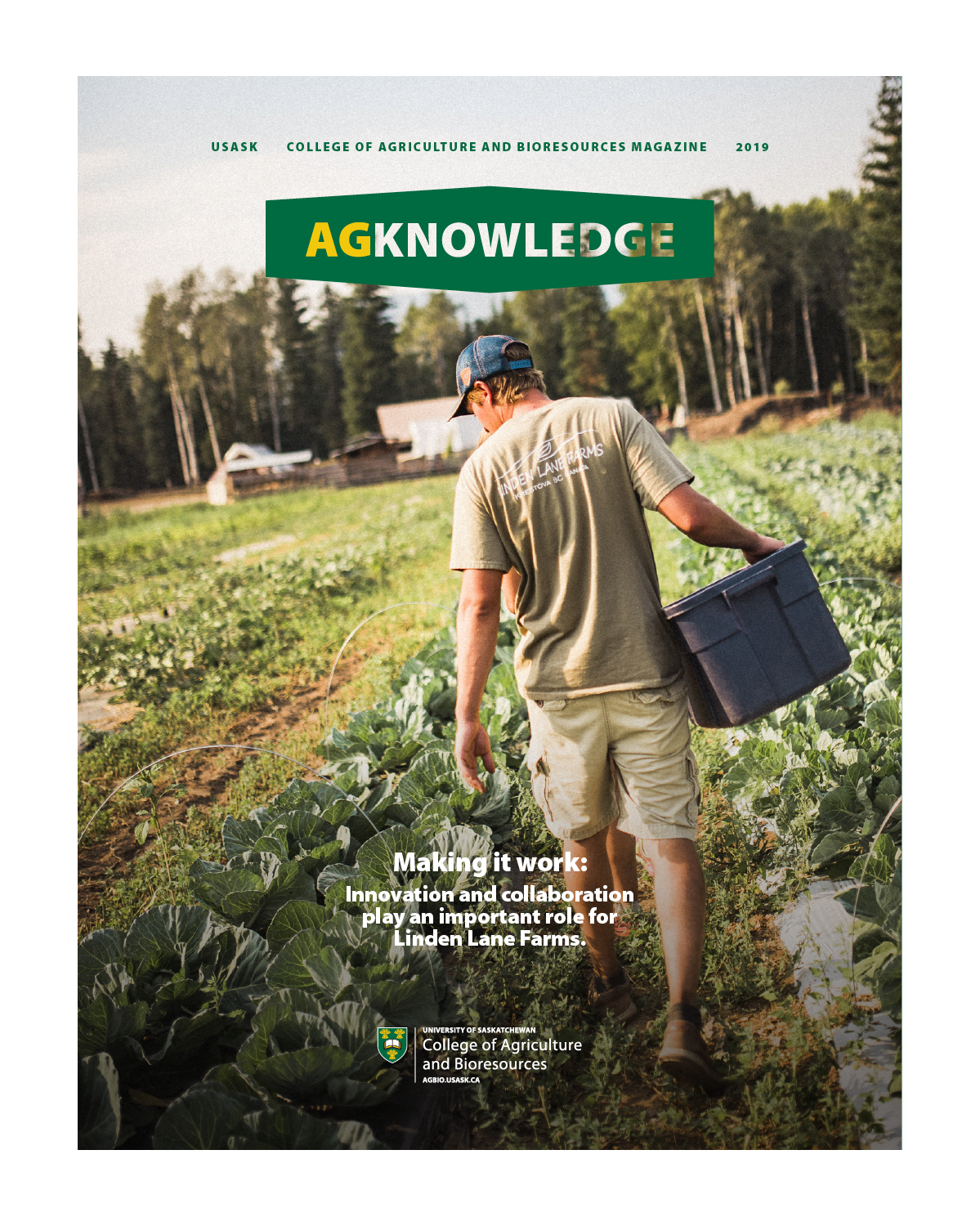
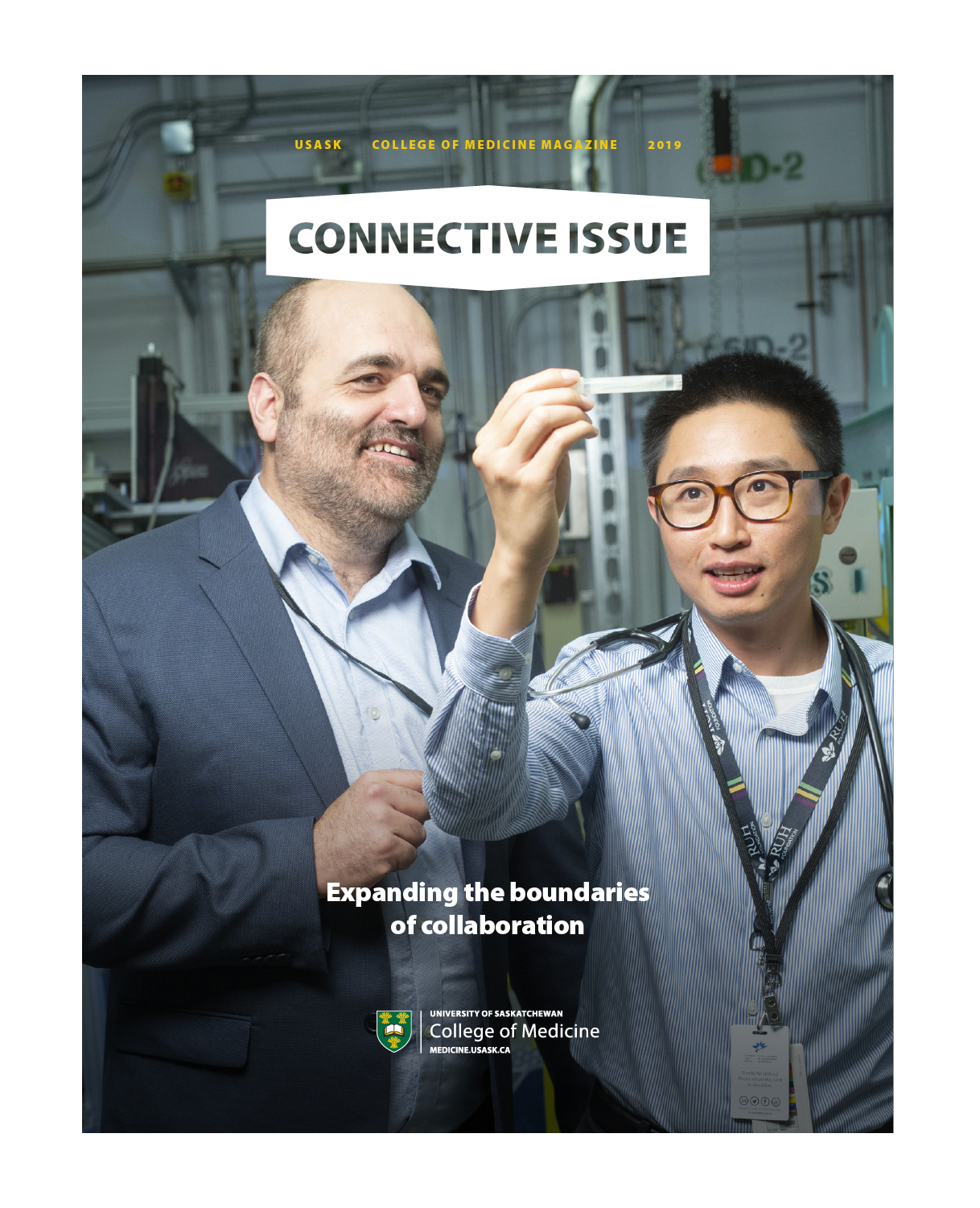
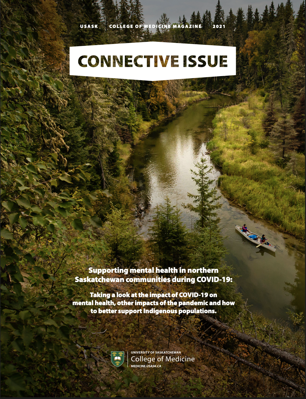
see below for three of the first with the new cover: green & white, agknowledge [college of agriculture], and connective issue [college of medicine].
the story of the inside front cover
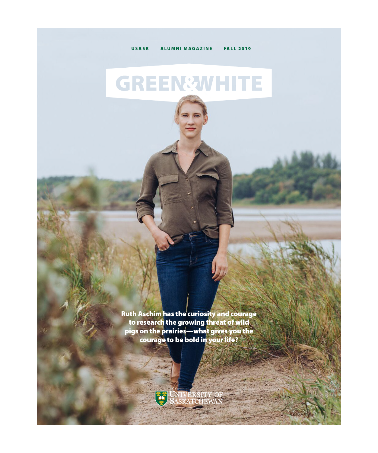
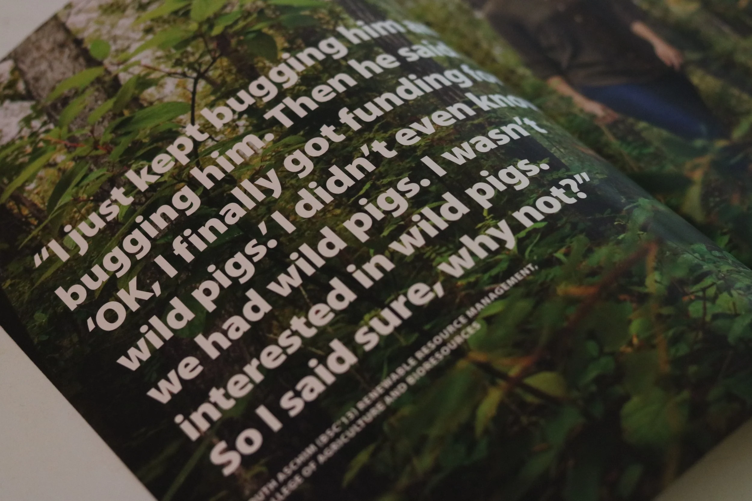
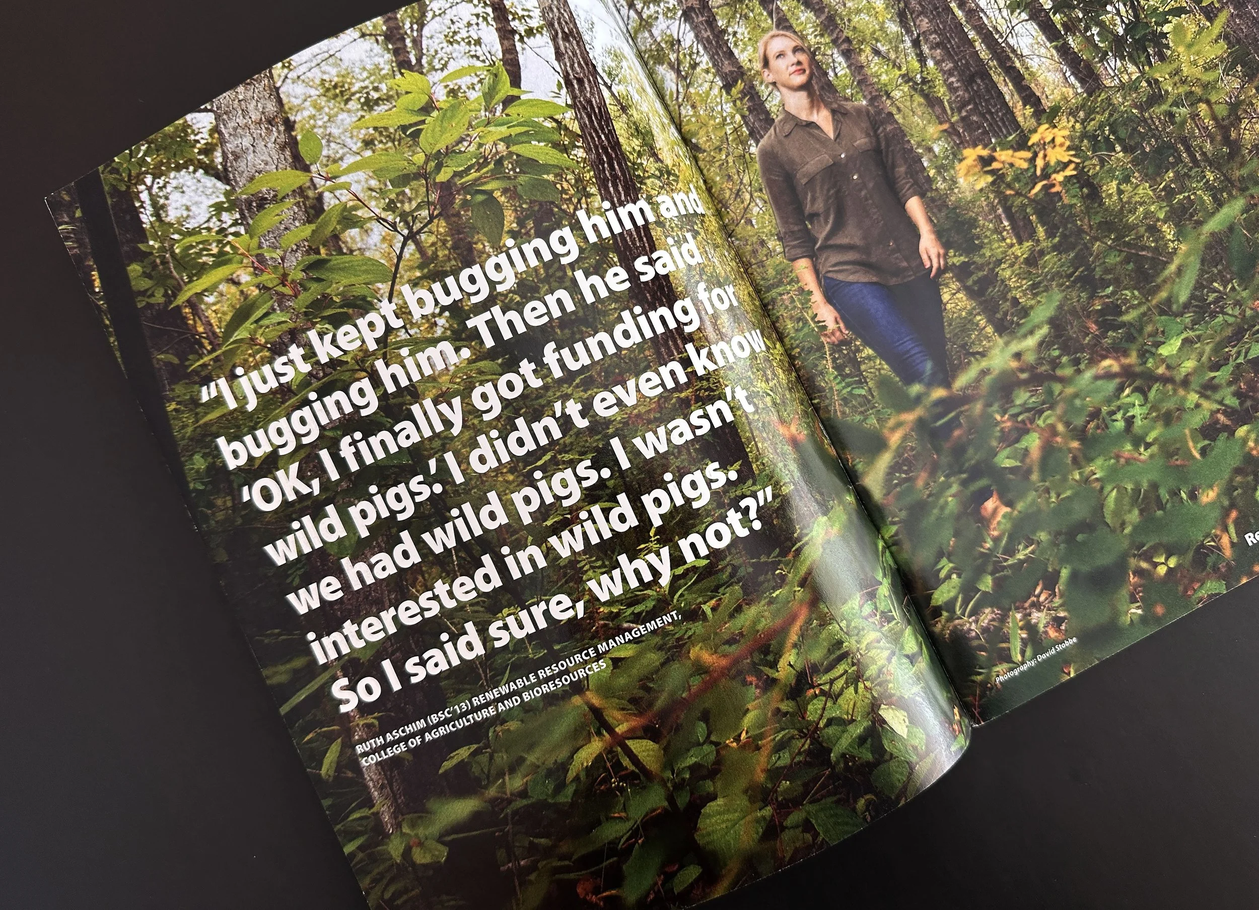
FALL 2019 GREEN & WHITE
COURAGEOUS CURIOSITY
My main focus was to work with the stories to make the theme come alive through pull quotes and text; for this particular issue, budget was a bit lower for photography so I leaned into the words. I found specific quotes within the stories that I knew would emphasize the theme.
A cover story had not been decided and when I merely read the quote by Ruth Aschim [inside front cover] I knew it was the one.
The words felt so fearless, adventurous, and of course, curious so I couldn’t ignore it. The editor agreed and so a story about wild pigs became the cover story and those words became the path to guide the photographs [taken by David Stobbe].
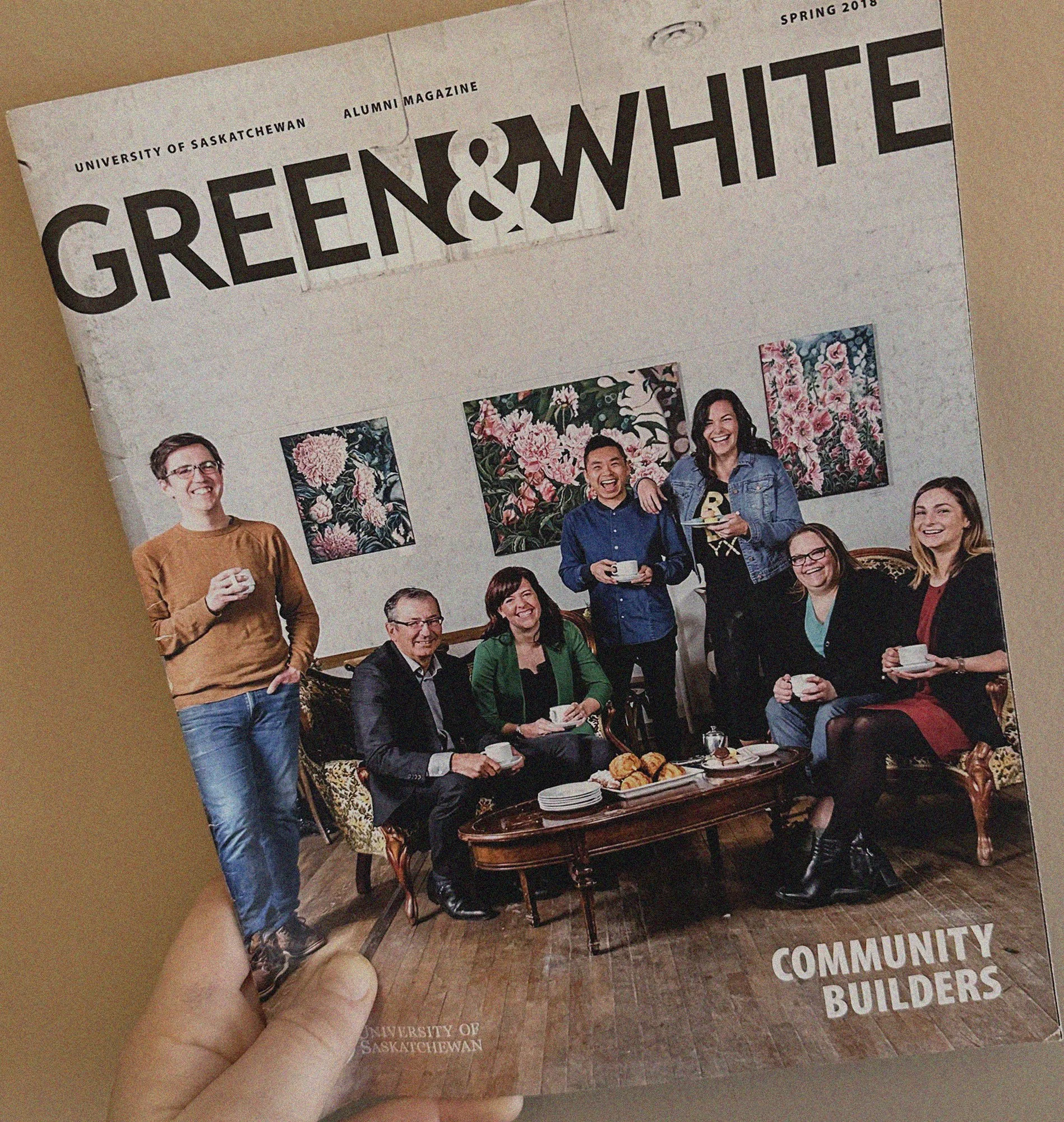
the story of the inside front cover
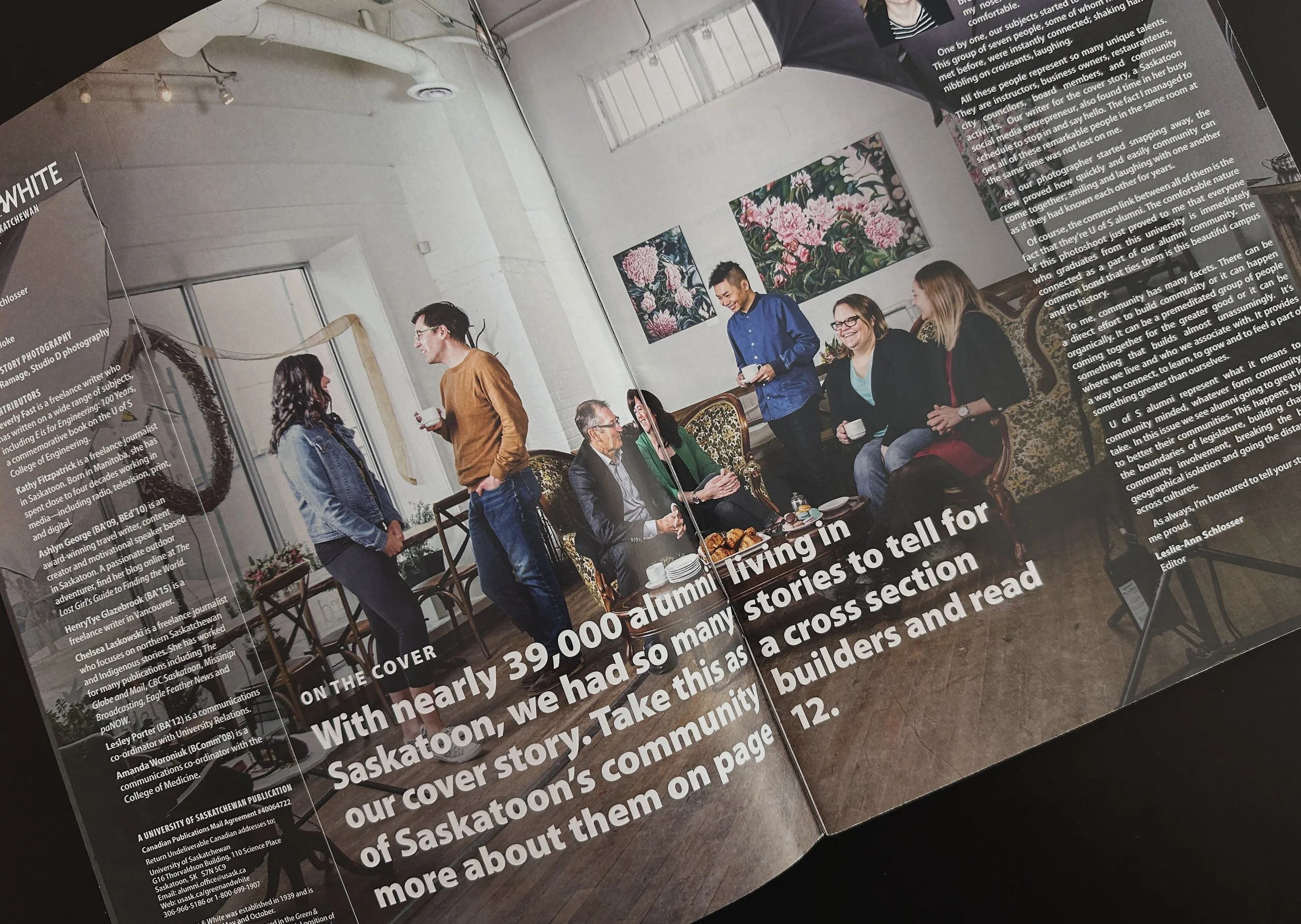
SPRING 2018 GREEN & WHITE
COMMUNITY BUILDERS
We knew the cover story was the one about a handful of local alumni turned entrepreneurs and we wanted to create a cover dynamic that would show everyone as if they were not just interacting as a group of alumni but more like old friends catching up. Saskatoon is a pretty small community and the alumni community in Saskatoon even smaller, so chances are they either were friends, or they had friends of friends.
We [the editor and I] worked with Studio D to bring this vision to life; the dirty frame shot on the inside front cover gave a very organic feel of alumni interacting in real-time to complement the story and cover photo.
a collection of some of the covers of the alumni mag [before the rebrand]: