usask stories
CREATIVE/ART DIRECTION
EDITORIAL DESIGN
BRAND STORYTELLING
project
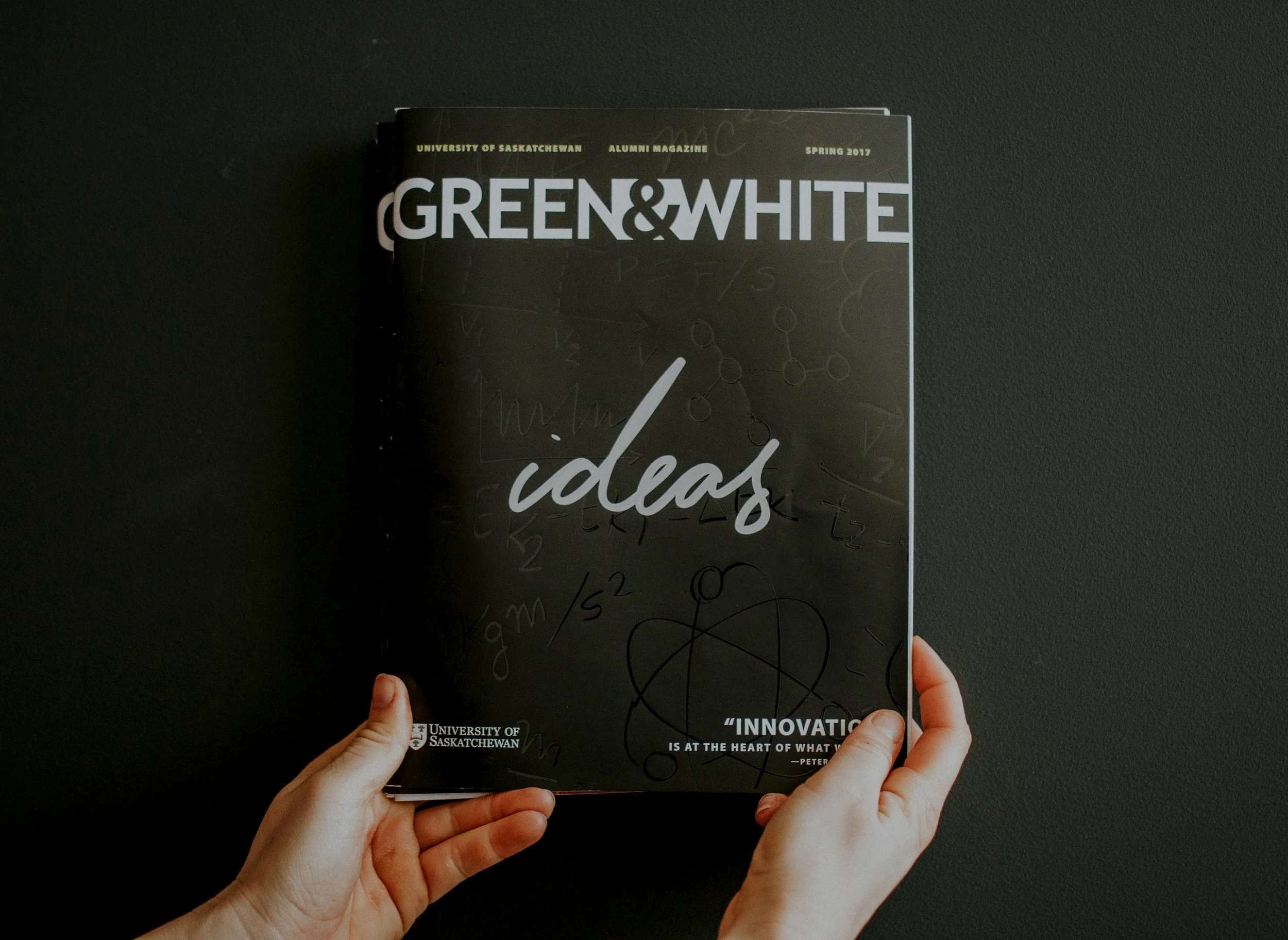
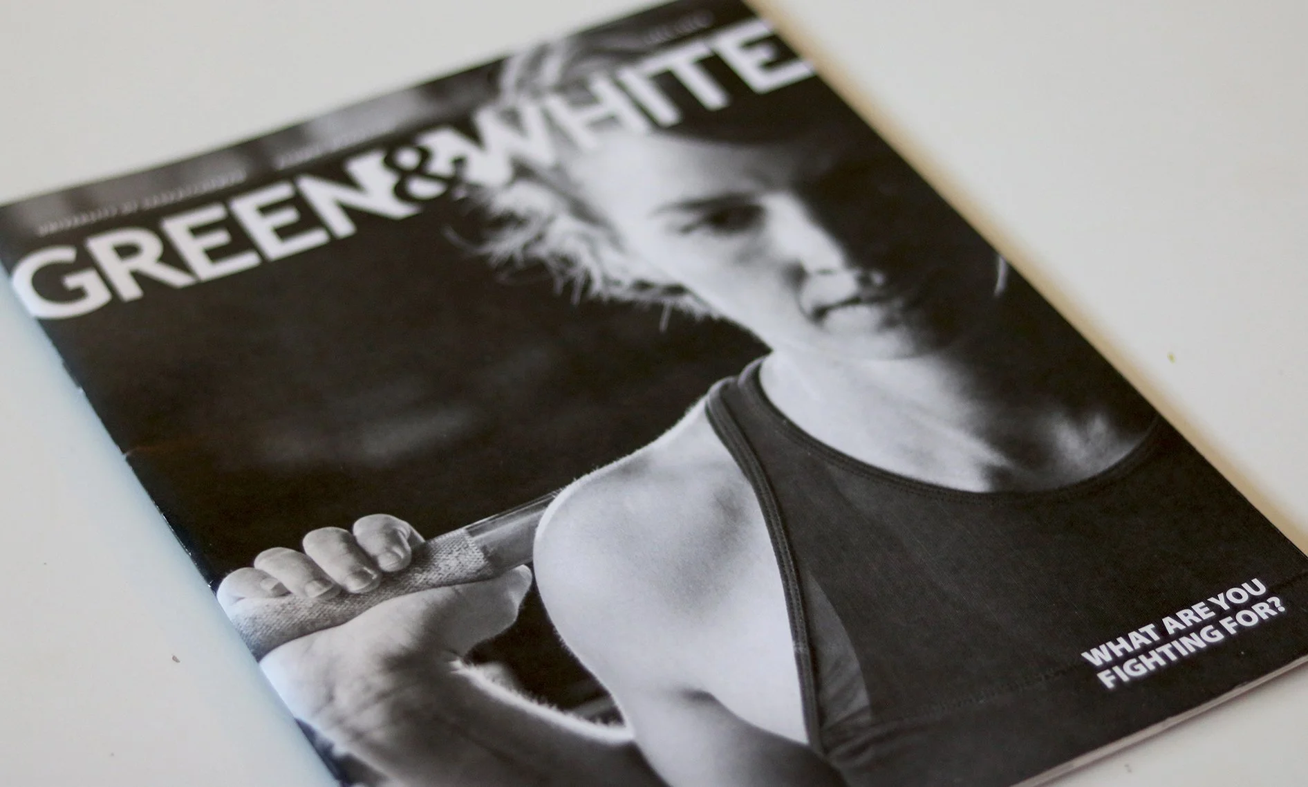
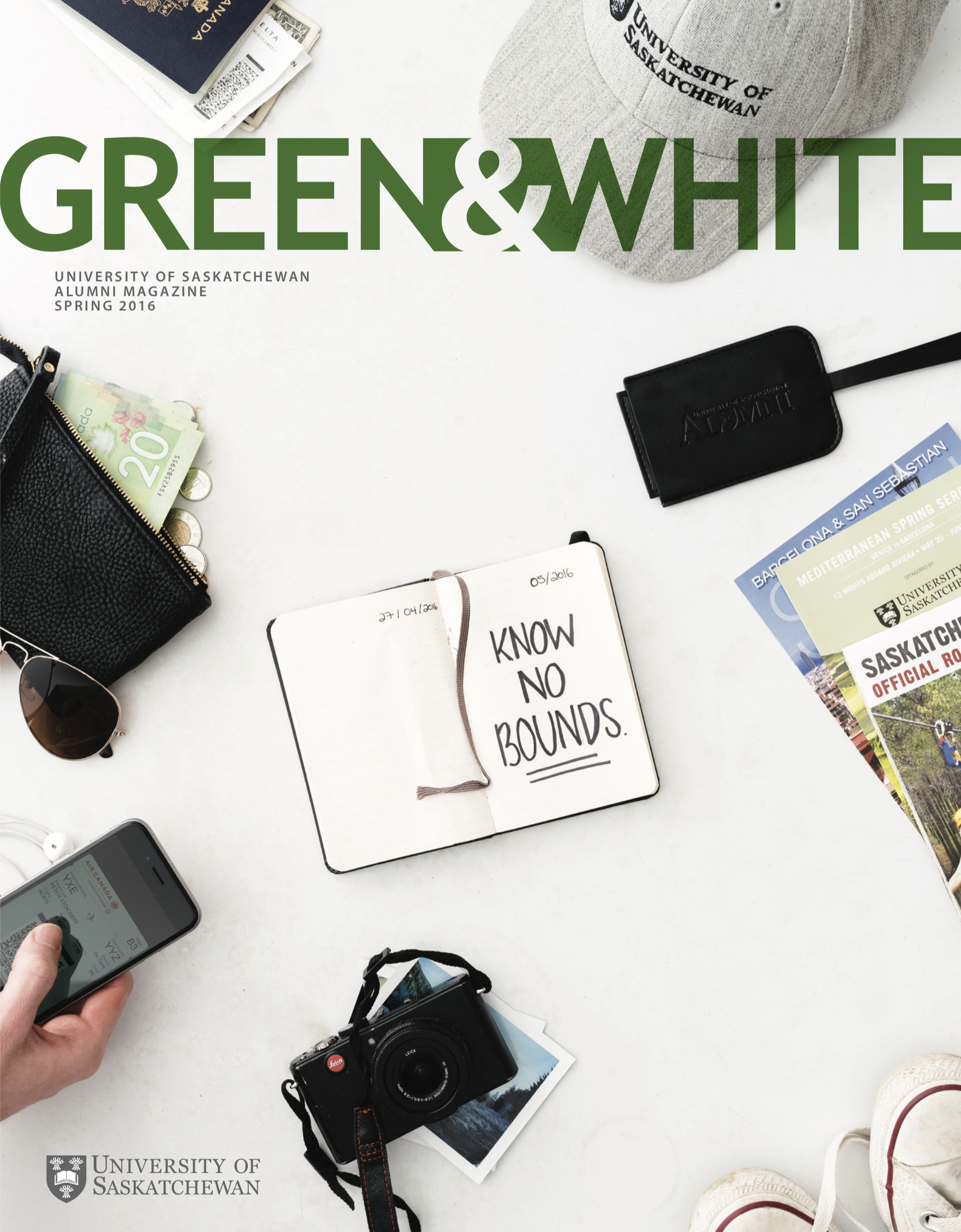
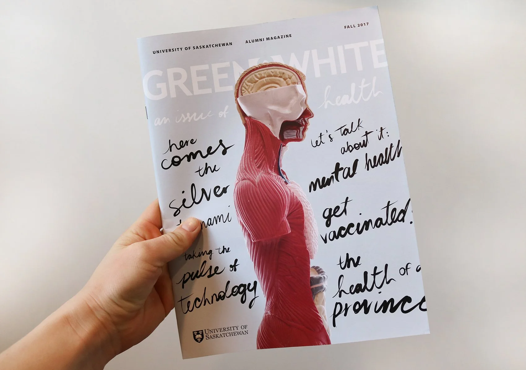
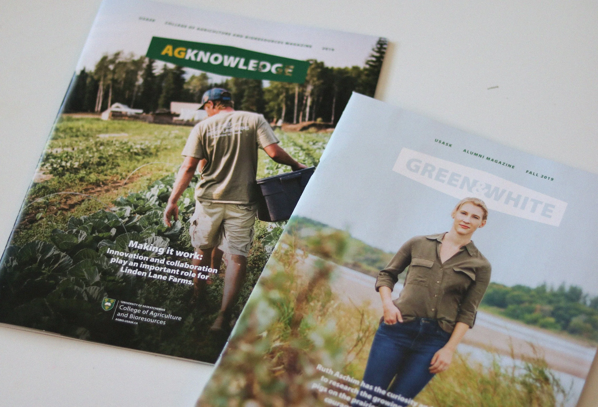
A cover + inside rebrand for multiple campus magazines across campus. the purpose was for all these publications to better work together to tell the greater usask story.
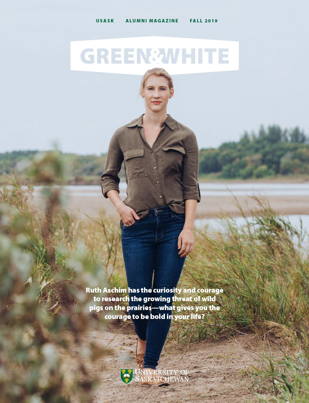
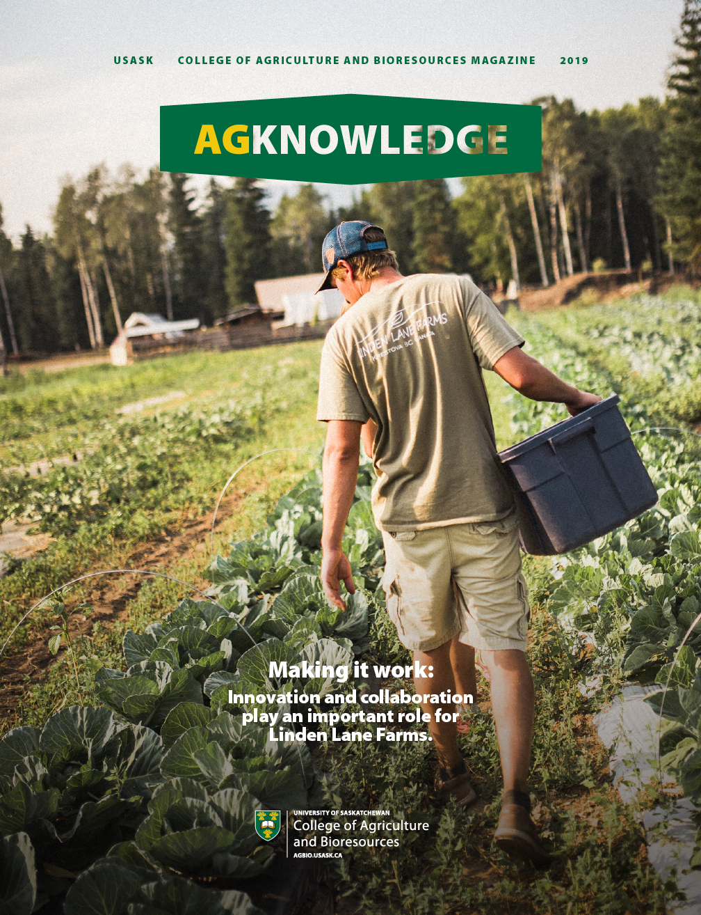
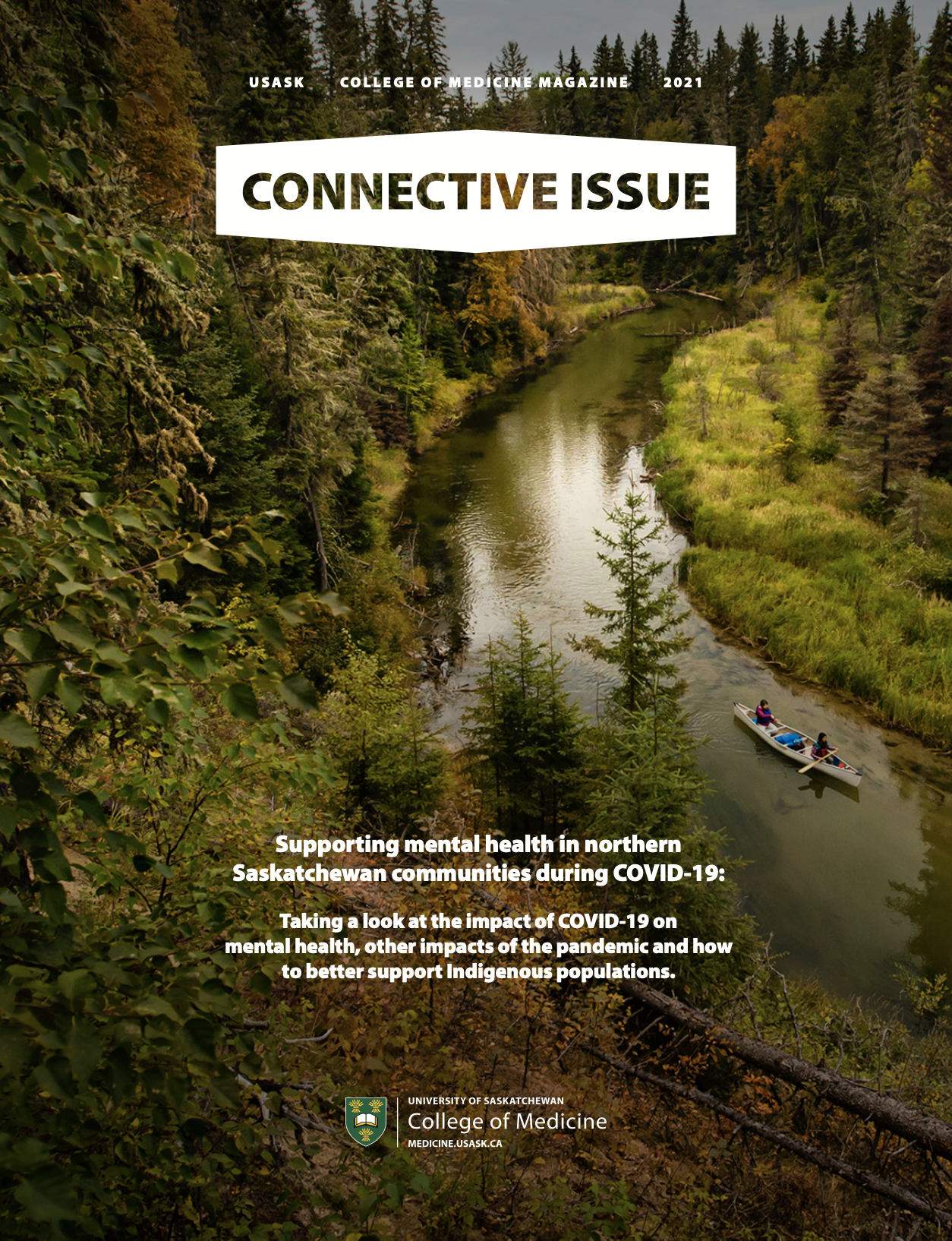
campus in general was amidst a brand redesign so my team and i thought it was time for a rebrand of the alumni mag [green & white]. pushing it further, i thought it would be a good time to bring other college magazines in the loop to bring all these publications together. they may be about very different subjects but they ought to look like they come from the same institution.


one of the main graphic elements in the campus rebrand was the icon shown above [which held the new tagline on a lot of marketing materials] so it was starting to be widely seen.
instinctively, i saw this icon as a natural container to hold the title on the cover of each different publication. since this is primarily shipped out to users and not as much held in magazine racks, i wanted to get away from the standard large magazine cover masthead. i wanted to make it smaller to leave more flexibility for cover art.
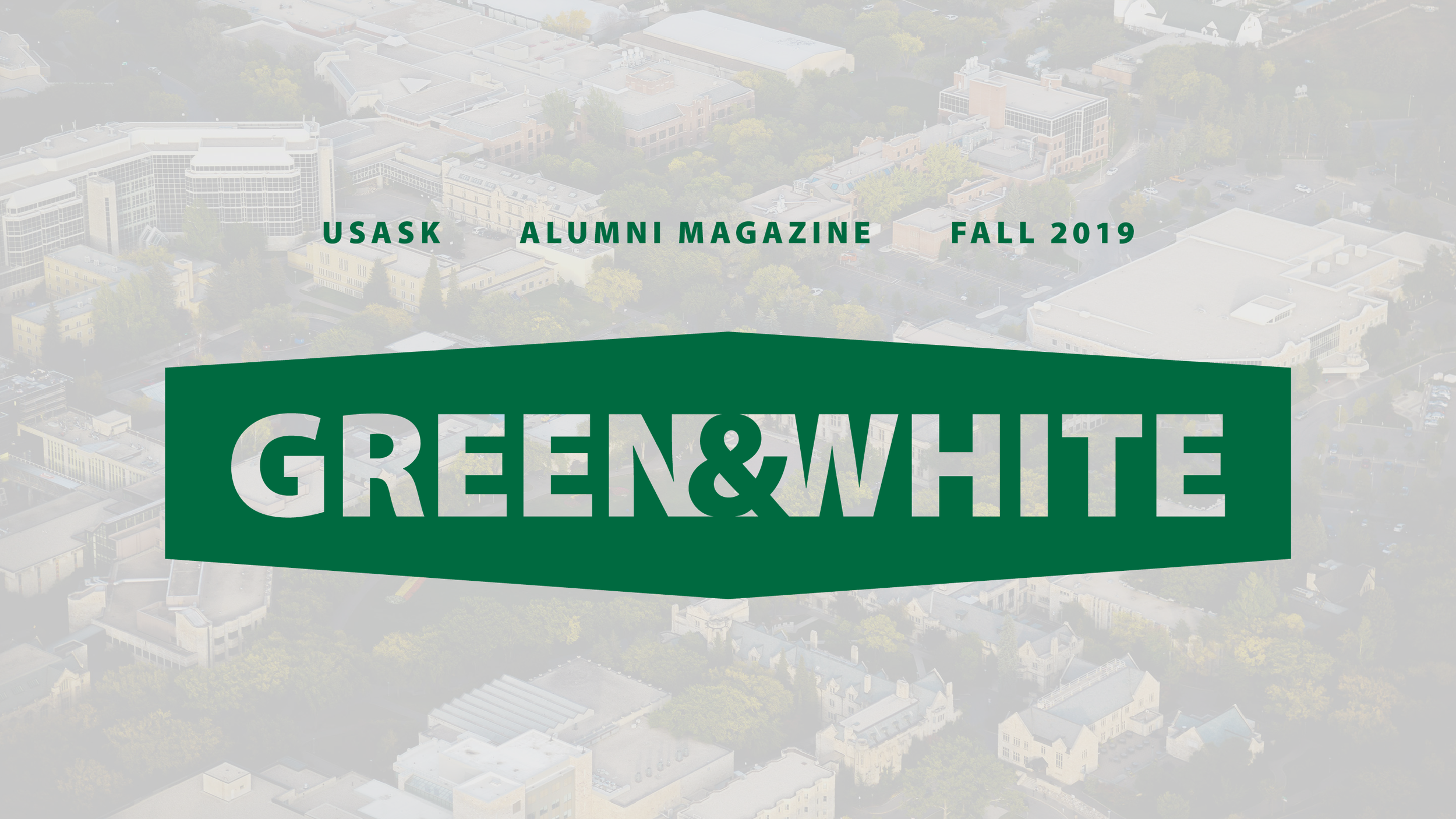
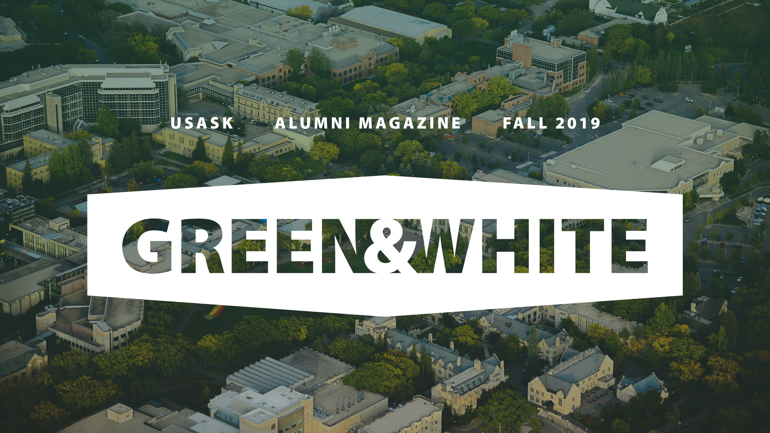
this project came together seemingly quick when the time came, but a cover + inside rebrand was something i tossed around casually with the editorial team for awhile. for each issue for a few years prior to this, i’d cheekily say, “maybe now?” often met with a “no.”
but i just kept asking and so when it was a yes, it felt like i just knew what to do.
see below for three of the first with the new cover: green & white, agknowledge [college of agriculture], and connective issue [college of medicine].
the story behind the inside front cover
FALL 2019 GREEN & WHITE
theme: cOURAGEOUS CURIOSITY
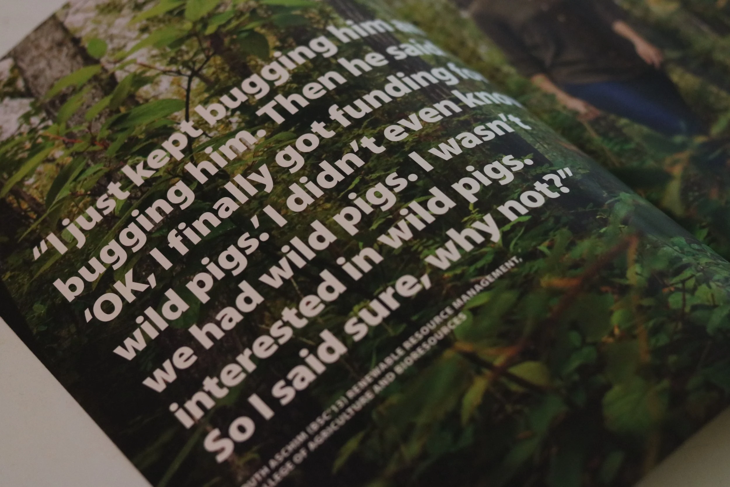
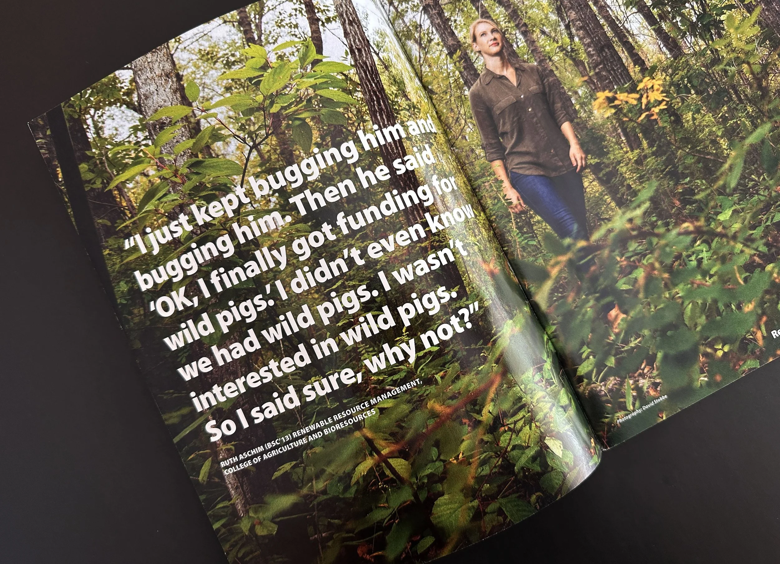
i always loved to work with the stories to make the theme of each issue come alive by way of quotes from each story, especially when budget was lower for photography.
for this issue, A cover story had not been decided but when I read the quote in this story I knew it was a cover story simply because it embodied both courage and curiosity in a very simple way.
the story behind the inside front cover
SPRING 2018 GREEN & WHITE
theme: cOMMUNITY BUILDERS
the cover story featured a handful of alumni + local entrepreneurs and we wanted to create a cover dynamic that portrayed more of a cozy, community of friends + alumni catching up rather than a business meeting.
We worked with Studio D to bring this vision to life; the dirty frame candid-like shot on the inside front cover gave an organic feel of alumni interacting to execute this vision.